SwiftUI Tutorial for iOS: Creating Charts
In this SwiftUI tutorial, you’ll learn how to build a variety of custom charts to effectively model your iOS app data to your users. By Bill Morefield.
Creating a Heat Map
Create a new SwiftUI view in the Charts group and name the new view TemperatureChart. Open TemperatureChart.swift and add a variable for the measurement data at the beginning of the struct.
var measurements: [DayInfo]
Change the preview to provide the information:
TemperatureChart(measurements: WeatherInformation()!.stations[1].measurements)
This chart should convey the high and low temperatures for each station across the year. You'll need to use some helper functions to achieve this visualization. Add the following methods to the struct after the measurements variable:
func degreeHeight(_ height: CGFloat, range: Int) -> CGFloat {
  height / CGFloat(range)
}

func dayWidth(_ width: CGFloat, count: Int) -> CGFloat {
  width / CGFloat(count)
}
Instead of using a fixed amount determined by trial and error, this chart adjusts to fit the view. These two functions calculate the points taken by one degree of temperature vertically and the points taken by one day horizontally for the chart. Both functions divide the size of the dimension by the number of elements. The result gives the number of points to use for each element in the view.
With that result, you can determine the point location in the view for a given day and temperature. Add the following two functions after the previous two:
func dayOffset(_ date: Date, dWidth: CGFloat) -> CGFloat {
  CGFloat(Calendar.current.ordinality(of: .day, in: .year, for: date)!) * dWidth
}

func tempOffset(_ temperature: Double, degreeHeight: CGFloat) -> CGFloat {
  CGFloat(temperature + 10) * degreeHeight
}
dayOffset(_:dWidth:) calculates the day of the year from the passed in date and then multiples by the dWidth parameter. This calculates the horizontal position to plot this measurement in the view.
tempOffset(_:degreeHeight:) does a similar calculation to get the point for a given temperature. Since you start the temperature range at -10 degrees, you add ten to the temperature before the multiplication. This shifts the bottom of the range to come out to zero points.
Now change body to the following:
// 1
GeometryReader { reader in
  ForEach(self.measurements) { measurement in
    // 2
    Path { p in
      // 3
      let dWidth = self.dayWidth(reader.size.width, count: 365)
      let dHeight = self.degreeHeight(reader.size.height, range: 110)
      // 4
      let dOffset = self.dayOffset(measurement.date, dWidth: dWidth)
      let lowOffset = self.tempOffset(measurement.low, degreeHeight: dHeight)
      let highOffset = self.tempOffset(measurement.high, degreeHeight: dHeight)
      // 5
      p.move(to: CGPoint(x: dOffset, y: reader.size.height - lowOffset))
      p.addLine(to: CGPoint(x: dOffset, y: reader.size.height - highOffset))
      // 6
    }.stroke()
  }
}
There's a lot here, but the functions simplify much of the needed calculations. Here's how the code works:
In the previous charts, you used constant sizes to produce something that looked correct. Now you calculate the best values for the chart using these values with the earlier functions.
- You create the
GeometryReaderto wrap the chart. AGeometryReaderexpands to fill the view containing it. The closure also provides aGeometryProxyparameter that contains information about the size of the view.In the previous charts, you used constant sizes to produce something that looked correct. Now you calculate the best values for the chart using these values with the earlier functions.
-
Pathprovides a way to create a two dimensional shape. Here you'll create a vertical line connecting the low and high temperatures for each day.Pathalso has a bit of a unique feature in SwiftUI in that you can define variables inside it easing the calculation of points for the path. - Here you use the two functions to calculate the size in points of one degree of temperature and one day for the view using the size from the
GeometryReader. You use a range of 110 because -10 to 100 degrees Fahrenheit covers the range of temperatures found for all locations in the data for this year. - Now you use the functions to determine the vertical point for the date as well as the high and low temperatures.
- These lines move the path to the point for the low temperature and add a line to the high temperature. The vertical view coordinates begin at the top of the view and increase downward. As you want points to start at the bottom and go upward, you subtract the vertical position from
reader.size.heightto get the desired location. -
stroke()tells SwiftUI to outline the path you've created in the current system color.
Open TemperatureTab.swift and replace body with this to use your new view:
VStack {
  Text("Temperatures for 2018")
  TemperatureChart(measurements: station.measurements)
}.padding()
Build and run the app. Select any location and look at the temperature tab. Notice that the chart adapts to fit the smaller in-app view as well as the larger preview.
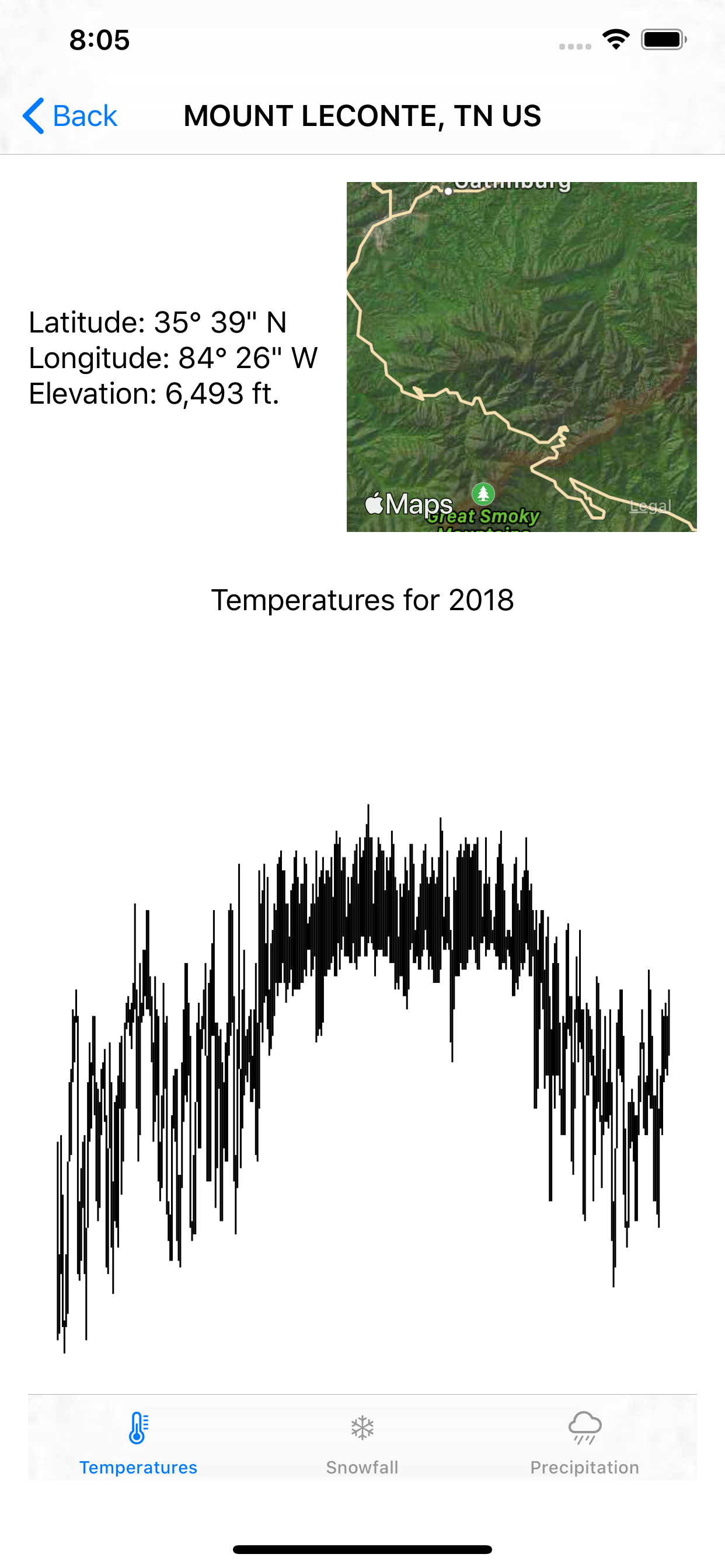
The shape of the chart shows the changes in temperature pretty well but looks a bit bland. Next, you'll make it more interesting by turning the chart into a heat map that uses color to more clearly indicate temperatures.
Adding Heat Map Color
A heat map graphically represents values using colors. Weather maps often represent temperatures using a range of colors starting with purple and blue shades for low temperatures and moving toward yellow, orange and red shades for warmer temperatures. Calculating these colors and changes could involve some complicated math, but not here.
In SwiftUI, you represent the transitions of color using a gradient. A linear gradient creates a smooth color transition between two or more colors along a single axis. Add the following in TemperatureChart.swift after measurements and before the helper functions:
let tempGradient = Gradient(colors: [
  .purple,
  Color(red: 0, green: 0, blue: 139.0/255.0),
  .blue,
  Color(red: 30.0/255.0, green: 144.0/255.0, blue: 1.0),
  Color(red: 0, green: 191/255.0, blue: 1.0),
  Color(red: 135.0/255.0, green: 206.0/255.0, blue: 250.0/255.0),
  .green,
  .yellow,
  .orange,
  Color(red: 1.0, green: 140.0/255.0, blue: 0.0),
  .red,
  Color(red: 139.0/255.0, green: 0.0, blue: 0.0)
])
This defines a gradient consisting of 12 colors to evenly split a temperature range of 110 degrees by ten-degree increments, from purple for -10 to dark red for 100 degrees.
Now change the stroke() at comment six in the body view to:
.stroke(LinearGradient(
  gradient: self.tempGradient,
  startPoint: UnitPoint(x: 0.0, y: 1.0),
  endPoint: UnitPoint(x: 0.0, y: 0.0)))
You replace the solid color with a linear gradient using the previously defined gradient colors. The startPoint and endPoint parameters let you do something almost magical.
Both parameters are UnitPoints that define space in a point independent way where 0.0 and 1.0 mark the edges of the view. The zero points for each direction are at the origin: the top left corner of the view.
You set the start point for the gradient to the bottom left corner of the view and the endpoint to the top left corner of the view. Since it's a linear gradient, the gradient varies only vertically. Each color extends horizontally across the entire view at each point.
Applying it to the path means the gradient shows only for the stroked portion: The range between the low and high temperatures.
