SwiftUI Tutorial for iOS: Creating Charts
In this SwiftUI tutorial, you’ll learn how to build a variety of custom charts to effectively model your iOS app data to your users. By Bill Morefield.
Adding Grid Lines and Labels
All that's left now is to make things a little easier on the viewers eyes by adding grid lines, similar to what you did in the bar charts. Add the following helper function after the existing ones in TemperatureChart.swift:
func tempLabelOffset(_ line: Int, height: CGFloat) -> CGFloat {
  height - self.tempOffset(
    Double(line * 10),
    degreeHeight: self.degreeHeight(height, range: 110))
}
This divides the grid into ten-degree blocks and passes in an integer representing the starting temperature divided by ten for that block along with the total height of the view. The function calculates the appropriate vertical offset.
Add the following code to draw the temperature grid lines and labels after the closing bracket of the ForEach loop in body:
// 1
ForEach(-1..<11) { line in
  // 2
  Group {
    Path { path in
      let y = self.tempLabelOffset(line, height: reader.size.height)
      path.move(to: CGPoint(x: 0, y: y))
      path.addLine(to: CGPoint(x: reader.size.width, y: y))
      // 4
    }.stroke(line == 0 ? Color.black : Color.gray)
    // 5
    if line >= 0 {
      Text("\(line * 10)°")
        .offset(x: 10, y: self.tempLabelOffset(line, height: reader.size.height))
    }
  }
}
Here's a breakdown of the new code:
- You loop through the range of -1 to 10 representing the temperatures -10 to 100 degrees Fahrenheit.
- A
Groupview acts as a bit of glue in SwiftUI that combines its child views but doesn't render an element directly. Here it allows you to use both aPathand aText()view inside the loop. - You use the function you just added to calculate the position of the temperature for this line. Then you draw the line horizontally from the left side to the right side of the view at that vertical position.
- You draw most of the grid lines in gray. To help the zero degrees line stand out, you show it in black.
- For all except the first grid line, you add a text label. Since you're no longer inside the
Pathenclosure, you recalculate the position for the temperature the line represents. You again use thetempLabelOffset(_:height:)function to calculate the vertical position.
With the temperatures done, you need indicators and labels for the months to finish. Add the following two helper functions after the existing ones:
func offsetFirstOfMonth(_ month: Int, width: CGFloat) -> CGFloat {
  let dateFormatter = DateFormatter()
  dateFormatter.dateFormat = "M/d/yyyy"
  let foM = dateFormatter.date(from: "\(month)/1/2018")!
  let dayWidth = self.dayWidth(width, count: 365)
  return self.dayOffset(foM, dWidth: dayWidth)
}

func monthAbbreviationFromInt(_ month: Int) -> String {
  let ma = Calendar.current.shortMonthSymbols
  return ma[month - 1]
}
Add the following code to add the month grid lines and labels to the end of body after the closing bracket of the previous ForEach loop:
ForEach(1..<13) { month in
  Group {
    Path { path in
      let dOffset = self.offsetFirstOfMonth(month, width: reader.size.width)

      path.move(to: CGPoint(x: dOffset, y: reader.size.height))
      path.addLine(to: CGPoint(x: dOffset, y: 0))
    }.stroke(Color.gray)
    Text("\(self.monthAbbreviationFromInt(month))")
      .font(.subheadline)
      .offset(
        x: self.offsetFirstOfMonth(month, width: reader.size.width) +
          5 * self.dayWidth(reader.size.width, count: 365),
        y: reader.size.height - 25.0)
  }
}
There's nothing here you haven't used before. A Group, as before, wraps the grid lines and month labels. You then draw a vertical line at the offset that corresponds to the first day of each month.
Then you get the text abbreviation for each month and draw it at the same offset plus a small shift to move the text into the middle of the month. You get the text abbreviation for each month and draw it at the same offset plus a small shift to move the text into the middle of the month.

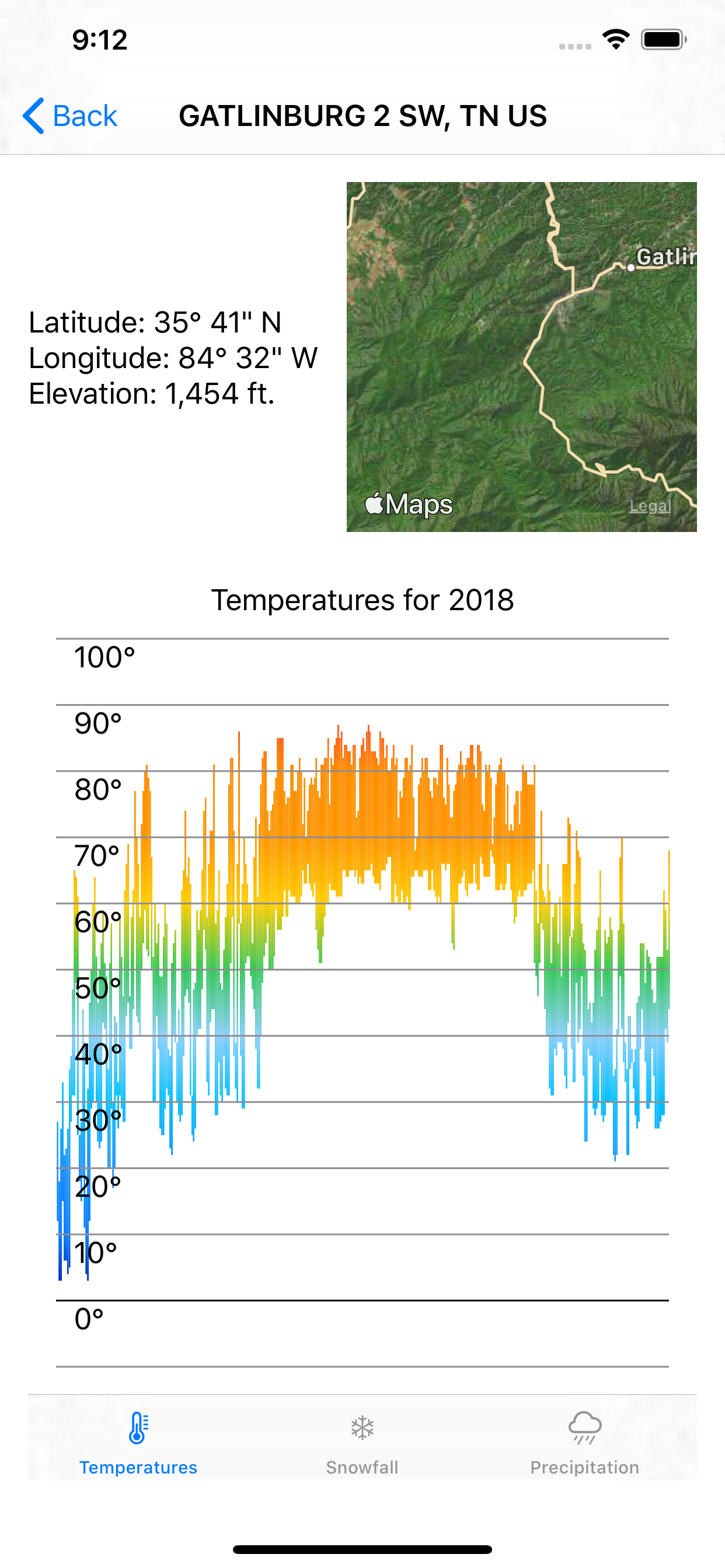
Your chart now gives a good overview of the temperature ranges at each location. The top and bottom of each vertical line combine with the color to clearly show the temperatures at different times of the year. The grid lines and labels help the viewer identify a time of year or temperature range.
Where to Go From Here
You can download the finished project by clicking the Download Materials button at the top or bottom of this tutorial.
With all UI things, the Apple Human Interface Guidelines are a good starting point if you’d like to learn more. You'll find a brief section on Charts in the Human Interface Guidelines. You should also read the guidelines on Color when choosing colors for your charts.
Chapter 13: Drawing and Custom Graphics in SwiftUI by Tutorials is a good introduction to creating SwiftUI graphics. But perhaps I'm biased since I wrote it. :]
If you have any questions or comments, please join the discussion below.