SwiftUI Tutorial for iOS: Creating Charts
In this SwiftUI tutorial, you’ll learn how to build a variety of custom charts to effectively model your iOS app data to your users. By Bill Morefield.
Charts are an excellent way to present data to your users. They help users grasp the relationships inherent in large amounts of information. You can use charts to draw attention to trends, clarify causes and assist your users in truly visualizing the information.
In this SwiftUI tutorial, you’ll learn how to create a variety of custom charts to help visualize your app’s data.
While SwiftUI doesn’t provide a native chart library, it includes a rich graphics capability you can use to build custom charts. In this tutorial, you’ll add charts to an app showing historical weather data for several weather stations in and around the Great Smoky Mountains National Park.
Why Use a Chart?
Looking at a few points of data can be enlightening, but staring at a long list of numbers isn’t the best way to gain insight. A list of numbers doesn’t make it easier to get a sense of how warm a certain month was or determine what months are the driest.
Most people have an easier time grasping information when it’s presented graphically. A chart can provide a graphic representation of data designed to inform the viewer.
Charts vs. Graphs
While people often use the terms chart and graph interchangeably, they aren’t the same thing.
A graph shows any relation among values. A simple graph can show the value of y for a given x. The resulting curve can be pretty, but it doesn’t provide insight.
A chart should tell a story. It guides the viewer to a better understanding of the data by making it easier to understand and interpret. In short, all charts are graphs, but not all graphs are charts.
Getting Started
Download the materials by clicking the Download Materials button at the top or bottom of this tutorial. Open the begin project in Xcode, then build and run the app.
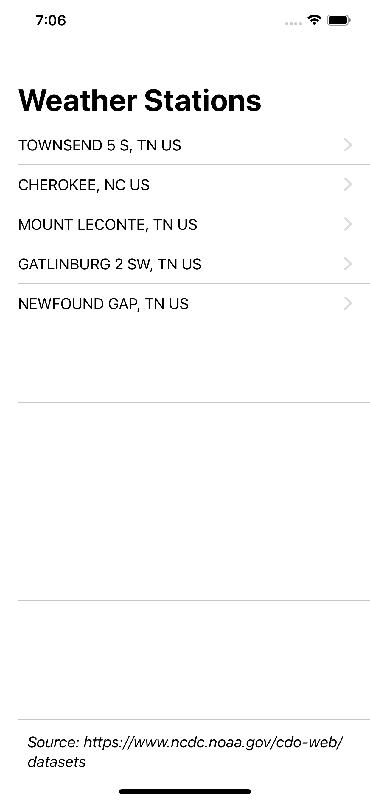
The app shows data for five stations:
- Cherokee, NC and Gatlinburg, TN: The two cities on the main road through the park.
- Newfound Gap: The gap the main road crosses.
- Townsend 5 S: A cover in the southwest part of the park.
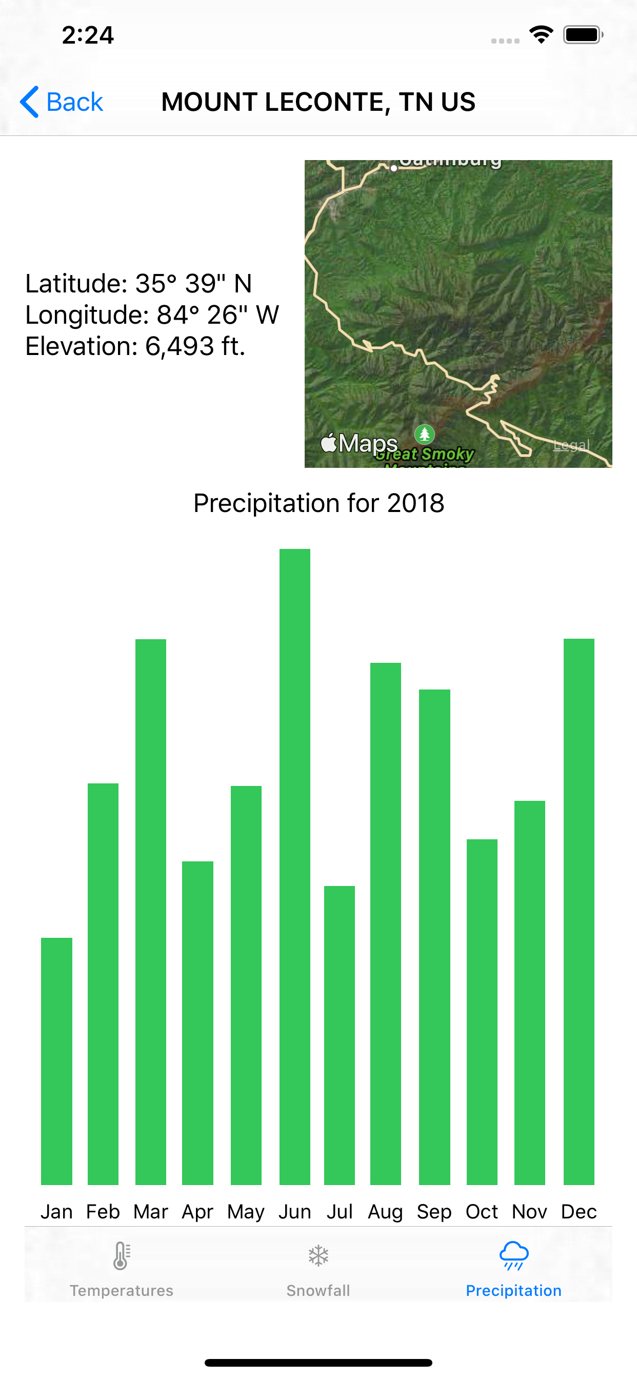
- Mount LeConte: One of the highest mountains in the park.
The dataset contains the precipitation, snowfall and temperature range for each day at each location.
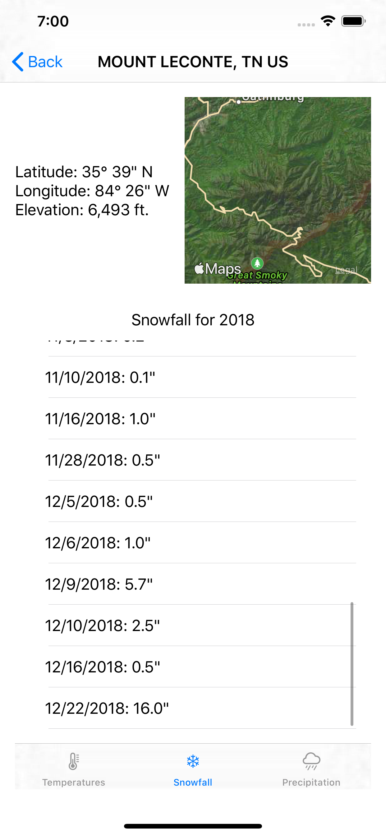
Tapping a location shows information about the location, a map showing the location and three tabs of weather information. The three tabs show the temperature range for each day, the total precipitation for each month and the snowfall for each day with snow.
To begin, you’ll add a bar chart to the app which displays the precipitation data.
Refactoring for Charts
A bar chart provides a bar for each data point. The length of each bar represents a numerical value and can run horizontally or vertically to suit your needs.
Expand the Tabs group and open PrecipitationTab.swift. You’ll see a standard SwiftUI List() that loops through the integers zero through 11, representing the months of the year, and displays the total precipitation for each month. The included helper functions change the integer to a month name and sum the amounts for each month.
Right click the empty Charts group and select New File. Select SwiftUI View and click Next. Name the new view PrecipitationChart.
Ensure the group is set to Charts and click Create. Open the new file. If the Canvas isn’t visible, turn it on by selecting Editor ▸ Canvas from the menu so you can see your progress.
Add the following code at the top of the PrecipitationChart struct:
var measurements: [DayInfo]
You pass the measurements into the chart using this variable. Now update PrecipitationChart_Previews to pass in measurements for the preview. In this case, you’ll pass in the measurements for Mt. LeConte.
PrecipitationChart(measurements: WeatherInformation()!.stations[2].measurements)
At first, you’re going to replicate the existing functionality in this new view. First, add two helper functions after measurements:
func sumPrecipitation(_ month: Int) -> Double {
  self.measurements.filter {
    Calendar.current.component(.month, from: $0.date) == month + 1
  }.reduce(0, { $0 + $1.precipitation })
}

func monthAbbreviationFromInt(_ month: Int) -> String {
  let ma = Calendar.current.shortMonthSymbols
  return ma[month]
}
sumPrecipitation(_:) uses filter to get only the measurements for the month passed into the function. It adjusts for the integer passed in starting at zero instead of one. reduce sums the precipitation values for those measurements.
monthAbbreviationFromInt(_:) gets a list of the abbreviated month symbols for the current calendar and returns the one that matches the passed integer.
Update body to replicate the existing list:
List(0..<12) { month in
  Text("\(self.monthAbbreviationFromInt(month)): " +
    "\(self.sumPrecipitation(month))\"")
}
Open PrecipitationTab.swift and delete the no longer needed sumPrecipitation(_:) and monthAbbreviationFromInt(_:) methods. Inside body, replace the List and enclosure with a call to the new view:
PrecipitationChart(measurements: station.measurements)
Raising the SwiftUI Bar
SwiftUI contains several shape views, including a Rectangle shape that works well for building bar charts. Open PrecipitationChart.swift and replace body with:
// 1
HStack {
  // 2
  ForEach(0..<12) { month in
    // 3
    VStack {
      // 4
      Spacer()
      // 5
      Rectangle()
        .fill(Color.green)
        .frame(width: 20, height: CGFloat(self.sumPrecipitation(month)) * 15.0)
      // 6
      Text("\(self.monthAbbreviationFromInt(month))")
        .font(.footnote)
        .frame(height: 20)
    }
  }
}
Here’s a step by step breakdown of what's happening:
A month with one inch of rain results in a rectangle 20 points wide and 15 points long. A month with seven inches of rain shows as a rectangle 20 points wide and 105 points long.
- You've created vertical bars so you use
HStackto arrange the child views horizontally on the device. - You loop through the months using
ForEach. - You use
VStackfor each bar in the chart to stack the elements vertically. - You specify sizes on the other views in the stack and this
Spacerexpands to fill the remaining space. In effect, it tells SwiftUI to put the empty space at the top ofVStack. - You use the
RectangleSwiftUI shape primitive. It creates a rectangle shape that aligns with the view's containing frame and fills it using green. You specify a frame with a constant width and the height as the total precipitation for the month in inches multiplied by 15.A month with one inch of rain results in a rectangle 20 points wide and 15 points long. A month with seven inches of rain shows as a rectangle 20 points wide and 105 points long.
- You also provide a label for each bar, in this case, a month of the year. At the bottom of the stack, the
Textview contains the abbreviated name for the corresponding month with the.footnotefont and a static height. Providing a static height ensures the bottoms of the bars line up.