Recreating the Apple Music Now Playing Transition
A common visual pattern in many iPhone apps are stacks of cards sliding in from the screen edge. You’ll recreate the Apple Music Now Playing Transition By Warren Burton.
Changing the Status Bar’s Appearance
The presented controller has a dark background, so you’re going to use a light style for the status bar instead. Open MaxiSongCardViewController.swift and add the following code to the MaxiSongCardViewController class;
override var preferredStatusBarStyle: UIStatusBarStyle {
  return .lightContent
}
Build and run app, tap a song then tap the mini player to present the MaxiSongCardViewController. The status bar will now be white-on-black.

The last task in this section is to create the illusion of the controller falling away to the background.
Shrinking the View Controller
Open MaxiSongCardViewController.swift and add the following properties to the top of the class:
let primaryDuration = 4.0 //set to 0.5 when ready
let backingImageEdgeInset: CGFloat = 15.0
This provides the duration for the animation as well as the inset for the backing image. You can speed up the animation later, but for now it will run quite slowly so you can see what’s happening.
Next, add the following extension to the end of the file:
//background image animation
extension MaxiSongCardViewController {

  //1.
  private func configureBackingImageInPosition(presenting: Bool) {
    let edgeInset: CGFloat = presenting ? backingImageEdgeInset : 0
    let dimmerAlpha: CGFloat = presenting ? 0.3 : 0
    let cornerRadius: CGFloat = presenting ? cardCornerRadius : 0

    backingImageLeadingInset.constant = edgeInset
    backingImageTrailingInset.constant = edgeInset
    let aspectRatio = backingImageView.frame.height / backingImageView.frame.width
    backingImageTopInset.constant = edgeInset * aspectRatio
    backingImageBottomInset.constant = edgeInset * aspectRatio
    //2.
    dimmerLayer.alpha = dimmerAlpha
    //3.
    backingImageView.layer.cornerRadius = cornerRadius
  }

  //4.
  private func animateBackingImage(presenting: Bool) {
    UIView.animate(withDuration: primaryDuration) {
      self.configureBackingImageInPosition(presenting: presenting)
      self.view.layoutIfNeeded() //IMPORTANT!
    }
  }

  //5.
  func animateBackingImageIn() {
    animateBackingImage(presenting: true)
  }

  func animateBackingImageOut() {
    animateBackingImage(presenting: false)
  }
}
Let’s go over this step-by-step:
- Set the desired end position of the image frame. You correct the vertical insets with the aspect ratio of the image so the image doesn’t look squashed.
- The dimmer layer is a
UIViewabove the Image View with a black background color. You set the alpha on this to dim the image slightly. - You round off the corners of the image.
- Using the simplest
UIViewanimation API, you tell the image view to animate into its new layout. When animating Auto Layout constraints you must make a call tolayoutIfNeeded()within the block or the animation will not run. - Provide public accessors to keep your code clean.
Next, add the following to viewDidLoad() after the call to super:
backingImageView.image = backingImage
Here you install the snapshot you passed through from SongViewController previously.
Finally add the following to the end of viewDidAppear(_:):
animateBackingImageIn()
Once the view appears, you tell the animation to start.
Build and run the app, select a song and then touch the mini player. You should see the current view controller receding into the background…very…slowly…

Awesome stuff! That takes care of one part of the sequence. The next significant part of the animation is growing the thumbnail image in the mini player into the large top image of the card.
Growing the Song Image
Open Main.storyboard and expand its view hierarchy again.

You’re going to be focusing on the following views:
-
Cover Image Container: This is a
UIViewwith a white background. You’ll be animating its position in the scroll view. -
Cover Art Image: This is the
UIImageViewyou’re going to transition. It has a yellow background so it’s easier to see and grab in Xcode. Note the following two things about this view: - The Aspect Ratio is set to 1:1. This means it’s always a square.
- The height is constrained to a fixed value. You’ll learn why this is in just a bit.
- The Aspect Ratio is set to 1:1. This means it’s always a square.
- The height is constrained to a fixed value. You’ll learn why this is in just a bit.
Open MaxiSongCardViewController.swift. You can see the outlets for the two views and dismiss button are already connected:
//cover image
@IBOutlet weak var coverImageContainer: UIView!
@IBOutlet weak var coverArtImage: UIImageView!
@IBOutlet weak var dismissChevron: UIButton!
Next, find viewDidLoad(), and delete the following lines:
//DELETE THIS LATER
scrollView.isHidden = true
This makes the UIScrollView visible. It was hidden previously so you could see what was going on with the background image.
Next, add the following lines to the end of viewDidLoad():
coverImageContainer.layer.cornerRadius = cardCornerRadius
coverImageContainer.layer.maskedCorners = [.layerMaxXMinYCorner, .layerMinXMinYCorner]
This sets corner radii for the top two corners only.
Build and run the app, tap the mini player and you’ll see you now see the container view and image view displayed above the background image snapshot.

Also notice that the image view has rounded corners. This was accomplished without code; instead, it was done via the User Defined Runtime Attributes panel.

Configuring the Cover Image Constraints
In this part you are going to add the constraints needed to animate the cover image display.
Open MaxiSongCardViewController.swift. Next, add the following constraints:
//cover image constraints
@IBOutlet weak var coverImageLeading: NSLayoutConstraint!
@IBOutlet weak var coverImageTop: NSLayoutConstraint!
@IBOutlet weak var coverImageBottom: NSLayoutConstraint!
@IBOutlet weak var coverImageHeight: NSLayoutConstraint!
Next, open Main.storyboard in the assistant editor and connect the outlets as follows:
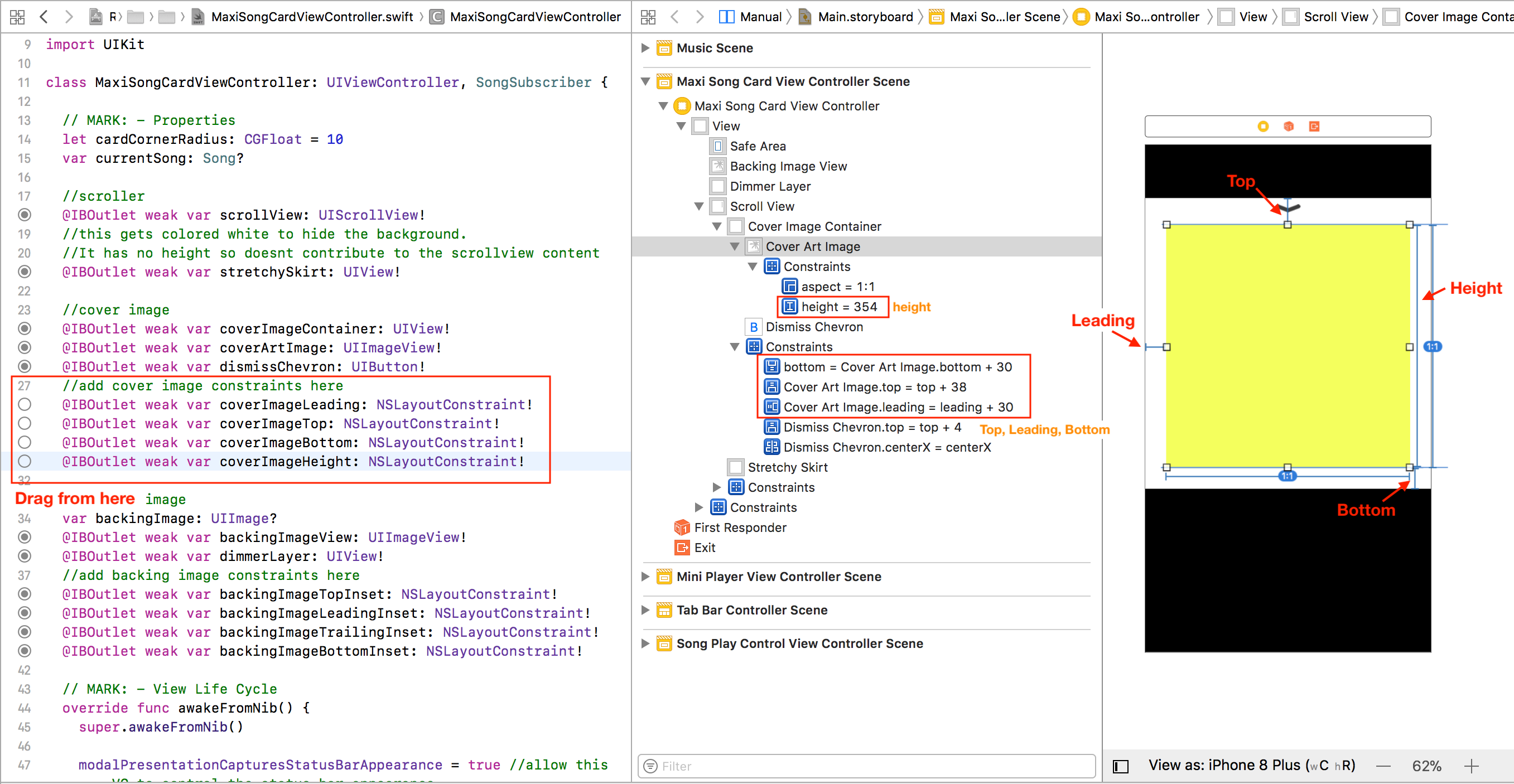
- Connect coverImageLeading, coverImageTop and coverImageBottom to the leading, top and bottom constraints of the Image View.
- Connect coverImageHeight to the height constraint of the Image View.
The last constraint to add is the distance from the top of the cover image container to the content view of the scroll view.
Open MaxiSongCardViewController.swift. Next, add the following property to the class declaration:
//cover image constraints
@IBOutlet weak var coverImageContainerTopInset: NSLayoutConstraint!
Finally, connect coverImageContainerTopInset to the top inset of the cover image container; this is the constraint with the constant parameter of 57, visible in Interface Builder.

Now all the constraints are set up to perform the animation.
Build and run the app; tap a song then tap the mini player to make sure everything is working fine.
Creating a Source Protocol
You need to know the starting point for the animation of the cover image. You could pass a reference of the mini player to the maxi player to derive all the necessary information to perform this information, but that would create a hard dependency between MiniPlayerViewController and MaxiSongCardViewController. Instead, you’ll add a protocol to pass the information.
Close the assistant editor and add the following protocol to the top of MaxiSongCardViewController.swift:
protocol MaxiPlayerSourceProtocol: class {
  var originatingFrameInWindow: CGRect { get }
  var originatingCoverImageView: UIImageView { get }
}
Next, open MiniPlayerViewController.swift and add the following code at the end of the file:
extension MiniPlayerViewController: MaxiPlayerSourceProtocol {
  var originatingFrameInWindow: CGRect {
    let windowRect = view.convert(view.frame, to: nil)
    return windowRect
  }

  var originatingCoverImageView: UIImageView {
    return thumbImage
  }
}
This defines a protocol to express the information the maxi player needs to animate. You then made MiniPlayerViewController conform to that protocol by supplying that information. UIView has built in conversion methods for rectangles and points that you’ll use a lot.
Next, open MaxiSongCardViewController.swift and add the following property to the main class:
weak var sourceView: MaxiPlayerSourceProtocol!
The reference here is weak to avoid retain cycles.
Open SongViewController.swift and add the following line to expandSong before the call to present(_, animated:):
maxiCard.sourceView = miniPlayer
Here you pass the source view reference to the maxi player at instantiation.