ConstraintLayout Tutorial for Android: Getting Started
In this tutorial, you’ll learn the basics of creating Android views by using ConstraintLayout to build a login screen from scratch. By Fuad Kamal.
Sign up/Sign in
With a free Kodeco account you can download source code, track your progress, bookmark, personalise your learner profile and more!
Create accountAlready a member of Kodeco? Sign in
Sign up/Sign in
With a free Kodeco account you can download source code, track your progress, bookmark, personalise your learner profile and more!
Create accountAlready a member of Kodeco? Sign in
Sign up/Sign in
With a free Kodeco account you can download source code, track your progress, bookmark, personalise your learner profile and more!
Create accountAlready a member of Kodeco? Sign in
Contents
ConstraintLayout Tutorial for Android: Getting Started
25 mins
- Raze Galactic — An Intergalactic Travel Service
- Getting Started
- Checking the ConstraintLayout Version
- Setting up Android Studio for Efficient Constraint Development: Design Surfaces
- Creating a New ConstraintLayout From Scratch
- Adding an Image to Your App
- Testing the View Placement
- Getting to Know the Layout Editor Toolbar
- Autoconnect
- Infer Constraints
- Clear All Constraints
- Adding and Removing Individual Constraints
- Constraining Objects to Their Container
- Deleting Individual Constraints
- Constraining Objects to One Another
- Applying Alignment Constraints
- Constraint Bias
- Align the Left Edge and Distribute Vertically
- Using Default Margins
- Where to Go From Here?
A great Android app not only needs to have a beautiful UI, but also optimized performance. You need to control where and how views appear on your users’ screens.
Android provides various types of layouts which use different methods to contain child views and determine their positions. Layouts all descend from the ViewGroup class.
Some of the most common layouts to use when building your Android UI are FrameLayout
, LinearLayout
and RelativeLayout
. They are easy to use, but they each have certain limitations and performance issues when the view hierarchy becomes complex:
-
FrameLayout
can only position child views by applying gravity relative to their parent. -
LinearLayout
doesn’t allow views to overlap one another. Most of the time, you have to use multiple nestedLinearLayout
s. -
RelativeLayout
is expensive because it always does two measure passes.
Nested LinearLayout
s with layout_weight
and nested RelativeLayout
s increase the layout cost exponentially. That’s where ConstraintLayout
comes to the rescue.
ConstraintLayout
, which is now the default layout in Android Studio, gives you many ways to place objects. You can constrain them to their container, to one another or to guidelines. This allows you to create large, complex, dynamic and responsive views in flat hierarchy. It even supports animations!
Raze Galactic — An Intergalactic Travel Service
In this tutorial, you’ll learn the basic features of ConstraintLayout
by building the UI of the login screen for an intergalactic travel app from scratch. You can use the app to book trips between planets, plan a weekend space station getaway and make moon rover reservations to get around once you arrive.
In the process, you’ll learn:
- How to add and remove constraints.
- How to dynamically position UI elements onscreen in relation to other elements.
Note: This tutorial assumes you are familiar with the basics of Android and Android Studio. If you are new to Android development, check out our Android Tutorial for Beginners series first.
Getting Started
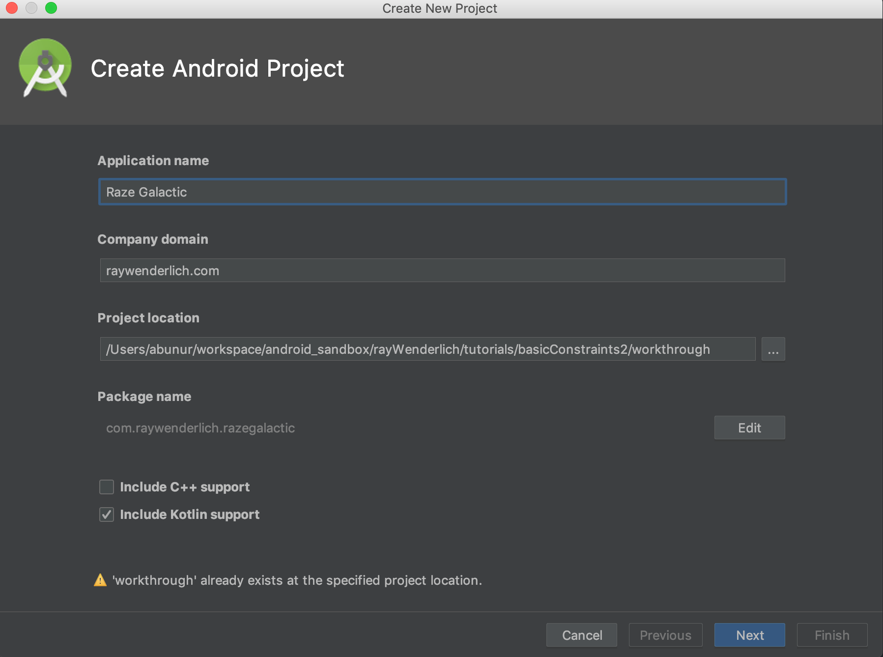
Open Android Studio version 3.2.1 or greater and create a new Android Studio project by selecting Start a new Android Studio project from the startup screen.
On the next screen, enter Raze Galactic for the Application name.
For Company domain, you can enter anything you like; the example uses raywenderlich.com.
For Project location, choose a location on your computer that makes sense for you. Make sure that there are no spaces in the location path. You can press the ellipsis ...
to the right of the project location field to choose a directory on your computer.
Finally, make sure you’ve checked Include Kotlin support and press the Next button.
On the next screen of the wizard, Target Android Devices, you’ll want to choose Phone and Tablet. Then select API 28: Android 9.0 (Pie) and press Next.
On the Add an Activity to Mobile screen, select Empty Activity. Later, you will add UI elements to this empty activity to learn about layout in Android.
Next — you guessed it — press Next!
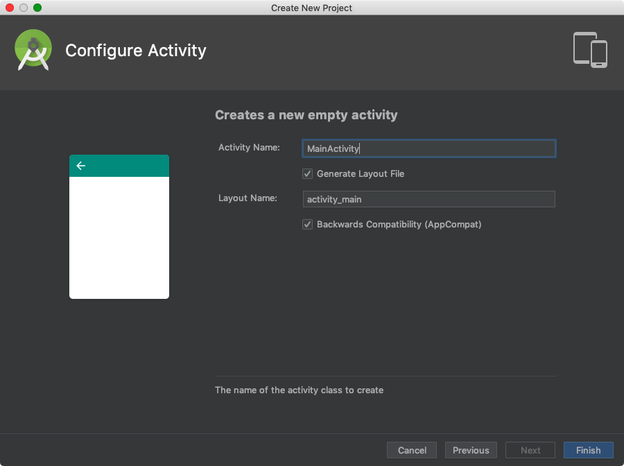
On the final screen of the wizard, Configure Activity, leave all the default settings as they are. Just press Finish to complete the project setup.
Checking the ConstraintLayout Version
Before you start creating new layouts, you’ll want to check whether you need to update your project’s version of ConstraintLayout
.
You can find this information in the build Gradle file for the app module. In Android Studio, open app ▸ build.gradle and have a look at the dependencies { … }
section.
Among the various build dependancies you should find implementation 'com.android.support.constraint:constraint-layout:x'
where ‘x’ is the version of ConstraintLayout
that your project is using.
To complete this tutorial, you’ll need ConstraintLayout
version 1.1.3 or later. To be sure you have the most recent version of the ConstraintLayout
library, select Tools ▸ SDK Manager from the menu.
Click on the SDK Tools tab and look at ConstraintLayout for Android under Support Repository. If it says installed, you are using the most recent version.
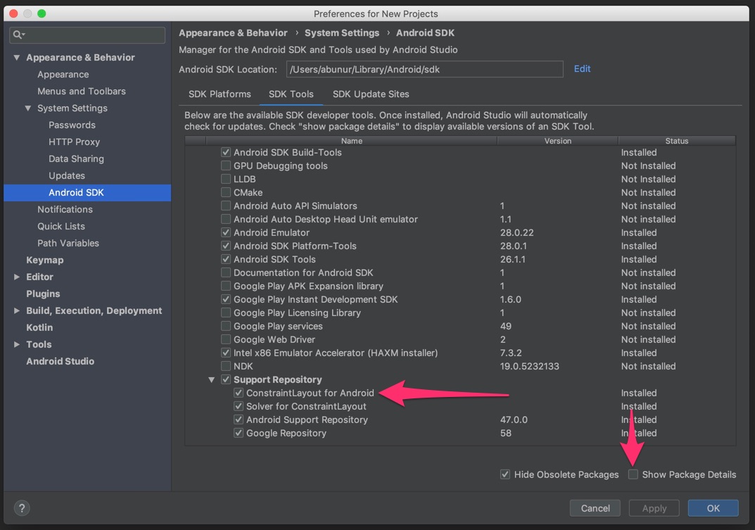
Next, select the checkbox labeled Show Package Details to see which versions of the library you have. The version number in your Gradle file needs to match a version that you have installed in the SDK manager.
Setting up Android Studio for Efficient Constraint Development: Design Surfaces
Before you continue with the tutorial, set up your view of Android Studio to make it easier to add and view constraints and their related elements.
Start by opening activity_main.xml. Then click on the Select Design Surface icon in the tool bar and choose Design + Blueprint.
You will now see a blueprint view next to the design preview while you are working.
The blueprint view helps you see the constraints and guidelines more clearly without getting distracted by the content or background.
As you develop the app UI, you will switch back and forth between a code view (Text tab) and a design view (Design tab).
The code view allows you to see and edit the XML behind the layout, while the design view is useful for manipulating your UI elements visually. The design view also provides the Component Tree, which lets you see and select all the UI elements present in the view.
When you are in the code view, it’s useful to be able to see the visual preview and the blueprint. That way, when you select any element in the preview, it becomes highlighted in the XML code.
If you don’t see the preview in the code view, click on the Preview tab on the right.
Creating a New ConstraintLayout From Scratch
For your next step, open activity_main.xml and switch to the code view to see the source code for the file:
<?xml version="1.0" encoding="utf-8"?>
<android.support.constraint.ConstraintLayout
xmlns:android="http://schemas.android.com/apk/res/android"
xmlns:app="http://schemas.android.com/apk/res-auto"
xmlns:tools="http://schemas.android.com/tools"
android:layout_width="match_parent"
android:layout_height="match_parent"
tools:context=".MainActivity">
<TextView
android:layout_width="wrap_content"
android:layout_height="wrap_content"
android:text="Hello World!"
app:layout_constraintBottom_toBottomOf="parent"
app:layout_constraintLeft_toLeftOf="parent"
app:layout_constraintRight_toRightOf="parent"
app:layout_constraintTop_toTopOf="parent" />
</android.support.constraint.ConstraintLayout>
Note that the default root element of this layout is android.support.constraint.ConstraintLayout
. Also note the TextView
element with the text “Hello World!” already has some constraint attributes, such as app:layout_constraintBottom_toBottomOf="parent"
, which constrains the bottom of this view to the bottom of its parent container.
The constraints at the top, bottom, left and right of its parent, “Hello World!”, position TextView
at the center of the screen.
Switch to the design view and move your mouse cursor over the “Hello World!” TextView
. You can now see four squiggly lines connecting the TextView
to its parent container. These indicate constraints that you have applied to the TextView
.
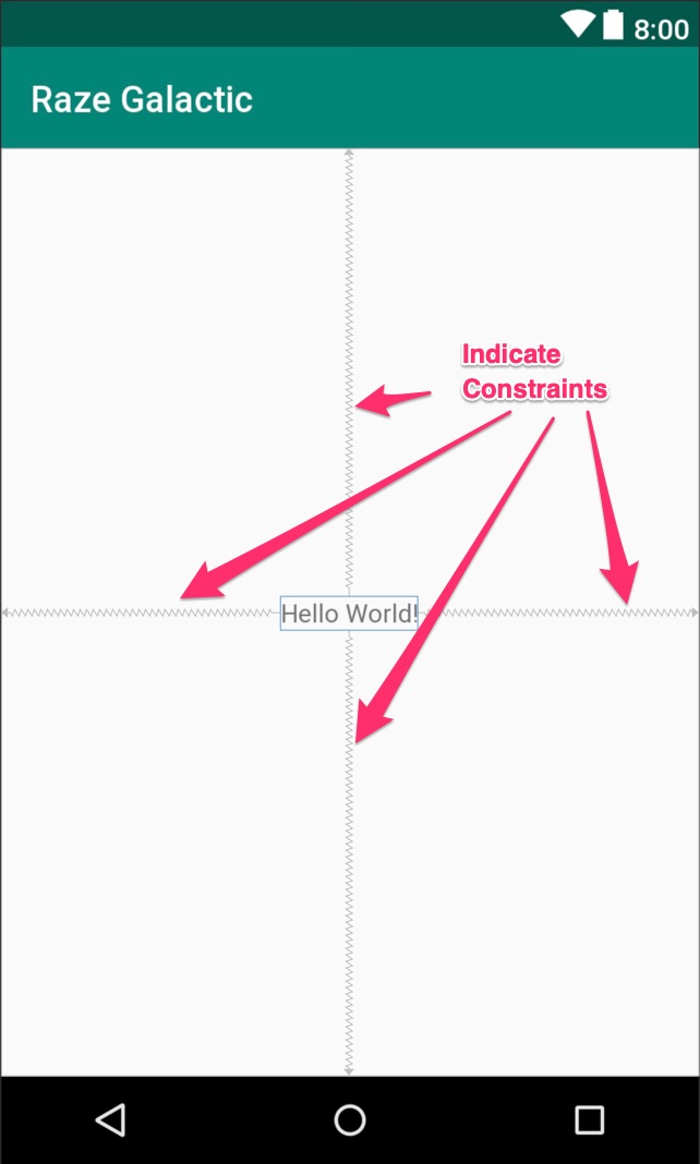
If the lines don’t appear, click on the TextView
and they will. If you have checked the Show Constraints view option, you’ll see all constraints without hovering with the mouse cursor or selecting any views.
Adding an Image to Your App
For the next step, you’ll need the rocket image you saw in the screenshot of the app at the beginning of the tutorial. Use the Download Materials button at the start or end of the tutorial to download materials for this tutorial. You can find track_icon.png in the RazeGalactic-starter folder.
Take the track_icon.png and add it to the drawable folder of the project. You can select the file in your file system by copying with command-C on Mac or control-C on Windows, then right-clicking on the drawable folder in your Android project and pasting the image with command-V on Mac or contol-V on Windows.
You can drag and drop UI elements from Palette into the design screen. If you don’t see Palette, click on the vertical Palette tab icon.
Delete the “Hello World!” TextView
then drag the following UI elements into the view from the Palette:
- One
ImageView
. Pick the rocket image when prompted to select an image.
- Three
Button
s. - Three
TextView
s.
Change the text of the UI elements and drag them around the screen to arrange them to look like the final layout preview at the beginning of this tutorial. Don’t worry too much about the precision of the views’ dimensions, spacing or alignment.
Next, you’ll need to add android:textAppearance="@style/TextAppearance.AppCompat.Headline"
to Raze Galactic TextView
to get the proper styling.
Notice the little alignment lines that appear to assist you as you drag the views around the screen. Those lines make it easy to line things up with one another.
Testing the View Placement
Now, build and run your app.
Oh no! The views aren’t appearing in the positions that you assigned to them in the design view! Everything is bunched up in the upper-left corner of the screen. What happened?
Well, Android doesn’t have enough information to place the UI elements because the views you added don’t have any defined constraints. So you’re going to need to fix that.
Go back to Android Studio and notice that there is now a series of errors for each of the new views in the Component Tree. To see the full text of the error, click the red exclamation mark in the Component Tree.
The error reads:
Switch back to code view to examine the source code of the layout XML. Notice that the source code of any view has some attributes with the tools
prefix, such as these:
<ImageView
android:id="@+id/imageView"
android:layout_width="46dp"
android:layout_height="46dp"
app:srcCompat="@drawable/track_icon"
tools:layout_editor_absoluteX="16dp"
tools:layout_editor_absoluteY="16dp" />
The layout editor allows you to place widgets anywhere on the canvas, and it records the current position with designtime attributes using the tools
prefix. These attributes are not applied to the actual runtime properties of the component. Keep this in mind moving forward.
Getting to Know the Layout Editor Toolbar
Switch back to the design view of the layout and you’ll see a bunch of small controls above the layout preview. If you hover over each control briefly with your mouse, you can read a brief description of what that control does.
Autoconnect
Click on the magnet icon in the tool bar to turn on Autoconnect. Drag any of the views to the area near the corners of the parent view. As you do so, Android Studio will automatically create new constraints for you.
Note that this only works for creating constraints between a UI element and its parent view, not among UI elements, so Autoconnect has very limited usefulness. Most of the time, you’ll want to make sure you have turned Autoconnect off.
Infer Constraints
Next, click the Infer Constraints button. Android Studio will now add all the constraints that were missing from your layout.
Build and run your app again. Now the components are not all bunched in the corner. They appear where you’ve placed them.
This is the easiest way to add constraints, but it can also be the worst. What Android Studio thinks you meant to do with the layout is often nothing like what you actually meant to do.
The view placement works correctly in this particular screen size, but it might not look like you want it to in a different screen size or screen orientation.
Clear All Constraints
If the constraints are messed up, you can clear all constraints and restart from scratch. To continue, clear your current constraints with the Clear All Constraints button.
Adding and Removing Individual Constraints
Android gives you several options to constrain UI elements to different parts of the screen, giving you flexibility with how you design your layout.
In this part of the tutorial, you’ll learn how to constrain objects to their container, delete individual constraints, and constrain objects to one another for a dynamic layout.
Constraining Objects to Their Container
Note that when you click on the ImageView
, it becomes highlighted and little circles appear on the top, bottom, left and right sides of the view. These circles are your constraint anchors.
When you mouse over one of the constraint anchors, it will blink a green color. Android Studio gives you a hint that this is for creating constraint connections.
Click on the circle on the left-hand side of your element and drag it to the left. As you drag, a line with an arrow will appear, creating a constraint between the left side of the UI element and the element you want to connect it to.
Drag the circle to the left side of the view, constraining the ImageView
to the left side of the parent view. Repeat this for the circle on the top of the ImageView to constrain it to the top of the view. You have now constrained the ImageView
to the upper-left corner of the view.
Drag the image down a little, and Android Studio will create a margin at the top. Set the margin at the top to 30dp either by editing the XML code in the code view or by editing it in the Attributes inspector in the design view.
Next, select the Raze Galactic TextView
. Drag the left constraint anchor to the left side of the parent view and the right constraint anchor to the right side of the parent view. By constraining this UI element to both the right and left sides, Android understands that you want to center it horizontally.
Deleting Individual Constraints
Next, bring your mouse cursor over one of the constraint anchors where you have already set a constraint. The circle representing the arrow should now flash red, and the constraint is also highlighted in red.
Clicking the anchor would now delete the constraint. Don’t click, and leave the anchor where it is, but remember that option if you need to delete a constraint in the future.
Now you know how to constrain a UI element to the borders of its parent container. It’s time to learn how to constrain UI elements to each other, as well.
Constraining Objects to One Another
In this step of the tutorial, you’ll ensure that the Raze Galactic TextView
is always aligned with the rocket image.
To do this, you’ll constrain the top anchor of the Raze Galactic TextView
to the top anchor of the ImageView
, and the bottom anchor of the TextView
to the bottom anchor of the ImageView
. This will align the two views vertically.
Now, if you click and drag the rocket up and down, you will see that the Raze Galactic TextView
moves up and down with it.
Later, you’ll see how to create alignments like this using the align menu. However, that method doesn’t always work perfectly, so it’s a good to know how to do it manually as well.
Switch to the code view in Android Studio and examine the code of the views where you just added constraints:
<ImageView
android:id="@+id/imageView2"
android:layout_width="46dp"
android:layout_height="46dp"
android:layout_marginStart="16dp"
android:layout_marginTop="30dp"
app:layout_constraintStart_toStartOf="parent"
app:layout_constraintTop_toTopOf="parent"
app:srcCompat="@drawable/track_icon"/>
<TextView
android:id="@+id/textView2"
android:layout_width="wrap_content"
android:layout_height="wrap_content"
android:layout_marginEnd="8dp"
android:layout_marginStart="8dp"
android:text="Raze Galactic"
android:textAppearance="@style/TextAppearance.AppCompat.Headline"
app:layout_constraintBottom_toBottomOf="@+id/imageView2"
app:layout_constraintEnd_toEndOf="parent"
app:layout_constraintStart_toStartOf="parent"
app:layout_constraintTop_toTopOf="@+id/imageView2"/>
Now that you’ve added some constraints, the attributes with the tools
prefix have disappeared because Android Studio no longer needs separate designtime-only layout instructions for the TextView
.
Attributes for each of the constraints you’ve added now appear, such as app:layout_constraintTop_toTopOf="parent"
.
You can now see any margin that Android Studio inferred on your behalf, whether you wanted it to or not. These margins may look like android:layout_marginStart="16dp"
.
Go ahead and delete any margin attributes from the Raze Galactic TextView
and switch back to the design view. The Raze Galactic TextView
should now appear aligned with the rocket image.
No errors appear for these two views anymore, because Android Studio now has the minimal amount of information needed to place those two UI elements.
contentDescription
. You can ignore these for now.You should now align the Login button with the Sign Up button, just as you aligned the Raze Galactic TextView
with the rocket image. To do this, you’ll set three constraints:
- The top anchor of the Login button to the top of the Sign Up button.
- The bottom anchor of the Login button to the bottom of the Sign Up button.
- The left anchor of the Login button to the right of the Sign Up button, setting a start margin of 30dp to put some space between them.
Applying Alignment Constraints
Select the Raze Galactic TextView
and click on the right anchor and left anchor to delete those constraints. Then, while the TextView
is still selected, click on the Align tool in the toolbar and choose Horizontally in Parent.
This automatically centers the Raze Galactic TextView
in the parent container. This is the same effect that you achieved earlier when you manually added the constraints.
In fact, if you switch to Code view and inspect Raze Galactic TextView
closely, you’ll notice Android Studio has added the following constraint attributes:
app:layout_constraintEnd_toEndOf="parent"
app:layout_constraintHorizontal_bias="0.5"
app:layout_constraintStart_toStartOf="parent"
What’s this layout_constraintHorizontal_bias
that Android Studio automatically added, you may ask?
Constraint Bias
When a view is constrained on both sides horizontally or vertically, either to parent or other views, by default it has 0.5 or 50% constraint bias. In other words, the view stays in the center between the two edges to which it’s constrained.
Constraint bias ranges from 0.0 (0%) to 1.0 (100%). Horizontal constraint bias grows from left to right, while vertical constraint bias grows from top to bottom. Constraint bias is useful for positioning a view dynamically for different screen sizes.
To easily see how constraint bias works, switch back to design view. While Raze Galactic TextView
is selected, look at the view inspector in the Attributes inspector:
The vertical slider on the left side of view inspector controls vertical constraint bias, and the one on the bottom controls horizontal constraint bias. Drag each slider to see how constraint bias works:
Before you move on, reset the bias to 50% for both horizontal and vertical constraints.
Align the Left Edge and Distribute Vertically
Next, simultaneously select all the TextView
s, the Google Sign-In button and the Sign-Up button. You can shift-click each UI element to select them all. Then, from the toolbar, click on Align and select Left Edges.
Here is the layout after you apply Left Edges:
Have you noticed a problem here? The horizontal constraints of Raze Galactic TextView
have disappeared!
Left Edges aligns the views to the left-most view among those selected. What it actually does is to create left constraint dependency from one view to another in descending order. The bottommost view acts as an anchor.
Therefore, for the Left Edges command to work, it must remove the existing horizontal constraints of the rest of the selected views.
To reverse the constraint dependency order, apply the Left Edges command again. You can see that the constraint arrow is now pointing upward.
Now, with the same UI elements selected as in the previous step, click on the Pack menu and choose Distribute Vertically.
After distributing vertically, your screen will look like this:
Again, you may have noticed a similar issue as above: The constraint connecting the bottom of the rocket icon and Raze Galactic TextView
has disappeared.
The constraint dependency is in descending order, just as it was after the first Left Edges command. Unfortunately, there is no easy way to fix this, so you have to create vertically-distributed constraints manually.
The tutorial will cover how to do this in the next section, so go ahead and undo the Distribute Vertically command.
Note: The Align and Pack commands might not work as you expect. They might remove existing constraints and some constrained views might not be moved. Be sure to check the constraints of the affected views before and after applying those commands.
Using Default Margins
To create vertically-distributed constraints, you simply connect constraints that have the same margins. A trick to do this quickly is to use the Default Margin tool.
Now, click the Default Margin button and set the value 60dp. Start connecting constraints from the top Google Sign-In button to the bottom of the Raze Galactic TextView
. You’ll notice that the Google Sign-In button shifts automatically, leaving a 60dp margin between it and the Raze Galactic TextView
. Magic :]
Create the rest of the vertical constraints as shown in the GIF above. Finally, constrain the left side of Raze Galactic TextView
to the right side of the rocket icon with a 30dp margin.
Check Component Tree to see if there are any remaining errors. If not, congratulations!
Build and run your app. Everything should now appear with the proper layout in the emulator.
Where to Go From Here?
You can download the final version of this project using the Download Materials button at the top or bottom of this tutorial.
Building UI with ConstraintLayout
in Layout Editor can be frustrating because some tools are not smart enough. However, if you know the right tools, you can save lots of time.
There are other Layout Editor tools which are not mentioned in this tutorial, and you can play around with them to understand how they work. Check out Google’s documentation on ConstraintLayout
to find out more.
For more complex ConstraintLayout
examples see our follow up article ConstraintLayout Tutorial for Android: Complex Layouts.
To see more examples of ConstraintLayout
, check out our book Android Apprentice, which uses ConstraintLayout
for all of its layouts.
You’ve now mastered the basic concepts of ConstraintLayout
. To learn more advanced features and to get tips on dealing with complex layouts, stay tuned for our upcoming tutorial on building complex layouts with ConstraintLayout
, where you will build a much more complex constraint view for the Raze Galactic travel app, and then animate it!
If you have any questions or comments, please join the forum discussion below!
All videos. All books.
One low price.
A Kodeco subscription is the best way to learn and master mobile development — plans start at just $19.99/month! Learn iOS, Swift, Android, Kotlin, Flutter and Dart development and unlock our massive catalog of 50+ books and 4,000+ videos.
Learn more