OS X Stack Views with NSStackView
In this tutorial you will learn how to use stack views to design your OS X app’s layout by leveraging the power of NSStackView. By Marin Todorov.
We’ve all been there: that moment when you start laying down the UI of your app window and it all looks great.
But then you have to make it practical.
Once there are more than a few Cocoa controls laying around, you start planning how to put Auto Layout to work so that all your views reposition and resize as desired when the user resizes the app window.
The fun starts when you add constraints in Interface Builder — things can get complex very quickly. Often, you’ll end up with constraints that contradict each other and you need to retrace your steps to find the offending constraint and adjust it to play nicely with the rest.
Stack views were introduced with the release of OS X Mavericks, and ever since, they’ve spread to watchOS (well, a similar form at least) and iOS. The APIs for each platform differ to reflect the needs of each UI paradigm, but the core concept of leveraging the power of Auto Layout without the need to use constraints remains the same.
Note: This NSStackView tutorial assumes basic familiarity with Auto Layout. If you’re new to Auto Layout go check out the Auto Layout introduction tutorial, because iOS concepts are very similar to those used for OS X.
Note: This NSStackView tutorial assumes basic familiarity with Auto Layout. If you’re new to Auto Layout go check out the Auto Layout introduction tutorial, because iOS concepts are very similar to those used for OS X.
What is a Stack View?
A stack view allows you to arrange a number of views in a stack; it looks much like a table with a single column or a single row, depending whether you set a horizontal or vertical orientation for your stack:

At first glance, it might not look like much, but you’ll be surprised how much power you gain from a simple stack. You’ll also enjoy greater control of spacing between the arranged views, their alignment, and so on.

And finally, you can nest stacks. That’s where the real fun starts.

When to Use a Stack View in Your OS X App?
A stack view is not a silver bullet to all of your UI problems, but it does make many day-to-day tasks much easier. For instance, sometimes you can design the complete layout of a window without creating a single constraint, and that’s a pretty big win!
Stack views are pretty handy in a number of cases, for instance when:
- You plan on using split view but don’t need the user to be able to resize its subviews
- You have a view on top or the sides of the window that shows and hides often, e.g. a notification bar
- You need to align groups of controls in any table-like layout
- You need a custom toolbar somewhere inside a view
- And so many more…
To say there are lot of applications for a stack view would be an understatement. Once you finish this tutorial and try some stack view magic you’ll be able to spot opportunities where they can help your layout within your apps.
The Tutorial Project
In this tutorial, you’re going to work on an OS X app and implement a complex UI based on stack views.
One of the key points you’ll learn is how to customize a stack view layout beyond the built-in properties. Finally, you’ll build UI animations based on stacks.
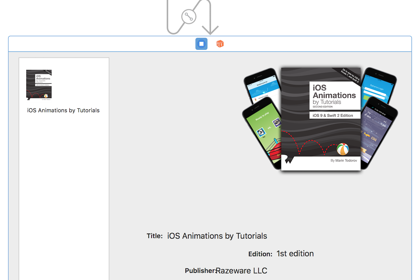
By the time you’re finished, the app will be a fully functional raywenderlich.com book store and it will look like this:

Getting Started
In this NSStackView tutorial, you’ll work on an app called Book Shop. It’s a complete working app that allows people to browse books on the raywenderlich.com store and purchase them through the actual store that opens in their browser.
Start by downloading the starter project for this tutorial: BookShop-starter.
Open BookShop.xcodeproj and select Main.storyboard to have a look at the current state of the app’s interface. You’ll see that someone had a hard time designing the UI and pretty much left you a big mess:
No fear — thanks to stack views, finishing the app layout is as easy as can be!
Your First Stack View
Creating stack views in Interface Builder is really easy. In fact, you better pay close attention because you might blink and not notice you created them. :]
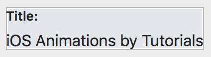
For your first steps with stack views, you’re going to focus on the part of the app that shows the text data about the selected book: the title, the current edition and the publisher:

Your first task is to align the labels Title and iOS Animations by Tutorials in a horizontal stack. This will keep those two nicely aligned.
Select the Title label, then while pressing the Command key on your keyboard, select iOS Animations by Tutorials.

Now find the stack button at the bottom of the Interface Builder panel and click it once:

Once you click the Stack button, look back at the labels: they now look like one entity, and that’s your first stack view!

But what happened? You had two views selected.
When you clicked on the stack button, Interface Builder checked the relative position between the selected views and assumed you wanted to create a horizontal stack! Check the Attributes Inspector that shows the stack properties:

But what if Interface Builder guessed wrong? How difficult is to have a vertical stack instead?
It’s as simple as choosing Vertical from the orientation drop-down and checking the result:
That was easy! Now go back to Horizontal for orientation and let’s move on!
Since you’re almost a pro by now, stack up the rest of the labels thusly:
- Select Edition and 1st edition and click the stack button to stack them
- Select Publisher and Razeware LLC and click the stack button to stack those too
Your layout should now look like this:
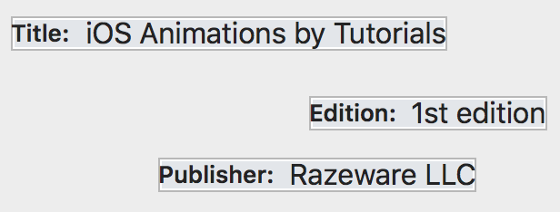
You now have all the labels aligned horizontally in pairs. Notice how you have the same spacing between sets. Each stack view applies the default spacing of 8 points between its views.
Good going so far! Things are looking organized. :]