Self-sizing Table View Cells

In this tutorial, you’ll learn how to enable self-sizing table view cells, as well as how to make them resize on-demand and support Dynamic Type. By Kevin Colligan.

Leave a rating/review
Download materials
Save for later
Share
Update note: Kevin Colligan updated this tutorial for Xcode 10, iOS 12 and Swift 4.2. Joshua Greene wrote the original.

If you’ve ever created custom table view cells before, chances are good that you have spent a lot of time sizing table view cells in code. You may even be familiar with having to calculate, manually, the height of every label, image view, text field — and everything else within the cell.

Frankly, this approach is mind-boggling and error prone. In this self-sizing table view cells tutorial, you’ll learn how to create and size table view cells dynamically to fit their contents. You might be thinking: “That’s going to take a lot of work!” Nope! :]

This tutorial assumes you have a basic familiarity with Auto Layout and UITableView.

Getting Started

Back in the days of iOS 6, Apple introduced a wonderful new technology: Auto Layout. Developers rejoiced; parties commenced in the streets; bands wrote songs to celebrate its greatness…

OK, so that might be a stretch, but it was a big deal.

While it inspired hope for developers, Auto Layout was still cumbersome. Handling Auto Layout manually was, and still is, a great example of the verbosity in iOS development. Interface Builder was also initially quite inefficient when setting up constraints.

Flash forward to now. With all the improvements to Interface Builder, it’s easy to use Auto Layout to create self-sizing table view cells!

A few ins-and-outs aside, all you really have to do is:

  1. Use Auto Layout for the UI elements inside the table view cells.
  2. Set the table view rowHeight to UITableViewAutomaticDimension.
  3. Set the estimatedRowHeight or implement the height estimation delegate method.

But you don’t want to delve into theory right now, do you? You’re ready to get down to coding — so get to business with the project.

Tutorial App Overview

Imagine that you have a movie-crazy client who wants an app to show off a number of favorite film directors and some of their most prominent work. Not just any directors, actually, just their favorite auteurs.

“Auteurs?” you ask, “That sounds French.”

Oui, it is. The auteur theory of film making arose in France in the 1940s and it basically means that the director is the driving creative force behind a film. Not every director is an auteur — only the ones who stamp each film with their individual styles. Think Tarantino or Scorsese. And not everyone agrees with this theory — don’t get your screenwriter friend started. But, the client is always right, so you’re ready to start rolling.

There’s one problem: “We started making the app, but we’re stumped at how to display the content in a table view,” your client admits. “Our table view cells have to resize (gulp!) dynamically! Can you make it work?”

You suddenly feel the urge to don a spiffy beret and start shouting orders!

Auteur

But you don’t need gimmicks to be your client’s iOS auteur — your programming skills will suffice!

First, download the “client’s code” using the Download Materials button at the top or bottom of this tutorial. Expand the zip file and open the Auteur-starter project. (Spoiler alert: You can also open the final Auteur project to see what this app will look like once you’ve finished.)

In the Auteur-starter project, open Main.storyboard in the Views group under the Auteurs project. You’ll see three scenes:

Main.storyboard

From left to right, they are:

  • A top-level navigation controller.
  • AuteurListViewController shows a list of auteurs.
  • AuteurDetailViewController displays the auteur’s films and information about each film.

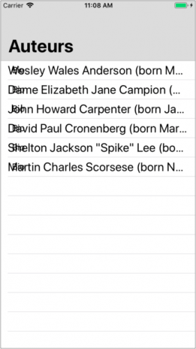
Build and run. You’ll see the AuteurListViewController displaying a list of auteurs. Select the first auteur, Wes Anderson. The app will segue to the AuteurDetailViewController to display a list of the selected auteur’s films:

View Controllers

Not only is the app missing images of each auteur and each film, the information you are trying to display is also cut off! Each piece of information and image will be a different size, so you can’t just increase the table view cell height and call it a wrap. Your cell heights will need to be dynamic, based on the content of each cell.

You’ll start by implementing the dynamic cell heights in AuteurListViewController.

Creating Self-Sizing Table View Cells

To get dynamic cell heights working properly, you need to create a custom table view cell and set it up with the right Auto Layout constraints.

In the project navigator, select the Views group and press Command-N to create a new file in this group. Create a new Cocoa Touch Class, called AuteurTableViewCell, and make it a subclass of UITableViewCell. Make sure Also create XIB file is unchecked and that the language is set to Swift.

AuteurTableViewCell

First, open AuteurTableViewCell.swift. Then, delete the two automatically generated methods and add the following property:

@IBOutlet weak var bioLabel: UILabel!

Next, open Main.storyboard and select the cell in the table view of the Auteurs scene. In Identity inspector, change Class to AuteurTableViewCell:

AuteurTableViewCell

Drag and drop a new UILabel onto the cell, and set the text to Bio. Set the new label’s Lines property (the number of lines the label can have at most) to 0 in the Attributes inspector. It should look like this:

AuteurTableViewCell Identity Inspector

Setting the number of lines is very important for dynamically sized cells. A label with its number of lines set to 0 will grow based on how much text it is showing. A label with number of lines set to any other number will truncate the text once it’s out of available lines.

Connect the bioLabel outlet of AuteurTableViewCell to the label on the cell. One quick way to do this is to right-click the Cell in the Document Outline, and click-drag from the empty circle to the right of bioLabel under the Outlets list in the pop-up menu to your label that you laid out:

Connect the bioLabel outlet

The trick to get Auto Layout working on a UITableViewCell is to ensure that you have constraints to pin each subview on all sides — that is, each subview should have leading, top, trailing and bottom constraints. Then, the intrinsic height of the subviews will be used to dictate the height of each cell. You’ll do this now.

Note: If you’re not familiar with Auto Layout, or you would like a refresher to understand how to set up Auto Layout constraints, take a look at this tutorial.

Select the bio label and press the Pin button at the bottom of your storyboard. In this menu, select the four dotted lines towards the top of the menu. Next, change the leading and trailing values to 8 and click Add Constraints. It will look like this:

Add Constraints

This ensures that, no matter how big or small the cell may be, the bio label is always:

  • 0 points from the top and bottom margins.
  • 8 points from the leading and trailing margins.
Review: Does this satisfy the previous Auto Layout criteria?
  1. Does each subview have constraints that pin all of their sides? Yes
  2. Are there constraints going from the top to the bottom of the contentView? Yes

The bio label is connected to the top and bottom margins by 0 points, so Auto Layout can now determine the height of the cell!

Awesome, your AuteurTableViewCell is set up! If you build and run the app now, you’ll see that…

One for the blooper reel

…whoa, that’s not right! Cut!

There’s a bit of code you need to write before the cells can become dynamic.

Configuring the Table View

First, you need to configure the table view to use properly your custom cell.

Open AuteurListViewController.swift (in the ViewControllers group) and replace tableView(_:cellForRowAt:) with the following:

func tableView(
  _ tableView: UITableView,
  cellForRowAt indexPath: IndexPath
) -> UITableViewCell {
  let cell = tableView.dequeueReusableCell(
    withIdentifier: "Cell",
    for: indexPath) as! AuteurTableViewCell
  let auteur = auteurs[indexPath.row]
  cell.bioLabel.text = auteur.bio
  cell.bioLabel.textColor = UIColor(red:0.75, green:0.75, blue:0.75, alpha:1.0)
  return cell
}

The code above is pretty straightforward: You dequeue a cell, set its information with a text color and return the cell.

In AuteurListViewController.swift, add these two lines of code at the bottom of viewDidLoad():

tableView.rowHeight = UITableView.automaticDimension
tableView.estimatedRowHeight = 600

When you set the row height as UITableViewAutomaticDimension, the table view is told to use the Auto Layout constraints and the contents of its cells to determine each cell’s height.

In order for the table view to do this, you must also provide an estimatedRowHeight. In this case, 600 is just an arbitrary value that works well in this particular instance. For your own projects, you should pick a value that better conforms to the type of data that you’ll display.

Build and run, and you should now see all of each auteur’s bio.

AuteurListViewController

That looks better! But do you know what would make this app even more dramatic? A moody dark background.

Open Main.storyboard, select the cell in the table view of the Auteur scene. In the Attributes inspector find the Background color drop-down menu:

Background color

Click Background and select Custom. In the window that pops up, select the RGB Sliders tab and, in the Hex Color # field, enter 161616 — this will give you a nice black-ish background (pure black is not cool enough for auteurs :]).

Blackish

Press Return; build and run your app. It should look like this:

AuteurListViewController

Such drama!

Adding Images

It’s nice that you can now read the entire bio of each artist, but there is still more data to show. Each artist has an image and a name. This app uses an external API to retrieve the information, so there’s a source label as well. Using these additional pieces of data will make the app look much better.

You will need to add an image view to AuteurTableViewCell, and another label for the auteur’s name. You should also add a source label to properly credit the photo. Open AuteurTableViewCell.swift and add the following properties:

@IBOutlet weak var nameLabel: UILabel!
@IBOutlet weak var source: UILabel!
@IBOutlet weak var auteurImageView: UIImageView!
Note: The image view’s variable name is auteurImageView rather than imageView because there is already an imageView property on UITableViewCell.

Now, adjust the bio label. It’s tough to see in the Main.storyboard with the dark cell background. Open Main.storyboard, select the bio label and choose a lighter color for the text.

Lighten up your label

Note: It really doesn’t matter what you set the bioLabel color to in Main.storyboard because this code from AuteurListViewController.swift will override it at runtime:
cell.bioLabel.textColor = UIColor(red:0.75, green:0.75, 
                                  blue:0.75, alpha:1.0)

Now, remove the constraints from bio label so that you can add more elements to the cell and shift things around. In the Document Outline, find the Constraints under Bio Label. Select each of the four constraints (hold the Shift key to select them all) and press Delete. Ignore any Auto Layout warnings for now.

Delete Bio Label constraints

Before you add more elements, you’ll need some elbow room. Select the Cell from the Document Outline. Then, in the Size inspector, change the Row Height to 450.

Increase the cell row height

Now, you’ll fill up that space:

  • Drag an ImageView into the cell.
  • Drag a Label into the cell. Then, set its text to Name and its color to white.
  • Drag another Label into the cell. Then, set its text to Source, its Font to System 13.0 and its color to white.

Move the elements in the following order, from top to bottom (you’ll add constraints in a soon):

  1. ImageView
  2. Name
  3. Bio
  4. Source

Next, connect the outlets for the new image view and labels, using the same technique you used for the bio label:

Connect the remaining outlets

Now, it’s time to setup more constraints. Starting with the source label moving up, use the Pin menu to add these vertical constraints:

  • Pin the bottom edge of the source label to 16 points from the superview.
  • Pin the top edge of the source label to 8 points from the bottom of the bio label.
  • Pin the top edge of the bio label to 8 points from the bottom of the name label.
  • Pin the top edge of the name label 8 points from the bottom of the image view.
  • Pin the top edge of the image view 0 points from the top of the content view.

Now, add horizontal constraints. First, use the Pin menu to:

  • Pin the leading edge of the name label to 8 points from the superview.
  • Pin the trailing edge of the name label to 8 points from the superview.
  • Shift-Click the name label, bio label and source label and choose Equal Width from the Pin menu.
  • Set the image view to have a height and width of 300 points.

Then, use the Align menu to center all items:

  • Shift-click the image view, name label, bio label and source label and choose Horizontally in Container from the Align menu

Finally (well, almost), you need to set the hugging vertical priorities for the name label and bio label. Select the nameLabel in the Size inspector and scroll down until you see Content Hugging Priority. Horizontal and Vertical will both be set to 251 by default. Change the name label’s Vertical priority to 253.

Content Hugging Priority

Now, select the bio label and set its Vertical priority to 252, and you’re done with the storyboard for now.

Note: Wait, what’s with all the hugging? Is this a romance picture?

Not exactly. Setting a higher priority on content hugging means that the view will resist growing larger than its intrinsic size. You told the storyboard to make your cell with 450 points tall, which is larger than the intrinsic size of your views. Setting a vertical content hugging priority tells Xcode which view to expand if it needs to fill the space.

Open AuteurListViewController.swift and add the following two lines of code to tableView(_:cellForRowAt:), after you set the bioLabel‘s text:

cell.auteurImageView.image = UIImage(named: auteur.image)
cell.nameLabel.text = auteur.name
cell.source.text = auteur.source

Then, add these lines after you set the textColor:

cell.nameLabel.textColor = .white
cell.bioLabel.textColor = UIColor(red:0.75, green:0.75, blue:0.75, alpha:1.0)
cell.source.textColor = UIColor(red:0.74, green:0.74, blue:0.74, alpha:1.0)
cell.source.font = UIFont.italicSystemFont(ofSize: cell.source.font.pointSize)
cell.nameLabel.textAlignment = .center
cell.selectionStyle = .none

Build and run your app.

Looking good!

Looks pretty good. But auteurs aren’t square, so let’s tweak tableView(_:cellForRowAt:) to add the following code just before return cell:

cell.auteurImageView.layer.cornerRadius = cell.auteurImageView.frame.size.width / 2

Then, head back to Main.storyboard and select the image view. Then, select the Clip to Bounds option in the Attributes inspector:

Clip to Bounds

Build and run your app once more to see your auteur images in a circular frame fit for the MGM lion:

Circles are better

You’re just about done with constraints on the AuteurListViewController, but eagle-eyed readers may have noticed Xcode throwing up a warning.

You have issues

If you click on the warning, you’ll get more information. It turns out that the layout works fine in English, but you may have problems if you localize your app to use a language that reads from right to left.

Right-to-left

Xcode offers to fix the problem. But you can do it yourself by adjusting one of the name label constraints. Head back to Main.storyboard and select the name label. In the Size Inspector, find the Trailing Space constraint and click Edit.

Trailing space

Change the operator from equal to greater-than or equal.

Greater or Equal

And the Xcode warning is gone!

Creating Dynamic Height

If you recall from the beginning, selecting an auteur presents a view controller that shows the selected auteur’s films. The cells in this table view will need to have dynamic height as well.

The first step, just like before, is to create another subclass of UITableViewCell.

In the project navigator select the Views group and press Command-N to create a new file in this group. Create a new Cocoa Touch Class called FilmTableViewCell and make it a subclass of UITableViewCell.

Open FilmTableViewCell.swift and, like before, delete the two automatically generated methods in FilmTableViewCell and then add these properties:

@IBOutlet weak var filmImageView: UIImageView!
@IBOutlet weak var filmTitleLabel: UILabel!
@IBOutlet weak var moreInfoTextView: UITextView!

Open Main.storyboard and select the cell in the table view in the Auteur Detail View Controller scene. Set the Custom Class of the cell to FilmTableViewCell, and then change the row height to 300 to give yourself plenty of room to work with.

Now, drag out an Image View, a Label and a Text View. Place them as pictured below (the text view is on the very bottom):

Auteur Detail View Controller

Change the text of the text view to Tap For Details > and the label to Name. Change the mode of the image view to Aspect Fit. Select the text view, in the Attribute inspector. Then, change its alignment to Centered, set the text color to Red and disable scrolling:

No Scroll

Disabling scrolling is of similar importance to setting a label to 0 lines. With scrolling disabled, the text view knows to grow its size to fit all of its content, since the user won’t be able to scroll through the text.

A bit further down past where you disabled scrolling, remove the check from User Interaction Enabled. This will allow touches to pass through the text view and trigger a selection of the cell itself. Then, set the background color to Clear Color.

More tweaks

Now, select the cell in Auteur Detail View Controller scene and set the background to the Hex Color #161616, just as you did on the Auteur scene. Select the name label and set the text color to white, so you can see it on the Main.storyboard.

Connect the three elements with their corresponding outlets, as you did with the first cell.

Now, you’ll add constraints. Starting with the text view and moving up:

  • Pin the bottom edge of the text view 0 points from the bottom margin of the content view.
  • Pin the leading and trailing edges of the text view 8 points from the leading and trailing margins of the content view.
  • Pin the top edge of the text view 8 points from the bottom of the label.
  • Pin the top edge of the label 8 points from the bottom of the image view.
  • Center the name label by choosing Horizontally in Container in the Align menu.
  • Select both the name label and image view (using Shift-click) and choose Equal Widths from the Pin menu.
  • Pin the top edge of the image view 0 points from the top margin of the content view.
  • Pin the leading and trailing edges of the image view 8 points from the leading and trailing margins of the content view

You’re done with the storyboard for now. Just as you had to do with the previous view controller, dynamic cell heights take a bit of code as well.

Open AuteurDetailViewController.swift and replace tableView(_:cellForRowAt:) with the following:

func tableView(_ tableView: UITableView, cellForRowAt indexPath: IndexPath) 
    -> UITableViewCell {
  let cell = tableView
    .dequeueReusableCell(withIdentifier: "Cell", for: indexPath) as! FilmTableViewCell
  let film = selectedAuteur.films[indexPath.row]
  cell.filmTitleLabel.text = film.title
  cell.filmImageView.image = UIImage(named: film.poster)
  cell.filmTitleLabel.textColor = .white
  cell.filmTitleLabel.textAlignment = .center
  cell.moreInfoTextView.textColor = .red
  cell.selectionStyle = .none
  
  return cell
}

This should look very familiar by now. You are dequeuing and casting your cell, getting a reference of the model struct you are going to display and then configuring your cell before you return it.

Now, in viewDidLoad() of the same class, add the following code to the end of the method:

tableView.rowHeight = UITableView.automaticDimension
tableView.estimatedRowHeight = 300

Build and run your app. Click through one of the auteurs to see their films.

Auteur Detail View Controller

Not bad, but take it to the next level by adding expanding cells to reveal more info about each work. Your client is going to love this!

Expanding Cells

Since your cell heights are driven by Auto Layout constraints and the content of each interface element, expanding the cell should be as simple as adding more text to the text view when the user taps that cell.

Open AuteurDetailViewController.swift and add the following extension:

extension AuteurDetailViewController: UITableViewDelegate {
  func tableView(_ tableView: UITableView, didSelectRowAt indexPath: IndexPath) {
  // 1
  guard let cell = tableView.cellForRow(at: indexPath) as? FilmTableViewCell else {
    return
  }
  
  var film = selectedAuteur.films[indexPath.row]

  // 2
  film.isExpanded = !film.isExpanded
  selectedAuteur.films[indexPath.row] = film

  // 3
  cell.moreInfoTextView.text = film.isExpanded ? film.plot : moreInfoText
  cell.moreInfoTextView.textAlignment = film.isExpanded ? .left : .center
  cell.moreInfoTextView.textColor = film.isExpanded ? 
    UIColor(red:0.75, green:0.75, blue:0.75, alpha:1.0) : 
    .red

  // 4
  tableView.beginUpdates()
  tableView.endUpdates()

  // 5
  tableView.scrollToRow(at: indexPath, at: .top, animated: true)
 }
}

Here’s what’s happening:

  1. You ask the tableView for a reference of the cell at the selected indexPath and then to get the corresponding Film object.
  2. You toggle the isExpanded state of the Film object and add it back into the array, which is necessary since structs are value types.
  3. Next, you alter the text view of the cell, depending on whether the work is expanded. If it is, you set the text view to display the film’s info property. You also change the text alignment to .left and its color to light gray. If it isn’t expanded, you set the text back to “Tap for Details >”, the alignment back to .center and the color back to red.
  4. The table view needs to refresh the cell heights now. Calling beginUpdates() and endUpdates() will force the table view to refresh the heights in an animated fashion.
  5. Finally, you tell the table view to scroll the selected row to the top of the table view in an animated fashion.

Now in tableView(_:cellForRowAt:), add the following three lines at the end, before you return the cell:

cell.moreInfoTextView.text = film.isExpanded ? film.plot : moreInfoText
cell.moreInfoTextView.textAlignment = film.isExpanded ? .left : .center
cell.moreInfoTextView.textColor = film.isExpanded ? 
  UIColor(red:0.75, green:0.75, blue:0.75, alpha:1.0) : 
  .red

This code will cause a cell that is being reused to correctly remember if it was previously in the expanded state.

Build and run the app. When you tap a film cell, you’ll see that it expands to accommodate the full text. But the image animates a bit weirdly.

That won’t be hard to fix! Open Main.storyboard, select the image view in your FilmTableViewCell and open the Size inspector. Change the Content Hugging Priority and Content Compression Resistance Priority to the values pictured below:

Hugs

Setting the Vertical Content Hugging Priority to 252 will help the image view to hug its content and not to get stretched during the animation. Setting the Vertical Compression Resistance Priority to 1000 prevents the image from being compressed if other interface elements grow around it.

Build and run the app. Select an auteur and tap on the films. You should see some very smooth cell expansion, revealing information about each film.

Implementing Dynamic Type

You’ve shown your progress to your client and they are loving it! But they have one final request. They want the app to support the Larger Text Accessibility feature. The app needs to adjust to the customer’s preferred reading size.

Introduced in iOS 7, Dynamic Type makes this task easy. It gives developers the ability to specify different text styles for different blocks of text (like Headline or Body) and have that text adjust automatically when the user changes the preferred size in device Settings.

Head back to Main.storyboard and the Auteurs scene. Select the name label and, in the Attributes inspector, complete the following steps:

  1. Click the “T” icon in Font.
  2. Select Headline from under Text Styles.
  3. Check the Automatically Adjusts Font box
  4. Set the Lines to 0.

Dynamic Text

Do the same with the bio label, but choose Body under Text Styles instead of Headline.

On the Auteur Detail View Controller scene, take the same steps with the name label, setting its Text Style to Headline. Set the text style of the Text View to Body (there is no Lines adjustment since this isn’t a label).

That’s all you need to do to make the app more accessible. Build and run your app.

Click the Home button on your simulator and open the Settings app, then click General ▸ Accessibility ▸ Larger Text and drag the slider to the right to increase the text size to a large setting:

Larger Accessibility Sizes

Then, go back to the Auteurs app’ your text should now appear larger. Thanks to your work on getting the dynamically sized cells, the table view still looks great:

Larger Type

Where to Go From Here?

Congratulations on completing this tutorial on self-sizing table view cells!

You can download the completed version of the project using the Download Materials button at the top or bottom of this tutorial.

Table views are perhaps the most fundamental of structured data views in iOS. As your apps get more complex, you’re likely to use all sorts of custom table view cell layouts. You can delve deeply into Auto Layout in the Mastering Auto Layout video course.

If you have any comments or questions, please respond below!