How to Create a Neumorphic Design With SwiftUI
In this neumorphic design tutorial, you’ll learn how to use SwiftUI’s powerful modifiers to craft beautiful custom elements. By Yono Mittlefehldt.
Sign up/Sign in
With a free Kodeco account you can download source code, track your progress, bookmark, personalise your learner profile and more!
Create accountAlready a member of Kodeco? Sign in
Sign up/Sign in
With a free Kodeco account you can download source code, track your progress, bookmark, personalise your learner profile and more!
Create accountAlready a member of Kodeco? Sign in
Sign up/Sign in
With a free Kodeco account you can download source code, track your progress, bookmark, personalise your learner profile and more!
Create accountAlready a member of Kodeco? Sign in
Contents
How to Create a Neumorphic Design With SwiftUI
35 mins
- Getting Started
- Introducing Linear Gradient
- Customizing Your First Element
- Including the Image Gradient
- Adding Highlight and Shadow
- Changing the Text Gradient
- Rounding the Corners
- Making That Border Pop
- Changing the Border Shape
- Troubleshooting AccessoryView
- Introducing Built-in Modifiers
- Discovering Inverse Masks
- Tackling Tab Bar Buttons
- Designing the Unselected Tab Bar Button
- Adding Unselected Tab Bar Button Effects
- Designing the Select Tab Bar Button
- Incorporating the Button Symbol
- Tidying up the Details
- Crafting the Progress Bar
- Modifying the Second Capsule
- Deepening the Progress Bar
- Navigating the Navigation Bar
- Where to Go From Here?
Don’t deny it. You feel the longing, that absence to make hearts grow fonder. You’re heart’s been fond to near bursting since the release of iOS 7. You miss your dear skeuomorphism.
When you look at your screens today, they look so flat and boring. Then again, when you look at those pre-iOS 7 designs, they’re old and outdated. If only there was a skeuomorphic design language that looked new and fresh.
You’ve come to the right place!
In late 2019, a tweet made the rounds that included designs from Alexandar Plyuto. And they are fabulous:
In this tutorial, you’ll learn how to recreate some of these design elements in SwiftUI. You will discover how to:
- Use linear gradients to give depth to your views.
- Create complex effects by combining simple ones such as shadows.
- Master the art of the inverse mask, an effect that does not exist natively in SwiftUI.
Get ready for a whole lot of design fun!
Getting Started
Smart homes are all the rage these days. Not to be outdone, super villains and mad scientists are now super into smart lairs. Hey, you don’t build your HQ in an active caldera without wiring some mad tech throughout.
Here’s the little-known secret: The app super villains use to control their lairs — called SmartLair — is as flat and boring as the Home app on your iPhone. Maybe more so.
In this exercise, you’ve retrieved a copy of SmartLair’s source code through illicit back channels. You’ve been threatened, erm, hired to snazz it up.
To get started, click the Download Materials button at the top or bottom of this tutorial. Open the begin project and explore its contents.
Remember: This is a big opportunity for you. If the villains like your work, it could lead to more contracts in the future. But if they don’t, well, laser sharks aren’t known to be picky eaters.
Introducing Linear Gradient
Before you begin, you need to familiarize yourself with LinearGradient
. Skeuomorphic design leans heavily on linear gradients. They’re kind of a big deal.
In SwiftUI, you define a linear gradient like this:
LinearGradient(
gradient: Gradient(colors: [.white, .lairLightGray]),
startPoint: UnitPoint(x: 0.2, y: 0.2),
endPoint: .bottomTrailing
)
If used as a view to cover the whole screen, it looks like this:
Here, you define that the gradient will go from white
to lairLightGray
, a Color
you will add to the project later. You can have more than two colors if you want the gradient to pass through several:
startPoint
and endPoint
are coordinates relative to the unit square, which has a coordinate of (0, 0) in the top left and (1, 1) in the bottom right. However, they aren’t required to be within this range. For instance, a negative coordinate value would start the gradient outside of the view.
In the code above, there are also some predefined constants for typical start and end points, such as .leading
, .trailing
, .top
, .bottom
and combinations of those.
Customizing Your First Element
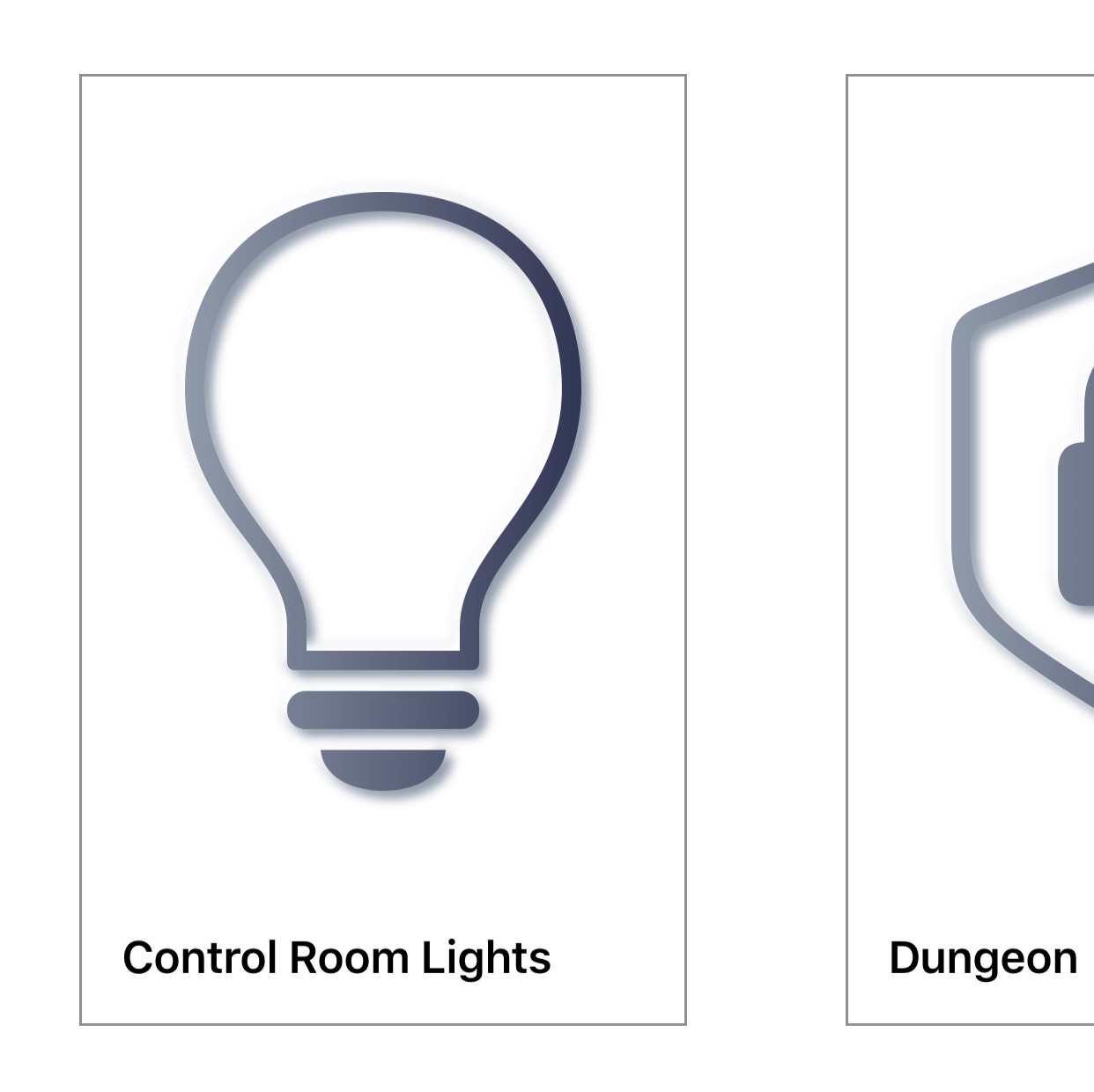
Start by attacking the boring looking AccessoryView
. It represents the large rectangles in the middle of the screen with labels such as Control Room Lights and Dungeon.
Drag the Extensions folder from the downloaded materials to your Xcode project. Place it above the Views group. Make sure Copy items if needed and Create groups are selected, then click Finish.
These three files define some UIColor
constants, the SwiftUI Color
equivalents, and some LinearGradient
definitions. You already saw how to create a LinearGradient
, but skeuomorphic design uses a lot of gradients. It takes too long to go through them one by one, and super villains aren’t the patient type, so you’ll get straight to it.
Including the Image Gradient
In AccessoryView.swift under the definition for body
, find the line that begins with image
in the VStack
. Replace that line with the code below, but don’t remove the modifiers frame
, padding
and font
that are there:
LinearGradient.lairHorizontalDark
.mask(image.resizable().scaledToFit())
You just turned the SFSymbol image into a mask for the gradient. The layer with the gradient will be cut out in the shape of the opaque pixels from the image. Cool! You can build and run to see the changes, or turn on the previewing canvas in Xcode to see changes immediately:
Adding Highlight and Shadow
Add this code after font
:
// 1
.shadow(color: .white, radius: 2, x: -3, y: -3)
// 2
.shadow(color: .lairShadowGray, radius: 2, x: 3, y: 3)
With these two lines, you have:
- Added a white shadow that is offset relative to the top left of the image.
- Added a dark shadow that is offset relative to the bottom right.
This contrast provides the illusion of depth in all directions. You can use this shadow trick to get a raised effect.
The code for the element with all modifiers should now look like this:
LinearGradient.lairHorizontalDark
.mask(image.resizable().scaledToFit())
.frame(width: 150, height: 236)
.padding(40)
.font(.system(size: 150, weight: .thin))
.shadow(color: .white, radius: 2, x: -3, y: -3)
.shadow(color: .lairShadowGray, radius: 2, x: 3, y: 3)
Changing the Text Gradient
The text clearly can’t stay black. Add the following modifier to Text
within the HStack
:
.foregroundColor(.lairDarkGray)
Now, your text is an attractive shade of lair dark gray.
The complete HStack
should look like this now:
HStack {
Text(title)
.foregroundColor(.lairDarkGray)
.bold()
.padding(.leading)
.padding(.bottom)
Spacer()
}
Note that if you put foregroundColor
in a different location among Text
, it still works. You can order some modifiers any which way, but as you’ll see, the order matters for others.
Rounding the Corners
Your next step is to round off the border corners. It’s not as straightforward as it sounds, though.
For example, try something like this:
.border(Color.gray, width: 1)
.cornerRadius(15)
And you see that the corners are cut off.
Swap the two modifiers like so:
.cornerRadius(15)
.border(Color.gray, width: 1)
And you see that the borders maintain sharp corners.
Fortunately, there is a workaround. You can use an overlay to obtain those sweet, sweet curved borders.
Delete border
and, if you added it, cornerRadius
. Replace them with:
.overlay(
RoundedRectangle(cornerRadius: 15)
.stroke(LinearGradient.lairDiagonalDarkBorder, lineWidth: 2)
)
This code lays another view over your view — i.e., an overlay — that draws a rounded rectangle with the desired corner radius.
For structs conforming to Shape
, such as RoundedRectangle
or Path
, use stroke
instead of border
to draw a line around it.
With this change, you also add a gradient to the border by stroking it with LinearGradient.lairDiagonalDarkBorder
instead of Color.gray
. This addition gives the border a bright highlight in the top left of the element and a darker shadow in the bottom right. Simultaneously, you make the border heavier by increasing the width of the border/stroke to “2.”
You may notice the top and bottom borders are thinner than the left and right. That’s because the view has no vertical padding and clips half of the stroke. No worries. You’ll fix this in a bit.
Making That Border Pop
Right now, you want the white sections of the border and the highlights to stand out. Time to change the background color of the element.
After the closing parenthesis for overlay
, add the following lines:
.background(Color.lairBackgroundGray)
.cornerRadius(15)
Since a background can be any View
and not just a color, you need to pass it Color.lairBackgroundGray
. This is different from foregroundColor
, which can only take a Color
.
Changing the Border Shape
You may be asking yourself, “What’s up with the cornerRadius
? Wasn’t that already taken care of with the border you created using the overlay
?
Sort of. cornerRadius
defined that the border would have a corner radius. However, the border is an overlay on top of the view. This means cornerRadius
doesn’t change the shape of the view. You’ll still need to change the underlying shape yourself.
If you comment out cornerRadius
, you’ll see your view still has sharp corners and your border is just an overlay.
That’s ugly. But uncomment the modifier again, and everything is back to normal.
AccessoryView
looks much better. But it doesn’t pop now, and the symbol in the middle lacks depth. To add that depth to the view, use the same technique you used with the symbol: Highlights and shadows.
Just below cornerRadius
, add the following:
.shadow(
color: Color(white: 1.0).opacity(0.9),
radius: 18,
x: -18,
y: -18)
.shadow(
color: Color.lairShadowGray.opacity(0.5),
radius: 14,
x: 14,
y: 14)
Since the first shadow is white, it acts as a highlight. The second shadow is your, well, shadow.
Troubleshooting AccessoryView
If you run the app, you’ll encounter two problems that prevent you from viewing AccessoryView
in its full glory.
Here you see that:
- The background remains white, so the highlight cannot be seen against it.
-
AccessoryViewRow
has no vertical padding, so the shadow and highlight are cut off.
To fix the first problem, open LairView.swift and embed NavigationView
‘s VStack
in a ZStack
. Command-click on VStack
and select Embed in HStack (there’s no option to embed in a ZStack
. Then change HStack
to a ZStack
.
Add the following as the first element in the new ZStack
right above the VStack
:
Color.lairBackgroundGray.edgesIgnoringSafeArea(.all)
This adds Color
in the desired background color, allowing it to fill the screen by ignoring all safe area edges.
To fix the second problem, open AccessoryRowView.swift. Then add the following two modifiers to the entire HStack
in ScrollView
:
.padding(.top, 32)
.padding(.bottom, 38)
This code adds padding to the top and the bottom of the view. Very cool.
You’re now done with AccessoryView
. Build and run.
That’s starting to look good!
Introducing Built-in Modifiers
You’ve used a couple of View
modifiers to customize your first element. But SwiftUI sports a ton of built-in modifiers. For example:
- animation: This applies an animation to the view.
- clipShape: This sets a clipping shape for the view.
- onAppear: This allows some code to run when the view appears.
- rotationEffect: This rotates the view about a given point.
If you are interested in the full list, check out Apple’s documentation.
There’s a modifier for almost everything you could possibly want to do. Almost.
Discovering Inverse Masks
Before you can tackle the tab bar, you need to learn about inverse masks.
Since Apple included mask
, you’d think it would also include inverseMask
so everything opaque could cut a “hole” in the layer below. Well, Apple did not.
You will have to create your own modifier for this. Add a new Swift File to the Extensions group. Name it ViewExtension.swift.
Then replace the contents with the following code:
import SwiftUI
extension View {
// 1
func inverseMask<Mask>(_ mask: Mask) -> some View where Mask: View {
// 2
self.mask(mask
// 3
.foregroundColor(.black)
// 4
.background(Color.white)
// 5
.compositingGroup()
// 6
.luminanceToAlpha()
)
}
}
With this handful of lines, you have:
- Defined a new
inverseMask
that mimicsmask
. - Returned the current view masked with the input mask and modified.
- Set the foreground color of the input mask to black.
- Ensured the background of the input mask is solid white.
- Wrapped the input mask in a compositing group.
- Converted the luminance to alpha, turning the black foreground transparent and keeping the light background opaque — i.e., an inverse mask!
It’s worth stressing that this would not work without compositingGroup
. Before creating the compositing group, the background was a solid white layer, and the foreground was a black image with a transparent background sitting on top of the white background.
If you call luminaceToAlpha
, the black foreground becomes transparent, and the entire solid white background becomes visible.
But by using compositingGroup
, you have a single-rendered layer composed of black and white pixels.
After running luminanceToAlpha
, you get the dark foreground cut out from the view.
Phew! Time to use this new effect on the tab bar buttons!
Tackling Tab Bar Buttons
This step is the most involved in the tutorial. Part of the problem is the use of inverse masks as required by the designer. But, of course, you already solved that part.
The other part is the limited options you have for customizing tab bar buttons. Luckily, the previous developers of SmartLair didn’t know how to properly use TabView
, so they implemented it manually. This makes your job easier! As for the previous developers, may they rest in peace.
Even so, you still need to design both a selected and unselected look for the buttons.
To get started, open TabBarItemView.swift and add the following constant above the definition of body
:
let size: CGFloat = 32
Yes, that’s a hard-coded size. Don’t worry. This is just for the tutorial. You can fix it in a point release later. ;]
Just below the constant, add a helper function:
func isSelected() -> Bool {
return selectedItem == smartView
}
This function does exactly what it says on the tin: It asks whether the current tab bar item is selected. It does so by checking if the bound selectedItem
matches its defined SmartView
.
Because this is a toggle button, the function can help you determine how to present the tab bar button.
Next, add the following stubs to the bottom of TabBarItemView
:
var buttonUp: some View {
EmptyView()
}
var buttonDown: some View {
EmptyView()
}
You’ll use these to better organize how the tab bar items look when they’re up and down. For now, the EmptyView
s are placeholders to prevent Xcode from nagging you.
Now, update the Button
in the body
to look like this:
Button(action: {
self.selectedItem = self.smartView
}) {
// This is the new stuff!
if isSelected() {
buttonDown
} else {
buttonUp
}
}
You replaced the Image
with a conditional to decide which button state to present to the user.
All that’s left is to design how the buttons look.
Designing the Unselected Tab Bar Button
You will start with the unselected button and design it similarly to AccessoryView
. There’s one difference, though. Instead of making the symbol look raised above the surface, you will make it look cut from the surface. It’s inverse mask time!
Replace buttonUp
with:
var buttonUp: some View {
// 1
var buttonMask: some View {
// 2
ZStack {
// 3
Rectangle()
.foregroundColor(.white)
.frame(width: size * 2, height: size * 2)
// 4
Image(systemName: self.icon)
.resizable()
.scaledToFit()
.frame(width: size, height: size)
}
}
// 5
return buttonMask
}
In this code, you have:
- Defined a property within a property to store the mask you’ll use for the button. This will keep the code a little more readable.
- Used a
ZStack
as the top-level view for the mask. - Defined a white
Rectangle
to act as the background of the mask. - Created an
Image
that is half the width and height of the background rectangle. This image will be what’s cut out when you turn this button into an inverse mask. - Returned the mask, so you can see what it looks like. You’ll replace this line after checking to make sure it looks right.
You should see a very simple icon in the middle of the canvas preview.
Next, replace return buttonMask
with the following:
// 1
var button: some View {
// 2
ZStack {
// 3
Rectangle()
.inverseMask(buttonMask)
.frame(width: size * 2, height: size * 2)
.foregroundColor(.lairBackgroundGray)
}
}
// 4
return button
Here, you have:
- Defined another property for the actual button.
- Used a
ZStack
to contain all the elements. There will be more to come. - Created a
Rectangle
that usesbuttonMask
as an inverse mask! - Returned the button.
If you look at the canvas preview, you finally see the fruits of your inverse mask labor!
Adding Unselected Tab Bar Button Effects
A button with a hole isn’t spectacular on its own, so you’ll add some more effects to it!
Just above the button
‘s Rectangle
, but still within ZStack
, add the following LinearGradient
:
LinearGradient.lairHorizontalDarkReverse
.frame(width: size, height: size)
This LinearGradient
is just big enough to cover the symbol cutout in the button and be visible through the cutout.
Next, add the following modifiers to the button
‘s Rectangle
just after foregroundColor
:
.shadow(color: .lairShadowGray, radius: 3, x: 3, y: 3)
.shadow(color: .white, radius: 3, x: -3, y: -3)
.clipShape(RoundedRectangle(cornerRadius: size * 8 / 16))
Here, you added highlights and shadows but in the opposite direction from before. That’s because you want them to affect the cutout in the middle of the button. The clipShape
not only rounds the corners of the button; it also contains the highlights and shadows within those bounds. If they leaked out, it wouldn’t look right.
Finally, add these effects to the entire ZStack
:
.compositingGroup()
.shadow(
color: Color.white.opacity(0.9),
radius: 10,
x: -5,
y: -5)
.shadow(
color: Color.lairShadowGray.opacity(0.5),
radius: 10,
x: 5,
y: 5)
First, ensure all views within the ZStack
are in a compositing group. Then add the typical highlight and shadow to give the button a raised look. Your unselected button now looks like this:
And when you get the correct background color behind it, it will look like this:
Designing the Select Tab Bar Button
An unselected state for a button is not enough. You’ll need to add the selected state, too.
Before you get started, scroll down to the bottom of TabBarItemView.swift to TabBarItemView_Previews
. In the parameter list for the preview TabBarItemView
, change the selectedItem
to be .constant(SmartView.lair)
:
struct TabBarItemView_Previews: PreviewProvider {
static var previews: some View {
TabBarItemView(
selectedItem: .constant(SmartView.lair),
smartView: .lair,
icon: "pencil.tip")
}
}
This presents the button as selected in the preview canvas, so you can see the changes as you make them.
OK. Now, replace the current implementation of buttonDown
with the following:
var buttonDown: some View {
ZStack {
Rectangle()
.foregroundColor(.lairBackgroundGray)
.frame(width: size * 2.25, height: size * 2.25)
.cornerRadius(size * 8 / 16)
}
}
Here, you defined the shape, color and size of the button when it is selected.
Unfortunately, it’s a bit larger than the unselected button. Here’s the cross-section effect you’re shooting for from a different angle:
As such, you need to make it slightly larger to account for the outer rim of the selected button. Previously, this would have been “hidden” in the highlights and shadows, but now it needs to be visible.
Add the following Rectangle
below the one you just created:
Rectangle()
.foregroundColor(.lairBackgroundGray)
.frame(width: size * 2.25, height: size * 2.25)
.cornerRadius(size * 8 / 16)
.inverseMask(Rectangle()
.cornerRadius(size * 6 / 16)
.padding(size / 8)
)
The preview looks exactly the same, but don’t adjust your screen. Instead, change foregroundColor
of this Rectangle
to .blue
. See what happens.
You created a border around the button that’s invisible, but you didn’t use the same overlay trick from earlier. That’s because an inverse mask will allow you to create a shadow on the inside of the button, while the overlay will not.
Change the .blue
back to .lairBackgroundGray
.
Now, add these modifiers to the Rectangle
after inverseMask
‘s closing parenthesis:
.shadow(
color: Color.lairShadowGray.opacity(0.7),
radius: size * 0.1875,
x: size * 0.1875,
y: size * 0.1875)
.shadow(
color: Color(white: 1.0).opacity(0.9),
radius: size * 0.1875,
x: -size * 0.1875,
y: -size * 0.1875)
.clipShape(RoundedRectangle(cornerRadius: size * 8 / 16))
These add the typical inner shadow and highlight to the inverse mask and clip the outer shape of the button so that the shadows don’t bleed through to the other side.
It’s starting to look like a button that’s been pressed!
Incorporating the Button Symbol
You’ll now add the button symbol. You’ll make it slightly heavier — that is, darker — to show the button has been selected. You’ll also skip the inverse mask this time.
Add the following below the last Rectangle
and all of its modifiers:
LinearGradient.lairHorizontalDarkReverse
.frame(width: size, height: size)
.mask(Image(systemName: self.icon)
.resizable()
.scaledToFit()
)
.shadow(
color: Color.lairShadowGray.opacity(0.5),
radius: size * 0.1875,
x: size * 0.1875,
y: size * 0.1875)
.shadow(
color: Color(white: 1.0).opacity(0.9),
radius: size * 0.1875,
x: -size * 0.1875,
y: -size * 0.1875)
With this view, you use the button icon to mask the LinearGradient
at the appropriate size and then add highlights and shadows.
There’s one last effect to add: A nice gradient border around the button. After the closing brace of the ZStack
, add the following overlay:
.overlay(
RoundedRectangle(cornerRadius: size * 8 / 16)
.stroke(LinearGradient.lairDiagonalLightBorder, lineWidth: 2)
)
This overlay defines a border that’s a rounded rectangle with a width of two points and uses a diagonal linear gradient.
Again, here’s how it will look with the proper background color:
Tidying up the Details
Before you build and run, you’ll make some small changes to the code in ContentView.swift.
First, find and remove the following Rectangle
:
Rectangle()
.frame(height: 1.0 / UIScreen.main.scale)
.foregroundColor(Color(white: 0.698))
This defined a one-pixel line between the tab bar and the rest of the screen, but it’s no longer necessary.
Now, change the padding
and the backgroundColor
of the TabBarView
to this:
.padding(.bottom, geometry.safeAreaInsets.bottom / 2)
.background(Color.lairBackgroundGray)
Here, you halved the amount of padding to lower the tab bar buttons and give the rest of the content room. You also matched TabBarView
‘s background color to that of the NavigationView
.
Build and run, and see out how far you’ve come.
Not too shabby!
Crafting the Progress Bar
You’re in the home stretch. There’s one final UI element to tackle.
To get that villainous look, the progress bar will rely less on shadows and more on linear gradients. The bar’s long, thin nature allows you to make this substitution.
Open ProgressBarView.swift and take a look at what’s currently there.
It’s divided into two main sections: An HStack
that contains all the labels and a ZStack
to draw the progress bar. If you look at the ZStack
, you see it’s made of two Capsule
s. One is for the total bar length, the other for the progress. Capsule
is a shape included in SwiftUI. Score!
First, update the two Text
so that your HStack
looks like this:
HStack {
Text(self.title)
.foregroundColor(.lairDarkGray)
.bold()
Spacer()
Text("\(Int(self.percent * 100))%")
.foregroundColor(.lairDarkGray)
.bold()
}
The bold text gives the bar a more pronounced look, while the dark gray color removes some harsh contrast that the default black color had.
Next, in the progress bar ZStack
section, embed the first Capsule
in another ZStack
, change the frame height to 14
and the foreground color to .lairBackgroundGray
.
The first capsule should now look like this:
ZStack {
Capsule()
.frame(height: 14)
.foregroundColor(.lairBackgroundGray)
}
You’ve used a slightly lighter color for the capsule to match your current color scheme. The increase in the height will soon make the progress bar feel like it’s sitting in a groove cut out for it.
Under that same Capsule
, but still within the new ZStack
, add this LinearGradient
:
LinearGradient.lairHorizontalDarkToLight
.frame(height: 14)
.mask(Capsule())
.opacity(0.7)
The LinearGradient.lairHorizontalDarkToLight
starts dark at the top, goes to 100 percent clear color in the middle and ends with white at the bottom. You use this to simulate shadow and highlight effects. The clear color in the middle of the gradient allows the color of the Capsule
to shine through. It now looks like it’s a groove cut out of the iPhone.
You also set the frame height to match the previous Capsule
and used a Capsule
as a mask to ensure it has the same shape. Finally, the opacity lets more of the lairBackgroundGray
color through.
Modifying the Second Capsule
Next, check out the Capsule
that draws the actual progress. It’s currently just a boring blue blob. Replace Capsule
and its two modifiers with the following:
// 1
ZStack {
// 2
LinearGradient.lairHorizontalLight
// 3
.frame(
width: (geometry.size.width - 32) * CGFloat(self.percent),
height: 10)
// 4
.mask(
Capsule()
.padding(.horizontal, 2)
)
}
- Created a
ZStack
to contain theLinearGradient
and the second one you’ll add next. - Added a horizontal gradient, which will showcase the importance of the length of the progress bar, going from light to dark.
- Used the same frame size as the
Capsule
you deleted. It uses thepercent
property and the size of the view to calculate how wide it should be. - Masked the gradient with a
Capsule
since, by default, aLinearGradient
is a rectangle. You also padded theCapsule
to give it a pleasant offset from the groove it sits in.
Add the next LinearGradient
just below the previous one, but still within the ZStack
:
LinearGradient.lairVerticalLightToDark
.frame(
width: (geometry.size.width - 32) * CGFloat(self.percent),
height: 10)
.mask(
Capsule()
.padding(.horizontal, 2)
)
.opacity(0.7)
This gradient is very similar. The only differences are that the gradient is vertical and the opacity is 0.7. This gradient simulates the shadows and highlights but in the opposite direction to the groove gradient. It makes it look like the progress bar is resting inside the groove.
Deepening the Progress Bar
To give the progress bar some depth, you want to include a shadow to the entire shape within the groove. Add the following shadow to the ZStack
containing the two LinearGradient
s:
.shadow(
color: Color.lairShadowGray.opacity(0.5),
radius: 2,
x: 0,
y: 1)
Because this shadow bleeds outside of the groove as well, you need to clip the top-level ZStack
(the one with leading alignment, to help you match braces):
.clipShape(Capsule())
Here’s how the progress bar should look on the screen:
This was a complicated section, so if you’re not seeing the results you expect, check against the end project included in the materials.
Navigating the Navigation Bar
Two parts of the navigation view don’t yet fit your newly styled app: the navigation bar title and the profile icon.
For the navigation bar title, you need to use an appearance proxy. Open LairView.swift, and add this init
to LairView
:
init() {
UINavigationBar.appearance().largeTitleTextAttributes =
[.foregroundColor: UIColor.lairDarkGray]
}
Next is the profileView
. This is your challenge! Change it to use a LinearGradient.lairHorizontalDark
. After completing this tutorial, you know everything you need to do it yourself!
Hint: you’ll need to hard code the size to be 22×22 points.
[spoiler title=”Solution”]
var profileView: some View {
LinearGradient.lairHorizontalDark
.frame(width: 22, height: 22)
.mask(
Image(systemName: "person.crop.circle")
.resizable()
.scaledToFit()
)
.padding()
}
[/spoiler]
When you’re done, the finished app should be phenomenal!
Where to Go From Here?
Woohoo! You’ve reached the end of this tutorial. You clearly have a bright future ahead of you as the lead iOS engineer for all evil villains!
You can download the completed version of the project using the Download Materials button at the top or bottom of this tutorial.
While you’ve crafted a few elements in this modern skeuomorphic style, there are others to try. For example, you could tackle a switch, a slider or a search bar. You could also take this skeuomorphic design to the next level with haptics. That would really be something special!
If you’re interested in getting deeper into SwiftUI, check out How to Create a Splash Screen With SwiftUI, Getting Started With SwiftUI Animations or the SwiftUI by Tutorials book available on this site.
Thank you for trying this tutorial. If you have any questions or comments, please join the forum discussion below!
All videos. All books.
One low price.
A Kodeco subscription is the best way to learn and master mobile development — plans start at just $19.99/month! Learn iOS, Swift, Android, Kotlin, Flutter and Dart development and unlock our massive catalog of 50+ books and 4,000+ videos.
Learn more