20 Best Practices for Mobile App Search
Learn how to design a great UX experience for your mobile app search, by following these 20 best practices for entering queries and displaying results. By Lea Marolt Sonnenschein.
The only thing users have to do after they download your app is find that content.
And while that sounds easy in theory, things aren’t always that smooth in practice. How often do you struggle to find what you’re searching for in an app, and in desperation, turn to Google for assistance?
It doesn’t have to be that way – and in this article I’ll show you how, by sharing 20 best practices for mobile app search design.
Along the way, I’ll provide plenty of screenshots of both good and bad examples of app search, to help you make your app search shine.
Successful Mobile App Search is like a Good Conversation
App search is great because it helps your users access all the content that you’re providing.
However, to successfully search, users need a fundamental understanding of your app and your products in order to know:
- How to search
- What to search for
- What the query should be
To resolve this knowledge gap, a successful search interaction should be like a good conversation between you and your user that ultimately helps them find what they need.
You can think of a search as being broken down into three key components:
- Entering the query
- Showing no results (if no match was found)
- Showing results (if at least one result was found)
Let’s investigate each of these in term.
Entering the Query
Before the user can ever see any results, they have to type a query into some sort of search bar. The query then gets matched to the data in your database and the appropriate results returned.
Unfortunately, unless your app includes a powerful search engine, the results will likely be less than desirable and hard to digest.
Fear not, though! Best practices #1-8 will help you steer your user to the objects of their desire.
Medium displays a search icon on the Nav Bar
Tumblr puts the icon more prominently on the Tab Bar
Messenger simply says “Search” in the search box. This leads me to believe that anything goes
But when I try to find a recent conversation I had about Netflix, I discover that the only thing I can search for are entities with which to start conversations
Robinhood does a great job at letting you know what to search and expect results for – companies or financial products.
Normally, you might need to look up a ticker symbol to find a company’s stock. But Robinhood does a great job at being approachable to novices here, despite its slightly daunting stock-trading theme.
Offer Suggestions: One of the worst mistakes you can make is showing an empty screen underneath the search bar when the user taps it. There’s a limited amount of real estate on a mobile screen, so don’t waste it with empty space.
This is your chance to guide the user through your conversation. Use this space to offer the user some suggestions or curated content such as “Popular Searches”, “Favorites”, “Closest”, or “Top Rated”.
Skillshare’s search functionality leaves much to be desired because it offers no suggestions on how to search. It, quite literally, leaves the user in the dark.
Pinterest helps their users stay in “the know” by showing a list of popular searches.
The advantage of this pattern is that the user might not even need to perform the search query, but can instead choose from a selection of predefined content that you can guarantee will return relevant results.
Cookpad looks at the user’s query and semi-dynamically provides more intricate and concrete searches for the user to tap.
A location-services app like Lyft would be almost useless if it didn’t provide as-you-type suggestions.
iTrans NYC requires the user to enter a nearly-complete address before figuring out what they want.
As the users type, Spring lets them see what categories their query is available in and the number of results.
Save Search History: Users appreciate when an app has an idea of what they were doing in a previous session – especially related to browsing. Imagine how frustrated you would be if a call or a notification interrupted you from finding that perfect butter knife, and you had to start all over again.
Including such a section in your search flow increases the user’s trust in your product and encourages their willingness to explore. This can manifest itself in one of two ways: the app storing the user’s search automatically as they go, or the app allowing the user to proactively save the search.
Evernote provides both options to remember the user’s actions. It saves their recent history and lets them store searches for the future. While a user can appreciate the functionality to save their search, the interaction becomes more annoying than useful because of the number of steps involved.
Even though Amazon saves the user’s searches, it’s a little cumbersome to remove searches one by one.
Medium neatly stores the user’s searches and provides a simple way to clear their history and decrease clutter.
As the user types, ProductHunt provides four clear, overarching content categories in which they can search.
Airbnb does a great job at constrained search by letting users know what’s important from the first screen: Location, Date and Number of Guests. These strong affordances leave no room for confusion.
- Make Search Easily Discoverable: If your app relies heavily on search to drive user engagement, make sure that the search interaction is easy to find. This can mean either showing a persistent search bar on the top of the screen or placing an icon of a magnifying glass in a prominent spot like the Tab Bar or the Nav Bar.
-
Make the Placeholder a Hint: Don’t use a generic placeholder in the search bar like “Search.” Instead, use something more descriptive that tells the user what kind of information they should be looking for. And if there are limits to your search, explain them here, so that the user knows what kinds of searches the app affords.
Bad Example: Messenger 
Messenger simply says “Search” in the search box. This leads me to believe that anything goes
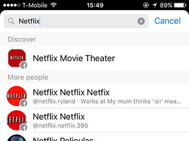
But when I try to find a recent conversation I had about Netflix, I discover that the only thing I can search for are entities with which to start conversations
Good Example: Robinhood 
Robinhood does a great job at letting you know what to search and expect results for – companies or financial products.
Normally, you might need to look up a ticker symbol to find a company’s stock. But Robinhood does a great job at being approachable to novices here, despite its slightly daunting stock-trading theme.
-
Offer Suggestions: One of the worst mistakes you can make is showing an empty screen underneath the search bar when the user taps it. There’s a limited amount of real estate on a mobile screen, so don’t waste it with empty space.
This is your chance to guide the user through your conversation. Use this space to offer the user some suggestions or curated content such as “Popular Searches”, “Favorites”, “Closest”, or “Top Rated”.
Bad Example: Skillshare 
Skillshare’s search functionality leaves much to be desired because it offers no suggestions on how to search. It, quite literally, leaves the user in the dark.
Good Example: Pinterest 
Pinterest helps their users stay in “the know” by showing a list of popular searches.
The advantage of this pattern is that the user might not even need to perform the search query, but can instead choose from a selection of predefined content that you can guarantee will return relevant results.
-
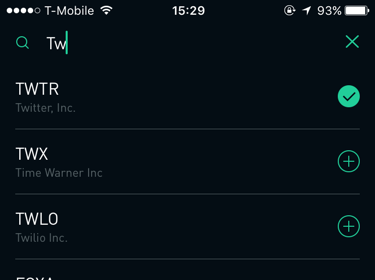
Auto-Complete: One of the more popular, and useful, design patterns is auto-complete or “Search within Search”. As the user types, the app suggests several other related queries that the user can select easily. It has one of the best benefits for mobile users: reduced typing time. It also allows you, as the creator of the app, to gently nudge the user in the direction you think would be best for them.
Good Example: Cookpad 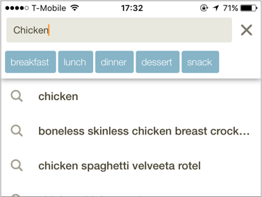
Cookpad looks at the user’s query and semi-dynamically provides more intricate and concrete searches for the user to tap.
Good Example: Lyft 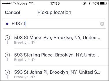
A location-services app like Lyft would be almost useless if it didn’t provide as-you-type suggestions.
Bad Example: iTrans NYC 
iTrans NYC requires the user to enter a nearly-complete address before figuring out what they want.
-
Search Within: A special kind of search that allows users to search within a category they’ve navigated into. Even though not many apps or businesses support this model, most users expect it. This type of search also helps prevent errors, because you’re guiding the user to search for something that will definitely yield results.
Good Example: Spring 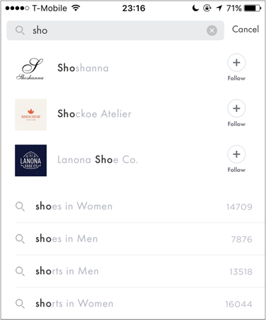
As the users type, Spring lets them see what categories their query is available in and the number of results.
-
Save Search History: Users appreciate when an app has an idea of what they were doing in a previous session – especially related to browsing. Imagine how frustrated you would be if a call or a notification interrupted you from finding that perfect butter knife, and you had to start all over again.
Including such a section in your search flow increases the user’s trust in your product and encourages their willingness to explore. This can manifest itself in one of two ways: the app storing the user’s search automatically as they go, or the app allowing the user to proactively save the search.
So-So Example: Evernote 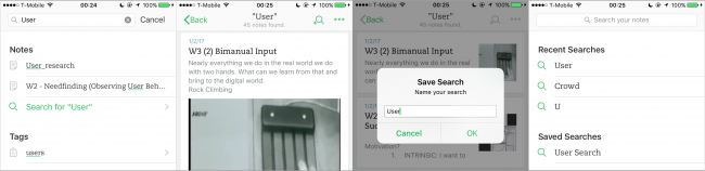
Evernote provides both options to remember the user’s actions. It saves their recent history and lets them store searches for the future. While a user can appreciate the functionality to save their search, the interaction becomes more annoying than useful because of the number of steps involved.
So-So Example: Amazon 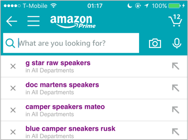
Even though Amazon saves the user’s searches, it’s a little cumbersome to remove searches one by one.
Good Example: Medium 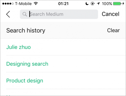
Medium neatly stores the user’s searches and provides a simple way to clear their history and decrease clutter.
-
Offer Scoped Search: If your app has a whole lot of content that can be further broken into a number of categories, you might want to consider a scoped search, which helps users understand the “space” that they’re in — as long as the scope is shown prominently enough and can easily be changed.
Good Example: ProductHunt 
As the user types, ProductHunt provides four clear, overarching content categories in which they can search.
-
Constrain Search: If your app is very specific about what type of content it offers, the best way to help the user find what they want is to constrain their search to a couple of different parameters. That way the app is as clear as possible about what it needs from the user, and the user can be as specific as they want to be in the boundaries of those constraints.
Good Example: Airbnb 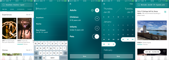
Airbnb does a great job at constrained search by letting users know what’s important from the first screen: Location, Date and Number of Guests. These strong affordances leave no room for confusion.
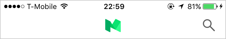
Medium displays a search icon on the Nav Bar

Tumblr puts the icon more prominently on the Tab Bar
Medium displays a search icon on the Nav Bar
Tumblr puts the icon more prominently on the Tab Bar
Messenger simply says “Search” in the search box. This leads me to believe that anything goes
But when I try to find a recent conversation I had about Netflix, I discover that the only thing I can search for are entities with which to start conversations
Robinhood does a great job at letting you know what to search and expect results for – companies or financial products.
Normally, you might need to look up a ticker symbol to find a company’s stock. But Robinhood does a great job at being approachable to novices here, despite its slightly daunting stock-trading theme.
Skillshare’s search functionality leaves much to be desired because it offers no suggestions on how to search. It, quite literally, leaves the user in the dark.
Pinterest helps their users stay in “the know” by showing a list of popular searches.
Cookpad looks at the user’s query and semi-dynamically provides more intricate and concrete searches for the user to tap.
A location-services app like Lyft would be almost useless if it didn’t provide as-you-type suggestions.

iTrans NYC requires the user to enter a nearly-complete address before figuring out what they want.
As the users type, Spring lets them see what categories their query is available in and the number of results.

Evernote provides both options to remember the user’s actions. It saves their recent history and lets them store searches for the future. While a user can appreciate the functionality to save their search, the interaction becomes more annoying than useful because of the number of steps involved.
Even though Amazon saves the user’s searches, it’s a little cumbersome to remove searches one by one.

Medium neatly stores the user’s searches and provides a simple way to clear their history and decrease clutter.

As the user types, ProductHunt provides four clear, overarching content categories in which they can search.

Airbnb does a great job at constrained search by letting users know what’s important from the first screen: Location, Date and Number of Guests. These strong affordances leave no room for confusion.
Note: As you’ve seen in some of these examples, the methods above don’t have to be used exclusively of each other, but can most definitely be used in parallel — it all depends on the type of products you have.
Note: As you’ve seen in some of these examples, the methods above don’t have to be used exclusively of each other, but can most definitely be used in parallel — it all depends on the type of products you have.