iOS Accessibility in SwiftUI Tutorial Part 1: Getting Started
In this article, you’ll fix the accessibility of a SwiftUI master-detail app with various types of images that need more informative labels. By Audrey Tam.
Sign up/Sign in
With a free Kodeco account you can download source code, track your progress, bookmark, personalise your learner profile and more!
Create accountAlready a member of Kodeco? Sign in
Sign up/Sign in
With a free Kodeco account you can download source code, track your progress, bookmark, personalise your learner profile and more!
Create accountAlready a member of Kodeco? Sign in
Sign up/Sign in
With a free Kodeco account you can download source code, track your progress, bookmark, personalise your learner profile and more!
Create accountAlready a member of Kodeco? Sign in
Contents
iOS Accessibility in SwiftUI Tutorial Part 1: Getting Started
35 mins
- Getting Started
- Accessibility in SwiftUI
- Using the Accessibility Inspector
- SwiftUI: Accessibility by Default
- Emoji Need Context
- Performing Actions
- Unhelpful Image Names
- MapView Accessibility Information?
- Context Menu Accessibility?
- Accessibility Issues Identified
- Fixing Accessibility Labels
- Labeling Artwork Images
- Labeling System Images
- Labeling the MapView Annotation
- Labeling Emoji
- Using VoiceOver on a Device: Basic Navigation
- Running on Your Device
- Setting Up VoiceOver Shortcut
Accessibility matters. You already know this, or you wouldn’t be reading this article. ;] 15-20% of people live with some form of disability, and another 5% experience short-term disability. They’re all potential customers of your app: They want to use your app, you want to make sure they can use your app, and SwiftUI is here to help.
Most app UIs are very visual experiences, so most accessibility work focuses on VoiceOver — a screen reader that lets people with low to no vision use Apple devices without needing to see their screens. VoiceOver reads out information to users about your app’s UI elements. It’s up to you to make sure this information helps users interact efficiently with your app.
In this tutorial, you’ll fix the accessibility of a simple SwiftUI master-detail app with various types of images that need more informative labels. You’ll learn that SwiftUI elements are accessible by default, and how this helps you.
In particular, you’ll learn how to:
- Improve your app’s accessible UI with labels that provide context for images, emoji, system images and map view annotations.
- Use the SwiftUI Accessibility API attributes.
- Inspect your app with Xcode’s Accessibility Inspector and its VoiceOver simulator.
- Navigate your app with VoiceOver on an iOS device.
Apple’s investing a lot of effort in helping you improve the accessibility of your apps. With SwiftUI, it’s easier than ever before. The future is accessible, and you can help make it happen!
Getting Started
Get started by downloading the materials for this tutorial — you can find the link at the top or bottom of this article. Open the PublicArt project in the begin folder. This is based on the project from SwiftUI Tutorial: Navigation.
Build and run the app in an iPhone Simulator. You get a list of public artworks in Honolulu:
Some have a reaction emoji, which indicates the user has already visited them. There’s a Hide Visited toggle in the navigation bar, to show only artworks that the user hasn’t visited.
Long-press an item to see a context menu where the user can select a reaction emoji:
Tap anywhere to close the context menu, then tap an item to show its detail view with image, title, location, artist and description of the artwork. Depending on the length of the title, the Back button is Artworks, Back or just an arrow.
Tap the small map pin icon next to the location, to show a map with a pin at the location:
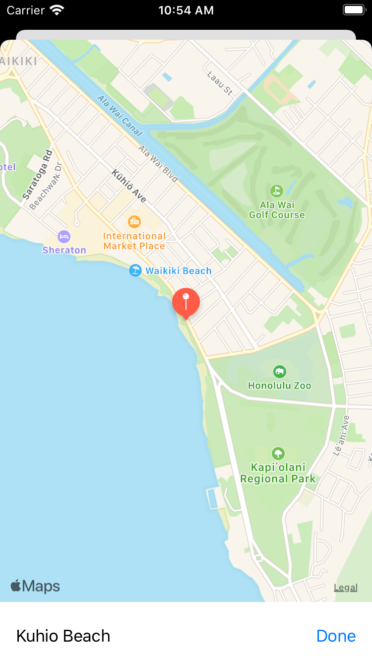
Tap Done to dismiss the map, then tap the Back button or arrow to return to the list.
NavigationLink
bug in Simulator and doesn’t happen when you run this app on a device.
Accessibility in SwiftUI
With SwiftUI, it’s easy to ensure your apps are accessible because SwiftUI does a lot of the work for you. SwiftUI elements support Dynamic Type and are accessible by default. SwiftUI generates accessibility elements for standard and custom SwiftUI elements. Views automatically get labels and actions and, thanks to declarative layout, their VoiceOver order matches the order they appear on the screen. SwiftUI tracks changes to views and sends notifications to keep VoiceOver up to date on visual changes in your app.
When the accessibility built into SwiftUI doesn’t provide the right information in the right order, you’ll use the SwiftUI Accessibility API to make your accessible elements understandable, interactable and navigable:
- Understandable: In this first part of this tutorial, you’ll learn what SwiftUI generates for VoiceOver from SwiftUI element initializers. Then, to clarify or add context to accessible elements, you’ll override the generated default labels. In Part 2, you’ll customize the accessibility labels and values, hiding elements that provide redundant information, and moving some information to hints that the user doesn’t have to listen to.
- Interactable: Try to give your accessible elements appropriate default actions, and create custom actions to simplify interaction for users of assistive technology. When VoiceOver is working correctly, it lets users swipe down to access custom actions like context menus.
- Navigable: In Part 2, you’ll change the order that VoiceOver visits elements, and you’ll group elements to reduce the number of steps and speed up navigation for VoiceOver users.
The amount of work for each accessible element could be as little as a few words or lines of code. Or you might need to refactor or add code, or even change a navigation link into a modal sheet.
Most of the time, you’ll add accessibility to your app without changing its appearance and behavior for users who aren’t using VoiceOver. But sometimes, something you do for VoiceOver will inspire an improvement to your visual UI.
Using the Accessibility Inspector
Now try out Xcode’s Accessibility Inspector on PublicArt running in the simulator. The app doesn’t have to be running in Xcode.
To start, in the Xcode menu, select Xcode▸Open Developer Tool▸Accessibility Inspector.
When the window appears, select your simulator in the target selection menu, and select the Inspection tab: It’s the first of the set of three buttons:
The single button next to the target field turns on the Inspection Pointer or Inspection-follows-point — Option-Space toggles it. When it’s working, you just point the cursor at a UI element to highlight it and view its accessibility information. At the time of writing this article with Xcode 11.3, this doesn’t work. Instead, click the Fast-Forward button to advance highlighting to the next element.
First, point the cursor or click Fast-Forward to highlight the Hide Visited toggle in the navigation bar. Its accessibility information appears in the inspector:
There are four sections: Basic, Actions, Element and Hierarchy. If necessary, click Show for the Basic and Actions sections. The Basic information also appears in the top Quicklook area: It consists of the Label Hide Visited, the Value 0 and the Trait Button. And there’s an Activate: Perform button in the Actions section.
SwiftUI: Accessibility by Default
Look at the code for this button in ContentView.swift — it’s a modifier for NavigationView
:
.navigationBarItems(trailing:
Toggle(isOn: $hideVisited, label: { Text("Hide Visited") }))
There’s no explicit accessibility code here, just the type of element — Toggle — and its label. SwiftUI uses these to generate an accessibility element:
- The accessibility label defaults to the element’s label Hide Visited.
- The accessibility value defaults to match the element’s value: 0, because the initial value of
hideVisited
isfalse
. - The accessibility trait defaults to Button because this element is a Toggle.
label
parameter, which should be used as the default accessibility label. You’ll see a current exception to this rule in Part 2.
Now advance the highlighting to the navigation view title Artworks:
Again, SwiftUI automatically creates an accessibility label Artworks, and assigns the trait Header, although there’s no specific accessibility code. There’s only this other NavigationView
modifier to provide the default accessibility label:
.navigationBarTitle("Artworks")
Emoji Need Context
Next, advance the highlighting to the first list item, which happens to have a reaction emoji:
SwiftUI takes its accessibility label from the item’s Text
, and identifies this as a Button.
The accessibility inspector also has a VoiceOver simulator — the button in the middle of the Quicklook section — which gives you a reasonable idea of what VoiceOver will say on a device.
Click the VoiceOver button to hear how this label sounds:
Glowing Star, Prince Jonah Kuhio Kalanianaole, Button
Do you feel the default label — emoji name Glowing Star — is not really helpful to someone who is just listening to the app? In the context of the app, this emoji indicates a Wow reaction. A big part of making your app accessible means ensuring your labels give context and meaning for the elements in your app. You’ll soon fix this problem by replacing the default label with a custom label.
Performing Actions
Now look at the accessibility inspector’s Action section: Activate, Scroll up and Scroll down. Click the Activate Perform button to simulate tapping the list item button in the simulator:
Now you’re on the detail view for Prince Jonah, and the accessibility inspector says the back button’s label is Artworks, while iOS shows an arrow, because the navigation bar title is so long:
That’s probably a feature, not a bug ;].
Unhelpful Image Names
Keep moving the highlighting. The title itself is a Header, then the image has another unhelpful default accessibility label 002_200105: This is the name of the image. You’ll soon fix this with the Image
element’s label-based initializer.
The title below the image also has the unhelpful Glowing Star in its label, and the system image beside the location text has the unhelpful image name — mappin.and.ellipse — as its default accessibility label.
MapView Accessibility Information?
Click VoiceOver to turn it off, then tap the map pin to open the map view. Click VoiceOver to turn it on: It says Description for element unavailable, and there’s no information in the accessibility inspector!
Now click the Play button to start auto-navigation: VoiceOver reads the points of interest that appear on the map, from top to bottom, leading to trailing edge, before visiting the map pin, and the rest of the elements:
Ala Wai Golf Course, Waikiki Beach, description for element unavailable, Honolulu Zoo, Kapiolani Regional Park, map pin, map pin, Legal, Link, Kuhio Beach, Done, Button.
So there is some accessibility information somewhere, but there’s none available for the most important location on the map. You’ll soon see a way to fix that.
Click VoiceOver to turn it off.
Context Menu Accessibility?
I almost forgot: The list has a context menu for setting an artwork’s reaction emoji. Navigate back to the master list view in the simulator, highlight an item, and click VoiceOver:
Glowing Star, Prince Jonah Kuhio Kalanianaole, Button
Nope, not a word about the context menu.
Long-press the item to show the context menu, then highlight each menu item to see they’re all accessible, and the whole-screen-highlighted UIVisualEffectView
has the label Dismiss context menu:
Further investigation is needed for this!
Accessibility Issues Identified
In a brief scan of this app, you’ve seen how SwiftUI automates accessibility for you, but you’ve also found these accessibility issues:
- Emoji names aren’t helpful information.
- Artwork image names aren’t helpful information.
- System image names aren’t helpful information.
- The map view has no accessibility information for the map pin.
- How does accessibility work for the context menu?
Next, you’ll jump in and fix these, before diving into the details of the Accessibility API.
Fixing Accessibility Labels
Fixing the artwork image label is easiest, so you’ll start with that.
Labeling Artwork Images
In DetailView.swift, the first element in the VStack
is Image(artwork.imageName)
. Replace this with:
Image(artwork.imageName, label: Text(artwork.title))
You’re using the Image
initializer with a label
parameter to provide a meaningful label. VoiceOver will read this instead of the Image
name.
Build and run the app, and navigate to a detail view. In the accessibility inspector, highlight the image:
Now the image’s label is the title of the artwork. Play the VoiceOver to hear:
Prince Jonah Kuhio Kalanianaole, Image
That’s right, VoiceOver reads out the Image trait, so you should never include this information in your accessibility label.
I told you that was easy. Next, you’ll fix the system image.
Labeling System Images
You’re still in the detail view. Highlight the map pin icon next to the artwork’s location:
Its Trait is Button, so tapping it is a command for the app to perform an action. Its label should tell the user what this command is.
In DetailView.swift, in the HStack
, replace Image(systemName: "mappin.and.ellipse")
with this code:
Image(systemName: "mappin.and.ellipse")
.accessibility(label: Text("Open Map"))
The name of an SFSymbols image describes what it looks like, which doesn’t convey any of your app’s context to your users. The Image(systemName:)
initializer doesn’t have a label
parameter, so you have to use the Accessibility API to specify one.
Build and run, then navigate to a detail view. Use the accessibility inspector and VoiceOver to confirm the system image has a new label:
So far, you’ve only had to add a small amount of code. For the next two fixes, you’ll need to do some refactoring.
Labeling the MapView Annotation
MapView
is an MKMapView
wrapped in a UIViewRepresentable
protocol. It’s accessible by default. You can pan and zoom the map and flick through the points of interest. But the map pin marking the annotation isn’t labeled. I adapted this view from Apple’s Landmarks sample project, which has only a coordinate
property.
To fix this, you’ll need to modify MapView
. You’ll pass it the Artwork
, so it can set more properties of its annotation.
In MapView.swift, add this property:
let artwork: Artwork
And delete the coordinate
property:
let coordinate: CLLocationCoordinate2D // Delete this line
Xcode now complains a lot, but that just helps you find everything you need to fix.
First, down in updateUIView(_:context:)
, replace the second line with this:
let region = MKCoordinateRegion(center: artwork.coordinate, span: span)
You’re replacing the coordinate
property with the same value artwork.coordinate
.
There’s another use of coordinate
, just after you create annotation
. Replace annotation.coordinate = coordinate
with:
annotation.coordinate = artwork.coordinate
annotation.title = artwork.title
annotation.subtitle = artwork.locationName
Here, in addition to replacing the deleted property coordinate
, you’re setting the annotation’s title
and subtitle
. Now these will appear on the map, and VoiceOver will read them to the user.
Your last task is to change the two initializations of MapView
to take an Artwork
argument, instead of CLLocationCoordinate2D
.
Down in MapView_Previews
, replace the MapView
initializer with this:
MapView(artwork: artData[5])
And finally, in LocationMap.swift, replace the MapView
initializer with this:
MapView(artwork: artwork)
Build and run, then navigate to the first detail view and tap the map pin to show the map. In Accessibility Inspector, click the Play button to auto-navigate the VoiceOver simulator over the map. You’ll hear something similar to this:
Ala Wai Golf Course, Waikiki Beach, Prince Jonah Kuhio Kalanianaole, Honolulu Zoo, Kapiolani Regional Park, Prince Jonah Kuhio Kalanianaole, Kuhio Beach, Prince Jonah Kuhio Kalanianaole, Kuhio Beach, Legal, Link, Kuhio Beach, Done, Button.
Text
element in the HStack
by modifying it with an accessibility label — tell your VoiceOver user this is a map centered at the artwork’s location. Click Reveal to see the solution.
[spoiler title=”Solution”]
Add this modifier to the Text
element:
.accessibility(label: Text("Map centered at " + artwork.locationName))
VoiceOver will read this accessibility label instead of just the location name.
[/spoiler]
Build and run, then navigate to a map view, and use the accessibility inspector and VoiceOver to see the new label:
MKAnnotation
, which is read after all the Points of Interest. At the time of writing this article with Xcode 11.3 and iOS 13.3, VoiceOver also reads out Points of Interest on devices.
Labeling Emoji
Next, you’ll provide context for the reaction emoji. These appear in both the master list view and the detail view as artwork.reaction.rawValue
. What you need is a way to translate each emoji into a word or phrase that expresses its meaning in this app.
Artwork.swift has an enumeration for the reaction emoji:
enum reactionEmoji: String {
case love = "💕"
case thoughtful = "🙏"
case wow = "🌟"
case none = ""
}
var reaction: reactionEmoji
To begin, in Artwork.swift, add this method to the enum
:
func reactionWord() -> String {
switch self {
case .love: return "love it reaction: "
case .thoughtful: return "thoughtful reaction: "
case .wow: return "wow reaction: "
case .none: return ""
}
}
You’re specifying the meaning of the emoji in the context of this app. The colon makes VoiceOver pause between reaction and the artwork’s title.
Now, in ContentView.swift, add this modifier to the Text
element in the List
:
.accessibility(label: Text(artwork.reaction.reactionWord()
+ artwork.title))
And, in DetailView.swift, add the same modifier to the first Text
element in the VStack
:
.accessibility(label: Text(artwork.reaction.reactionWord()
+ artwork.title))
You’re providing an explicit accessibility label for the Text
elements. VoiceOver will read this instead of the Text
element’s content.
Build and run, then use the accessibility inspector and VoiceOver to check your new labels:
Using VoiceOver on a Device: Basic Navigation
The accessibility inspector’s VoiceOver simulator is really convenient, but you should run your app on a device, to find out how it really behaves and sounds for a VoiceOver user.
Running on Your Device
In the PublicArt Project, adjust the iOS Deployment Target, if your device isn’t on the latest version of iOS 13. Note that it must be some version of iOS 13.
In the PublicArt Target, change the Bundle Identifier organization, then click Signing & Capabilities. Check the checkbox to Automatically manage signing, and select a Team.
Setting Up VoiceOver Shortcut
On your device, open Settings▸Accessibility▸Accessibility Shortcut, and select VoiceOver. This enables you to switch VoiceOver on and off by triple-clicking the device’s side button.
Build and run the app on your device. Triple-click the side button to start VoiceOver. Tap the first item, and listen to VoiceOver say Wow reaction then mangle Prince Jonah’s name.
A few instructions for basic navigation in VoiceOver:
- No-vision user: Swipe right to next element, left to previous element. Double-tap anywhere to execute.
- Low-vision user: Tap to select an element, double-tap to execute. Alternative: Instead of tapping an item then double-tapping, use a split-tap gesture: Touch and hold an item with one finger, then tap the screen with another finger.
There are many more gestures, and links to more information about VoiceOver, at Learn VoiceOver Gestures on iPhone.
So now, swipe right until you reach the second artwork, double-tap anywhere to view its detail view, and keep swiping right to hear VoiceOver read your new labels for the image and the map pin icon.
Tap the Back button to select it, then split-tap it or double-tap anywhere to return to the list view.
Stay on your device to experience the context menu.
What About the Context Menu?
Context menus replace 3D Touch peek and pop. UIKit has UIContextMenuInteraction
, but SwiftUI has a wonderful contextMenu
modifier for easily creating a context menu and attaching it to a view. Like other SwiftUI controls, context menus are accessible by default … most of the time.
Here’s how it works when it’s working:
On your device, tap the Giraffe artwork: VoiceOver says Giraffe. Button. Actions available. Wait a little, and it might say Swipe up or down to select a custom action, then double-tap to activate. It’s hard to predict when it will say hints, so don’t wait more than a couple of seconds.
Swipe up or down to hear Show context menu, then double-tap anywhere to see the context menu.
.accessibilityAction(named:_:)
. When the custom actions feature is working, VoiceOver will read it out as a custom action, and your user can activate it by double-tapping.
Using the Context Menu in VoiceOver
With the context menu open, swipe right to navigate the emoji buttons. Double-tap anywhere to select one. This dismisses the context menu and returns to the list view:
Tap Giraffe to hear VoiceOver read your reaction emoji, followed by Giraffe.
Triple-click the side button to turn off VoiceOver on your device.
Accessibility Inspector Audit?
Accessibility Inspector has an Audit function: You may have seen it demonstrated in WWDC sessions and in our UIKit accessibility article. First, you use it to find accessibility issues in your app, and later you use it to verify that you’ve fixed them.
Build and run the app in Simulator, and check it’s the selected target for Accessibility Inspector. Tap an item to show its detail view.
In Accessibility Inspector, click the Audit button — the exclamation mark in a triangle — then click Run Audit. Wait a short time, and several warnings appear. Most of them say:
Potentially inaccessible text
Open the disclosure arrow to see:
This element appears to display text that should be represented using the accessibility API.
When you select one of the warnings, the element it refers to is highlighted in the simulator and also appears below the list of warnings:
Every one of these elements has an accessibility label, so what’s going on here? I suspect at least parts of the accessibility inspector don’t really know about SwiftUI, and doesn’t recognize when you use its Accessibility API. So although this audit function is useful for UIKit apps, I don’t use it in this article.
Accessibility API
Now that you’ve gotten comfortable splashing around in the deep end of accessibility, it’s time to dive into some details about the SwiftUI Accessibility API.
When a user of your app turns on an iOS assistive technology like VoiceOver, they’re actually interacting with an accessible user interface that iOS creates for your app. This accessible UI tells a VoiceOver user about the accessible elements of your UI — what they are and how to use them.
Every accessible UI element has these two attributes:
-
Frame: This is the element’s location and size, as given in its
CGRect
structure. -
Label: The default value of an element’s label is the label, name or text used to create the element. You’ve already changed many default values in PublicArt with
accessibility(label:)
. Apple’s programming guide provides guidelines for creating labels and hints.
Depending on its nature, a UI element might have one or more of these three attributes:
-
Traits: An element can have one or more traits, describing its type or state. The list of traits includes
isButton
,isModal
,isSelected
andupdatesFrequently
. SwiftUI views have default traits. For example, a Trait ofToggle
is Button. You can add or remove traits withaccessibility(addTraits:)
andaccessibility(removeTraits:)
. VoiceOver reads out an element’s traits, so never include them in its label. -
Value: A UI element has a value if its content can change. If the default value isn’t meaningful to VoiceOver users, use
accessibility(value:)
to create a more useful value. For example, the Hide VisitedToggle
has values 0 or 1 — too generic to mean anything to your users. Set up values likeNot Hidden
andHidden
to communicate their context in your app. -
Hint: This attribute is optional. If the user doesn’t do anything after VoiceOver reads a label, VoiceOver reads the hint. You can set it with
accessibility(hint:)
to describe what happens if the user interacts with the element.
The accessible UI doesn’t change anything in your app’s visible UI, so you can add more information, in a different order, than what your other users see. In Part 2, you’ll change the order and amount of information for your VoiceOver users.
identifier
. This is only used in UITests. You would set an identifier for an element that doesn’t have an accessibility label, or if an element’s accessibility label is too long or ambiguous.
Adding an Accessibility Trait and Hint
Now take a closer look at traits and hints.
The map pin button on the detail view is small and easy to miss. Why not make the image a button? When the user taps it, the map appears.
In DetailView.swift, add this modifier to the Image
element after the resizable()
modifier:
.onTapGesture { self.showMap = true }
Build and run in Simulator to test your new button. Navigate to a detail view, then tap the image to show the map.
Tap Done to return to the detail view, then highlight the image in Accessibility Inspector:
Its Traits lists only Image, so VoiceOver users won’t know it’s a button. You need to use the Accessibility API to add this trait.
Add two more modifiers to the Image
in DetailView.swift:
.accessibility(addTraits: .isButton)
.accessibility(hint: Text("Opens Map."))
Now VoiceOver will tell the user this element is a button; after a pause with no action from the user, VoiceOver will tell them the button opens the map.
Notice the hint is Opens Map not Open Map: you’re telling the user what this button does, not instructing them to open the map.
Build and run, then tap an item to open its detail view, and highlight the image:
Now its traits are Button and Image.
The Accessibility Inspector VoiceOver simulator doesn’t read hints, so build and run the app on your device. Navigate to a detail view image, then triple-click your device’s side button to play VoiceOver:
Prince Jonah Kuhio Kalanianaole, Button, Image [pause] Opens map
If you’re lucky, VoiceOver also tells you what the machine-learning Vision model detects in the image:
grass, path, shrub, statue
Really Testing Your App’s Accessibility
To really test whether a VoiceOver user can use your app, build and run the app on your device, turn on VoiceOver, then turn on the screen curtain: Triple-tap with three fingers.
This turns off the display while keeping the screen contents active. VoiceOver users can use this for privacy.
Now navigate to the Giraffe artwork, set a reaction, listen to its description, then return to the list. You can’t see the items and buttons, so you must rely entirely on VoiceOver information and gestures. Click Reveal if you need some hints.
[spoiler title=”Solution”]
- Swipe right/left to move to the next/previous item in the list or in the context menu.
- When you’ve selected a list item, Double-tap-and-hold anywhere to open that item’s context menu.
- When you’ve selected a list item, Double-tap anywhere to open that item’s detail view.
- Swipe right/left to move to the next/previous element in the detail view.
- When you’ve selected the back button, Double-tap anywhere to return to the list.
[/spoiler]
Did you succeed? Good for you!
Triple-tap with three fingers to show the display, then triple-click the side button to turn off VoiceOver.
Congratulations, you’re well on your way to becoming an accessibility ninja!
Where to Go From Here?
You can download the final end project using the link at the top or bottom of this article.
You’ve learned a lot about SwiftUI accessibility in this article. Here’s what you’ve done:
- Created labels that provide context for images, emoji, system images and map view annotations.
- Saved time by using Xcode’s Accessibility Inspector and its VoiceOver simulator.
- Used VoiceOver on an iOS device to navigate a master-detail app.
Here are some links for further exploration:
Continue to Part 2, to learn how to fine-tune accessibility information by modifying your app’s accessibility tree.
We hope you enjoyed this article, and if you have any questions or comments, please join the forum discussion below!
All videos. All books.
One low price.
A Kodeco subscription is the best way to learn and master mobile development — plans start at just $19.99/month! Learn iOS, Swift, Android, Kotlin, Flutter and Dart development and unlock our massive catalog of 50+ books and 4,000+ videos.
Learn more