Jetpack Compose Tutorial for Android: Getting Started

In this Jetpack Compose tutorial, you’ll learn to use the new declarative UI framework being developed by the Android team by creating a cookbook app. By Alex Sullivan.

Leave a rating/review
Download materials
Save for later
Share

Mobile app development innovations often come in waves or trends. Whether the current trend is about language safety and stability, or performance improvements of the platform, it’s always important to keep up to the trends, because some of them radically change the way we develop applications. The past year or two have been all about building declarative and reactive programming when it comes to apps’ business logic.

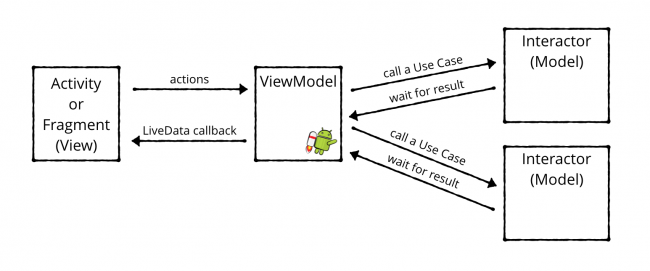
This means that people have moved away from the classic imperative MVC/P (Model-View-Controller/Presenter) approach, to a more reactive approach such as MVVM (Model-View-ViewModel), where you update the data streams within the ViewModel, and the UI reacts to the change by re-drawing itself or simply updating sections of the UI. This is because declarative programming is less error-prone, more composable, and easier to test because you’re working mostly with values of data, rather than interactions.

MVVM with Jetpack

Following such a trend, it’s only natural that building user interfaces has taken a turn in that direction, as well, with the trend of declarative UI frameworks and toolkits. Frontend toolkits and frameworks such as React.js and Flutter have grown more and more popular by the day, and this has influenced other platforms to come up with their own implementations, using the same approach.

At Google I/O 2019, Google first announced Jetpack Compose. Jetpack Compose is their response to the declarative UI framework trend, which the Android team is developing to fundamentally change the way developers create UI, making it easier and faster to write, and more performant to run. It is a part of the Jetpack suite of libraries and as such should provide compatibility throughout platform versions, removing the need to avoid certain features, because you’re targeting lower-end devices or older versions of Android.

Although it’s still in an early preview state, Compose is already making big waves in the Android community. If you want to stay up-to-date on the latest and greatest technology, read on!

In this tutorial, you’ll learn about the basic concepts of Jetpack Compose, such as composable functions, setting the content to the screen, and updating content. After you’ve mastered the basics, you’ll proceed to use Jetpack Compose to build a cookbook app, which shows a Material-design-powerded list of food recipes, with cards, images, and texts.

Note: Compose is still in an early pre-alpha state. You should not use it in production apps, as it is bound to change, and possibly break your code.

Why Build With Jetpack Compose?

Before you write your first app with Compose, consider why the Android team wrote the library.

Creature Brain

Compose has three huge benefits over the current UI-building process in Android.

It’s Declarative

Jetpack Compose is a declarative UI framework, which means you describe your view without relying on mutation and more traditional imperative programming concepts.

Take hiding a view as an example. With the current UI toolkit, you’d typically use a method like findViewById() to get a reference to the View you want to hide, then call setVisibility() on it.

In a declarative UI, you instead describe the UI as being visible or not. When you want to change the visibility, you re-run the code describing the UI.

So you’re no longer grabbing a reference to the View after you’ve created it. Instead, you just re-run the code that created the View with different parameters.

Note: Compose doesn’t actually rebuild the entire View when you update something. It’s smart enough to only change the section that needs to change.

It’s Independent

Compose is a library that isn’t coupled to the operating system. This is a major advantage for developers.

Right now, if Google wants to update the LinearLayout component, it needs to release a new version of the OS. Unfortunately, fragmentation issues prevent many people from using the latest Android versions.

That means that you can’t rely on users having access to new features of the current UI toolkit until years after they’re released when most people have finally upgraded.

With Jetpack Compose, developers can add new features without changing the OS version. You can rely on them working, regardless of the operating system on the user’s device.

Not only that but unlike the LinearLayout component, releasing new versions of Jetpack Compose won’t break existing applications, because you don’t have to upgrade to a newer version of Jetpack Compose unless you want to. It also doesn’t use the existing UI toolkit from Android, so it’s a fresh start, to fix some of the age-old problems the View hierarchy has. Whereas as soon as you upgrade to a new version of Android, the LinearLayout component, being a part of the operating system, is upgraded too, and it may bring breaking changes to applications which heavily rely on it.

It’s, Ahem, Composable

Last but not least, Jetpack Compose will resolve some long-standing issues with the current UI toolkit. This goes along with the idea of it being independent.

Android has been out for over ten years, and its UI creation code is starting to show its age. The View class alone contains over ten thousand lines of code! That’s a lot of legacy code to support.

Compose will let Google start from scratch in a more composable manner.

Getting Started

Start by clicking the Download Materials button at the top or bottom of this page to download everything you’ll need for this project.

Since Jetpack Compose is in such an early pre-alpha state, you’ll need to run at least Android Studio 4.0 Canary 3 or later.

At the time of writing, you need to be on the Canary channel of Android Studio to work with Compose. To switch to the Canary channel for updates, go to the Check for Updates dialog and click Configure in the bottom-left corner of the dialog.

Next, choose Canary Channel in the drop-down on the configuration screen.

Update Canary Channel

Click OK and run Check for Updates again. You’ll see a prompt to install the Canary version of Android Studio.

Install the new version. You can have both the Canary and the stable versions of Android Studio installed at the same time. You’ll know you’re using the Canary version because it has a yellow version of the Android Studio icon.

AS Canary logo

Now that you have the right version of Android Studio installed, it’s time to dive into Jetpack Compose!

Getting Up and Running With Jetpack Compose

Go to the materials you downloaded and open the begin project in your Canary version of Android Studio.

Build and run and you’ll see a blank, white screen with the Hello World text of a brand-new Android Studio project.

Hello World screen of your new AS project

Now open the app/build.gradle file and look at the dependencies block. You’ll see three interesting dependencies:

implementation 'androidx.ui:ui-layout:0.1.0-dev02'
implementation 'androidx.ui:ui-material:0.1.0-dev02'
implementation 'androidx.ui:ui-tooling:0.1.0-dev02'

Compose uses the androidx.ui namespace for the dependencies that make up the library.

In addition to those dependencies, you also need to add the compose flag as true, in the buildFeatures block within android:

buildFeatures {
  compose true
}

Now that you’ve learned which dependencies you need for a Jetpack Compose project, you can get to work.

Dipping Your Toes Into Jetpack Compose

Since Jetpack Compose exposes a programmatic way to build user interfaces, you won’t be using any XML. This means you won’t use setContentView() in your activities or fragments, instead you’ll use setContent() to set up your UI.

To do this, open MainActivity.kt and replace the existing call to setContentView() with the following:

setContent {
  Text("Hello, World!")
}

Make sure to import the dependencies from the androidx.ui.core package, as you do so. setContent() is a Kotlin extension function in Activity that takes a @Composable lambda as a parameter. You’ll learn more about what @Composable means later on.

In addition to setContent(), there’s another new player in town in the above code snippet: Text().

In Jetpack Compose, you use methods marked with the @Composable annotation to build your UI. If you Command-Click on Mac or Control-click on Windows on Text(), you’ll see something like this:

@Composable
fun Text(
    ...
)

Text() is actually a function marked with the @Composable. Text() composable is in charge of, you guessed it, drawing text on the screen. You can think of it as being the Compose version of a TextView.

Note: Normally you’d use camelCase when naming methods. However, when you create composables, you capitalize the method name so it’s clear that you’re constructing an instance of a composable. Similar to how Flutter widgets work or Kotlin Coroutine functions like the Job() are named

Build and run and you’ll see the Text() on screen! :]

Hello World Text With Jetpack Compose

You can customize your text by using a TextStyle. Try it out by replacing the existing Text() with the following:

Text("Hello, World!", style = TextStyle(color = Color.Red))

Once again, make sure to import the proper androidx.ui packages. Build and run and you’ll see that the text is now red.

Hello World with red text

When using Jetpack Compose, you’ll use normal Kotlin code and method arguments instead of XML styles and attributes to customize your UI. You’ll try your hand at this in the next section.

Creating a Composable Function

One of the most profound benefits of Jetpack Compose is that you build your UI in a modular manner with lots of small functions rather than using one giant XML file for each Activity.

Now that you’re familiar with Text(), you can make your first @Composable function.

Add the following function below the MainActivity:

@Composable
fun Greeting() {
  Text("Hello, World!", style = TextStyle(color = Color.Red))
}

Congratulations, you’ve just created your first custom Composable function!

To use it, replace the existing call to Text() in setContent() with a call to Greeting():

setContent {
  Greeting()
}

Build and run. Like before, you’ll see your dazzling red text!

Hello World with red text

Using lots of small functions is a great way to create chunks of UI that you can reuse on different screens.

One thing to keep in mind, though, is that you can only call a @Composable function from within another @Composable function; otherwise, your app will crash.

This is similar to Kotlin Coroutines, where you can only call suspending functions from within other suspending functions or coroutines.

Previewing a Composable

Normally, when you create the UI for one of your activities in XML, you use the layout preview to see how your view will look without having to build and run your app.

Jetpack Compose comes with a similar tool.

Add @Preview below @Composable on Greeting(), which you defined earlier:

@Composable
@Preview
fun Greeting() {
  Text("Hello, World!", style = TextStyle(color = Color.Red))
}

After you import the annotation, you’ll see a message pop up at the top of Android Studio telling you that you can now display a preview of the composable.

Click Show Preview and wait for the build to finish. You’ll see a preview of your composable on the right-hand side of the screen.

Hello World in the preview section

Every time you update the composable you’re previewing, you’ll have to refresh the build to see the updated view. You can only preview composables that don’t take any arguments.

Now that you can preview your components, it’s time to learn how to work with layouts.

Laying Out Composables

Having only one Text on the screen doesn’t make for a particularly interesting app. However, having three Texts on the screen should make for an absolutely riveting experience! :]

Update Greeting() to use Text() three times:

Text("Hello, World!", style = TextStyle(color = Color.Red))
Text("Hello, Second World!", style = TextStyle(color = Color.Red))
Text("Hello, Third World!", style = TextStyle(color = Color.Red))

How do you expect this composable to look? Build and run and take a look in the preview window to see if the results match your expectations.

Three Text controls overlapping.

Perfect.

Just kidding, that looks pretty awful! :]

Nothing governs the positioning of these Text controls, so they all draw on top of each other as if they were sitting in a FrameLayout. Luckily, Jetpack Compose offers a large collection of layout composables.

In this case, you’ll use the Column composable to add order to this chaos.

Using the Column Composable

Think of a Column as a LinearLayout with a vertical orientation. It simply lays out all its child composables in a vertical column.

Update Greeting() to wrap the three Text() in a Column():

@Composable
@Preview
fun Greeting() {
  Column {
    Text("Hello, World!", style = TextStyle(color = Color.Red))
    Text("Hello, Second World!", style = TextStyle(color = Color.Red))
    Text("Hello, Third World!", style = TextStyle(color = Color.Red))
  }
}

Column() takes an @Composable lambda block, which is where you declare the column’s children.

In Greeting(), you’re adding three Texts as this Columns children. This pattern of having a composable function accept a lambda to create other composable functions is common in Jetpack Compose. You might even say that it’s what the whole idea composed of. :]

Build and run and you’ll see that you’ve now laid out the three Texts in a vertical column. Much better!

Three texts in a column

In addition to Column(), you can use Row() to lay children out in a horizontal row. This looks like a LinearLayout with a horizontal orientation.

Introducing ComposableCookBook

That was quite an introduction, and I can only imagine how excited and all over the place you are! But you might want to compose yourself because you’ll be working on an even cooler feature for the project! :]

Instead of building simple red texts, you’re going to build a cookbook app called ComposableCookBook that displays a list of delicious recipes. The project comes with a pre-defined Recipe:

data class Recipe(
  @DrawableRes val imageResource: Int,
  val title: String,
  val ingredients: List<String>
)

A Recipe has an image, a title and a list of ingredients. The app also ships with a default list of recipes in Recipes.kt. You’ll use this list of recipes to build your cookbook app.

Creating a Recipe Composable

Your goal is to use Jetpack Compose to make the ComposeCookbook recipe app look better, by creating a UI that shows each recipe in a card with the recipe’s image at the top of the card and a list of ingredients below it.

Your first step is to create a composable that shows an individual recipe.

Right-click on the ComposableCookBook package and select New ▸ New Kotlin File/Class. Then select File from the list and type the name RecipeCard. Lastly, add the composable method, RecipeCard(), shown below:

@Composable
fun RecipeCard(recipe: Recipe) {
  Text(recipe.title)
}

For now, this just displays the title of the recipe using Text().

Since RecipeCard() takes a parameter, you can’t use @Preview. However, you can create another composable method that supplies a default RecipeCard(). Add the following below RecipeCard():

@Composable
@Preview
fun DefaultRecipeCard() {
  RecipeCard(defaultRecipes[0])
}

Build and run. You can now preview the RecipeCard().

Preview of Recipe Card

Next, you’re going to add an image to RecipeCard(), above the title.

Adding an Image to the RecipeCard

Replace the contents of RecipeCard() with the following:

// 1
val image = +imageResource(recipe.imageResource)
Column {
  // 2
  Container(expanded = true, height = 144.dp) {
    // 3
    DrawImage(image = image)
  }
  Text(recipe.title)
}

Make sure to import all the functions which might be marked as red, as unresolved references. There’s a lot of magic going on there for such a tiny chunk of code! Here’s a breakdown:

  1. Each Recipe comes with an image resource which points to a Drawable. Normally, you’d either set the drawable on an ImageView or use a Context to get an instance of a Drawable.

    In Jetpack Compose, you use a different mechanism to get an instance of the Image. This line tells Jetpack Compose to fetch an Image from a given drawable resource identifier.

  2. Next, you need some way to size the image you’ll show. Container is a simple layout composable that can help you size a child composable. In this scenario, you’re telling it to fully expand horizontally and to have a height of 144 dp.

    Pay special attention to the .dp method called on the height. Compose exposes an extremely handy extension method to turn numbers into dps!

  3. Finally, you’re using DrawImage() to render the image, passing through the Image you retrieved in the first step.

Refresh the preview and you’ll see your recipe card starting to take shape!


Recipe card with image preview

That ramen looks pretty tasty – but what ingredients do you need to cook it? For your next task, you’ll create an ingredient list.

Listing Ingredients

To list the ingredients, you’ll use your handy Text(). Since you already defined a Column() in the previous step, adding the ingredients will be easy.

Add the following below the Text drawing the recipe’s title:

for (ingredient in recipe.ingredients) {
  Text(ingredient)
}

One of the awesome things about Jetpack Compose is that you can use normal Kotlin code to express slightly more complex UI details.

In the above code, you use a for loop to list all the Text ingredients. If you rebuild the UI you’ll see all the ingredients of this delicious ramen meal listed below the title. Pretty cool, right? And you didn’t have to define a RecyclerView.Adapter, or ViewHolders!

List of recipe ingredients preview

That ramen does look tasty, but the recipe card itself looks pretty square. Next, you’ll add rounded corners to the recipe card, to make it nicer.

Rounding the RecipeCard’s Corners

Using a Surface() parent gives you the option to round the corners of your item. Replace the existing contents of RecipeCard() with the following:

Surface(shape = RoundedCornerShape(8.dp), elevation = 8.dp) {
  val image = +imageResource(recipe.imageResource)
  Column {
    Container(expanded = true, height = 144.dp) {
      DrawImage(image = image)
    }
    Text(recipe.title)
    for (ingredient in recipe.ingredients) {
      Text("• $ingredient")
    }
  }
}

Surface() handles drawing shapes and providing a component’s elevation. For the recipe card, you’ll use a Surface() with a RoundedCornerShape() and an elevation of 8 dp.

Build and run to update the preview and you’ll notice that nothing happens. You’ll also see a small exclamation point icon in the top-right of the preview window, which indicates an error or a warning.


Error drawing the Surface preview

Click on that icon and you’ll see the error message. It might say that the view cannot have a width of zero (0), or that no colors are found to draw the UI. At the moment of writing the tutorial, we received different errors on different machines, so you might get something different. No matter what, this error message doesn’t explicitly indicate the problem – a drawback of Jetpack Compose still being in the pre-alpha stage.

Nevertheless, the problem is that Jetpack Compose cannot draw the UI, do to the lack of a color value, but that lack comes from the lack of a Theme, so that’s where the culprit lies.

Adding a Theme

To find the origin of the real problem, Command-Click on Mac or Control-click in Windows on Surface(). You’ll see something like this:

@Composable
fun Surface(
    shape: Shape = RectangleShape,
    color: Color = +themeColor { surface },
    border: Border? = null,
    elevation: Dp = 0.dp,
    children: @Composable() () -> Unit
)

Notice the line defining a color:

color: Color = +themeColor { surface }

Compose uses a theming engine that lets you swap out different themes as your UI dictates. However, you need to make sure you have a theme composable above any composable that tries to fetch a theme color.

In this scenario, the preview fails to show because there’s no theme composable higher up in the chain telling this Surface() what the surface color should be.

Fix the problem by wrapping the RecipeCard() with a MaterialTheme() in DefaultRecipeCard():

@Composable
@Preview
fun DefaultRecipeCard() {
  MaterialTheme {
    RecipeCard(defaultRecipes[0])
  }
}

MaterialTheme()/code> is a built-in theme that offers many colors and text styles out of the box.

Refresh the build. The preview should now show a rounded card!

Rounded RecipeCard preview

The card is starting to shape up, but it's missing two things: some basic styling on the title component and some padding between elements. You'll take care of that in the next step.

Improving the Recipe Card's Look

Start by adding a text style inside the recipe title Text():

Text(recipe.title, style = +themeTextStyle { h4 })

Here, you use the style parameter to style your text. The +themeTextStyle functionality requests the h4 text style from your app's theme. If you rebuild the preview, you'll see that your title is now larger and bolder. Nice!

Styled title preview

Adding Padding to the Recipe Card

To add the padding to your card, wrap the title and ingredient Text() inside another Column() and add the following modifier:

Column(modifier = Spacing(16.dp)) {
  Text(recipe.title, style = +themeTextStyle { h4 })
  for (ingredient in recipe.ingredients) {
    Text("• $ingredient")
  }
}

Modifiers let you adjust the UI of a composable. In this scenario, you're using a modifier to add spacing around the column.

You can use modifiers for much more than spacing, including expanding a composable or applying an aspect ratio.

Rebuild the preview. You should see a beautiful recipe card:


Your recipe card looks great now. It's time to give your users the ability to make lists of their favorite recipes.

Creating a List of Recipes

Normally, to make a list you'd use something like a RecyclerView. The Jetpack Compose authors are still working through the best way to make a list of items in the new UI toolkit. For now, you'll use a VerticalScroller(). This works similarly to a ScrollView in the old UI toolkit.

To start putting together your list of recipes, right-click on the root code package once more, and select New ▸ New Kotlin File/Class. Then select File from the list and type the name RecipeList. Finally, add RecipeList() to the file:

@Composable
fun RecipeList(recipes: List<Recipe>) {
  // 1
  VerticalScroller {
  // 2
    Column {
    // 3
      for (recipe in recipes) {
      // 4
        Padding(16.dp) {
          RecipeCard(recipe)
        }
      }
    }
  }
}

Make sure to import the missing references. Here's a breakdown of what you just added:

  1. You use a VerticalScroller to create a scrollable list of recipe cards.
  2. VerticalScroller expects to have only one child, similar to how a ScrollView works, so you add a Column.
  3. You then loop through each recipe in your list and create a RecipeCard, which adds them to the Column.
  4. Finally, you add 16 dp of padding around each RecipeCard to make the list look better.

Now that you have a composable to show your list of recipes, it's time to wire everything up in your MainActivity and see your hard work on a device!

Wiring Everything Up

Navigate to MainActivity and replace the contents of setContent() with the following:

MaterialTheme {
  RecipeList(defaultRecipes)
}

You need to include the MaterialTheme() in the root of your content so the components that reach for theme values have something to grab onto, just like you did with the DefaultRecipeCard().

Build and run. You'll see a mouth-watering list of delicious foods.


App showing a list of recipes

The app looks good, but it's missing a toolbar! You'll add one as your final step.

Adding a Toolbar

Having a Toolbar is the default behavior of Android applications, so it's important to include it! Replace the contents of setContent() with the following:

MaterialTheme {
  // 1
  FlexColumn {
    // 2
    inflexible {
      // 3
      TopAppBar(title = {
        Text("ComposableCookBook")
      })
    }
    // 4
    flexible(flex = 1f) {
      RecipeList(defaultRecipes)
    }
  }
}

That's a lot of new stuff! Here's a breakdown of the new concepts:

  1. You use FlexColumn() to house the app bar and your list of recipes. A FlexColumn is similar to a normal Column except that it uses a flex system to lay out and size components.

    You can think of flex as a LinearLayouts with weights; that is, a system where you size items depending on how many other items are in the column.

  2. You don't want to size the actual toolbar with flex – instead, you want it to have a static height. To do this, you wrap the toolbar in an inflexible call.
  3. You then use the TopAppBar() to create a view at the top of the screen similar to the Toolbar in the current UI toolkit.
  4. Finally, you add your RecipeList and tell it to expand to fill the remaining space by giving it a flex value of 1.

Build and run and you'll see a fancy new toolbar at the top of ComposeCookbook.

Finished App

Congratulations! You've built your first app using Jetpack Compose.

Where to Go From Here?

You've now experienced some of the latest and greatest changes coming to the world of UI on Android. But you've only scratched the surface of what Compose has to offer, and many of these APIs are bound to change dramatically before the library is stable.

In this tutorial, you learned about:

  • The philosophy and motivation behind Jetpack Compose.
  • How to build a composable using the @Composable annotation.
  • How to preview a composable using the @Preview annotation.
  • The basics of laying out composables using the Column composable.
  • How to add theme styling to your components using the + method.

To learn more about Jetpack Compose, check out the official developer docs.

You can also see some of the latest and great elements in action by browsing the (JetNews sample app, which some of the authors of Jetpack Compose develop and maintain.

You could also check out the Jetpack Compose Primer course from our very own video course team! It covers most of what you covered in this tutorial, but it touches upon some details of FlexRow. You can also watch it to repeat the things you've learned here, on a different example! :]

We hope that you've enjoyed this tutorial! If you have any questions or comments, feel free to join the forum discussion below.