
CompositionLocal in Jetpack Compose
Learn about CompositionLocal in Jetpack Compose and implement an efficient way for multiple composables to access data. By Rodrigo Guerrero.
Using a Custom CompositionLocal With a Custom Theme
Jetpack Compose gives you access to MaterialTheme classes to style your app. However, some apps need their own design system.
With CompositionLocal, you have the option to provide the necessary classes to style all your composables. In fact, that is what MaterialTheme uses behind the scenes.
The starter includes two classes with custom colors and fonts:
-
MyReadingColors(), located in Colors.kt, defines a custom color palette. -
MyReadingTypography(), located in Type.kt, define the app’s custom fonts.
You need to create two instances of CompositionLocal to use these classes: one for the custom colors and another for the custom fonts.
Open CompositionLocals.kt, and add the following code at the end of the file:
// 1.
val LocalColorsProvider = staticCompositionLocalOf { MyReadingColors() }
// 2.
val LocalTypographyProvider = staticCompositionLocalOf { MyReadingTypography() }
Here, you create two static CompositionLocal instances:
1. The first holds the custom colors for your app’s theme, provided by MyReadingColors().
2. The second holds the custom fonts, provided by MyReadingTypography().
To make your custom theme accessible in a way similar to MaterialTheme, add the following code to the top of Theme.kt:
// 1.
object MyReadingTheme {
  // 2.
  val colors: MyReadingColors
  // 3.
  @Composable
  get() = LocalColorsProvider.current
  // 4.
  val typography: MyReadingTypography
  // 5.
  @Composable
  get() = LocalTypographyProvider.current
}
You do several things in this code:
- Create the object
MyReadingThemethat holds two style-related variables. - Add the
colorsvariable of typeMyReadingColors. - Create a custom getter for
colors. This method provides the current value of yourLocalColorsProvider. - Add the
typographyvariable of typeMyReadingTypography. - Add a custom getter for
typography. This method provides the current value of yourLocalTypographyProvider.
Now you can access your colors and typography using a syntax like this: MyReadingTheme.colors or MyReadingTheme.typography.
Stay in Theme.kt, and replace ToReadListTheme() with the following code:
@Composable
fun ToReadListTheme(content: @Composable () -> Unit) {
  // 1.
  CompositionLocalProvider(
    LocalColorsProvider provides MyReadingColors(),
    LocalTypographyProvider provides MyReadingTypography()
  ) {
    MaterialTheme(
      // 2.
      colors = lightColors(
        primary = MyReadingTheme.colors.primary100,
        primaryVariant = MyReadingTheme.colors.primary90,
        secondary = MyReadingTheme.colors.secondary100,
        secondaryVariant = MyReadingTheme.colors.secondary90
      ),
      content = content
    )
  }
}
Here, you:
- Provide values to your colors and typography providers. For this case, this is an optional step because you added the default values when you created two
CompositionLocal. - Set default color values according to your custom theme.
Build and run. Notice that the search FAB has a beautiful new color:

Finally, open Book.kt and replace the contents of the Column composable with the following:
Column {
  // 1.
  Text(text = book.title, style = MyReadingTheme.typography.H5)
  Spacer(modifier = Modifier.height(4.dp))
  // 2.
  Text(text = book.author, style = MyReadingTheme.typography.subtitle)
  Spacer(modifier = Modifier.height(4.dp))

  if (showAddToList) {
    Button(
      onClick = {
        onAddToList(book)
        Toast.makeText(context, "Added to list", Toast.LENGTH_SHORT).show()
      },
      modifier = Modifier.fillMaxWidth()
    ) {
      Text(text = "Add to List")
    }
  }
}
In this code, you:
- Use the
H5typography fromMyReadingThemefor the book title. - Use the
subtitletypography fromMyReadingThemefor the book author.
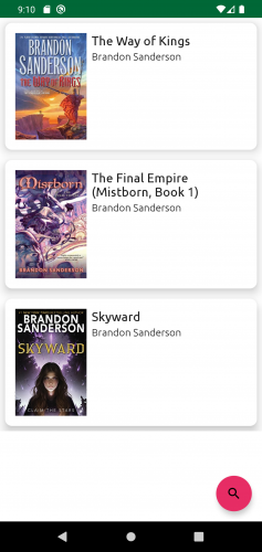
Build and run. You can see your new fonts in the list of book items:
Great job! Now you’re ready to use the other type of CompositionLocals: compositionLocalOf.
Using compositionLocalOf()
Contrary to staticCompositionLocalOf, compositionLocalOf will only invalidate the composables that read its current value. To make use of compositionLocalOf, you need to provide values for a couple of paddings used in the book lists.
Open Theme.kt and add the following code at the top of the file:
data class MyReadingPaddings(
  val small: Dp,
  val medium: Dp
)
This class holds two Dp values for a small and medium padding.
Now, open CompositionLocals.kt and add the following code at the bottom of the file:
val LocalPaddings = compositionLocalOf { MyReadingPaddings(small = 8.dp, medium = 16.dp) }
With this line, you create LocalPaddings as a compositionLocalOf, with the specified default values. Since you already provided default values, you don’t have to add LocalPaddings with the CompositionLocalProvider.
Open Book.kt then replace the content of Card() as follows:
Card(
  modifier = modifier
    .fillMaxWidth()
    // 1.
    .padding(all = LocalPaddings.current.small),
  elevation = 12.dp,
  shape = RoundedCornerShape(size = 11.dp)
) {
  Row(
    modifier = Modifier
      // 2.
      .padding(LocalPaddings.current.medium)
  ) {
    AsyncImage(
      modifier = Modifier
        .width(120.dp)
        // 3.
        .padding(end = LocalPaddings.current.small),
      model = ImageRequest
        .Builder(context)
        .data(book.coverUrl)
        .error(context.getDrawable(R.drawable.error_cover))
        .build(),
      contentScale = ContentScale.Crop,
      contentDescription = book.title
    )
    Column {
      Text(text = book.title, style = MyReadingTheme.typography.H5)
      Spacer(modifier = Modifier.height(4.dp))
      Text(text = book.author, style = MyReadingTheme.typography.subtitle)
      Spacer(modifier = Modifier.height(4.dp))

      if (showAddToList) {
        Button(
          onClick = {
            onAddToList(book)
            Toast.makeText(context, "Added to list", Toast.LENGTH_SHORT).show()
          },
          modifier = Modifier.fillMaxWidth()
        ) {
          Text(text = "Add to List")
        }
      }
    }
  }
}
In this code, you set the:
- Entire padding of the card with a value of
LocalPaddings.current.small. - Entire padding of the row with a value of
LocalPaddings.current.medium. - End padding of the image with a value of
LocalPaddings.current.small.
Build and run. Your screen should look the same, but you didn’t have to set the padding values manually everywhere, nor did you have to pass the values from one composable to the other.
Understanding When to Use CompositionLocal
It’s tempting to use CompositionLocal to pass data to all your composables. However, you need to be aware of some rules that help determine when to use them.
- You can provide a value through
CompositionLocalwhen the value is a UI tree-wide value. As you saw before withnavController, the theme-related values and paddings you implemented in the previous sections can be used by all composables, a subset, and even several composables at once. - You need to provide a good default value, or as you learned, throw an error if you forget to provide a default value.
If your use case doesn’t meet these criteria, you still have several options to pass data to your composables.
Alternatives to CompositionLocal
You can pass parameters explicitly to the composables, but you should only pass the data that each composable needs to ensure your composables remain reusable.
For example, in Book.kt you see the following code:
@Composable
fun BookRow(
  // 1.
  book: Book,
  modifier: Modifier = Modifier,
  // 2.
  showAddToList: Boolean = false,
  onAddToList: (Book) -> Unit = { }
)
This composable receives the following data:
- A
Bookobject. This composable usestitle,authorandcoverIdfrom theBookobject. - And
showAddToList. which determines if the composable needs to show the button to add a book to your list.
At a minimum, the composable needs both of these data points to work and be reusable. In fact, you use this composable in both BookListScreen() and SearchScreen().
Another alternative to CompositionLocal is to use inversion of control — the composable receives a lambda function as a parameter to use when needed.
For example, BookRow() receives the lambda function onAddToList.
You can see in the following code when the composable executes this function:
Button(
  onClick = {
    onAddToList(book)
    Toast.makeText(context, "Added to list", Toast.LENGTH_SHORT).show()
  },
  modifier = Modifier.fillMaxWidth()
) {
  Text(text = "Add to List")
}
The composable calls onAddToList(book) when the user taps the button, but the composable doesn’t know which logic to perform next.
Find the following code in MainActivity.kt:
SearchScreen(
  searchUiState = searchUiState,
  onSearch = { searchViewModel.search(it) },
  onAddToList = { searchViewModel.addToList(it) },
  onBackPressed = {
    searchViewModel.clearResults()
    navController.popBackStack()
  }
)
In onAddToList, you can see the logic that executes when a user taps the button. With this implementation, the BookRow() composable has no idea about the details around how to add the book the list, hence, you can reuse it elsewhere.
Now that you’re aware of the alternatives, you can decide when it’s appropriate to use CompositionLocal.