How to Update Your App for iOS 7
Learn how to update your app for iOS 7, from a richly textured to a minimalistic design. By Matthijs Hollemans.
Tint color
Just for fun, compare the iOS 6 version of Treasure Hunt with the new, cleaned-up iOS 7 version below:

The new version certainly fits in better with iOS 7 aesthetic — but it’s looking a bit bland in comparison with the extravagant textures from iOS 6. Just because iOS 7 has a cleaner, lighter design, doesn’t mean your apps can’t have some personality of their own. Later on you’ll make some extensive changes to the look of the app, but right now you’ll begin by tweaking one of the most basic but most obvious visual aspects of your app: the tint color.
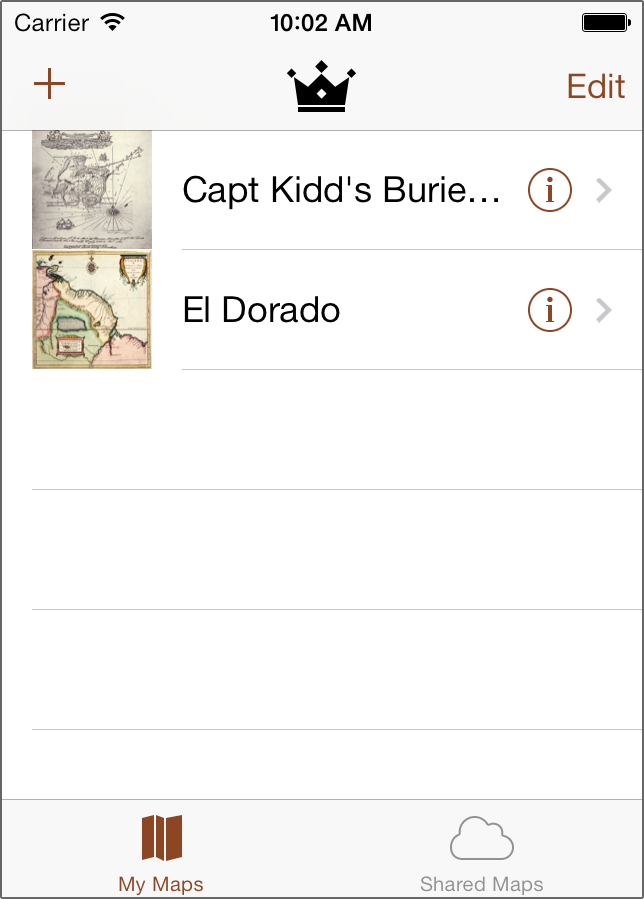
Everything colored blue in the iOS 7 screenshot above is based on the tint color of the app. On iOS 7, the tint color is used to indicate which items can be tapped; for example, the + and Edit buttons in the navigation bar and the disclosure buttons of the table view cells are all selectable. Tinting also highlights active items, such as the icon on the currently selected tab. The tint color is used throughout an app to make the distinction between active and non-active elements. Because the UI is intended to stay out of the user’s way in iOS 7, the use of a single color in your app has until now never been so important.
The tint color is blue by default, but by changing this color you can immediately give your app its own unique style with very little effort. Views inherit the tint color from their parent views, so by setting the tintColor property on the app’s single UIWindow instance you effectively change the tint color for every view. However, in an app that uses a storyboard you can also set the tint color from Interface Builder, which is even easier.
Open MainStoryboard.storyboard and activate the File inspector, which is the first tab in the inspectors pane. Change the Global Tint setting to a light brown color — red 140, green 70, blue 35 — that will harken back to the old theme of wooden treasure chests:

Build and run the app to see your new tint color in action:
This already looks a little less stock than before. You want to make sure that when choosing a tint color it’s not too dark, or else it’ll be difficult to tell apart from inactive UI elements, such as black labels and gray tab bar icons.
Note: Due to a bug in iOS 7, the segmented control on the Map Detail screen does not get the proper tint color. As a workaround, add the following lines to viewDidLoad in MapDetailViewController.m:
Note: Due to a bug in iOS 7, the segmented control on the Map Detail screen does not get the proper tint color. As a workaround, add the following lines to viewDidLoad in MapDetailViewController.m:
self.view.tintColor = [UIColor whiteColor];
self.view.tintColor = [UIColor colorWithRed:140/255.0f green:70/255.0f blue:35/255.0f alpha:1.0f];
self.view.tintColor = [UIColor whiteColor];
self.view.tintColor = [UIColor colorWithRed:140/255.0f green:70/255.0f blue:35/255.0f alpha:1.0f];
Credits: The treasure map images are public domain images taken from Wikipedia.
Where To Go From Here?
You have cleaned up the table view from the My Maps screen, added an asset catalog to hold the app’s images, and set a custom tint color. But there is still a lot more that needs to be done before this app is iOS 7-ready!
If you want to learn more, check out our book iOS 7 by Tutorials, where you’ll also learn how to use Auto Layout to make the layout more flexible, how to inline the date picker, how to implement blur effects (“frosted glass”), and much more — including different strategies for making the app backwards compatible with iOS 6.
In the meantime, if you have any questions or comments, please join our forum discussion below!