UIVisualEffectView Tutorial: Getting Started

In this UIVisualEffectView tutorial, you’ll learn how blurs work on a technical level and how to add native blur and vibrancy effects to your own apps. By Ron Kliffer.

5 (7) · 1 Review

Download materials
Save for later
Share
Update note: Ron Kliffer updated this tutorial for Xcode 12, Swift 5 and iOS 14. Ryan Nystrom wrote the original.

Ever since the design of iOS dramatically changed in iOS 7, blurs have played an important role in app design. When used appropriately, blurs can significantly improve the usability and appearance of your apps.

Apple uses blurs at the system level to great effect. Two notable examples are the Control Center and the new iOS 14 Widget Center. The blurred background used in these preserves the context of an action — Control Center and Widget Center aren’t their own apps, rather they’re panels shown above the active app.

Notification Center uses the blur effect as well, but rather than blurring the entire background, each Notification Center extension or notification has its own blurred background. In addition to looking beautiful, this blur helps each element stand out just the right amount.

iOS examples for using blur

So how do you recreate these types of blurs in your own apps? Use the built-in UIVisualEffectView! In this tutorial, you’ll learn everything you need to know to make your apps stand out using blurs, including:

  • How blurs work
  • Strategies for designing blurs
  • How to use UIVisualEffectView

Read on to get started!

Getting Started

Download the starter project by clicking the Download Materials button at the top or bottom of the tutorial.

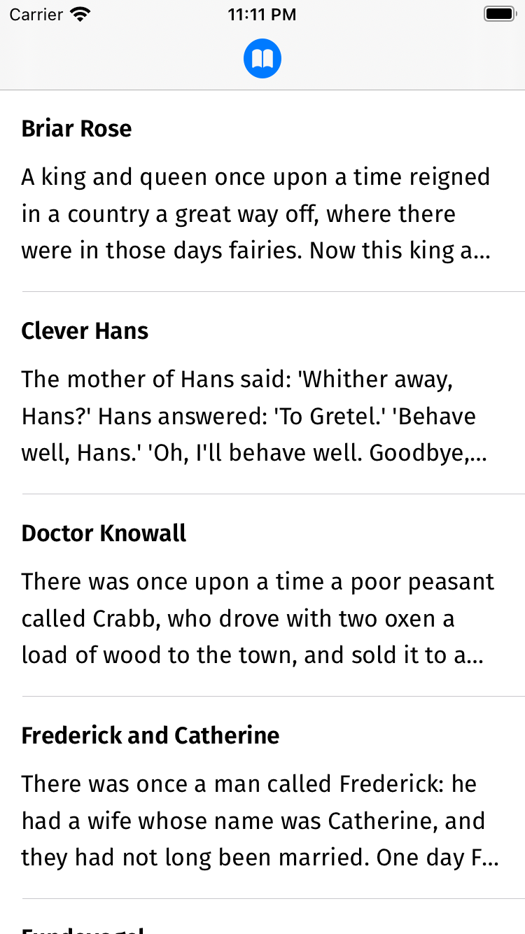
To learn how to use blurring, you’ll add blur effects to a brand-new Brothers Grimm fairy-tale app — aptly named Grimm.

The app displays a library of fairy tales. When a user taps a fairy tale, the app presents the full story. The user can customize the display font, the text alignment and even the color theme.

Open Grimm.xcodeproj in Xcode. Open Main.storyboard and take a look at the view controllers contained in the app as illustrated below:

Sample project Storyboard

You can ignore the first view controller in the image above, as it’s simply the root navigation controller of the app, which has StoryListViewController as it’s root view controller. Taking each numbered view controller in turn, you’ll see the following:

  1. The first view controller is StoryListViewController, which displays a list of all the fairy tales in the database.
  2. Tapping a story in the list segues the user to StoryViewController, which displays the title and text of the selected fairy tale.
  3. OptionsViewController is contained within StoryViewController and displays the available font, text alignment and color options. To display it, tap the top-right settings icon in the navigation bar.

Build and run. You’ll see the initial screen as shown below:

Grimm starter app

Have some fun exploring the app. Select different stories, tap the settings icon and swipe to different fonts and reading modes to understand how the user interface functions.

Now, before moving on, it’s important to understand more about blurs. The next sections will cover how blurs work and discuss design guidelines for them.

How Blurs Work

All blurs start with an image. To achieve a blur, apply a blurring algorithm to each pixel in the image. The resulting image will contain an evenly blurred version of the original image. Blurring algorithms vary in style and complexity; in this section, you’ll learn about a common algorithm known as a Gaussian blur.

Blurring algorithms generally examine each pixel of an image and use the surrounding pixels to calculate a new color value for that pixel. For example, consider the following theoretical image grid:

blur example grid

Each cell in the grid above represents an individual pixel, and each pixel has a value between 1 and 10. Consider the case where the algorithm is evaluating the center pixel. The algorithm averages the values of the surrounding pixels and inserts this averaged value into the center pixel, resulting in the following new pixel grid:

blur example grid averaged

The algorithm repeats this process for every pixel in the original image.

The example above only looks at one pixel in each direction to create the new averaged value. But expanding the blur radius increases the amount of blurring in the image, as depicted in the image below:

3px and 16px Gaussian Blur applied to an image

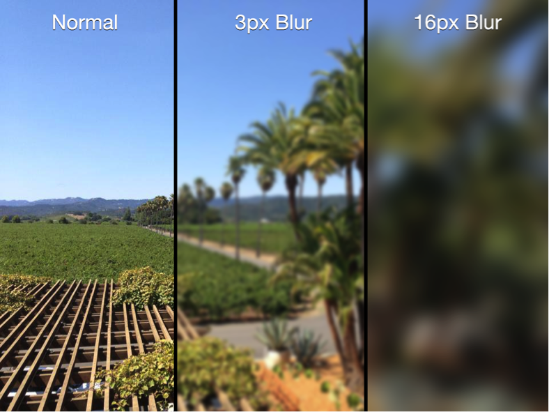
3px and 16px Gaussian blur applied to an image

Note: Generally, the greater the blur radius, the greater the processing power required to process the image. iOS offloads most image processing activities to the GPU to keep the main thread free.

You now know a bit about how blurs work, but what about their design? The next section will cover some guidelines on how and when to use them.

Blur Design Strategies

Humans have a tendency to pay attention to elements that are in focus and ignore those that aren’t. Believe it or not, this is a natural consequence of how our eyes work. Focusing on an object as it moves closer or further away from the eye is known as accommodation. This is what helps you perceive the depth and distance of objects around you.

App designers exploit this fact and blur unimportant items on the screen to direct the user’s attention to the remaining non-blurred elements, as demonstrated in this screenshot of the iOS native Photos app:

Photos usage of UIVisualEffectView

The user interface in the background is recognizable in the image above, but barely. This provides contextual awareness to the user about where they are in the navigational hierarchy. For instance, you’d expect to return to the blurred-out view in the background once you dismiss the menu displayed.

Note: Be careful about the overuse of blurs in your mobile apps. Although blurs can provide great-looking effects, they can be distracting and annoying if used inappropriately or too often.

Follow the standard design approach to use blurs to direct a user’s attention to things that matter and you’ll seldom go wrong. See the Materials section of the iOS Human Interface Guidelines document for more on this subject.

With that out of the way, it’s time to start applying blur effects.

Blur Effects Using UIVisualEffectView

UIKit provides an entire suite of visual effects goodies. UIBlurEffect, a subclass of UIVisualEffect, is particularly relevant, as it provides the nice blurs you see in navigation bars, Notification Center and Control Center — and you can use it in your apps as well.

Adding a UIBlurEffect

In this project, you’ll use blur to make OptionsViewController stand out on top of the story.

Open OptionsViewController.swift and add the following code to the end of viewDidLoad():

// 1
view.backgroundColor = .clear
// 2
let blurEffect = UIBlurEffect(style: .light)
// 3
let blurView = UIVisualEffectView(effect: blurEffect)
// 4
blurView.translatesAutoresizingMaskIntoConstraints = false
view.insertSubview(blurView, at: 0)

Here’s what you’re doing in the code above:

  1. In order for UIVisualEffectView to actually blur the content, its superview must be transparent. To make it transparent, change the background color of view to clear.
  2. Create a UIBlurEffect with a UIBlurEffect.Style.light style. This defines the blur style. There are many different styles; check the documentation to see the full list.
  3. Create a UIVisualEffectView with the blur you just created. This class is a subclass of UIView. Its sole purpose is to define and display complex visual effects.
  4. Disable translating the auto-resizing masks into constraints on blurView — you’ll manually add constraints in a moment — and add it at the bottom of the view stack. If you added blurView on top of the view, it would blur all the controls underneath it instead!

Now you need to ensure blurView is laid out properly with the rest of the view.

Add the following code to the end of viewDidLoad:

NSLayoutConstraint.activate([
  blurView.topAnchor.constraint(equalTo: view.topAnchor),
  blurView.leadingAnchor.constraint(equalTo: view.leadingAnchor),
  blurView.heightAnchor.constraint(equalTo: view.heightAnchor),
  blurView.widthAnchor.constraint(equalTo: view.widthAnchor)
])

These constraints keep the frame of blurView consistent with that of OptionsViewController.

Build and run. Select a fairy tale, tap the settings button and then scroll the text. You’ll see the blur update in real time.

Grimm with blur

Toggle the Reading Mode and notice how the blurred background changes:

Grimm with blur

You now have a dynamic blur effect in your app that was not only easy to implement, but looks great too.

Adding Vibrancy to Your Blur

Blur effects are great‚ but as usual, Apple has taken it to the next level with UIVibrancyEffect. Vibrancy, when used in combination with UIVisualEffectView, adjusts the colors of the content to make it feel more vivid.

The following image shows how vibrancy makes your labels and icons pop off the screen, while at the same time blending with the background itself:

Example of vibrancy effect

The left side of the image above shows a normal label and button, while the right side shows a label and button with vibrancy applied.

Note: You must add UIVibrancyEffect to the contentView of a UIVisualEffectView that has been set up and configured with a UIBlurEffect object. Otherwise, there won’t be any blurs to apply a vibrancy effect to!

Open OptionsViewController.swift and add the following code to the end of viewDidLoad():

// 1
let vibrancyEffect = UIVibrancyEffect(blurEffect: blurEffect)
// 2
let vibrancyView = UIVisualEffectView(effect: vibrancyEffect)
vibrancyView.translatesAutoresizingMaskIntoConstraints = false
// 3
vibrancyView.contentView.addSubview(optionsView)
// 4
blurView.contentView.addSubview(vibrancyView)

In the code above, you:

  1. Create a UIVibrancyEffect that uses the blurEffect you set up earlier. UIVibrancyEffect is another subclass of UIVisualEffect.
  2. Create a UIVisualEffectView to contain the vibrancy effect. This process is exactly the same as creating a blur. Since you’re using Auto Layout, you make sure to disable auto-resizing translations here.
  3. Add optionsView as a subview of your vibrancy view’s contentView. This ensures the vibrancy effect is applied to the view that contains all the controls.
  4. Add the vibrancy view to the blur view’s contentView to complete the effect.

Next you need to set up the Auto Layout constraints for the vibrancy view so that it has the same dimensions as the blur view. Then be sure to center the options view in the vibrancy view.

Add the following constraints at the end of viewDidLoad():

NSLayoutConstraint.activate([
  vibrancyView
    .heightAnchor
    .constraint(equalTo: blurView.contentView.heightAnchor),
  vibrancyView
    .widthAnchor
    .constraint(equalTo: blurView.contentView.widthAnchor),
  vibrancyView
    .centerXAnchor
    .constraint(equalTo: blurView.contentView.centerXAnchor),
  vibrancyView
    .centerYAnchor
    .constraint(equalTo: blurView.contentView.centerYAnchor)
])

NSLayoutConstraint.activate([
  optionsView
    .centerXAnchor
    .constraint(equalTo: vibrancyView.contentView.centerXAnchor),
  optionsView
    .centerYAnchor
    .constraint(equalTo: vibrancyView.contentView.centerYAnchor)
])

Build and run. Navigate to the options view to see your new vibrancy effect in action:

Grimm with blur & vibrancy

Unless you have high-contrast vision, the vibrancy effect makes it difficult to read the labels and controls. What’s going on?

Ah — the content behind the blur view is light and you’re applying a UIBlurEffect.Style.light effect. That’s counterproductive, to be sure.

Change the line near the top of viewDidLoad() that initializes blurEffect:

let blurEffect = UIBlurEffect(style: .dark)

The change from a light style to a dark style adds more contrast between the background and text.

Build and run. You’re now experiencing some true vibrancy:

Grimm with blur & vibrancy

Accessibility

However, when it comes to blurs, there’s one last thing you need to consider: What if the user has blurs disabled?

In the simulator or on your device, open the Settings app and go to Accessibility ▸ Display & Text Size, and enable Reduce Transparency. Go back to the app and open the options view once again.

Grimm with reduced transparency

Well, that’s a bit dark. Going back to what you started out with is a better alternative.

Fortunately, you can check if this accessibility setting is enabled using UIAccessibility.isReduceTransparencyEnabled. If you know that this setting is on, you can change the way your app looks and behaves.

Add the following right before you set the view’s background color in viewDidLoad():

guard !UIAccessibility.isReduceTransparencyEnabled else {
  return
}

This code checks to see if Reduce Transparency is on. If it is, ignore all the code you just wrote and go back to the original layout without any blurring.

Build and run, and you’ll see that the options menu’s background is no longer blurred:

Grimm without blur

Where to Go From Here?

Download the completed version of the project by clicking the Download Materials button at the top or bottom of this tutorial.

You’ve seen how to blur images, as well as how to create real-time blur effects using UIVisualEffectView. You can just as easily add advanced blur effects to your own app! There are many more effects and options you could dive in to, and the best place to continue your exploration would be in Apple’s official UIVisualEffectView documentation.

UIVisualEffectViews update in real time, so you can achieve all sorts of weird and wonderful things with these effects. While it’s tempting to go ahead and blur all the things, remember the tips from earlier in the tutorial regarding using these effects sparingly and only where appropriate. As is often the case, with blur and vibrancy, less is definitely more.

If you have any questions or comments about this UIVisualEffectView tutorial or visual effects in general, please join the forum discussion below!