ConstraintLayout Tutorial for Android: Complex Layouts
In this ConstraintLayout tutorial, you’ll learn how to dynamically position UI elements in relation to other elements on the screen and to animate your views. By Fuad Kamal.
Setting the Horizontal and Vertical Guidelines
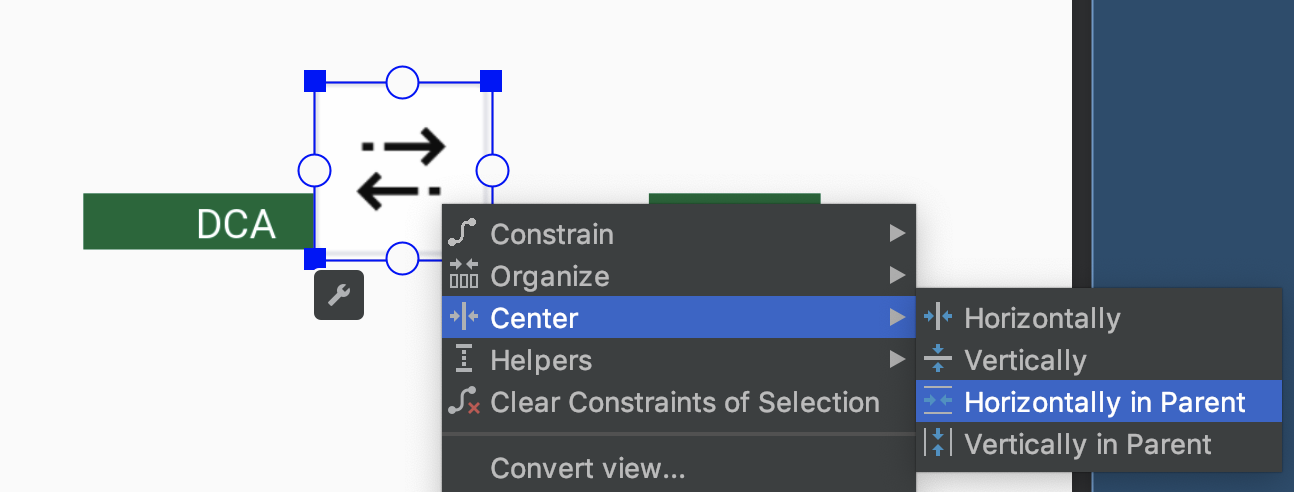
Select the double arrows icon and set the height and width to 60dp. Then right-click on it and choose Center ▸ Horizontally in Parent from the context menu.
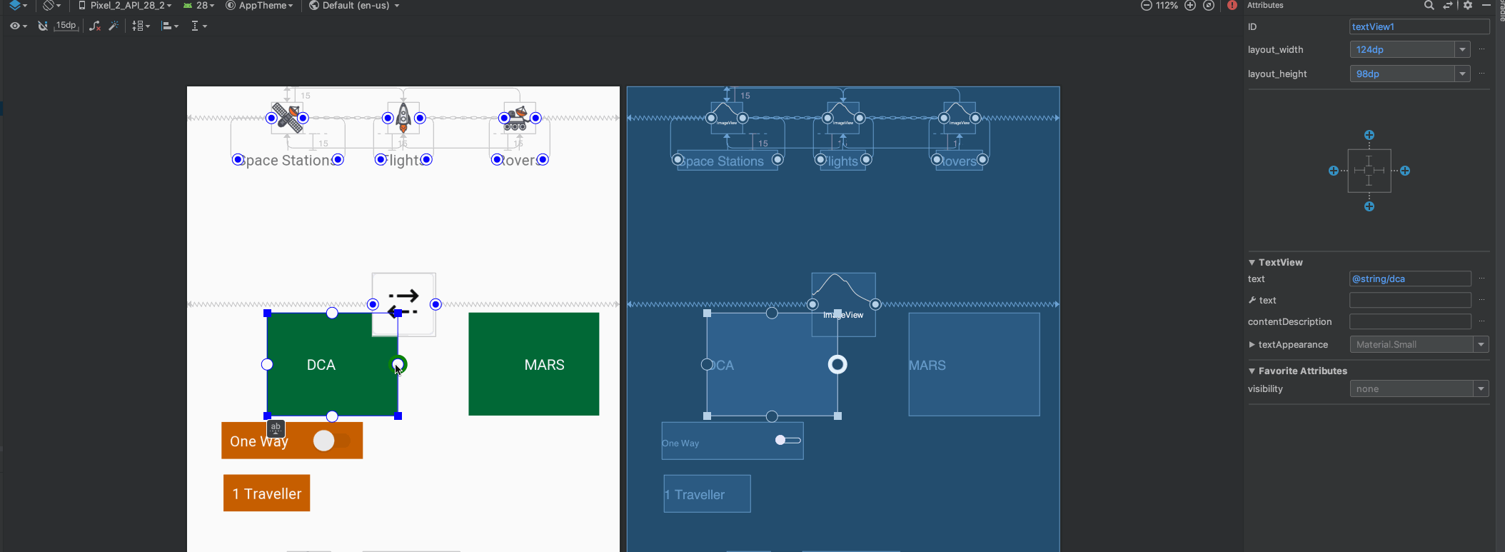
For each of the green TextViews, you’ll now set the width to 124dp and the height to 98dp.
To make the double arrows icon overlap the two green TextViews, you’ll constrain the right side of the left TextView to the right side of the double arrows icon and set the right margin to 40dp.
Similarly, constrain the left side of the right TextView to the left side of the double arrows icon and set the left margin to 40dp.
Lastly, constrain the top and bottom of the TextViews to the top and bottom of doubleArrowsIcon.
Next, click on the Guidelines menu in the toolbar and select Add Horizontal Guideline.

This will add a horizontal dashed line to the layout.
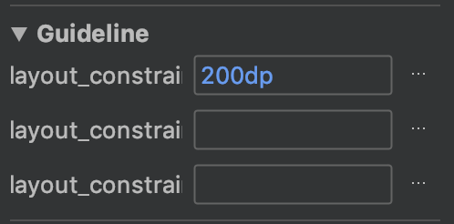
Select the horizontal guideline using the Component Tree in Design view. In the attributes inspector, change the ID of the guideline to guideline1. Note the guideline properties: layout_constraintGuide_begin and layout_constraintGuide_percent.
For the horizontal guideline, set layout_constraintGuide_begin to 200dp.
Finally, add a vertical guideline, ensure that you’ve set its ID to guideline2 and set its layout_constraintGuide_percent to 0.05. This positions guideline2 to 5% of the screen width from the left.
Positioning the Guidelines
You can position guidelines using one of these three attributes:
- layout_constraintGuide_begin: positions a guideline with a specific number of dp from the left (for vertical guides) or the top (for horizontal guides) of its parent.
- layout_constraintGuide_end: positions a guideline a specific number of dp from the right or bottom of its parent.
- layout_constraintGuide_percent: places a guideline at a percentage of the width or height of its parent.
After you constrain elements to the guidelines, you can constrain other elements to them. That way, if the guideline changes position, everything constrained to the guideline, or to the other elements fixed to the guideline, will adjust its position.
Hint: Later, you’ll use this feature to create some cool animations!
Hint: Later, you’ll use this feature to create some cool animations!
Adding Constraints to Guidelines
Now that your guidelines are set up, you can start adding constraints to them.
First, for the double arrows icon:
- Constrain the bottom to the horizontal guideline.
- Set the bottom margin to 40dp.
For the switch:
- Set the width to 160dp.
- Constrain the left side to the vertical guideline.
- Constrain the top to the parent (top of the screen).
- Set the margin at the top to 200dp.
For the label beneath the switch listing the number of travelers:
- Constrain the left side to the vertical guideline.
- Constrain the top to the bottom of the switch.
For the galaxy icon (id is galaxyIcon):
- Set the width and height to 90dp.
- Constrain the top to the horizontal guideline.
- Constrain the bottom to the bottom of the parent (bottom of the screen). This will center it between the horizontal guideline and the bottom of the screen.
- Center it horizontally in the parent view.
For the rocket icon to the left of the galaxy icon (ID is rocketIcon):
- Set the width and height to 30dp.
- Constrain the rocket icon’s top, bottom, and right sides to the top, bottom, and left sides of the galaxy icon, respectively.
Finally, for the DEPART button at the bottom:
- Change the width from
wrap_contenttomatch_parent. - Constrain its bottom to the bottom of the parent (bottom of the screen).
At this point, you should have set all the constraints Android Studio needs to figure out the layout; there should be no errors in the Component Tree. Your layout should now look similar to this:

Build and run the app:

Your layout looks great now! But clicking the button doesn’t do anything… so it’s time to add some pizzaz with a few simple animations!
Circular Position Constraints
In addition to the methods that you’ve already learned, you can also constrain UI elements relative to each other using distance and an angle. This allows you to position them on a circle, where one UI element is at the center of the circle and the other is on the perimeter.

To do this, select the rocket icon next to the galaxy icon and update its code in Code view as follows:
<ImageView
  android:id="@+id/rocketIcon"
  android:layout_width="30dp"
  android:layout_height="30dp"
  android:src="@drawable/rocket_icon"
  app:layout_constraintCircle="@id/galaxyIcon"
  app:layout_constraintCircleAngle="270"
  app:layout_constraintCircleRadius="100dp" />
The first constraint attribute, layout_constraintCircle, indicates the ID of the UI element that will be on the center of the circle. The other two attributes indicate the angle and radius.
Why would you want to use such an unusual type of constraint, you ask? Stay tuned, in a moment you’ll use this technique to animate the rocket to fly around the screen!
Note: You can ignore the error in Component Tree for the view using circular constraint. Android Studio doesn’t seem to recognize circular constraint yet.
Note: You can ignore the error in Component Tree for the view using circular constraint. Android Studio doesn’t seem to recognize circular constraint yet.
Build and run the app. Everything should still appear properly positioned onscreen:

Animating the UI Elements on the Screen
Now that you’re a master of laying things out onscreen using ConstraintLayout, it’s time to add some rocket fuel into the mix and take off to the next level!
In this section, you’ll start with the complex layout you created and add some cool UI animations in just a few steps.
Constraint Sets
Using ConstraintLayouts, you can use Keyframe Animations to animate your views. To do this, you’ll provide a pared-down copy of your layout file, known as a ConstraintSet. A ConstraintSet only needs to contain the constraints, margins and padding of the elements within a given ConstraintLayout.
In your Kotlin code, you can then apply ConstraintSet to your ConstraintLayout to update its layout.
To build an animation, you need to specify a single layout file and a ConstraintSet to act as the starting and ending keyframes. You can also apply transitions to make your animations a bit fancier.