iOS Accessibility in SwiftUI Tutorial Part 3: Adapting
In this accessibility tutorial, you’ll improve the accessibility of a SwiftUI app by making it responsive to some common user accessibility settings. By Audrey Tam.
Using Accessibility Inspector Settings
Click the third tab of the accessibility inspector — the button with the Settings icon.
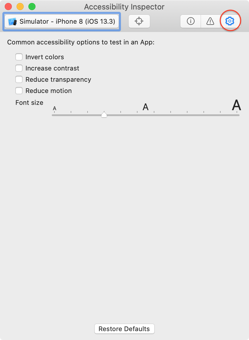
It lists these accessibility options:
-
Invert colors
@Environment(\.accessibilityInvertColors): The Smart Invert accessibility option reverses the colors of the display, except for images, media, and some apps that use dark color styles. Classic Invert reverses all colors. At the time of writing this article, this Accessibility Inspector Settings tool only works on an iOS or macOS device: It inverts all colors, including images (classic invert). The@Environmentvariable actually reports on Smart Invert. To make your app automatically adapt, use standard system color objects likelabelinstead of specific color values likeblue. -
Increase contrast
@Environment(\.colorSchemeContrast): This accessibility option alters color and text styling, and adjusts dynamic type to the user’s preferred text size. If your app detects this option is enabled, it should ensure color contrast ratios are 7:1 or higher. Or consider designing your UI so color contrast ratios are 7:1 or higher for all users. -
Reduce transparency
@Environment(\.accessibilityReduceTransparency): This accessibility option reduces the transparency and blurs on some backgrounds. If your app detects this option is enabled, it should ensure all alpha values are set to 1.0. -
Reduce motion
@Environment(\.accessibilityReduceMotion): This accessibility option slows down, reduces or removes some animations, like the spinning Activity app awards. Your app should run animations only if this option isn’t enabled:
@Environment(\.accessibilityReduceMotion) var reduceMotion
...
  if animated && !reduceMotion { // animate as much as you want }
-
Font size
@Environment(\.sizeCategory): This accessibility option sets the user’s preferred text size in apps that support Dynamic Type. This Accessibility Inspector Settings tool is very useful for checking how all your dynamic type looks at larger sizes. Consider adapting the layout of UI elements so important information is still legible at large font sizes.
Font size is the only Accessibility Inspector Settings tool that works in the simulator for this app. Try it out — move the slider to the fourth size from the right:
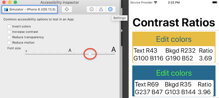
This is the Accessibility Large font size — at this font size, the text is jumbled, making it hard to read. Later in this article, you’ll learn how to fix this problem.
Close Accessibility Inspector.
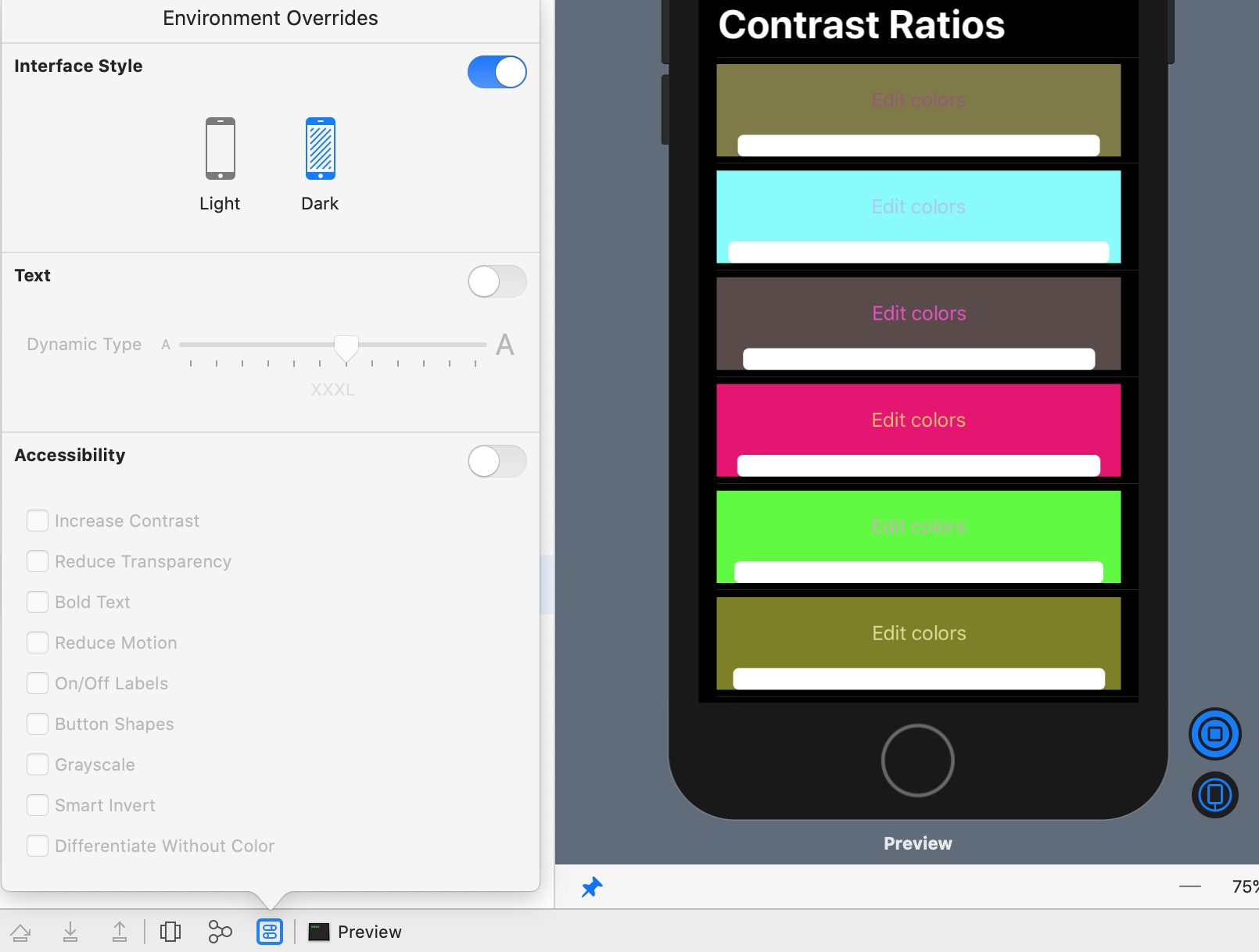
Using Debug Preview Environment Overrides
You can try out even more accessibility options in Xcode’s Debug Preview.
Switch back to the PublicArt project, open ContentView.swift, open its canvas, and refresh its preview (Option-Command-P).
To start Debug Preview, Control-click the Live Preview button, then select Debug Preview:
The first time you start Debug Preview, it takes a while to load. Eventually you’ll see the usual debug toolbar below your code editor:

Click the Environment Overrides button to see what’s available:
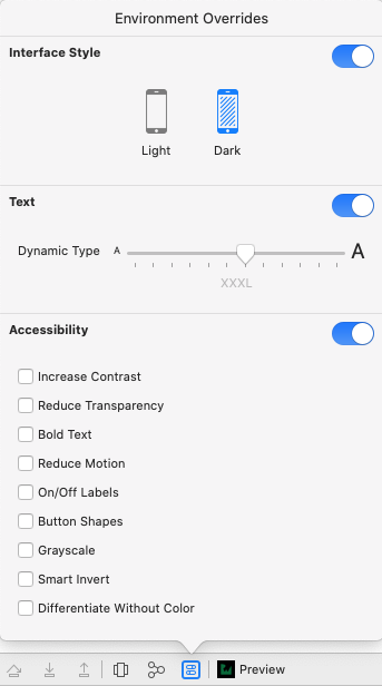
You can very easily see how your UI looks in Dark Mode.
The Text▸Dynamic Type slider is the same as Accessibility Inspector’s Font size slider, but the sizes are labeled, from Extra Small to Accessibility XXXL.
The Accessibility options include those in the Accessibility Inspector Settings tab, but also these:
-
Bold Text
@Environment(\.legibilityWeight): This accessibility option displays all text in boldface characters, so large font text uses even more space. -
On/Off Labels
UIAccessibility.isOnOffSwitchLabelsEnabled: This accessibility option shows 1 or 0 in a toggle that is on or off. If this messes up your custom toggle, consider redesigning it. Or replace it with a standard toggle if this option is enabled.

-
Button Shapes (There’s no
@Environmentvariable orUIAccessibilityproperty.): This accessibility option shows enabled buttons as underlined blue text. If this messes up your custom button, consider redesigning it for all users.

-
Grayscale
UIAccessibility.isGrayscaleEnabled: This accessibility option turns on a color filter that shows only the relative luminance of colors. This Debug Preview option doesn’t work, so you’ll have to check it on a device: Enable Settings▸Accessibility▸Display & Text Size▸Color Filters▸Color Filters▸Grayscale. Consider using higher contrast colors for elements so they’re still distinct in grayscale. contrastchecker.com lets you check how specific foreground and background colors look in grayscale.

-
Smart Invert
@Environment(\.accessibilityInvertColors): The same as Accessibility Inspector▸Settings▸Invert colors. In both Debug Preview and debugging on a device, this actually inverts image colors in PublicArt; the real on-device Settings▸Accessibility▸Display & Text Size▸Smart Invert setting doesn’t. -
Differentiate Without Color
@Environment(\.accessibilityDifferentiateWithoutColor): This accessibility option replaces UI items that rely on color to convey information with alternatives. I couldn’t find any example in an app to check whether this Debug Preview option works. You should always try to use shapes or additional text in addition to color.
There is also @Environment(\.accessibilityEnabled): This is true if VoiceOver, Voice Control or Switch Control is enabled. Check UIAccessibility.isVoiceOverRunning or UIAccessibility.isSwitchControlRunning. There’s no way to check for Voice Control, unless the user has not enabled VoiceOver or Switch Control:
accessibilityEnabled == true && !UIAccessibility.isVoiceOverRunning
  && !UIAccessibility.isSwitchControlRunning
There are many other UIAccessibility properties on this page, listed under Getting Capabilities. Check these values whenever you need them, to ensure you’re getting their current status.
Close the PublicArt project.
Adapting to Dark Mode
Now you get to try out some of these settings. Dark screens are really popular and play an important role in accessibility, so you definitely must ensure your apps look good in Dark Mode and Smart Invert.
You’ll use Debug Preview for these exercises because it has more settings, Smart Invert mostly works and, after its initial startup, it refreshes quickly.
First, see what happens in Dark Mode.
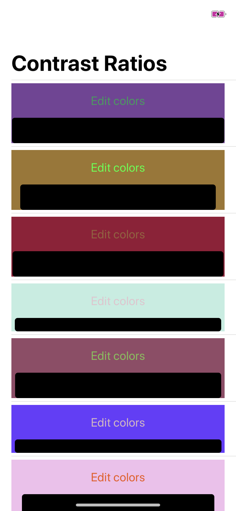
Open ContrastListView.swift in the ContrastPicker project, and run Debug Preview. Then turn on Environment Overrides▸Interface Style▸Dark, and turn off everything else.
The color descriptions disappear! This is because the HStack background color is set to white, the same as the dark mode label color.
Now see what happens in Smart Invert, in Light Mode: Turn off Interface Style to revert to Light Mode, then turn on Environment Overrides▸Accessibility▸Smart Invert:

The color descriptions remain visible, but the actual text and background colors are all inverted.
r, g and b between 0 and 1, the inverse color has values 1-r, 1-g and 1-b.
On a device, if Dark Mode is set to Automatic, enabling Smart Invert also turns on Dark Mode, so the color descriptions disappear and the text and background colors are inverted:
The Dark Mode problem is easy to fix: UIKit provides standard color objects for foreground and background colors of UI elements. The names of these color objects describe their intended use — they’re not specific color values. And standard color objects adapt automatically to Dark Mode, Smart Invert and Increase Contrast.
To ensure your app adapts automatically to both light and dark modes, locate the .background(Color(.white)) modifier of the ListCellView HStack, and replace it with this:
.background(Color(.systemBackground))
You’re setting the HStack background color to the standard color object .systemBackground: This is white for light mode and black for dark mode. The color description Text elements already use .label as their foreground color, so they automatically switch between dark and light colors.
Turn off Smart Invert, and turn on Environment Overrides▸Interface Style▸Dark again to see the HStack background is now black, so the color descriptions are visible:
