iOS Accessibility in SwiftUI Tutorial Part 3: Adapting
In this accessibility tutorial, you’ll improve the accessibility of a SwiftUI app by making it responsive to some common user accessibility settings. By Audrey Tam.
Adapting to Smart Invert
So that’s fixed, but there’s a harder problem to solve for this app: Smart Invert actually changes all the background and text colors, so the RGB values and contrast ratios are all wrong.
It’s a can of worms to display the corrected color values and also keep track of the color sliders while iOS is busy inverting all these values for the display. So it’s best to ask the user to turn off Smart Invert.
First, at the top of ContrastListView, create a local var for this environment variable:
@Environment(\.accessibilityInvertColors) var invertColors
The value of invertColors will stay in sync with the @Environment variable accessibilityInvertColors.
Then add this modifier to the List:
.alert(isPresented: .constant(invertColors)) {
  Alert(
    title: Text("Please Turn Off Smart Invert"),
    message: Text("This app doesn't work with Smart Invert."
      + " Dark mode is OK."))
}
If \.accessibilityInvertColors is true, you display an alert asking the user to turn it off; they can use dark mode instead. When they turn off Smart Invert, invertColors becomes false.
You have to pass a binding as the argument of isPresented, and .constant() is how you create a binding from any value.
Build and run the app in Simulator, then turn on Environment Overrides▸Accessibility▸Smart Invert:
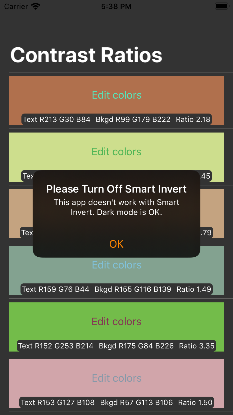
All the colors change to the inverse of the color descriptions, and the alert appears.
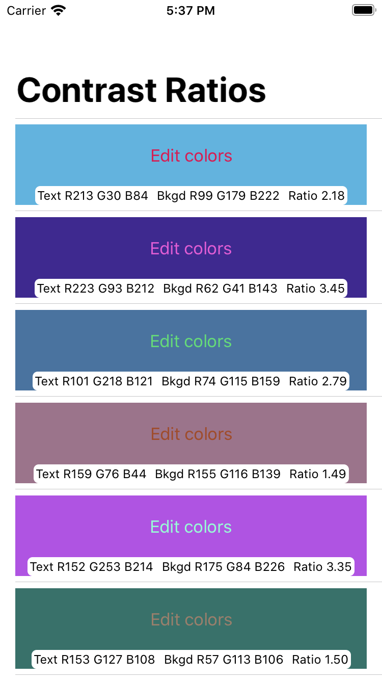
Turn off Smart Invert, and the colors revert to match their RGB values:
Stop the simulator.
Congratulations! You’ve taken care of Dark Mode and Smart Invert. Next, you’ll fix another really common problem.
Adapting to Large Font Sizes
Dynamic Type lets your users set the font size they feel comfortable reading — smaller, to fit more content on the page, or larger, for less than perfect vision or to compensate for low color contrast.
Apple’s Text Size and Weight guidelines recommend that you:
- Use Dynamic Type.
- Test that your app’s design can scale and is legible at all accessibility font sizes.
The first is easy: All SwiftUI text elements support multi-line dynamic type by default. And Apple provides several text styles: the default body, larger styles like title and headline, and smaller styles like caption and footnote.
The second is much less of a chore because both Accessibility Inspector▸Settings and Debug Preview▸Text enable you to quickly and easily check your UI at different font sizes.
Debug Preview lets you turn on Bold Text, as well. And anyway, you’re already using it.
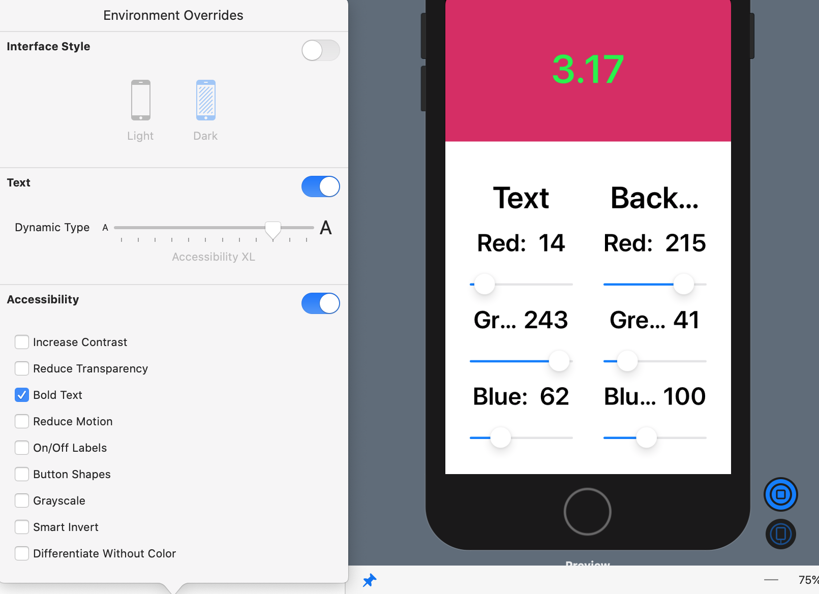
In Debug Preview▸Environment Overrides, turn on Bold Text and Text: Dynamic Type. Move the Dynamic Type slider to Accessibility Large:

It looks pretty awful! At least each Text element is multi-line, so all the text appears, but it’s hard to read. It might look better if you stack the Text elements vertically instead of horizontally?
As it happens, Supporting Files/AdaptingStack.swift contains the relevant code from WWDC 2019 Session 412: Debugging in Xcode 11:
struct AdaptingStack<Content>: View where Content: View {
  init(@ViewBuilder content: @escaping () -> Content) {
    self.content = content
  }

  var content: () -> Content
  @Environment(\.sizeCategory) var sizeCategory

    var body: some View {
      switch sizeCategory {
      case .accessibilityLarge,
           .accessibilityExtraLarge,
           .accessibilityExtraExtraLarge,
           .accessibilityExtraExtraExtraLarge:
        return AnyView(VStack(content: self.content).padding(.top, 10))
      default:
        return AnyView(HStack(alignment: .top, content: self.content))
      }
    }
}
AdaptingStack takes some content and displays it in an HStack, if the user’s preferred text size is smaller than accessibilityLarge, or in a VStack, if the user’s preferred text size is accessibilityLarge or larger.
So all you have to do is replace the HStack in ListCellView with the following AdaptingStack:
AdaptingStack {
  Text("Text \(self.contrast.text.description)")
    .accessibility(label: Text("for Text color "
      + self.contrast.text.accDescription))
  Text("Bkgd \(self.contrast.bkgd.description)")
    .accessibility(label: Text("on Background color "
      + self.contrast.bkgd.accDescription))
  Text("Ratio " + self.contrast.ratio())
}
You’re changing HStack to AdaptingStack, and inserting self. wherever you use a ListCellView property, because AdaptingStack wraps everything in another closure.
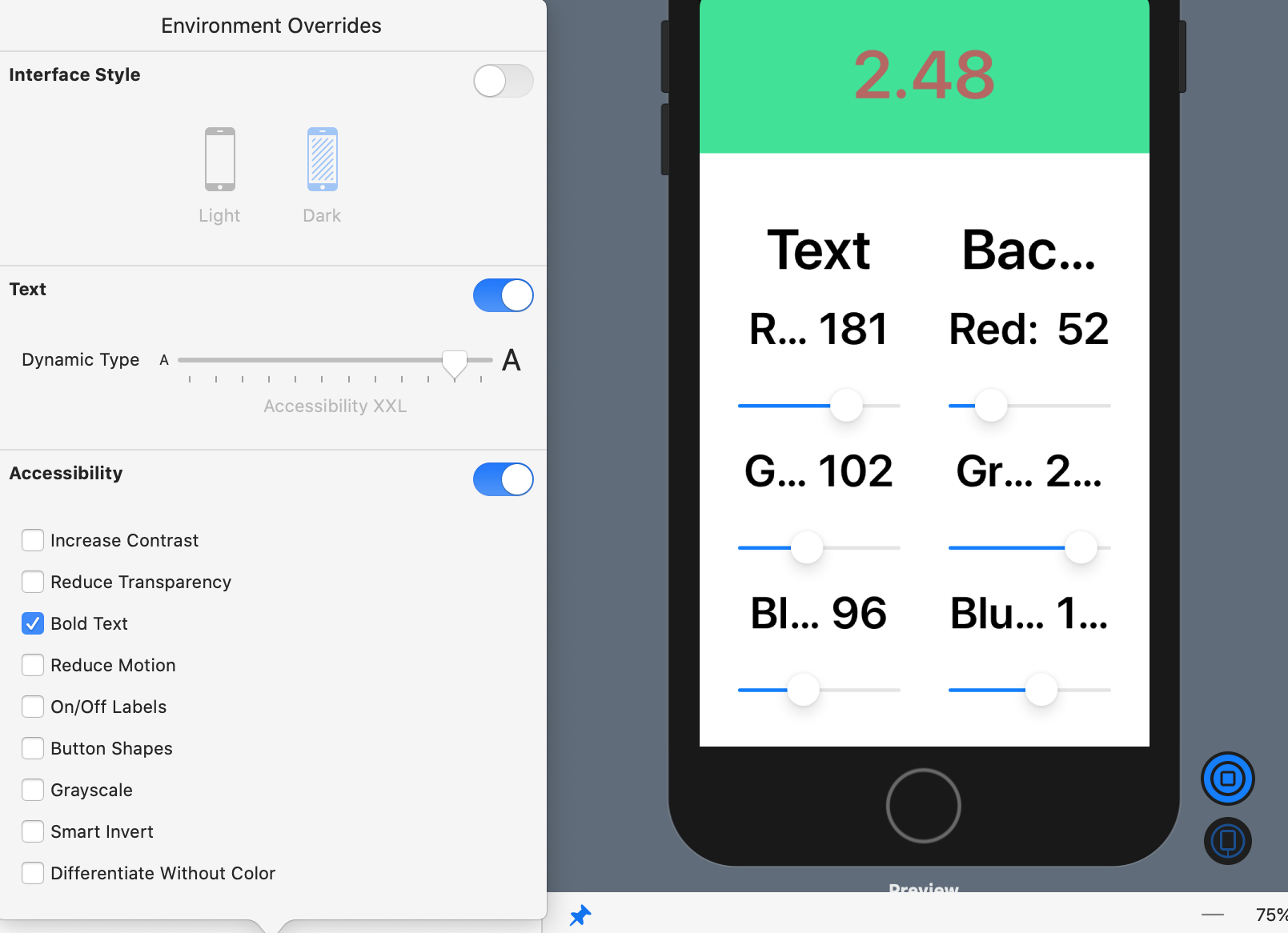
If necessary, refresh the debug preview (Option-Command-P), and set the Dynamic Type size to Accessibility Large. For good measure, check Bold Text, too:

Hey presto! The color description HStack is now a VStack! Set Dynamic Type size to Large, and you’re back to HStack:

This is a great trick to have in your repertoire! Where else can you use it? I’m glad you asked ;].
Tap a list item to edit its colors, then increase Dynamic Type size to Accessibility XL
Uh oh, some truncation is happening in the slider labels. At larger sizes, even the numbers get truncated:

Hint: You’ll need to break up the single Text element into two.
Click Reveal to see the solution.
AdaptingStack to fix this problem.
[spoiler title=”Solution”]
In ColorPicker.swift, down in struct SliderBlock, replace Text(colorString + ": " + colorInt) with this AdaptingStack, attaching the two modifiers to the AdaptingStack :
AdaptingStack {
  Text(self.colorString + ": ")
  Text(self.colorInt)
}
.accessibility(hidden: true)
.font(.caption)
[/spoiler]
Where to Go From Here?
You can download the completed version of the project using the Download Materials button at the top or bottom of this tutorial.
You’ve learned a lot more about SwiftUI accessibility in this article. You’ve added a speech synthesizer to read out text in your app and adapted your app to user accessibility settings like Dark Mode, Smart Invert and larger font sizes.
There’s more you might want to do. These two topics are beyond the scope of this article:
Here are some links for further exploration:
We hope you enjoyed this article, and if you have any questions or comments, please join the forum discussion below!