Yoga Tutorial: Using a Cross-Platform Layout Engine
Learn about Yoga, Facebook’s cross-platform layout engine that helps developers write more layout code in style akin to Flexbox By Christine Abernathy.
Advanced Layout
Your joy of building white, red, and blue boxes has probably worn thin. Time to shake it up a bit. In the following section, you’ll take your newly minted Yoga skills to create a view similar to the following:

Download and explore the starter project. It already includes the YogaKit dependency. The other main classes are:
- ViewController: Displays the main view. You’ll primarily be working in this class.
- ShowTableViewCell: Used to display an episode in the table view.
- Show: Model object for a show.
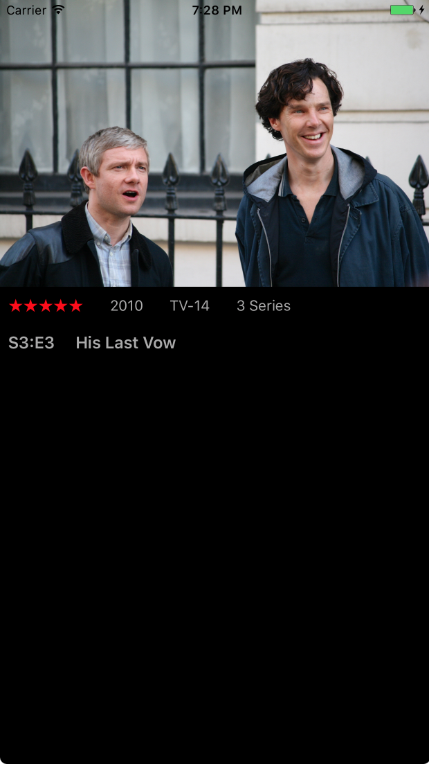
Build and run the app. You should see a black screen.
Here’s a wireframe breakdown of the desired layout to help plan things out:
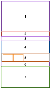
Let’s quickly dissect the layout for each box in the diagram:
- Displays the show’s image.
- Displays summary information for the series with the items laid out in a row.
- Displays title information for the show with the items laid out in a row.
- Displays the show’s description with the items laid out in a column.
- Displays actions that can be taken. The main container is laid out in a row. Each child item is a container with items laid out in a column.
- Displays tabs with items laid out in a row.
- Displays a table view that fills out the remaining space.
As you build each piece of the layout you’ll get a better feel for additional Yoga properties and how to fine tune a layout.
Open ViewController.swift and add the following to viewDidLoad(), just after the shows are loaded from the plist:
let show = shows[showSelectedIndex]
This sets the show to be displayed.
Aspect Ratio
Yoga introduces an aspectRatio property to help lay out a view if an item’s aspect ratio is known. AspectRatio represents the width-to-height ratio.
Add the following code right after contentView is added to its parent:
// 1
let episodeImageView = UIImageView(frame: .zero)
episodeImageView.backgroundColor = .gray
// 2
let image = UIImage(named: show.image)
episodeImageView.image = image
// 3
let imageWidth = image?.size.width ?? 1.0
let imageHeight = image?.size.height ?? 1.0
// 4
episodeImageView.configureLayout { (layout) in
  layout.isEnabled = true
  layout.flexGrow = 1.0
  layout.aspectRatio = imageWidth / imageHeight
}
contentView.addSubview(episodeImageView)
Let’s go through the code step-by-step:
- Creates a
UIImageView - Sets the image based on the selected show
- Teases out the image’s size
- Configures the layout and sets the
aspectRatiobased on the image size
Build and run the app. You should see the image stretch vertically yet respect the image’s aspect ratio:

FlexGrow
Thus far you’ve seen flexGrow applied to one item in a container. You stretched the blue box in a previous example by setting its flexGrow property to 1.
If more than one child sets a flexGrow property, then the child items are first laid out based on the space they need. Each child’s flexGrow is then used to distribute the remaining space.
In the series summary view, you’ll lay out the child items so that the middle section takes up twice as much left over space as the other two sections.
Add the following after episodeImageView is added to its parent:
let summaryView = UIView(frame: .zero)
summaryView.configureLayout { (layout) in
  layout.isEnabled = true
  layout.flexDirection = .row
  layout.padding = self.padding
}
This code specifies that the child items will be laid out in a row and include padding.
Add the following just after the previous code:
let summaryPopularityLabel = UILabel(frame: .zero)
summaryPopularityLabel.text = String(repeating: "★", count: showPopularity)
summaryPopularityLabel.textColor = .red
summaryPopularityLabel.configureLayout { (layout) in
  layout.isEnabled = true
  layout.flexGrow = 1.0
}
summaryView.addSubview(summaryPopularityLabel)

contentView.addSubview(summaryView)
This adds a popularity label and sets its flexGrow property to 1.
Build and run the app to view the popularity info:

Add the following code just above the line that adds summaryView to its parent:
let summaryInfoView = UIView(frame: .zero)
summaryInfoView.configureLayout { (layout) in
  layout.isEnabled = true
  layout.flexGrow = 2.0
  layout.flexDirection = .row
  layout.justifyContent = .spaceBetween
}
This sets up a new container view for the summary label child items. Note that the flexGrow property is set to 2. Therefore, summaryInfoView will take up twice as much remaining space as summaryPopularityLabel.
Now add the following code right after the previous block:
for text in [showYear, showRating, showLength] {
  let summaryInfoLabel = UILabel(frame: .zero)
  summaryInfoLabel.text = text
  summaryInfoLabel.font = UIFont.systemFont(ofSize: 14.0)
  summaryInfoLabel.textColor = .lightGray
  summaryInfoLabel.configureLayout { (layout) in
    layout.isEnabled = true
  }
  summaryInfoView.addSubview(summaryInfoLabel)
}
summaryView.addSubview(summaryInfoView)
This loops through the summary labels to display for a show. Each label is a child item to the summaryInfoView container. That container’s layout specifies that the labels be placed at the beginning, middle, and end.
Build and run the app to see the show’s labels:

To tweak the layout to get the spacing just right, you’ll add one more item to summaryView. Add the following code next:
let summaryInfoSpacerView =
  UIView(frame: CGRect(x: 0, y: 0, width: 100, height: 1))
summaryInfoSpacerView.configureLayout { (layout) in
  layout.isEnabled = true
  layout.flexGrow = 1.0
}
summaryView.addSubview(summaryInfoSpacerView)
This serves as a spacer with flexGrow set to 1. summaryView has 3 child items. The first and third child items will take 25% of any remaining container space while the second item will take 50% of the available space.
Build and run the app to see the properly tweaked layout:

More Examples
Continue building the layout to see more spacing and positioning examples.
Add the following just after the summaryView code:
let titleView = UIView(frame: .zero)
titleView.configureLayout { (layout) in
  layout.isEnabled = true
  layout.flexDirection = .row
  layout.padding = self.padding
}

let titleEpisodeLabel =
  showLabelFor(text: selectedShowSeriesLabel,
               font: UIFont.boldSystemFont(ofSize: 16.0))
titleView.addSubview(titleEpisodeLabel)

let titleFullLabel = UILabel(frame: .zero)
titleFullLabel.text = show.title
titleFullLabel.font = UIFont.boldSystemFont(ofSize: 16.0)
titleFullLabel.textColor = .lightGray
titleFullLabel.configureLayout { (layout) in
  layout.isEnabled = true
  layout.marginLeft = 20.0
  layout.marginBottom = 5.0
}
titleView.addSubview(titleFullLabel)
contentView.addSubview(titleView)
The code sets up titleView as a container with two items for the show’s title.
Build and run the app to see the title:
Add the following code next:
let descriptionView = UIView(frame: .zero)
descriptionView.configureLayout { (layout) in
  layout.isEnabled = true
  layout.paddingHorizontal = self.paddingHorizontal
}

let descriptionLabel = UILabel(frame: .zero)
descriptionLabel.font = UIFont.systemFont(ofSize: 14.0)
descriptionLabel.numberOfLines = 3
descriptionLabel.textColor = .lightGray
descriptionLabel.text = show.detail
descriptionLabel.configureLayout { (layout) in
  layout.isEnabled = true
  layout.marginBottom = 5.0
}
descriptionView.addSubview(descriptionLabel)
This creates a container view with horizontal padding and adds a child item for the show’s detail.
Now, add the following code:
let castText = "Cast: \(showCast)";
let castLabel = showLabelFor(text: castText,
                             font: UIFont.boldSystemFont(ofSize: 14.0))
descriptionView.addSubview(castLabel)

let creatorText = "Creators: \(showCreators)"
let creatorLabel = showLabelFor(text: creatorText,
                                font: UIFont.boldSystemFont(ofSize: 14.0))
descriptionView.addSubview(creatorLabel)

contentView.addSubview(descriptionView)
This adds two items to descriptionView for more show details.
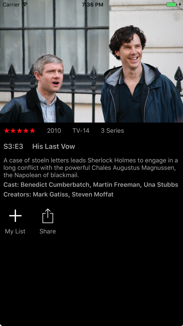
Build and run the app to see the complete description:

Next, you’ll add the show’s action views.
Add a private helper method to the ViewController extension:
func showActionViewFor(imageName: String, text: String) -> UIView {
  let actionView = UIView(frame: .zero)
  actionView.configureLayout { (layout) in
    layout.isEnabled = true
    layout.alignItems = .center
    layout.marginRight = 20.0
  }
  let actionButton = UIButton(type: .custom)
  actionButton.setImage(UIImage(named: imageName), for: .normal)
  actionButton.configureLayout{ (layout) in
    layout.isEnabled = true
    layout.padding = 10.0
  }
  actionView.addSubview(actionButton)
  let actionLabel = showLabelFor(text: text)
  actionView.addSubview(actionLabel)
  return actionView
}
This sets up a container view with an image and label that are center-aligned horizontally.
Now, add the following after the descriptionView code in viewDidLoad():
let actionsView = UIView(frame: .zero)
actionsView.configureLayout { (layout) in
  layout.isEnabled = true
  layout.flexDirection = .row
  layout.padding = self.padding
}

let addActionView =
  showActionViewFor(imageName: "add", text: "My List")
actionsView.addSubview(addActionView)

let shareActionView =
  showActionViewFor(imageName: "share", text: "Share")
actionsView.addSubview(shareActionView)

contentView.addSubview(actionsView)
This creates a container view with two items created using showActionViewFor(imageName:text).
Build and run the app to view the actions.
Time to lay out some tabs.
Add a new method to the ViewController extension:
func showTabBarFor(text: String, selected: Bool) -> UIView {
  // 1
  let tabView = UIView(frame: .zero)
  tabView.configureLayout { (layout) in
    layout.isEnabled = true
    layout.alignItems = .center
    layout.marginRight = 20.0
  }
  // 2
  let tabLabelFont = selected ?
    UIFont.boldSystemFont(ofSize: 14.0) :
    UIFont.systemFont(ofSize: 14.0)
  let fontSize: CGSize = text.size(attributes: [NSFontAttributeName: tabLabelFont])
  // 3
  let tabSelectionView =
    UIView(frame: CGRect(x: 0, y: 0, width: fontSize.width, height: 3))
  if selected {
    tabSelectionView.backgroundColor = .red
  }
  tabSelectionView.configureLayout { (layout) in
    layout.isEnabled = true
    layout.marginBottom = 5.0
  }
  tabView.addSubview(tabSelectionView)
  // 4
  let tabLabel = showLabelFor(text: text, font: tabLabelFont)
  tabView.addSubview(tabLabel)

  return tabView
}
Going through the code step-by-step:
- Creates a container with center-aligned horizontal items.
- Calculates the desired font info based on if the tab is selected or not.
- Creates a view to indicate that a tab is selected<.>
- Creates a label representing the tab title.
Add the following code after actionsView has been added to contentView (in viewDidLoad_:
let tabsView = UIView(frame: .zero)
tabsView.configureLayout { (layout) in
  layout.isEnabled = true
  layout.flexDirection = .row
  layout.padding = self.padding
}

let episodesTabView = showTabBarFor(text: "EPISODES", selected: true)
tabsView.addSubview(episodesTabView)
let moreTabView = showTabBarFor(text: "MORE LIKE THIS", selected: false)
tabsView.addSubview(moreTabView)

contentView.addSubview(tabsView)
This sets up the tab container view and adds the tab items to the container.
Build and run the app to see your new tabs:

The tab selection is non-functional in this sample app. Most of the hooks are in place if you’re interested in adding it later.
You’re almost done. You just have to add the table view to the end.
Add following code after tabView has been added to contentView:
let showsTableView = UITableView()
showsTableView.delegate = self
showsTableView.dataSource = self
showsTableView.backgroundColor = backgroundColor
showsTableView.register(ShowTableViewCell.self,
                        forCellReuseIdentifier: showCellIdentifier)
showsTableView.configureLayout{ (layout) in
  layout.isEnabled = true
  layout.flexGrow = 1.0
}
contentView.addSubview(showsTableView)
This code creates and configures a table view. The layout configuration sets the flexGrow property to 1, allowing the table view to expand to fill out any remaining space.
Build and run the app. You should see a list of episodes included in the view: