Yoga Tutorial: Using a Cross-Platform Layout Engine
Learn about Yoga, Facebook’s cross-platform layout engine that helps developers write more layout code in style akin to Flexbox By Christine Abernathy.

Yoga is a cross-platform layout engine based on Flexbox that makes working with layouts easy. Instead of using Auto Layout for iOS or using Cascading Style Sheets (CSS) on the web, you can use Yoga as a common layout system.
Initially launched as css-layout, an open source library from Facebook in 2014, it was revamped and rebranded as Yoga in 2016. Yoga supports multiple platforms including Java, C#, C, and Swift.
Library developers can incorporate Yoga into their layout systems, as Facebook has done for two of their open source projects: React Native and Litho. However, Yoga also exposes a framework that iOS developers can directly use for laying out views.
In this tutorial, you’ll work through core Yoga concepts then practice and expand them in building the FlexAndChill app.
Even though you’ll be using the Yoga layout engine, it will be helpful for you to be familiar with Auto Layout before reading this tutorial. You’ll also want to have a working knowledge of CocoaPods to include Yoga in your project.
Unpacking Flexbox
Flexbox, also referred to as CSS Flexible Box, was introduced to handle complex layouts on the web. One key feature is the efficient layout of content in a given direction and the “flexing” of its size to fit a certain space.
Flexbox consists of flex containers, each having one or more flex items:
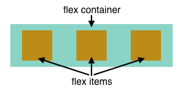
Flexbox defines how flex items are laid out inside of a flex container. Content outside of the flex container and inside of a flex item are rendered as usual.
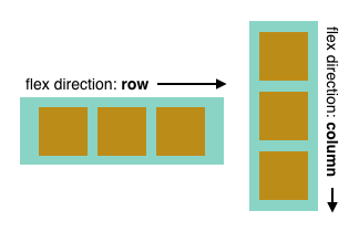
Flex items are laid out in a single direction inside of a container (although they can be optionally wrapped). This sets the main axis for the items. The opposite direction is known as the cross axis.
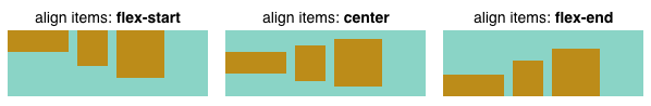
Flexbox allows you to specify how items are positioned and spaced on the main axis and the cross axis. justify-content specifies the alignment of items along the container’s main axis. The example below shows item placements when the container’s flex direction is row:

-
flex-start: Items are positioned at the beginning of the container. -
flex-end: Items are positioned at the end of the container. -
center: Items are positioned in the middle of the container. -
space-between: Items are evenly spaced with the first item placed at the beginning and the last item placed at the end of the container. -
space-around: Items are evenly spaced with the equal spacing around them.
align-items specifies the alignment of items along the container’s cross axis. The example shows item placements when the container’s flex direction is row which means the cross axis runs vertically:
The items are vertically aligned at the beginning, center, or end of the container.
These initial Flexbox properties should give you a feel for how Flexbox works. There are many more you can work with. Some control how an item stretches or shrinks relative to the available container space. Others can set the padding, margin, or even size.
Flexbox Examples
A perfect place to try out Flexbox concepts is jsFiddle, an online playground for JavaScript, HTML and CSS.
Go to this starter JSFiddle and take a look. You should see four panes:
The code in the three editors drive the output you see in the lower right pane. The starter example displays a white box.
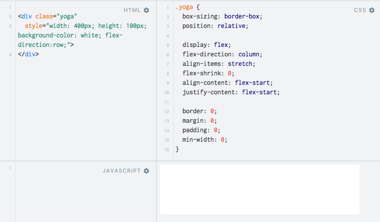
Note the yoga class selector defined in the CSS editor. These represent the CSS defaults that Yoga implements. Some of the values differ from the Flexbox w3 specification defaults. For example, Yoga defaults to a column flex direction and items are positioned at the start of the container. Any HTML elements that you style via class="yoga" will start off in “Yoga” mode.
Check out the HTML source:
<div class="yoga"
  style="width: 400px; height: 100px; background-color: white; flex-direction:row;">
</div>
The div‘s basic style is yoga. Additional style properties set the size, background, and overrides the default flex direction so that items will flow in a row.
In the HTML editor, add the following code just above the closing div tag:
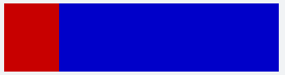
<div class="yoga" style="background-color: #cc0000; width: 80px;"></div>
This adds a yoga styled, 80-pixel wide, red box to the div container.
Tap Run in the top menu. You should see the following output:

Add the following child element to the root div, right after the red box’s div:
<div class="yoga" style="background-color: #0000cc; width: 80px;"></div>
This adds an 80-pixel wide blue box.
Tap Run. The updated output shows the blue box stacked to the right of the red box:

Replace the blue box’s div code with the following:
<div class="yoga" style="background-color: #0000cc; width: 80px; flex-grow: 1;"></div>
The additional flex-grow property allows the box to expand and fill any available space.
Tap Run to see the updated output with the blue box stretched out:
Replace the entire HTML source with the following:
<div class="yoga"
  style="width: 400px; height: 100px; background-color: white; flex-direction:row; padding: 10px;">
  <div class="yoga" style="background-color: #cc0000; width: 80px; margin-right: 10px;"></div>
  <div class="yoga" style="background-color: #0000cc; width: 80px; flex-grow: 1; height: 25px; align-self: center;"></div>
</div>
This introduces padding to the child items, adds a right margin to the red box, sets the height of the blue box, and aligns the blue box to the center of the container.
Tap Run to view the resulting output:

You can view the final jsFiddle here. Feel free to play around with other layout properties and values.
Yoga vs. Flexbox
Even though Yoga is based on Flexbox, there are some differences.
Yoga doesn’t implement all of CSS Flexbox. It skips non-layout properties such as setting the color. Yoga has modified some Flexbox properties to provide better Right-to-Left support. Lastly, Yoga has added a new AspectRatio property to handle a common need when laying out certain elements such as images.
Introducing YogaKit
While you may want to stay in wonderful world wide web-land, this is a Swift tutorial. Fear not, the Yoga API will keep you basking in the afterglow of Flexbox familiarity. You’ll be able to apply your Flexbox learnings to your Swift app layout.
Yoga is written in C, primarily to optimize performance and for easy integration with other platforms. To develop iOS apps, you’ll be working with YogaKit, which is a wrapper around the C implementation.
Recall that in the Flexbox web examples, layout was configured via style attributes. With YogaKit, layout configuration is done through a YGLayout object. YGLayout includes properties for flex direction, justify content, align items, padding, and margin.
YogaKit exposes YGLayout as a category on UIView. The category adds a configureLayout(block:) method to UIView. The block closure takes in a YGLayout parameter and uses that info to configure the view’s layout properties.
You build up your layout by configuring each participating view with the desired Yoga properties. Once done, you call applyLayout(preservingOrigin:) on the root view’s YGLayout. This calculates and applies the layout to the root view and subviews.