Platform-Aware Widgets in Flutter
Learn how to use both Android and iOS widgets so your app looks like it should on the platform you are running on. By Kevin D Moore.
Building a PlatformScaffold
Normally, you’ll only see Scaffold in your main.dart file. Scaffold is a Material Design widget; if you command-click into the Scaffold.dart file, you’ll see that it’s part of the Material package.
However, iOS uses the CupertinoPageScaffold widget to provide an experience more tailored towards iOS. So next, you’ll change Scaffold to use PlatformScaffold, which will allow you to specify both Android and iOS components.
Note that an app should have only one app widget, but it can have different scaffolds for each page. A Scaffold can contain an app bar, a bottom navigation bar and a body.
Now, replace Scaffold with PlatformScaffold and you’ll notice a red line indicating an error. That’s because PlatformScaffold doesn’t use AppBar, it uses a PlatformAppBar.
Android uses MaterialScaffoldData to customize the Scaffold, while iOS uses CupertinoPageScaffoldData. For Android, this is where you’d set the Drawer and the Floating Action button.
Add a Floating Action button for Android after the appBar:
      android: (_) => MaterialScaffoldData(
          floatingActionButton: FloatingActionButton(
        onPressed: () {
          Navigator.push(
            context,
            platformPageRoute(builder: (BuildContext context) {
              return Screen4();
            }, context: context),
          );
        },
        tooltip: 'Screen 4',
        child: Icon(Icons.add),
      )),
This will import Screen4 and add a floating action button just for Android that will launch Screen4 when a user presses that button. You’ll do something different for iOS a bit later.
Notice platformPageRoute, a platform method that will use a MaterialPageRoute for Android and a CupertinoPageRoute on iOS. These routes provide platform transitions and help to make your app feel more native to each platform.
Working With PlatformAppBar
It’s now time to get rid of the error that shows for AppBar. Start by changing AppBar to PlatformAppBar. The AppBar is used for both the Toolbar on Android and the Navigation Bar on iOS. It includes the title, a leading widget at the left side of the toolbar, and a trailing widget including menus and so on.
Android uses MaterialAppBarData and iOS uses CupertinoNavigationBarData. Remember that Floating Action buttons would look out of place on iOS, so you’ll use a button in the navigation bar instead, to more closely mimic typical iOS designs.
Here’s how you’ll add this iOS-specific code. Add the following inside of PlatformAppBar, after the title:
       ios: (_) => CupertinoNavigationBarData(
          transitionBetweenRoutes: false,
          trailing: PlatformButton(
            padding: EdgeInsets.all(4.0),
            child: Icon(
              Icons.add,
              color: Colors.white,
            ),
            onPressed: () {
              Navigator.push(
                context,
                platformPageRoute(builder: (BuildContext context) {
                  return Screen4();
                }, context: context),
              );
            },
          ),
        ),
This will add a “+” button in the top-right of the navigation bar that will launch Screen4, just like the Floating Action button does on Android.
Notice that you’re using PlatformButton, which will render a flat text button on iOS and an elevated button on Android.
Implementing Navigation Bars With PlatformNavBar
There’s still another error that you’ll need to fix. Change BottomNavigationBar to PlatformNavBar. Under the hood, PlatformNavBar will use BottomAppBar if the app is running on an Android device or CupertinoTabBar if the app’s running on an iOS device, instead.
Furthermore, you can use MaterialNavBarData to further customize the Android style of the navigation bar and CupertinoTabBarData to do the same for iOS.
PlatformNavBar uses a different name for the “item selected” function, so go ahead and change onTap to itemChanged. Last but not least, change the bottomNavigationBar key to bottomNavBar to get things compiling again.
Build and run the app on an iOS simulator if you have a Mac. Notice the “+” navigation bar item on the top-right.
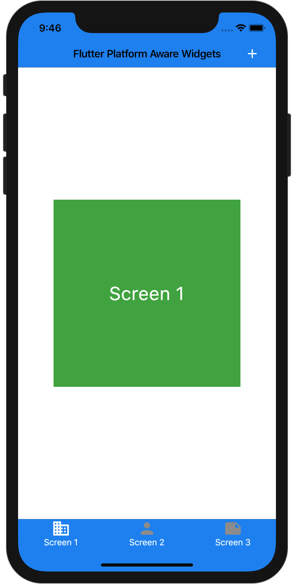
The app bar title is now black, which doesn’t look so great; to fix this, you’ll want to change the title style to use white. Replace the title in PlatformAppBar with:
title: Text(widget.title, style: toolbarTextStyle,),
…and save to see the change. Note that you defined toolbarTextStyle at the top of the page.
Trying Out Other Platform Widgets
Now that you’ve converted the Material Widgets, try out some of the other widgets at your disposal. To start, you’re going to change Screen1 to show off some of the available widgets.
Open up screen1.dart. The first thing you want to do is to convert the widget from a stateless widget to a stateful widget. Select Screen1 then press option(alt)-enter and choose “Convert to StatefulWidget”. Now, add the following variables to _Screen1State:
double _currentValue = 0.0;
bool _currentSwitchValue = true;
These variables will hold the state for some of your widgets.
Creating a Platform-Agnostic Slider
Now, replace Center with the following:
Column(
    children: <Widget>[
      Row(
        children: <Widget>[
          Expanded(
            flex: 1,
            child: Padding(
              padding: const EdgeInsets.all(8.0),
              child: PlatformSlider(
              min: 0.0,
              max: 100.0,
              value: _currentValue,
              onChanged: (value) {
                  setState(() {
                    _currentValue = value;
                  });
                },
              ),
            ),
          ),
        ],
      ),
]);
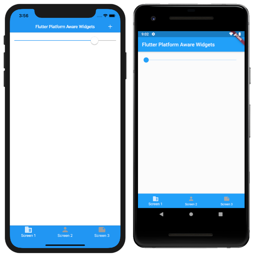
Here, you’re creating a new Column, which itself contains a PlatformSlider, a platform-agnostic version of Slider. You wrap that PlatformSlider in a few widgets to give it some padding and make sure it expands to fill the width of the screen.
Import PlatformSlider. Since you have changed your widget from a stateless widget to a stateful widget, you will need to rebuild the app. Press on the green icon:
Your screen should look like this:
Since you added onChanged and updated its value with setState, you can drag the slider around. If you hadn’t set this, you wouldn’t be able to drag the slider around since you wouldn’t save the position of the slider.
Trying Out a Switch
Now, see what happens when you use a switch. After Row, add the following:
Padding(
  padding: const EdgeInsets.all(8.0),
  child: PlatformSwitch(
    value: _currentSwitchValue,
    onChanged: (value) {
      setState(() {
        _currentSwitchValue = value;
      });
    },
  ),
),
Save the file and you should see a switch. You can see that you set the value to _currentSwitchValue and set it when it changes.
Adding Text Fields
Next, you’ll add a TextField after Padding, which you just added:
Padding(
  padding: const EdgeInsets.all(8.0),
  child: PlatformTextField(
    keyboardType: TextInputType.text,
    android: (_) => MaterialTextFieldData(
      decoration: InputDecoration(labelText: 'Text Field'),
    ),
    ios: (_) => CupertinoTextFieldData(
      placeholder: 'Text Field',
    ),
  ),
),
Here, you’re setting the field type to text, but you can set it to be numeric as well. Android and iOS handle hints a bit differently, so you can see how to do it for each platform.
Last but not least, add a new button below Padding, which you just added:
Padding(
    padding: const EdgeInsets.all(8.0),
    child: PlatformButton(
      onPressed: () {},
      child: Text('Button'),
      android: (_) => MaterialRaisedButtonData(),
      ios: (_) => CupertinoButtonData(),
)),
This is almost like a regular button except for the Android- and iOS-specific classes that you use to customize the button. Both of these have parameters for color and other platform-specific fields.
Your screen should now look like: