UX Design Patterns for Mobile Apps: Which and Why
Solutions for recurring problems in UX often start with tried and tested UX design patterns. Find out which ones to use and why to use them. By Luis Abreu.
Sign up/Sign in
With a free Kodeco account you can download source code, track your progress, bookmark, personalise your learner profile and more!
Create accountAlready a member of Kodeco? Sign in
Sign up/Sign in
With a free Kodeco account you can download source code, track your progress, bookmark, personalise your learner profile and more!
Create accountAlready a member of Kodeco? Sign in
Contents
UX Design Patterns for Mobile Apps: Which and Why
30 mins
Tips
- Accelerators should not be the only way to access a feature or content in your app.
- Use analytics and talk to customers to determine what content and features should be made more accessible through accelerators
- Educate your users, as accelerators are usually invisible to your users. Show them where the accelerators are, how they work, and what users get out of them.
- Consider all available triggers for your accelerators:
- Tap
- Double-tap
- Long-press
- 3D Touch (Peek & Pop, Quick Actions)
- Swipe Navigation (swiping between screens, dismiss by swiping upwards)
- Swipe Actions (swiping on list items)
- Look for common accelerators on Android and iOS. Users are more likely to know them and expect them to work on your app as well. For instance, swipe actions are now part of many iOS and Android apps. Apps like Mail and Gmail let users swipe left on an email to reveal archive, toggle unread, or other common actions.
- Use long-press only when 3D Touch isn’t available, such as on Android or older iOS devices. Long-press adds a 1-second delay and is more likely to be triggered accidentally compared to 3D Touch.
- When using an accelerator, people aren’t looking for the full content or all possible actions. Pick a goal such as searching for a specific venue on a map so you can get directions to it, and instead of showing all photos/reviews/full address, show only one photo, overall rating, and the distance. Narrow down the possible actions to getting directions, calling, sharing, viewing the website or seeing full details.
- Tap
- Double-tap
- Long-press
- 3D Touch (Peek & Pop, Quick Actions)
- Swipe Navigation (swiping between screens, dismiss by swiping upwards)
- Swipe Actions (swiping on list items)
One-Handed Usage
One-handed usage makes your app easier to use on larger screens as well as on regular-sized devices where you only have one hand available. To allow for one-handed usage, navigation and primary actions must be possible without repositioning the holding hand or use a second one.
In the video above, Apple Music is used as an example of an app where playback, browsing, and functions like Add to Queue can be performed without reaching beyond the bottom area of the screen. Notice how Edit (library shortcuts), User Account, Add (to library) and other secondary, less-used actions are nearer the top of the screen and thus can be put out of easy reach.
Android and iOS already provide components such as bottom/tab bars, floating action button and swipe navigation, but it’s up to you to use them in a way that makes your app easy to use.
Built-in behaviors like iOS’s swipe navigation or Android’s back button are designed with one-handed usage in mind. But it’s up to you to use built-in components like the bottom/tab/tool bar, floating action button, bottom sheet or snack bar, to make your app easy to use with one hand.
When To Use It
With enough effort, any app is usable with one hand. What one-handed usage aims for is effortlessness, as opposed to balancing your phone in your hand while trying to beat the world record for the longest thumb just so you can book a cab while holding your luggage at the airport.
If you’re not designing a desktop or tablet app, one-handed usage should always be on your mind. It doesn’t mean that every single thing in your app should be usable with one hand, but the main actions should be within easy reach.

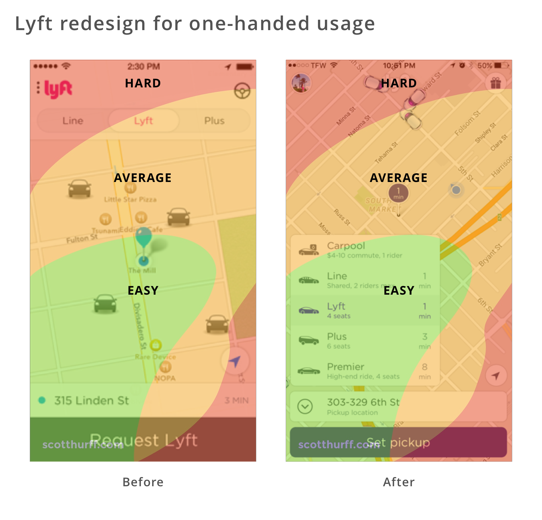
The above screenshots show the Lyft app before and after it was redesigned for one-handed usage. When ordering a Lyft, users primarily need to select the service type and pickup location. Notice how in the redesign these actions are within the easy and average comfort zones, but account and free rides remain out of reach as they’re less-frequently used secondary actions.
Tips
- Exhaust the possibilities of system-provided user interface components first, such as tab bars, bottom sheets, floating action buttons, swipe navigation and swipe-to-refresh, before creating custom solutions users may not be familiar with and ones that you’ll have to spend time creating and maintaining.
- On every screen, think about what has and what doesn’t have to be reachable. Make sure you don’t clutter the bottom of the screen with unrelated or too many features that are unrelated to the goal the user is trying to achieve or doesn’t use often.
- Keep in mind that techniques such as double-tapping or swiping up/down to zoom in/out and edge-gestures lack discoverability. Therefore, you’ll have to educate your users about them during the on-boarding process.
- Use icons on the navigation bar to also display state, such as adding a red dot to the Direct Messages icon to inform about unread messages.
- Educate users about adjacent screens. For instance, Instagram shows Stories and Direct Messages buttons on the navigation bar, which is also accessible by swiping left or right anywhere on the screen.
Intelligence

“A computer should never ask the user for any information that it can auto-detect, copy or deduce.” — Eric Raymond
Eric’s right: Computers can access and understand large amounts of data, and use that data to make predictions or act on our behalf.
Users expect your app to have some basic intelligence, they’ll use it more and rate it higher.
When To Use It
Basic intelligence doesn’t require you to be a machine learning specialist. Something as simple as setting an input field type enables the OS to offer its own intelligence in the form of password suggestions or credential autofill. A good example is the Android O Autofill from the 1Password blog.

With a little bit more code, you can let the OS understand content in your app and present that content in a context that makes sense for the user. In the example above, Apple Maps shows a venue I’ve looked at recently on Foursquare, making it easy to get directions.

You can also be smart about using sensor data to present relevant suggestions for a given moment. Uber avoids suggesting you get a ride home when you’re already there. Instead, they display recent destinations that exclude your current location.

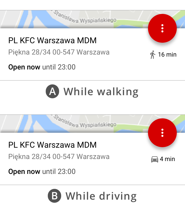
The Awareness API is built-in to Android. Recently, I’ve used it to offer driving directions, if the user is driving, or walking directions when the user is on foot. It also supports other forms of intelligence based on time, location, place, activity, weather, beacons, headphone status, or a combination or multiple characteristics.

The Card.io Uber integration for automatically adding a credit card was what allowed me to signup to Uber and quickly get out of a dodgy neighborhood at night the first time I visited San Francisco. Instead of typing in the 12-digit card number, name, and expiry date in the street at night, I simply pointed it at the card and moments later I’m counting the seconds until my driver arrives.

Users of ASOS, a UK online retailer, were finding it difficult to find the right product in a catalog of thousands of products, even with advanced search and filtering. What ASOS did was relatively simple: they trained a basic image recognition algorithm with images from their catalog, and allowed users to upload arbitrary images so they could be matched with similar products in their catalog.

Natural language processing is an interesting way to add intelligence to your app. In the past, I’ve used it to present people with trivia and products related to the content they were reading and watching.
Back then, I had to partner with a machine learning specialist company, later acquired by Microsoft. Fun fact: the app wasn’t able to understand that when Big Bird says “C is for Chair”, he wasn’t talking about an “Electric Chair”. Nowadays, natural language processing is built right into Android and iOS. It probably still doesn’t know it’s inappropriate to show electric chairs to kids, but the technology itself has become a commodity.
Another interesting example shown at WWDC 2017 involved using NLP to group content from multiple social networks into themes. Searching “hiking” photos given a search term of “hike”, “hiked”, “hiker”, or any other variation.