SwiftUI Button Tutorial: Customization
Learn how to easily customize your app buttons style with the minimum effort by leveraging the latest SwiftUI button modifiers. By Andy Pereira.
Sign up/Sign in
With a free Kodeco account you can download source code, track your progress, bookmark, personalise your learner profile and more!
Create accountAlready a member of Kodeco? Sign in
Sign up/Sign in
With a free Kodeco account you can download source code, track your progress, bookmark, personalise your learner profile and more!
Create accountAlready a member of Kodeco? Sign in
Sign up/Sign in
With a free Kodeco account you can download source code, track your progress, bookmark, personalise your learner profile and more!
Create accountAlready a member of Kodeco? Sign in
Contents
SwiftUI Button Tutorial: Customization
20 mins
Buttons are critical in any app UI. In iOS development, UIKit provided structure for everything buttons-related, but since SwiftUI emerged, dealing with buttons is easier and more fun. SwiftUI introduced many modifiers since the first version in iOS 13 SDK, providing more capabilities and customization. It does the heavy lifting for developers and gives them more flexibility.
In this tutorial, you’ll implement a basic app with different SwiftUI button styles and shapes. Along the way, you’ll learn:
- The basics of SwiftUI buttons.
- How to take advantage of available shapes and sizes.
- What button roles are.
- How to make custom button styles.
- How to use menus and make custom menu styles.
Without further ado, let’s button it. :]
Getting Started
Download the materials for this tutorial — use the link at the top or bottom of this article.
Open the starter project in Xcode 13 — the files are placeholders for all the buttons’ types and styles you’ll be building. Build and run the app to render a beautiful SwiftUI List
.
Button Style Basics
Open KitchenSinkView.swift. Find borderedButtonView
. The three buttons have the same appearance. Change the appearance of the first button by adding the following modifier to the end of the button’s declaration:
.buttonStyle(.borderedProminent)
The button style borderedProminent
applies a standard prominent border artwork based on the button’s context. No matter your platform code’s platform, it’ll apply the proper styling to align with it. You needn’t worry about creating different buttons for each operating system — Apple is taking care of it.
Build and run. You’ll see how the first button style has changed.
In the same borderedButtonView
, add the buttonStyle
modifier to apply a new style to the remaining buttons in the section:
Button {
} label: {
Text("Bordered")
}
.buttonStyle(.bordered)
Button {
} label: {
Text("Borderless")
}
.buttonStyle(.borderless)
You just added the following two styles:
-
bordered
: LikeborderedProminent
, this style applies a lighter border artwork compared with the prominent border style around your button. -
borderless
: Though this style doesn’t have a visual effect, it still shows how you can force a button not to have a border. Because SwiftUI’s environment can apply styles to multiple buttons simultaneously, you’ll need to know how to keep a specific button borderless when other buttons aren’t.
Now that the buttons all have styles, let’s add color. These button styles can have tints applied and be rendered based on their style.
Still in borderedButtonView
, add the following modifier to the Section
container view level:
.tint(applyTint ? .mint : .primary)
Build and run. Toggle Apply Tint.
As you can see, each button knows what color to apply to the background and to the text. By using built-in styles, you make it possible to have sweet-looking buttons, all while maintaining a codebase that’s easy to update should the SwiftUI API change.
Button Roles
In iOS 15, Apple introduced button roles to SwiftUI, a value that allows you to describe a purpose for your button. Similar to styles, adding a role to the button will automatically apply a look and feel that’s distinct to the environment your app runs on.
Find buttonRolesView
. Replace these two buttons:
Button {
} label: {
Text("Destructive")
}
Button {
} label: {
Text("Cancel")
}
With the following code:
Button(role: .destructive) {
} label: {
Text("Destructive")
}
Button(role: .cancel) {
} label: {
Text("Cancel")
}
Here, you provided the following roles to each of the two buttons:
-
destructive
: This role indicates it will cause a “destructive” action to occur. Use this role to prompt for actions such as deleting items. -
cancel
: This role implies a cancel action. When paired with a destructive button, users have better visuals to help them make a decision.
When you use a List
, roles can also be applied as a swipe action. Replace the first button in buttonRolesView
with the following:
Button(role: .destructive) {
} label: {
Text("Destructive")
}
// 1
.swipeActions {
// 2
Button(role: .destructive) {
actionTaken = "Remove"
} label: {
Label("Remove", systemImage: "trash")
}
// 3
Button(role: .cancel) {
actionTaken = "Add"
} label: {
Label("Add", systemImage: "plus")
}
// 4
Button {
actionTaken = "Share"
} label: {
Label("Share", systemImage: "square.and.arrow.up")
}
.tint(.mint)
}
Here’s what you just added:
-
swipeActions
is a modifier you can add to a row in a list view. The buttons you provide in the closure will be present when the user swipes on the row. - A button that indicates something will be destroyed by selecting this action.
- A cancel button indicates the swipe action will “cancel” when selected.
- Finally, a basic button that has no role. You aren’t required to provide roles to buttons in swipe actions, so use them as necessary.
Build and run. Then swipe from right to left on the row labeled “Destructive.”
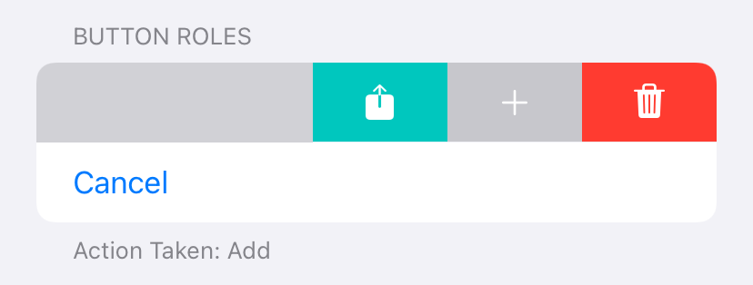
With the roles set on the first two buttons, see how Apple styles the “cancel” and “destructive” buttons, requiring almost no effort on your part.
All Shapes and Sizes
In addition to borders and styles, Apple also provides the ability to set shapes and sizes on buttons.
Shaping Up
Locate buttonShapesView
and replace the first button in the view with the following:
Button {
} label: {
Text("Rounded")
}
.buttonBorderShape(.roundedRectangle)
Just like setting a border style, setting the shape of your button can happen with a single modifier. Here, you’ve applied the style roundedRectangle
.
You’ll need to add one more modifier before the border can appear. Apply the following modifier to the Section
in buttonShapesView
:
.buttonStyle(.bordered)
That addition lets the buttons within the section know they should have a border applied.
Build and run. Notice how each button inside the section has a bordered style.
Notice how each of the buttons has the same border. Because you set the button style to the Section
, all buttons inside it inherit the same style.
You can apply custom shapes to a button. On the second button in buttonShapesView
, add the following modifier:
Button {
} label: {
Text("Custom Radius")
}
.buttonBorderShape(.roundedRectangle(radius: 12))
Here, you added a border shape that is a rectangle with a corner radius of 12 points.
Next, add the following modifier to the final button in buttonShapesView
:
Button {
} label: {
Text("Capsule")
}
.buttonBorderShape(.capsule)
Build and run. Each of these buttons has a border with a different shape.
You can customize any of your buttons with a few lines of code by combining borders and shapes.
Setting Sizes
Shapes and colors are helpful, but sometimes you might want to set sizes to indicate the button’s value. Luckily, applying a size is as easy as shapes and borders.
Replace all of the buttons in buttonSizesView
with the following:
Button {
} label: {
Text("Mini")
}
.controlSize(.mini)
Button {
} label: {
Text("Small")
}
.controlSize(.small)
Button {
} label: {
Text("Regular")
}
.controlSize(.regular)
Button {
} label: {
Text("Large")
}
.controlSize(.large)
Here, you’ve applied the four sizes available for buttons:
-
mini
: This is the smallest size provided. -
small
: Suitable for views where space is a concern. -
regular
: This is the default buttons size. You might want to use this to force a default size to a specific button while allowing other buttons to inherit from upper level size. -
large
: This is the “prominent” or largest size button available.
Finally, add the border style modifier to the Section
containing the buttons you just modified:
.buttonStyle(.bordered)
Build and run. Each button will have a different size for its text and borders.
Customizing Buttons
So far, you have been using built-in styles. While it’s a time-saver, you might need to create a custom, reusable button rendered with your own style. In SwiftUI, thankfully, it’s fairly easy. :]
Apple has provided the protocol ButtonStyle
to give you the flexibility to create a button that will appear the way you want. In a minute, you’ll make your own style that sets a gradient background to a button.
Open ButtonStyle.swift. Add the following code to GradientStyle
:
@Environment(\.isEnabled) private var isEnabled
private let colors: [Color]
init(
colors: [Color] = [.mint.opacity(0.6), .mint, .mint.opacity(0.6), .mint]
) {
self.colors = colors
}
This code provides a way to set the colors of your button’s background. You also added a property to reference the isEnabled
state of your button. You’ll need that in a moment.
Add the following properties to GradientStyle
:
// 1
private var enabledBackground: some View {
LinearGradient(
colors: colors,
startPoint: .topLeading,
endPoint: .bottomTrailing)
}
// 2
private var disabledBackground: some View {
LinearGradient(
colors: [.gray],
startPoint: .topLeading,
endPoint: .bottomTrailing)
}
// 3
private var pressedBackground: some View {
LinearGradient(
colors: colors,
startPoint: .topLeading,
endPoint: .bottomTrailing)
.opacity(0.4)
}
Let’s break down what you did:
- This will provide the default, linear-gradient view for the button’s background.
- When creating a button style, consider what the button will look like when disabled or pressed. This property will provide the disabled state, which will make the button look gray.
- Finally, this provides a gradient view for the background of the button when pressed. It applies a 40% opacity to the button colors, which provides a visual change to reflect a press action on the button.
Next, add the following method to the struct:
@ViewBuilder private func backgroundView(
configuration: Configuration
) -> some View {
if !isEnabled { // 1
disabledBackground
} else if configuration.isPressed { // 2
pressedBackground
} else {
enabledBackground
}
}
While this is a fairly small block of code, a few important matters are happening here.
- SwiftUI provides a view’s disabled state through the environment. You added the environment property
isEnabled
earlier. Now, you’re using that value to determine whether you should return the disabled background view. - The
configuration
parameter contains certain properties of your button.
The button’s Configuration
contains three properties:
-
role
: This is the samerole
value you used earlier. If you want the custom button to pick up an appearance based onrole
, use that within your custom style. -
label
: This represents the actual “label” or view provided by the button — it would be the text, image or any other view you provided. -
isPressed
: The property storing the state of the button.
Next, build the body of your button. Replace the makeBody(configuration:)
method with the following:
func makeBody(configuration: Configuration) -> some View {
// 1
HStack {
// 2
configuration.label
}
.font(.body.bold())
// 3
.foregroundColor(isEnabled ? .white : .black)
.padding()
.frame(height: 44)
// 4
.background(backgroundView(configuration: configuration))
.cornerRadius(10)
}
Here’s an explanation of what you added:
- You can make the button’s body be almost any view. Here, you use a
HStack
to act as a container view for the button. - Next, you add the actual view, or label, of the button. Whatever view the button provided will now always wrap inside a
HStack
- Then you set the foreground, or text color, based on the enabled state.
- You finally set the background based on the provided configuration. This was the method you implemented in the previous step.
To make using your custom button style a bit easier, add the following extension with static member lookup at the end of ButtonStyle.swift.
extension ButtonStyle where Self == GradientStyle {
static var gradient: GradientStyle { .init() }
}
This block of code makes a property available on ButtonStyle
. The property creates a default version of GradientStyle
. You’ll use this in the next step.
Finally, open KitchenSinkView.swift, find the customButtonsView
property and add the following two modifiers to the first button:
// 1
.buttonStyle(.gradient)
// 2
.disabled(isDisabled)
Here’s what the two modifiers do:
- This is how you apply any default or custom style to a button. Because you made a static variable in the
ButtonStyle
earlier, you were able to use it by calling.gradient
instead of explicitly writingGradientStyle.()
- While the disabled state will automatically be provided by the environment, you’re explicitly binding the disabled state to a local property. You’ll see how this works when you run the app.
Build and run. You should see the button with a nice mint gradient.
Turn on the toggle for Disable Buttons and you’ll see how the button shows with different colors to reflect the “disable” state.
Now, modify the second button with the same style. This time, you’ll provide your own colors. Still in customButtonsView
, add the following modifiers to the second button:
.buttonStyle(GradientStyle(colors: [.red, .yellow, .green]))
.disabled(isDisabled)
Here, you used the initializer provided by GradientStyle
to pass your own colors.
Build and run. You’ll see your new button with a rainbow-like gradient.
Custom Menu
Menu
is another type of button provided by SwiftUI. While it works nearly the same as a regular button, it has some differences in building custom styles.
Open MenuStyle.swift to start working on your style. Replace makeBody(configuration:)
with the following:
func makeBody(configuration: Configuration) -> some View {
HStack {
Spacer()
// 1
Menu(configuration)
Spacer()
Image(systemName: "chevron.up.chevron.down")
}
.padding()
// 2
.background(Color.mint)
.cornerRadius(8)
// 3
.foregroundColor(.white)
}
While this seems nearly the same as the custom button style you made earlier, it does have two differences:
- Instead of using the label of your configuration, you provide the configuration to another initializer for
Menu
. This will pick up all action handlers and bindings needed to keep the menu working. - Both the background and foreground don’t have logic around a pressed state. The menu will take care of some of these default behaviors for you.
Next, add a static member lookup extension for your menu style at the end of the MenuStyle.swift:
extension MenuStyle where Self == CustomMenu {
static var customMenu: CustomMenu { .init() }
}
Finally, open KitchenSinkView.swift. In menuButtonsView
, replace the following code:
Menu(menuSelection ?? "Select Language") {
ForEach(menuOptions, id: \.self) { menuOption in
Button {
menuSelection = menuOption
} label: {
Text(menuOption)
}
}
}
With the following:
Menu(menuSelection ?? "Select Language") {
ForEach(menuOptions, id: \.self) { menuOption in
Button {
menuSelection = menuOption
} label: {
Text(menuOption)
}
}
}
.menuStyle(.customMenu)
Adding a custom menu style is as easy as adding a custom button style.
Build and run. Your menu is now styled with a green background and stacked chevrons ;].
When you select the menu, you’ll see the text changes color to represent a selected state:
Nice work. You just learned the ingredients to customizing buttons in SwiftUI :]
Where to Go From Here?
You can download the completed version of the project by clicking the Download Materials button at the top or bottom of this article.
You can learn more about buttons in Apple’s documentation.
We hope you enjoyed this tutorial. If you have any questions or comments, please join the forum discussion below!
All videos. All books.
One low price.
A Kodeco subscription is the best way to learn and master mobile development — plans start at just $19.99/month! Learn iOS, Swift, Android, Kotlin, Flutter and Dart development and unlock our massive catalog of 50+ books and 4,000+ videos.
Learn more