Large Screens & Foldables Tutorial for Android
Learn how to build great user experiences for large screens & foldables in Android. Also learn how to design and test adaptive Android apps. By Beatrice Kinya.
Large screens are an important and fast-growing segment of active Android devices. There are more than 270 million large-screen Android devices in use. They include tablets, foldable devices and Chrome OS devices. To reach this growing segment of Android users, learn to make your app UI adaptive across a range of devices.
In this tutorial, you’ll build an app called Crafty Notebook, which shows a list of notes. Along the way, you’ll learn about:
- APIs and tools to build great user experiences for large-screen Android devices.
- Designing adaptive apps for different screen sizes, orientations and form factors.
- Google Play updates for large-screen devices.
- Testing your app layouts for large screens.
Getting Started
Download the starter project by clicking the Download Materials button at the top or bottom of the tutorial.
In this tutorial, you’ll use a resizable emulator to test your app’s UI across different devices. To set up a resizable emulator, open the starter project with Android Studio version 2021.2.1 or newer and follow these steps:
- Click Tools ▸ SDK Manager. In the SDK Tools tab, select Android Emulator and click OK. This will install the latest version of the emulator if it isn’t already installed.
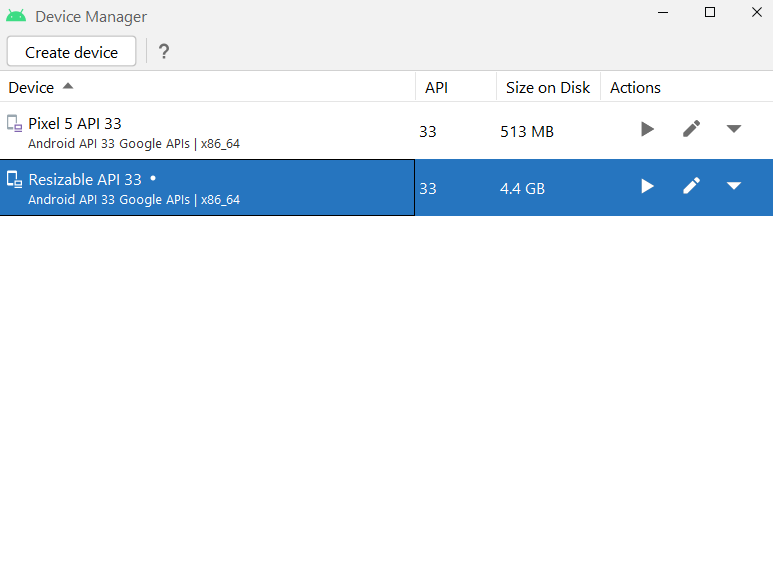
- To create a virtual device, click Tools ▸ Device Manager. Then, click the Create device button and select Phone ▸ Resizable. Click Next and select the latest API level. Confirm the emulator details and click Finish. This will create a resizable emulator.
- On the list of virtual devices, select the resizable device and click the Launch icon to start it.
Build and run the project. Here’s what you’ll see:

In the emulator window, click the Display Mode drop-down and select Tablet:

On a large-screen device like a tablet, content stretches to fill the available screen space like this:

But users expect a great experience while using your app across different Android devices. Your goal is to use the extra screen space to improve the user experience and provide great accessibility on large-screen devices.
Looking Into Android 12L Updates
Android devices come in various form factors: phones, tablets, foldables and Chrome OS devices. They vary in screen sizes from small to large screen sizes.
At Android Dev summit 2021, Google announced Android 12L. Android 12L is a feature update for Android 12 that was built for large-screen devices. Android 13 builds on updates made in Android 12L. Some of the updates include:
- Taskbar interaction: The new taskbar makes it easy to launch and switch apps. Gestures such as drag and drop enter split-screen mode. In gesture navigation, users can flip through recent apps. This enables powerful and intuitive multitasking on large screens.
- Default multi-window mode: To enhance the split screen experience, Android 12 or higher allows multi-window mode by default in all apps.
- Improved compatibility experience: Some apps aren’t optimized for large screens yet. They aren’t resizable or are using fixed orientation. These apps are launched in compatibility mode to make them look better by default. Such apps are centered on the screen with black bars filling the unused display area.
- Camera preview enhancements: This makes the camera app adaptive to large screens, multi-window mode and different foldable device postures.
- Media projection updates: Starting in Android 12L, the virtual display is scaled to fit available screen space. This improves screen casting on large displays like televisions. It maximizes the size of surface images and ensures the correct aspect ratio.
You’ve learned about updates for large-screen devices starting in Android 12L. Next, you’ll learn how to build responsive apps across different devices.
Designing Adaptive Apps
Responsive apps provide a great user experience across different screen sizes and form factors. They support different screen orientations and resizable configurations like multi-window mode.
To help you create adaptive layouts, Material Design 3 provides canonical layouts. Canonical layouts serve as a guideline for creating responsive layouts for large screens. They include:
- List-detail view: In a list-detail view, you place a list of items on the left. On the right side, you show details of an item.
- Supporting panel: A layout consists of focus and support regions. The focus region shows the primary content. It covers two-thirds of the display area. The supporting panel occupies the remaining screen space to show additional content like comments on a document. It’s placed at the bottom third on an expanded height or trailing third on an expanded width.
- Feed: Feed layouts are common in news or social content apps. For example, with a RecyclerView, use a different layout manager like GridLayoutManager when the width is not compact.
Knowing what kind of device the user is using won’t help you decide which app layouts to use. On tablets, for example, an app could be sharing the screen with another app in multi-window mode. Or, on a foldable device, there could be more than one physical screen. Instead, make decisions based on the actual portion of the screen that’s allocated by using Jetpack WindowManager library.
In the next section, you’ll learn how to use Window Size classes to determine the layout for your app. Window size classes are determined by the window size available to your application regardless of the type of device the app is running on.
Exploring Window Size Classes
Window size classes are viewport breakpoints to guide you in designing responsive and adaptive layouts. They classify screen space available for your app as compact, medium or expanded.
Available width and height are classified separately. The available width is more important than the available height because vertical scrolling is common across devices. The available width is classified as follows:
- Compact width: The device width is less than 600dp. Phones in portrait orientation and foldables in folded state are in this category.
- Medium width: The device width is more than 600dp. Medium-width devices include tablets and large unfolded foldables in portrait orientation.
- Expanded width: Tablets and large unfolded foldables in landscape orientation fall in this category. They are more than 840dp wide.
You’ll use the material3-window-size-class library to get the window size class of a device. The library calculates the window size class using current window metrics.
Open build.gradle(app). The following library dependency has already been added:
implementation "androidx.compose.material3:material3-window-size-class:1.0.0-alpha14"
Open presentation ▸ MainActivity.kt, and replace // TODO 1 with the following:
val windowSizeClass = calculateWindowSizeClass(activity = this)
The code above returns the window size class for the provided activity. calculateWindowSizeClass(activity: Activity) calculates WindowSizeClass for the provided activity. The method returns a new WindowSizeClass during screen rotation or window resize. The app recomposes the UI with the new window size class.
Add any missing imports by pressing Option-Return on Mac or Alt-Enter on PC.
You may see an error squiggly line. This is because the library is still experimental. To fix the error, add the following before onCreate() and import the corresponding package:
@OptIn(ExperimentalMaterial3WindowSizeClassApi::class)
Next, you’ll pass windowSizeClass to the NoteApp() composable. You’ll use this information later to determine the app layouts.
Replace // TODO 2 with the following:
windowSizeClass = windowSizeClass.widthSizeClass,
Before updating the app to respond to changes in screen sizes, you’ll consider device fold posture also.