Curved Line Charts in Flutter
Learn how to build Curved Line Charts in your Flutter app using the Canvas API. By Sam Smith.
Adding Labels
CustomPainters aren’t limited to painting paths; you can paint text within your CustomPainter as well. But painting text labels on a chart requires lots of math. It's often cleaner and simpler to create chart labels stacked behind a CustomPainter using standard layout widgets.
Your CustomPaint() widget is already sitting inside of a Stack() widget, so you can add your labels in this same Stack() so they render behind your chart.
Adding the X-Axis Labels
The first thing you’ll do is create some space under your chart for the x-axis labels. Look at your Container() that wraps your CustomPaint() widget. It should have a height of chartHeight. Add some padding underneath like this:
height: chartHeight + 80,
Next, wrap your CustomPaint() inside a Positioned() widget that sits 40 pixels from the top of the Stack():
Positioned(
  top: 40,
  child: CustomPaint(
    size:
        Size(MediaQuery.of(context).size.width, chartHeight),
    painter: PathPainter(
      path: drawPath(false),
      fillPath: drawPath(true),
    ),
  ),
)
Then, above this Positioned(), add another Positioned() to the bottom of the Stack() that contains a ChartDayLabels() widget. This widget will be your x-axis labels. This widget has already been set up for you, but you’ll learn how it works in detail next. Don’t forget to pass the chart padding constants into the widget, like this:
Container(
  height: chartHeight + 80,
  color: const Color(0xFF158443),
  child: Stack(
    children: [ // old code
      const Positioned(
      bottom: 0,
      left: 0,
      right: 0,
      child: ChartDayLabels(
        leftPadding: leftPadding,
        rightPadding: rightPadding,
      ),
    ),
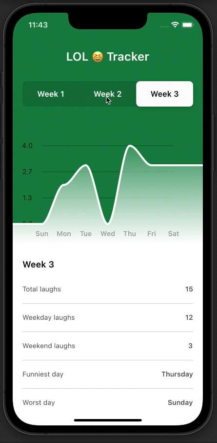
Before diving into how this labels widget is working, Build and run your code. You should see each day label positioned right beneath its corresponding data point in the chart:

Open components/chart_labels.dart, where you’ll see this ChartDayLabels() stateless widget. Notice it creates an array of Strings from ‘Sun’ to ‘Sat’, and maps each String to be a FractionalTranslation() widget inside of a Row(). The helper function labelOffset() helps calculate the exact offset of each Text() widget. This function is lining up the center of each Text() widget with the data point, instead of the left edge of each Text().
ChartDayLabels() also has a gradient background from Colors.white to Colors.white.withOpacity(0.85). This looks kind of silly though when the gradient resets between the labels and the chart. Fortunately there is an easy fix.
Back in the PathPainter inside of your main.dart file, change the second color in your gradient from Colors.white.withOpacity(1) to Colors.white.withOpacity(0.85).
Colors.white.withOpacity(0.85),
Now you should have a seamless connection between the gradient behind your labels and the gradient behind your chart.

Adding the Y-Axis Labels
Now you have your x-axis labels, it’s time to add the y-axis labels. At the very beginning of the Stack() wrapping your chart and x-axis labels, add your y-axis laugh labels like so above the Positioned widget:
ChartLaughLabels(
 chartHeight: chartHeight,
 topPadding: 40,
 leftPadding: leftPadding,
 rightPadding: rightPadding,
 weekData: weeksData[activeWeek - 1],
),
Build and Run this code. You'll see the y-axis labels and grid rendering nicely.

Look at ChartLaughLabels() inside components/chart_labels.dart. This labels widget requires five properties. The topPadding property is 40 pixels because, if you recall, your CustomPaint() widget is in a Positioned() that is 40 pixels from the top of the Stack(). It uses the weekData property to calculate the maxDay, which is the greatest number in the data set. The maxDay variable is then used for the highest label.
ChartLaughLabels() will create however many labels you specify with the labelCount variable. In this case, you're drawing four y-axis labels. It creates a List called labels that will store a double for all four of your labels. Your labels are equally divided between 0 and the maxDay value, so if your max value is 4 then your labels will be 0.0, 1.3, 2.7, and 4.0.
These labels are then mapped inside of a Column(), and it creates a thin grid line for each label. The Text() for each label is center-aligned with its grid line using the FractionalTranslation() trick from earlier.
And there you have it! You’ve created a beautiful curved line chart with a CustomPainter.
Where to Go From Here?
Compare your finished app to the completed project file. You can download it by clicking the Download Materials button at the top or bottom of the tutorial.
You learned a whole lot about creating a line chart with a CustomPainter, but believe it or not, there is a whole lot more you could do:
- Using an
animationControllerto transition your path from one chart to another when you toggle the data. - Adding a draggable marker that follows the path of the curve using
PathMetrics. - You could show the exact value for each data point as you drag over top of it.
We hope you enjoyed this tutorial. If you have any questions or comments, please join the forum discussion below!