Curved Line Charts in Flutter
Learn how to build Curved Line Charts in your Flutter app using the Canvas API. By Sam Smith.
So, you have some data, and you want to make a curved line chart? There are plenty of decent Flutter libraries out there to get the job done. But, if you want a uniquely beautiful chart that fits perfectly within the design aesthetic of your app, you’ll want to build it from scratch.
Flutter’s Canvas API is the perfect tool for drawing custom charts. This API is surprisingly intuitive, but if you want to start with a more general introduction, then check out Flutter Canvas API: Getting Started.
You should have at least an intermediate level of Flutter experience before diving into the Canvas API. If that sounds like you, then strap in and get ready to build some awesome charts!
In this tutorial you’ll build LOLTracker, an app that charts how often you laugh. This simple app will help you master the following Flutter principles:
- Learning to draw curved lines with a
CustomPaint()widget. - Mapping your curved line to follow data from a dataset.
- Adding labels on the x and y axes of your chart.
Getting Started
Download the starter project by using the Download Materials button at the top or bottom of the tutorial. This tutorial uses Android Studio, but Visual Studio Code or IntelliJ IDEA works fine.
Begin by opening pubspec.yaml in your starter project and click the Pub get button to install all dependencies.
Then open an iPhone simulator or Android emulator and click run in Android Studio.

You should see this on your virtual device:

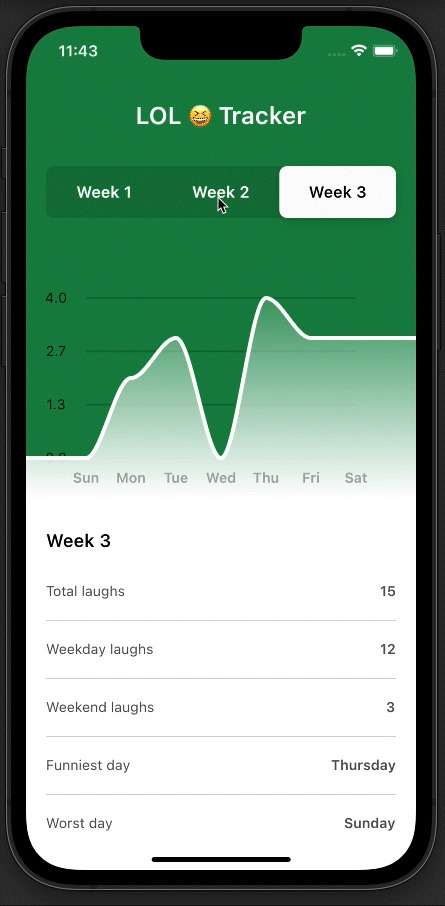
But what a hideous placeholder! Don’t worry, in a few simple steps you’ll transform that Placeholder() widget into a beautiful custom line chart. Here’s a sneak peek of the final project:
These are the files in the lib folder:
- main.dart is the entrypoint of the application and contains pre-built UI for toggling between three weeks of laughing data.
- laughing_data.dart contains model classes and the data to be plotted on the chart.
- components/slide_selector.dart holds a switch to toggle between weeks.
- components/week_summary.dart contains the weekly summary UI.
- components/chart_labels.dart contains the UI to show chart labels.
Adding a CustomPaint() widget
You’ll be using a CustomPainter to draw your own line chart. In the main.dart file, replace the Placeholder() widget on line 144 with a CustomPaint() widget, like this:
CustomPaint(
  size: Size(MediaQuery.of(context).size.width, chartHeight),
  painter: PathPainter(
    path: drawPath(),
  ),
),
Save the code. You’re probably seeing red error warnings already. That’s because you still need to define the PathPainter, as well as the drawPath() function that goes into it.
At the bottom of the file after the DashboardBackground() widget, create the PathPainter class that extends from CustomPainter like this:
class PathPainter extends CustomPainter {
 Path path;
 PathPainter({required this.path});
 @override
 void paint(Canvas canvas, Size size) {
   // paint the line
   final paint = Paint()
     ..color = Colors.white
     ..style = PaintingStyle.stroke
     ..strokeWidth = 4.0;
   canvas.drawPath(path, paint);
 }

 @override
 bool shouldRepaint(CustomPainter oldDelegate) => true;
}
This painter will draw a white line along whichever path you pass into it.
Inside your _DashboardState class, create a drawPath() function somewhere before the build method.
Path drawPath() {
 final width = MediaQuery.of(context).size.width;
 final height = chartHeight;
 final path = Path();
 path.moveTo(0, height);
 path.lineTo(width / 2, height * 0.5);
 path.lineTo(width, height * 0.75);
 return path;
}
The code above will define the path of the line you want to draw with your PathPainter:
Notice that moveTo() and lineTo() both take an x-coordinate and a y-coordinate as arguments. So, you’re using moveTo(0, height) to move the starting point of your line to the bottom-left corner of the painter.
Remember, the y-axis in a painter is inverted, which means 0 is at the top, and chartHeight is at the bottom of the y-axis. So, when you use height * 0.75 for the y-coordinate of your third line segment, that point is 25% of the way up from the bottom of the chart.
Build and run your code. Voilà! You’ve made a line chart. Thanks for reading this tutorial, see you next time.

Oh, you’re still here? You’re not satisfied with the beautiful line you just learned to make? Okay, fine, then it’s time to dial up the cool-factor and learn how to connect this line to some data.
Adding Data
Open the laughing_data.dart file and look at all the data you’ll be charting.
Looking at the data, you must have been in high spirits the second week. That week there were several days with double-digit laughs, and one day you even laughed out loud 14 times! The third week wasn’t so great, though, as you never laughed more than four times on any given day. So sad…
You know that you want your chart to show one week’s worth of data at any given time.
Since you need to toggle between different charts for each of the three weeks, you’ll want to normalize the data. This means that for any week’s dataset, the values get scaled down to a number between 0.0 and 1.0. If your chart uses a normalized data set, it will draw the maximum data point at the top of the chart, whether it is 4 or 400.
You’ll add a normalizeData() function to do this, but first you need to create a list in your state that holds your chart data. First, you need to define a data type used in the charting.
Define the ChartDataPoint class at the very bottom of the file, after PathPainter:
class ChartDataPoint {
 double value;
 ChartDataPoint({required this.value});
}
Now for the list. Add the code below right after you define chartHeight in the _DashboardState class:
late List<ChartDataPoint> chartData;
This just holds a series of data points for your chart. Now to normalize the data for your chart. Add the normalizeData() function right after your initState method:
List<ChartDataPoint> normalizeData(WeekData weekData) {
 final maxDay = weekData.days.reduce((DayData dayA, DayData dayB) {
   return dayA.laughs > dayB.laughs ? dayA : dayB;
 });
 final normalizedList = <ChartDataPoint>[];
 weekData.days.forEach((element) {
   normalizedList.add(ChartDataPoint(
       value: maxDay.laughs == 0 ? 0 : element.laughs / maxDay.laughs));
 });
 return normalizedList;
}
The function above takes in a week’s worth of data from laughing_data.dart. It calculates the day with the maximum laughs, and returns a normalized list of ChartDataPoints with values ranging from 0.0 to 1.0.
At this point, it’s time to call it. In the initState method, use the normalizeData() function to initialize your chartData:
@override
void initState() {
 super.initState();
 setState(() {
   chartData = normalizeData(weeksData[activeWeek - 1]);
 });
}
You’ll also want to update chartData when the user toggles between weeks. Inside your changeWeek() function, right after you set activeWeek, add the following:
chartData = normalizeData(weeksData[week - 1]);
Now that chartData is a normalized List, loop through it in your drawPath() function:
Path drawPath() {
 final width = MediaQuery.of(context).size.width;
 final height = chartHeight;
 final segmentWidth = width / (chartData.length - 1);
 final path = Path();
 path.moveTo(0, height - chartData[0].value * height);
 for (var i = 1; i < chartData.length; i++) {
   final x = i * segmentWidth;
   final y = height - (chartData[i].value * height);
   path.lineTo(x, y);
 }
 return path;
}
Before digging into this new drawPath() code, build and run your code; you may need to do a Hot Restart. You'll see a line with seven data points; this should also update when you toggle between weeks.
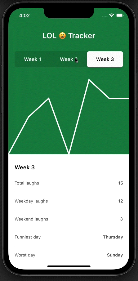
If you look at the data in laughing_data.dart, you'll see that these lines match the data for each week. But how exactly is this path created?
Take a closer look at the code you just added to drawPath(), and you can see how that raw data is being transformed into a nifty line that begins on the left side of the screen. The path.moveTo() method is setting the first point of the chart with an x-coordinate of 0, and a y-coordinate of height - chartData[0].value * height. Then you loop through the remaining chartData values to create six more lineTo() segments in your path.
The loop calculates the x-coordinate of each point with i * segmentWidth, where segmentWidth is one sixth of the screen width. It calculates the y-coordinate in the same way as the first point, with height - (chartData[i].value * height).
Now that you have a functional chart with data, the next step is to put some makeup on it. You'll add a fill to the path and learn how to turn these straight lines into curved ones.