UIAppearance Tutorial: Getting Started
In this UIAppearance tutorial, you’ll learn how to make your app stand out by using Swift to customize the look and feel of standard UIKit controls. By Essan Parto.
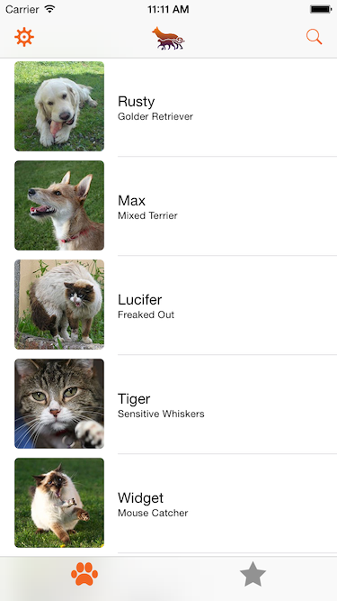
Sign up/Sign in
With a free Kodeco account you can download source code, track your progress, bookmark, personalise your learner profile and more!
Create accountAlready a member of Kodeco? Sign in
Sign up/Sign in
With a free Kodeco account you can download source code, track your progress, bookmark, personalise your learner profile and more!
Create accountAlready a member of Kodeco? Sign in
Contents
UIAppearance Tutorial: Getting Started
25 mins
- Getting Started
- Supporting Themes
- Applying Themes to Your Controls
- Applying Tint Colors
- Customizing the Navigation Bar
- Customizing the Navigation Bar Back Indicator
- Customizing the Tab Bar
- Customizing a Segmented Control
- Customizing Steppers, Sliders, and Switches
- Customizing a Single Instance
- Where to Go From Here?
Although skeuomorphism in iOS apps is a thing of the past, that doesn’t mean you’re limited to the stock appearance of controls in your iOS app.
While you can develop your own controls and app stylings from scratch, Apple recommends that you use standard UIKit controls and take advantage of the various customization techniques in iOS. This is because UIKit controls are highly efficient, and your customizations to the controls should be mostly future-proof.
In this UIAppearance tutorial, you’ll use some basic UI customization techniques to customize a plain Pet Finder app and make it stand out from the pack! :]
Getting Started
Download the starter project for this tutorial here. The app has many of the standard UIKit controls and looks extremely vanilla.
Open the project and have a look around to get a feel for its structure. Build and run and you’ll see the main UI elements of Pet Finder:
There’s a navigation bar and a tab bar. The main screen shows a list of pets; tap a pet to see some details about it. As well there’s a search screen and — aha! A screen that allows you to select a theme for your app. That sounds like a pretty good place to start!
Supporting Themes
Many apps don’t allow users to select a theme, and it’s not always advisable to ship an app with a theme selector. If you have little control over the content your app displays then you may quickly find yourself in a position where one of your themes clashes with the content other’s have generated or shared. However, you might want to test different themes during development to see which ones work best for your app, or you might A/B test your app with your beta users to see which style is the most popular.
In this UIAppearance tutorial, you’ll create a number of themes for your app that you can try out to see which one is most aesthetically pleasing.
Select File\New\File… and choose iOS\Source\Swift File. Click Next and type Theme as the name of the file. Finally click Next, followed by Create. Xcode automatically opens your new file, which contains just a single line of code.
Delete the single line and replace it with the following:
import UIKit
enum Theme {
case Default, Dark, Graphical
var mainColor: UIColor {
switch self {
case .Default:
return UIColor(red: 87.0/255.0, green: 188.0/255.0, blue: 95.0/255.0, alpha: 1.0)
case .Dark:
return UIColor(red: 242.0/255.0, green: 101.0/255.0, blue: 34.0/255.0, alpha: 1.0)
case .Graphical:
return UIColor(red: 10.0/255.0, green: 10.0/255.0, blue: 10.0/255.0, alpha: 1.0)
}
}
}
This adds an enum with the different themes for your app. For now, all themes only have a mainColor
that’s specific to that particular theme.
Next, add the following struct:
struct ThemeManager {
}
This will let you use a theme in the app. It’s still empty, but that will change soon enough!
Next, add the following line right above the enum
declaration:
let SelectedThemeKey = "SelectedTheme"
Now, add the following method to ThemeManager
:
static func currentTheme() -> Theme {
if let storedTheme = NSUserDefaults.standardUserDefaults().valueForKey(SelectedThemeKey)?.integerValue {
return Theme(rawValue: storedTheme)!
} else {
return .Default
}
}
Nothing overly complex here: this is the main method you’ll use to style the app. It uses NSUserDefaults
to persist the current theme, and uses it every time you launch your app.
To test that this works, open AppDelegate.swift and add the following line to application(_:didFinishLaunchingWithOptions)
:
println(ThemeManager.currentTheme().mainColor)
Build and run. You should the following printed to the console:
UIDeviceRGBColorSpace 0.94902 0.396078 0.133333 1
At this point, you have three themes and can manage them through ThemeManager
. Now it’s time to go use them in your app.
Applying Themes to Your Controls
Back in Theme.swift, add the following method to ThemeManager
:
static func applyTheme(theme: Theme) {
// 1
NSUserDefaults.standardUserDefaults().setValue(theme.rawValue, forKey: SelectedThemeKey)
NSUserDefaults.standardUserDefaults().synchronize()
// 2
let sharedApplication = UIApplication.sharedApplication()
sharedApplication.delegate?.window??.tintColor = theme.mainColor
}
Here’s a quick run-through of the above code:
- You first persist the selected theme using
NSUserDefaults
. - Then you get your current (selected) theme and apply the main color to the
tintColor
property of your application’s window. You’ll learn more abouttintColor
in just a moment.
Now the only thing you need to do is to call this method. There’s no better place than in AppDelegate.swift.
Replace the println()
statement you added earlier with the following:
let theme = ThemeManager.currentTheme()
ThemeManager.applyTheme(theme)
Build and run. You’ll see that your new app looks decidedly more green:
Navigate through the app; there are green accents everywhere! But you didn’t change any of your controllers or views. What is this black — er, green — magic?! :]
Applying Tint Colors
Since iOS 7, UIView
has exposed the tintColor
property, which is often used to define the primary color indicating selection and interactivity states for interface elements throughout an app.
When you specify a tint for a view, the tint is automatically propagated to all subviews in that view’s view hierarchy. Because UIWindow
inherits from UIView
, you can specify a tint color for the entire app by setting the window’s tintColor
, which is exactly what you did in applyTheme()
above.
Click on the Gear icon in the top left corner of your app; a table view with a segmented control slides up, but when you select a different theme and tap Apply, nothing changes. Time to fix that.
Open SettingsTableViewController.swift and add these lines to applyTheme()
, just above dismiss()
:
if let selectedTheme = Theme(rawValue: themeSelector.selectedSegmentIndex) {
ThemeManager.applyTheme(selectedTheme)
}
Here you call the method you added to ThemeManager
, which sets the selected theme’s mainColor
on the tintColor
property of the root UIWindow
instance.
Next, add the following line to the bottom of viewDidLoad()
to select the theme persisted to NSUserDefaults
when the view controller is first loaded:
themeSelector.selectedSegmentIndex = ThemeManager.currentTheme().rawValue
Build and run. Tap the settings button, select Dark, and then tap Apply. The tint in your app will change from green to orange right before your eyes:
Eagle-eyed readers likely noticed these colors were defined in mainColor()
, in ThemeType
.
But wait, you selected Dark, and this doesn’t look dark. To get this effect working, you’ll have to customize a few more things.
Customizing the Navigation Bar
Open Theme.swift and add the following two methods to Theme
:
var barStyle: UIBarStyle {
switch self {
case .Default, .Graphical:
return .Default
case .Dark:
return .Black
}
}
var navigationBackgroundImage: UIImage? {
return self == .Graphical ? UIImage(named: "navBackground") : nil
}
These methods simply return an appropriate bar style and background image for the navigation bar for each theme.
Next, add the following lines to the bottom of applyTheme()
:
UINavigationBar.appearance().barStyle = theme.barStyle
UINavigationBar.appearance().setBackgroundImage(theme.navigationBackgroundImage, forBarMetrics: .Default)
Okay — why does this work here, and not earlier when you set barStyle
on your UINavigationBar
instance?
UIKit has an informal protocol called UIAppearance
that most of its controls conform to. When you call appearance()
on UIKit classes— not instances —it returns a UIAppearance
proxy. When you change the properties of this proxy, all the instances of that class automatically get the same value. This is very convenient as you don’t have to manually style each control after it’s been instantiated.
Build and run. Select the Dark theme and the navigation bar should now be much darker:
This looks a little better, but you still have some work to do.
Next, you’ll customize the back indicator. iOS uses a chevron by default, but you can code up something far more exciting! :]
Customizing the Navigation Bar Back Indicator
This change applies to all themes, so you only need to add the following lines to applyTheme()
in Themes.swift:
UINavigationBar.appearance().backIndicatorImage = UIImage(named: "backArrow")
UINavigationBar.appearance().backIndicatorTransitionMaskImage = UIImage(named: "backArrowMask")
Here you’re simply setting the image and transition mask image to be used as the back indicator.
Build and run. Tap one of the pets and you should see the new back indicator:
Open Images.xcassets and find the backArrow image in the Navigation group. The image is all black, but in your app it takes on the tint color of your window and it just works.
But how can iOS just change the bar button item’s image color, and why doesn’t it do that everywhere?
As it turns out, images in iOS have three rendering modes:
- Original: Always use the image “as is” with its original colors.
- Template: Ignore the colors, and just use the image as a stencil. In this mode, iOS uses only the shape of the image, and colors the image itself before rendering it on screen. So when a control has a tint color, iOS takes the shape from the image you provide and uses the tint color to color it.
- Automatic: Depending on the context in which you use the image, the system decides whether it should draw the image as “original” or “template”. For items such as back indicators, navigation control bar button items and tab bar images, iOS ignores the image colors by default unless you change the rendering mode.
Head back to the app, tap one of the pets and tap Adopt. Watch the animation of the back indicator in the navigation bar carefully. Can you see the problem?
When the Back text transitions to the left, it overlaps the indicator and looks pretty bad:
To fix this, you’ll have to change the transition mask image.
Update the line where you set backIndicatorTransitionMaskImage
in applyTheme()
, in Themes.swift, to the following:
UINavigationBar.appearance().backIndicatorTransitionMaskImage = UIImage(named: "backArrow")
Build and run. Once again tap one of the pets and then tap Adopt. This time the transition looks much better:
The text is no longer cut off and looks like it goes underneath the indicator. So, what’s happening here?
While iOS uses all the non-transparent pixels of the back indicator image to draw the indicator, it does something entirely different with the transition mask image: it masks the indicator with the non-transparent pixels of the transition mask image so that when the text moves to the left, the indicator is only visible in the those areas.
In the original implementation, you provided an image that covered the entire surface of the back indicator so the text remained visible through the transition. But now you’re using the indicator image itself as the mask, but the text disappeared at the far right edge of the mask, not under the indicator proper.
Look at the indicator image and the “fixed” version of the mask in your image assets catalog; you’ll see they they line up perfectly with each other:
The black shape is your back indicator and the red shape is your mask. You want the text to only be visible when it’s passing under the red area and hidden everywhere else.
Change the last line of applyTheme()
once again, this time to use the updated mask:
UINavigationBar.appearance().backIndicatorTransitionMaskImage = UIImage(named: "backArrowMaskFixed")
Build and run. For the last time, tap one of the pets and then tap Adopt. You’ll see that the text now disappears under the image, just as you anticipated it would:
Now that your navigation bar is pixel perfect, it’s time to give the tab bar some much-needed love.
Customizing the Tab Bar
Still in Theme.swift, add the following properties to Theme
:
var tabBarBackgroundImage: UIImage? {
return self == .Graphical ? UIImage(named: "tabBarBackground") : nil
}
var backgroundColor: UIColor {
switch self {
case .Default, .Graphical:
return UIColor(white: 0.9, alpha: 1.0)
case .Dark:
return UIColor(white: 0.8, alpha: 1.0)
}
}
var secondaryColor: UIColor {
switch self {
case .Default:
return UIColor(red: 242.0/255.0, green: 101.0/255.0, blue: 34.0/255.0, alpha: 1.0)
case .Dark:
return UIColor(red: 34.0/255.0, green: 128.0/255.0, blue: 66.0/255.0, alpha: 1.0)
case .Graphical:
return UIColor(red: 140.0/255.0, green: 50.0/255.0, blue: 48.0/255.0, alpha: 1.0)
}
}
These properties provide appropriate tab bar background images, background colors, and secondary colors for each theme.
To apply these styles, add the following lines to applyTheme()
.
UITabBar.appearance().barStyle = theme.barStyle
UITabBar.appearance().backgroundImage = theme.tabBarBackgroundImage
let tabIndicator = UIImage(named: "tabBarSelectionIndicator")?.imageWithRenderingMode(.AlwaysTemplate)
let tabResizableIndicator = tabIndicator?.resizableImageWithCapInsets(
UIEdgeInsets(top: 0, left: 2.0, bottom: 0, right: 2.0))
UITabBar.appearance().selectionIndicatorImage = tabResizableIndicator
Setting the barStyle
and backgroundImage
should be familiar by now; it’s done in exactly the same you did for UINavigationBar
previously.
In the final three lines of code above, you retrieve an indicator image from the asset catalog and set its rendering mode to .AlwaysTemplate
. This is an example of one context where iOS doesn’t automatically use the template rendering mode.
Finally, you create a resizable image and set it as the tab bar’s selectionIndicatorImage
.
Build and run. You’ll see your newly themed tab bar:
The dark theme is starting to look more, well, dark! :]
See the line below the selected tab? That’s your indicator image. Although it’s only 6 points high and 49 points wide, iOS stretches this to the full width of the tab at run time.
The next section covers resizeable images and how they work.
Customizing a Segmented Control
One element that hasn’t changed yet is the segmented control that shows the currently selected theme. Time to bring that control into the wonderful world of theming.
Add the following code to the bottom of applyTheme()
in Theme.swift:
let controlBackground = UIImage(named: "controlBackground")?
.imageWithRenderingMode(.AlwaysTemplate)
.resizableImageWithCapInsets(UIEdgeInsets(top: 3, left: 3, bottom: 3, right: 3))
let controlSelectedBackground = UIImage(named: "controlSelectedBackground")?
.imageWithRenderingMode(.AlwaysTemplate)
.resizableImageWithCapInsets(UIEdgeInsets(top: 3, left: 3, bottom: 3, right: 3))
UISegmentedControl.appearance().setBackgroundImage(controlBackground, forState: .Normal,
barMetrics: .Default)
UISegmentedControl.appearance().setBackgroundImage(controlSelectedBackground, forState: .Selected,
barMetrics: .Default)
To understand the code above, first take a look at the controlBackground image in your asset catalog. The image may be tiny, but iOS knows exactly how to use it to draw the borders of your UISegmentedControl
, as it’s been pre-sliced and is resizable.
What does sliced mean? Take a look at the following magnified model:
There are four 3×3 squares, one in each corner. These squares are left untouched when resizing the image, but the gray pixels get stretched horizontally and vertically as required.
In your image, all the pixels are black and assume the tint color of the control. You instruct iOS how to stretch the image using UIEdgeInsets()
and passed 3
for the top, left, bottom and right parameters since your corners are 3×3.
Build and run. Tap the Gear icon in the top left and you’ll see that the UISegmentedControl
now reflects your new styling:
The rounded corners are gone and have been replaced by your 3×3 square corners.
Now that you’ve tinted and styled your segmented control, all that’s left is to tint the remaining controls.
Close the settings screen in the app, and tap the magnifier in the top right corner; you’ll see another segmented control which also has your customizations, along with a UIStepper
, UISlider
, and UISwitch
that still need to be themed.
Grab your brush and drop cloths — you’re going painting! :]
Customizing Steppers, Sliders, and Switches
To change the colors of the stepper, add the following lines to applyTheme()
in Theme.swift:
UIStepper.appearance().setBackgroundImage(controlBackground, forState: .Normal)
UIStepper.appearance().setBackgroundImage(controlBackground, forState: .Disabled)
UIStepper.appearance().setBackgroundImage(controlBackground, forState: .Highlighted)
UIStepper.appearance().setDecrementImage(UIImage(named: "fewerPaws"), forState: .Normal)
UIStepper.appearance().setIncrementImage(UIImage(named: "morePaws"), forState: .Normal)
You’ve used the same resizable image as you did for UISegmentedControl
; the only difference here is that UIStepper
segments become disabled when they reach their minimum or maximum values, so you needed to specify an image for this case as well. To keep things simple, you re-use the same image.
This not only changes the color of the stepper, but you also get some nice image buttons instead of the boring + and – symbols.
Build and run. Open Search to see how the stepper has changed:
UISlider
and UISwitch
need some theme lovin’ too.
Add the following code to applyTheme()
:
UISlider.appearance().setThumbImage(UIImage(named: "sliderThumb"), forState: .Normal)
UISlider.appearance().setMaximumTrackImage(UIImage(named: "maximumTrack")?
.resizableImageWithCapInsets(UIEdgeInsets(top: 0, left: 0.0, bottom: 0, right: 6.0)),
forState: .Normal)
UISlider.appearance().setMinimumTrackImage(UIImage(named: "minimumTrack")?
.imageWithRenderingMode(.AlwaysTemplate)
.resizableImageWithCapInsets(UIEdgeInsets(top: 0, left: 6.0, bottom: 0, right: 0)),
forState: .Normal)
UISwitch.appearance().onTintColor = theme.mainColor.colorWithAlphaComponent(0.3)
UISwitch.appearance().thumbTintColor = theme.mainColor
UISlider
has three main customization points: the slider’s thumb, the minimum track and the maximum track.
The thumb uses an image from your assets catalog, while the maximum track uses a resizable image in original rendering mode so it stays black regardless of the theme. The minimum track also uses a resizable image, but you’ve used the template rendering mode so that it inherits the tint of the template.
You’ve modified UISwitch
by setting thumbTintColor
to the main color and onTintColor
as a slightly lighter version of the main color t bump up the contrast between the two.
Build and run. Tap Search and your slider and switch should appear as follows:
As you saw with UISegmentedControl
, the appearance proxy customizes all instances of a class. But sometimes you don’t want a global appearance for a control — in these cases, you can customize just a single instance of a control.
Customizing a Single Instance
Open SearchTableViewController.swift and add the following lines to viewDidLoad()
:
speciesSelector.setImage(UIImage(named: "dog"), forSegmentAtIndex: 0)
speciesSelector.setImage(UIImage(named: "cat"), forSegmentAtIndex: 1)
Here you’re simply setting the image for each segment in the species selector.
Build and run. Open Search and you’ll see the segmented species selector looks like this:
iOS inverted the colors on the selected segment’s image without any work on your part; this is because images are automatically rendered in Template mode.
What about selectively changing the typeface on your controls? That’s easy as well.
Open PetTableViewController.swift and add the following two lines to the bottom of viewWillAppear()
:
view.backgroundColor = ThemeManager.currentTheme().backgroundColor
tableView.separatorColor = ThemeManager.currentTheme().secondaryColor
Next, add the following line to the end of tableView(_:cellForRowAtIndexPath:)
just before you return from the method:
cell.textLabel!.font = UIFont(name: "Zapfino", size: 14.0)
This simply changes font on the label that represents the pet’s name.
Build and run. Compare the before and after:
The image below shows the before and after results of the Search screen; I think you’ll agree that the new version is much less vanilla and much more interesting that the original:
Where to Go From Here?
You can download the finished project with all the tweaks from this tutorial here.
In addition to the tweaks you’ve already made, in Objective-C you can specify certain customizations to be applied to controls only when they’re contained in other controls of a specific class. For example, you can apply customizations to UITextField
, but only when contained in a UINavigationBar
.
Unfortunately, you cannot use this kind of customization in Swift, yet. The good news is that iOS 9 will add this functionality, and I’ll update this tutorial accordingly once it’s released.
I hope you enjoyed this UIAppearance tutorial and learned how easy it can be to tweak your UI. If you have any comments or questions about this tutorial, please join the forum discussion below!