Jetpack Compose Tutorial for Android: Getting Started
In this Jetpack Compose tutorial, you’ll learn to use the new declarative UI framework being developed by the Android team by creating a cookbook app. By Alex Sullivan.
Introducing ComposableCookBook
That was quite an introduction, and I can only imagine how excited and all over the place you are! But you might want to compose yourself because you’ll be working on an even cooler feature for the project! :]
Instead of building simple red texts, you’re going to build a cookbook app called ComposableCookBook that displays a list of delicious recipes. The project comes with a pre-defined Recipe:
data class Recipe(
  @DrawableRes val imageResource: Int,
  val title: String,
  val ingredients: List<String>
)
A Recipe has an image, a title and a list of ingredients. The app also ships with a default list of recipes in Recipes.kt. You’ll use this list of recipes to build your cookbook app.
Creating a Recipe Composable
Your goal is to use Jetpack Compose to make the ComposeCookbook recipe app look better, by creating a UI that shows each recipe in a card with the recipe’s image at the top of the card and a list of ingredients below it.
Your first step is to create a composable that shows an individual recipe.
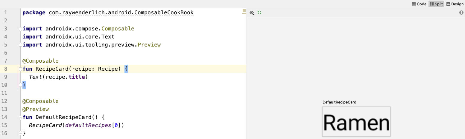
Right-click on the ComposableCookBook package and select New ▸ New Kotlin File/Class. Then select File from the list and type the name RecipeCard. Lastly, add the composable method, RecipeCard(), shown below:
@Composable
fun RecipeCard(recipe: Recipe) {
  Text(recipe.title)
}
For now, this just displays the title of the recipe using Text().
Since RecipeCard() takes a parameter, you can’t use @Preview. However, you can create another composable method that supplies a default RecipeCard(). Add the following below RecipeCard():
@Composable
@Preview
fun DefaultRecipeCard() {
  RecipeCard(defaultRecipes[0])
}
You can now preview the RecipeCard().
Next, you’re going to add an image to RecipeCard(), above the title.
Adding an Image to the RecipeCard
Replace the contents of RecipeCard() with the following:
// 1
val image = imageResource(recipe.imageResource)
// 2
Column(modifier = Modifier.fillMaxWidth()) {
  // 3
  Image(asset = image, contentScale = ContentScale.Crop, modifier = Modifier.fillMaxWidth().height(144.dp))
  Text(recipe.title)
}
Make sure to import all the functions which might be marked as red, as unresolved references. There’s a lot of magic going on there for such a tiny chunk of code! Then refresh the preview if needed.
Here’s a breakdown:
In Jetpack Compose, you use a different mechanism to get an instance of the Image. This line tells Jetpack Compose to fetch an Image from a given drawable resource identifier.
Modifiers let you adjust the UI of a composable. In this scenario, you’re using a modifier to control the sizing of the Column
You can use modifiers for much more than sizing, including expanding a composable or applying an aspect ratio.
-
Each
Recipecomes with an image resource which points to aDrawable. Normally, you’d either set the drawable on anImageViewor use aContextto get an instance of aDrawable.In Jetpack Compose, you use a different mechanism to get an instance of the
Image. This line tells Jetpack Compose to fetch anImagefrom a given drawable resource identifier. -
Next, you’re using the
Column@Composableyou learned about earlier to lay out your recipe card contents in a vertical layout. Ideally the images associated with the recipe should be full width, so you’re using aModifierto tell thisColumnto expand to be full width.Modifiers let you adjust the UI of a composable. In this scenario, you’re using a modifier to control the sizing of the
ColumnYou can use modifiers for much more than sizing, including expanding a composable or applying an aspect ratio.
-
Finally, you’re using
Image()to render the image, passing through the image you retrieved in the first step. Just like with theImageViewclass that you know and love, you can set the content scale, width and height of anImage. To do so, you’re using aModifierto set the width and the height of the image, and thecontentScaleargumnet to set the content scale.
Refresh the preview and you’ll see your recipe card starting to take shape!

That ramen looks pretty tasty – but what ingredients do you need to cook it? For your next task, you’ll create an ingredient list.
Listing Ingredients
To list the ingredients, you’ll use your handy Text(). Since you already defined a Column() in the previous step, adding the ingredients will be easy.
Add the following below the Text drawing the recipe’s title:
for (ingredient in recipe.ingredients) {
  Text(ingredient)
}
One of the awesome things about Jetpack Compose is that you can use normal Kotlin code to express slightly more complex UI details.
In the above code, you use a for loop to list all the Text ingredients. If you rebuild the UI you’ll see all the ingredients of this delicious ramen meal listed below the title. Pretty cool, right? And you didn’t have to define a RecyclerView.Adapter, or any ViewHolders!

That ramen does look tasty, but the recipe card itself looks pretty square. Next, you’ll add rounded corners to the recipe card, to make it nicer.
Rounding the RecipeCard’s Corners
Using a Surface() parent gives you the option to round the corners of your item. Replace the existing contents of RecipeCard() with the following:
Surface(shape = RoundedCornerShape(8.dp), elevation = 8.dp) {
  val image = imageResource(recipe.imageResource)
  Column(modifier = Modifier.fillMaxWidth()) {
    Image(asset = image, contentScale = ContentScale.Crop, modifier = Modifier.fillMaxWidth().height(144.dp))
    Text(recipe.title)
    for (ingredient in recipe.ingredients) {
      Text("• $ingredient")
    }
  }
}
Surface() handles drawing shapes and providing a component’s elevation. For the recipe card, you’ll use a Surface() with a RoundedCornerShape() and an elevation of 8 dp.
Refresh the build. The preview should now show a rounded card!

The card is starting to shape up, but it’s missing two things: some basic styling on the title component and some padding between elements. You’ll take care of that in the next step.
Improving the Recipe Card’s Look
Start by adding a text style inside the recipe title Text():
Text(recipe.title, style = MaterialTheme.typography.h4)
Here, you use the style parameter to style your text with the default MaterialTheme typography header style.
