Introduction to Unity UI – Part 2
In this second part of the tutorial, you’re going to add additional functionality like playing and pausing the music, selecting a track from a list inside a ScrollView, and changing the volume with a slider. As you add these features, you’ll learn all about Unity’s built-in UI components. By Ben MacKinnon.
Adding a ScrollView
You’ve actually already added a ScrollView to the scene! The Template component of the drop-down had a ScrollView on it for when the list of options gets too big for the size of the template. ScrollViews are the perfect solution for when you need to display a large amount of data within a confined space. Whether it’s a list of items, pages of information, or perhaps a large map in a small window, ScrollView can help.
The ScrollView you’re going to need will load a list of tracks based on the selection from the drop-down you just added, so for ease, there’s another prefab ready for you to use. Drag the Scroll View prefab from Assets / Prefabs out onto the Menu object. Like the drop-down, it should be already positioned and ready to use.
Let’s take a look at the anatomy of the Scroll View.

- Content: This RectTransform is the most important part of setting up a ScrollView. This is where you layout everything that you want to be able to scroll around and view. The size of the Content RectTransform needs to expand to fit everything, and only when the Content is larger than the Viewport does scrolling have any real effect.
- Horizontal and Vertical: These checkboxes turn on and off the scrolling in their respective directions. For a list like the one you’re about to put in, Vertical is sufficient.
- Viewport: This is the RectTransform that acts as a window to the content. It should have a Mask component on it so that any content outside of the Viewport is hidden.
- Scrollbar settings: This section details the Horizontal and Vertical scrollbars and their behaviors. The scrollbars can be set to Auto Hide so that they don’t display if they aren’t needed.
- On Value Changed: Like the drop-down, the ScrollView also raises an event when its value changes. Only the ScrollView raises a Vector2 that tells you the X and Y position it has scrolled to.
- Track List: This is an extra script for the Jukebox scene. It will handle loading the appropriate tracks into the ScrollView.
- Track Prefab: This is a reference to another prefab — the one for a track listing.
- Track List Parent: A reference to the Content RectTransform in the ScrollView. This is where new tracks will be added into the scene.
For the most part, ScrollViews don’t need much setup in order to work. The key thing is to add your content to the Content object and resize it to your needs. For the jukebox, though, the content is going to change depending on the genre selected from the drop-down. That’s where the TrackList script comes in. It’s going to dynamically load new UI objects into the scene at runtime.
For this to work, the Content RectTransform needs to resize depending on what’s loaded in from the TrackList. Select the Content GameObject in the Hierarchy and you’ll see a somewhat familiar component — the Vertical Layout Group — and another component, Content Size Fitter.

Vertical Layout Group is just like the Horizontal Layout Group you added to the Button Layout earlier in the tutorial, but it lays its children out… vertically!
Content Size Fitter is a component that will drive the size of the RectTransform it’s attached to, based on the layout of its children. It only works in combination with a layout component, such as the Vertical Layout Group. Here, the Content Size Fitter is set to have a Vertical Fit of Preferred Size. This means that as you add more child objects to it, its height will increase so they all fit. Notice that the Height value of the RectTransform is grayed out?
Go ahead and add a couple of child objects to the Content by right-clicking on it and selecting Create Empty. Then, select the Content GameObject again and see that it has a new Height value!

OK, now that you know how the track listing is going to work, it’s time to hook everything up! Delete any extra GameObjects you added to the Content of the ScrollView.
Select the Managers / JukeBox GameObject in the Hierarchy again, and you’ll see it has two missing references on the Juke Box component. Drag the Dropdown onto the Playlist Dropdown and the Scroll View onto the Track List spaces.
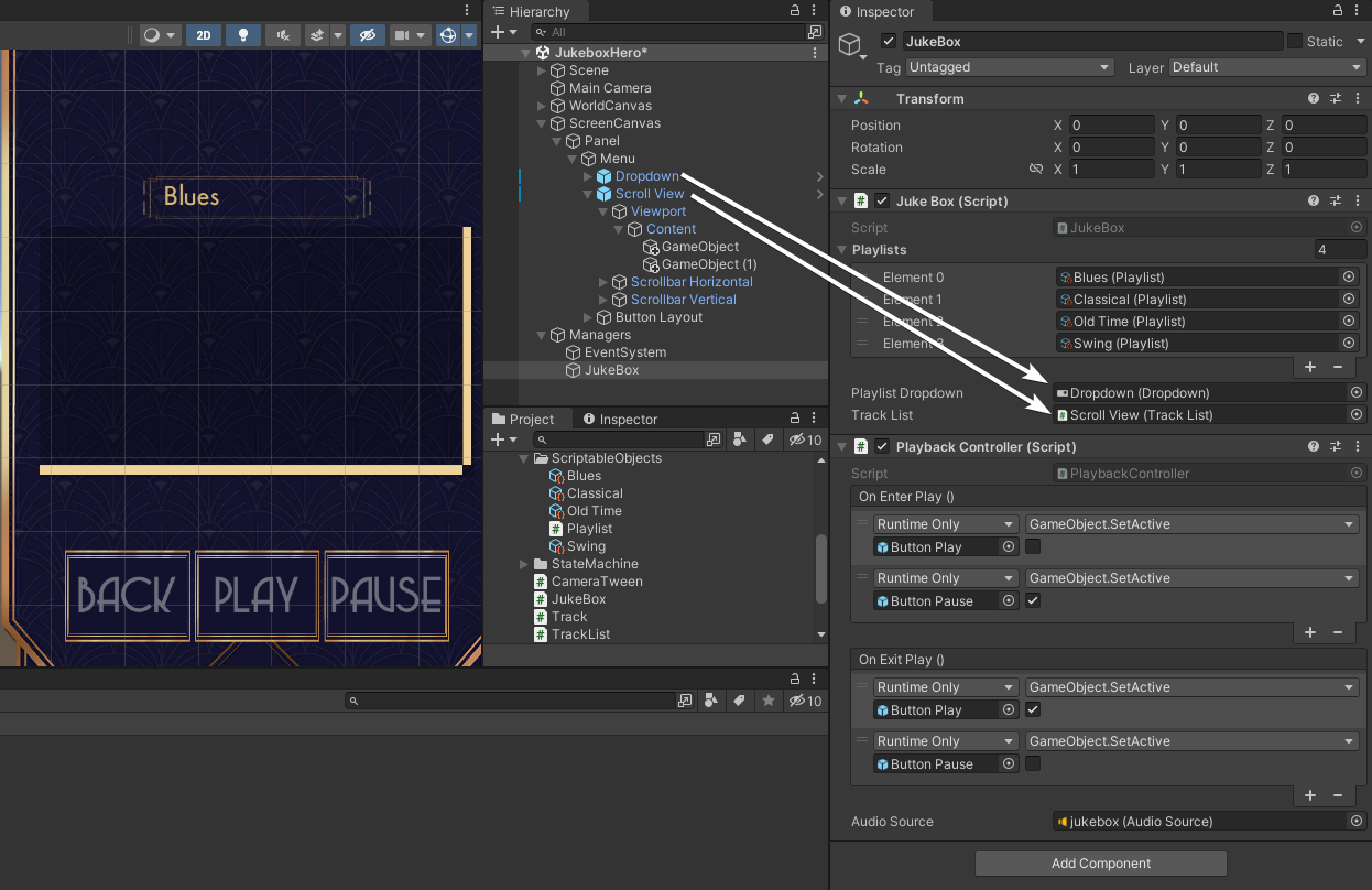
The Juke Box script will add a listener to the Dropdown OnValueChanged event that will tell the Track List which playlist to load inside the ScrollView.
If you changed the Alpha on the Canvas Group, change it back to zero and then save the scene and press play. Head into the jukebox menu and start trying out some of the different tracks available.

Now you’ve finally got a few tracks to listen to, but it’d be great to adjust the volume on the jukebox. And once more, Unity has the perfect component ready for you — the Slider!
Using the Slider
Sliders are another very common UI component when you need to adjust some value. Most settings menus are full of sliders. And changing the volume is the perfect example of such a setting!
Yet again, a prefab is provided in the project. Drag the Volume Slider prefab from Assets / Prefabs onto the Menu GameObject in the scene. Again, it should drop into the correct position.

The Slider component should look familiar because it’s another Selectable with all the same transitions that the Button and Dropdown components had. The Slider-specific settings are:
- Fill Rect: This is the RectTransform that acts as the filled in part of the slider. The Slider component drives the Anchor Max value of this component so that it stretches across the Fill Area (another subcomponent of the Slider).
- Handle Rect: Similar to the Fill Rect, this component is positioned based on the value of the slider. The only difference is that it’s moved rather than stretched across.
- Direction: The slider can be set to either direction in both horizontal and vertical axes.
- Min/Max Value: By default, a slider is set just to be 0-1 but you can define any Min and Max value that makes sense for your UI.
- Whole Numbers: When using a larger max value, you may want to use whole numbers only. With this on, the slider handle will snap to the appropriate position for whole numbers.
- Value: The current value of the slider.
- On Value Changed: When the slider value is changed, you can use this event to alert other objects.
You don’t need to change any of the settings on the slider for a volume slider. The only thing to do is to set up the On Value Changed event. A listener is already part of the prefab. Just drag the JukeBox onto the object field and select PlaybackController ▸ SetVolume from the list. Make sure to select the Dynamic float version from the top of the list, as this will send the slider’s value as the parameter to the function.

Save the scene and press Play once more. Play around with the slider once you open the 2D menu and see… no, hear… how the volume changes! :]
Finally, you can set the volume to 0 using the slider, but would it not be handy just to have a mute toggle to do it quickly? One last feature for the road, then!