How To Make a Custom Control
In this tutorial, you will implement your very own custom control. You’ll touch on such concepts as extending existing controls, designing and implementing your control’s API, and even how to share your new control with the development community. By Colin Eberhardt.
Learn how to make a custom control like a slider that has two knobs
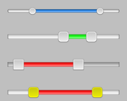
Learn how to make a custom control like a slider that has two knobs
Update 8/27/14: Post now updated to iOS 8 and Swift, check it out!
Controls are one of the most important building blocks of any application. They serve as the graphical components that allow your users to view and interact with their application’s data. This tutorial shows you how to make a custom control that’s reusable.
Apple supplies around 20 controls, such as UITextField, UIButton and UISwitch. Armed with this toolbox of pre-existing controls, you can create a great variety of user interfaces.
However, sometimes you need to do something just a little bit different; something that the other controls can’t handle quite the way you want.
As an example, say you’re developing an application for searching property-for-sale listings. This fictional application allows the user to filter search results so they fall within a certain price range.
You could provide an interface which presents the user with a pair of UISlider controls, one for setting the maximum price and one for setting the minimum, as shown in the screenshot below:

However, this interface doesn’t really help the user visualize the price range. It would be much better to present a single slider with two knobs to indicate the high and low price range they are searching for, as shown here:

The above interface provides a much better user experience; the users can immediately see that they are defining a range of values.
Unfortunately, this slider control isn’t in the standard UI toolbox. To implement this functionality, you’d have create it as a custom control.
You could build this range slider by subclassing UIView and creating a bespoke view for visualizing price ranges. That would be fine for the context of your app — but it would be a struggle to port it to other apps.
It’s a much better idea to make this new component generic so that you can reuse it in any context where it’s appropriate. This is the very essence of custom controls.
Custom controls are nothing more than controls that you have created yourself; that is, controls that do not come with the UIKit framework. Custom controls, just like standard controls, should be generic and versatile. As a result, you’ll find there is an active and vibrant community of developers who love to share their custom control creations.
In this tutorial, you will implement your very own RangeSlider custom control to solve the problems above. You’ll touch on such concepts as extending existing controls, designing and implementing your control’s API, and even how to share your new control with the development community.
Anyhow, enough theory. Time to start customizing!
Getting Started
This section will walk you through creating the basic structure of the control, which will be just enough to allow you to render a simple range slider on screen.
Fire up Xcode. Go to File\New\Project, select the iOS\Application\Single View Application template and click Next. On the next screen, enter CERangeSlider as the product name, and fill in the other details as in the image below:

Note that you’ll use Automatic Reference Counting (ARC) in this project but not Storyboards, since this is a single-page application. Also note that a Class Prefix is set for you in this project. You can omit the “Class Prefix”, but if you do, be aware that the auto-generated names for some files will be different from what’s specified in this tutorial.
Finally, feel free to use your own “Organization Name” and “Company Identifier”. When you’re done, click Next. Then choose a place to save the project and click Create.
The first decision you need to make when creating a custom control is which existing class to subclass, or extend, in order to make your new control.
Your class must be a UIView subclass in order for it be available in the application’s UI.
If you check the Apple UIKit reference, you’ll see that a number of the framework controls such as UILabel and UIWebView subclass UIView directly. However, there are a handful, such as UIButton and UISwitch which subclass UIControl, as shown in the hierarchy below:

Note: For a complete class hierarchy of UI components, check out the UIKit Framework Reference.
Note: For a complete class hierarchy of UI components, check out the UIKit Framework Reference.
The UIControl class implements the target-action pattern, which is a mechanism for notifying subscribers of changes. UIControl also has a few properties that relate to control state. You’ll be using the target-action pattern in this custom control, so UIControl will serve as a great starting point.
Right-click the CERangeSlider group in the Project Navigator and select New File…, then select the iOS\Cocoa Touch\Objective-C class template and click Next. Call the class CERangeSlider and enter UIControl into the “subclass of” field. Click Next and then Create to choose the default location to store the files associated with this new class.
Although writing code is pretty awesome, you probably want to see your control rendered on the screen to measure your progress! Before you write any code for your control, you should add your control to the view controller so that you can watch the evolution of the control.
Open up CEViewController.m, and import the header file of your new control at the top of the file, as so:
#import "CERangeSlider.h"
Further down CEViewController.m, add an instance variable just below the @implementation statement:
@implementation CEViewController
{
    CERangeSlider* _rangeSlider;
}
And further down still in CEViewController.m, replace the boiler-plate viewDidLoad with the following:
- (void)viewDidLoad
{
    [super viewDidLoad];

    // Do any additional setup after loading the view, typically from a nib.

    NSUInteger margin = 20;
    CGRect sliderFrame = CGRectMake(margin, margin, self.view.frame.size.width - margin * 2, 30);
    _rangeSlider = [[CERangeSlider alloc] initWithFrame:sliderFrame];
    _rangeSlider.backgroundColor = [UIColor redColor];

    [self.view addSubview:_rangeSlider];
}
The above three sections of code simply create an instance of your all-new control in the given frame and add it to the view. The control background color has been set to red so that it will be visible against the app’s background. If you didn’t set the control’s background to red, then the control would be clear — and you’d be wondering where your control went! :]
Build and run your app; you should see something very similar to the following:

Before you add the visual elements to your control, you’ll need a few properties to keep track of the various pieces of information that are stored in your control. This will form the start of your control’s Application Programming Interface, or API for short.
Note: Your control’s API defines the methods and properties that you decide to expose to the other developers who will be using your control. You’ll read about API design a little later in this article — for now, just hang tight!
Note: Your control’s API defines the methods and properties that you decide to expose to the other developers who will be using your control. You’ll read about API design a little later in this article — for now, just hang tight!