Android Accessibility Tutorial: Getting Started
In this Android accessibility tutorial, learn how to make apps that everyone can use, including people with vision, motor, or hearing disabilities. By Tori Gonda.
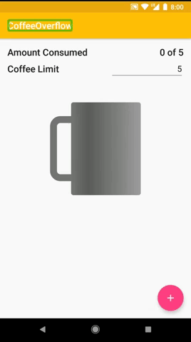
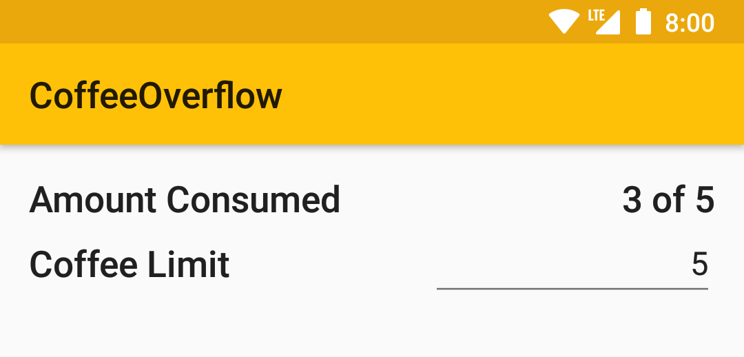
Traversal order
Now to handle the FloatingActionButton. You can use android:accessibilityTraversalBefore on a view to specify what item this should come before. Add this to the FloatingActionButton using the id of the container holding the consumed amount as the value.
activity_main.xml
<android.support.design.widget.FloatingActionButton
   android:id="@+id/addCoffee"
   android:layout_width="wrap_content"
   android:layout_height="wrap_content"
   android:accessibilityTraversalBefore="@+id/consumedContainer"
   android:clickable="true"
   android:contentDescription="@string/add_coffee"
   android:focusable="true"
   android:src="@drawable/ic_add_24px"
   app:fabSize="normal"
   app:layout_anchor="@id/mainContent"
   app:layout_anchorGravity="bottom|right|end"
   tools:targetApi="lollipop_mr1"/>
Now when you rebuild and run the app with TalkBack, you will reach the “add coffee” button before the container holding the consumption, and therefore, the rest of the view. This will also be helpful for navigating the app using Switch Access.
Note: accessibilityTraversalBefore is only available on Lollipop and higher, and will only work if the element whose id you provided is focusable. Because the LinearLayout with the id consumedContainer is focusable, this works here if you’re running on a device with version 5.0 or higher.
Note: accessibilityTraversalBefore is only available on Lollipop and higher, and will only work if the element whose id you provided is focusable. Because the LinearLayout with the id consumedContainer is focusable, this works here if you’re running on a device with version 5.0 or higher.
Announce for accessibility
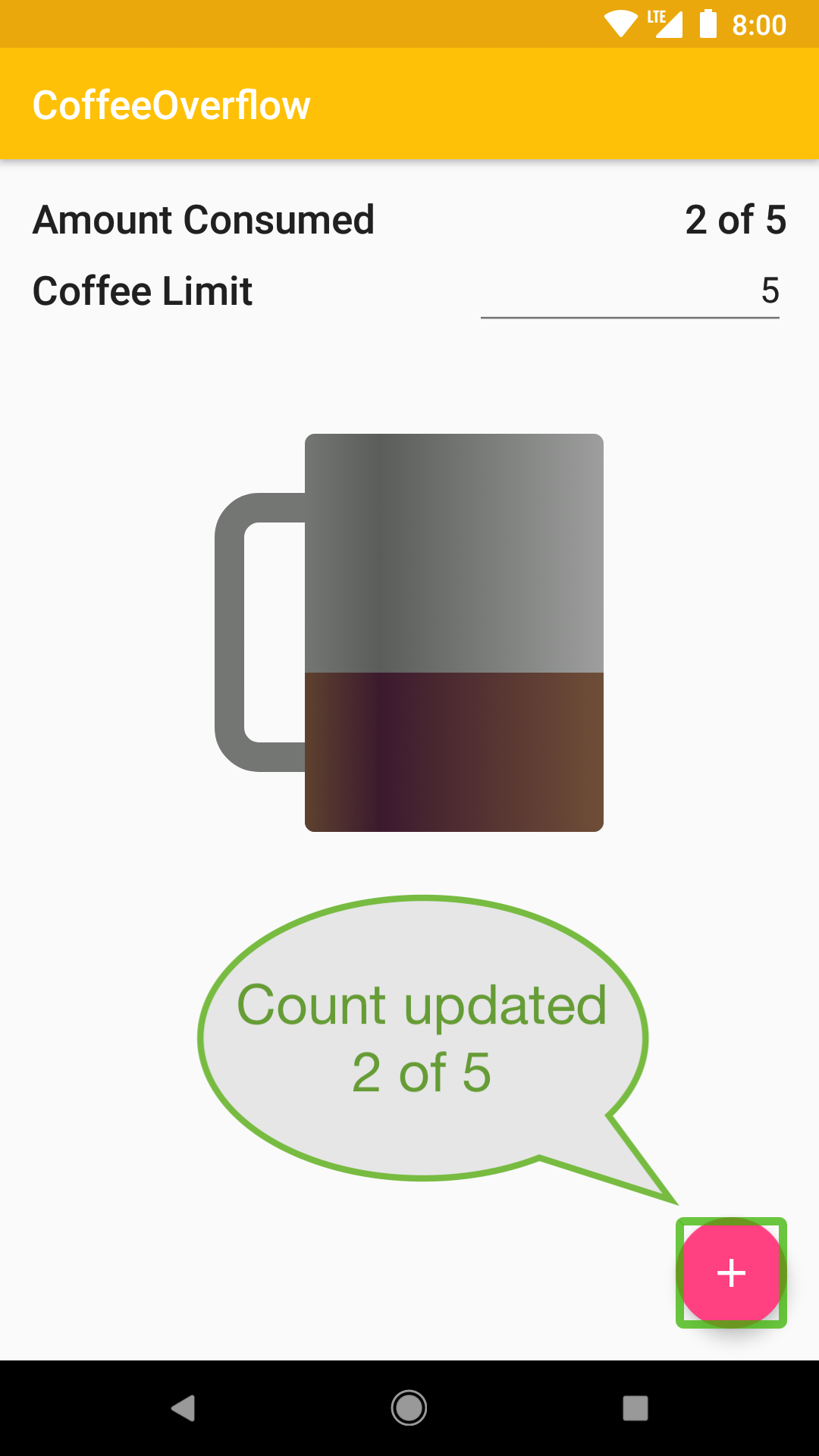
Have you tried adding a cup of coffee with TalkBack on? Did you notice anything missing for those with visual impairments? When the cup is added the value of the amount consumed is changed along with the ratio of coffee in the coffee cup. These are great visual cues, but it is lacking for those who can’t see them. How can you make this audible?

For this you can use the method announceForAccessibility() on a view. When announceForAccessibility() is called, Android will give an audible announcement for those using a screen reader, and do nothing if an accessibility tool is not in use. You can use this to inform the user that the value has been incremented.
In the onCreate() method in MainActivity, there is a click listener on the “add coffee” button that increments the number of cups of coffee, and shows the result. Add a call to announceForAccessibility() on the updated view to announce the change was made. Put the string you’re using for the message in the strings file. There is already a helper method, consumedString(), you can use to get the resulting value.
MainActivity.kt
override fun onCreate(savedInstanceState: Bundle?) {
 // …

 addCoffee.setOnClickListener {
   coffeeRepo.increment()
   showCount()

   amountConsumed.announceForAccessibility(getString(R.string.count_updated, consumedString()))
 }
}
strings.xml
<resources>
  <string name="app_name">CoffeeOverflow</string>
  <string name="coffee_limit_label">Coffee Limit</string>
  <string name="default_coffee_limit">5</string>
  <string name="coffee_limit_input_hint">Limit</string>
  <string name="amount_consumed">Amount Consumed</string>
  <string name="consumed_format">%1$d of %2$s</string>
  <string name="add_coffee">Add Coffee</string>
  <string name="count_updated">Count updated %s</string>
</resources>
Try using TalkBack to increment the cups of coffee consumed with this update. Now there is an audible cue in addition to the visual when the amount consumed is incremented.
If you don’t want the experience to change for sighted users, announceForAccessibility() is a great thing to use. Use it whenever you have a place where there is a meaningful change that was previously only indicated visually.
Another option for updating the user about a change is with Toasts. When Toasts are shown on screen, they are announced when accessibility tools such as TalkBack are enabled.
Designing for accessibility
There are things you can build into the design of your apps to make it easier for all your users to use. Size, colors, and layouts are all things you can be considerate of.
Touch targets
Take a look at your Accessibility Scanner results again. You can open the app to see the history of any scans you have taken, or perform a new scan. There is a warning on the limit EditText. It says, “Consider making this clickable item larger. This item’s height is 44dp. Consider making the height of this touch target 48dp or larger.”
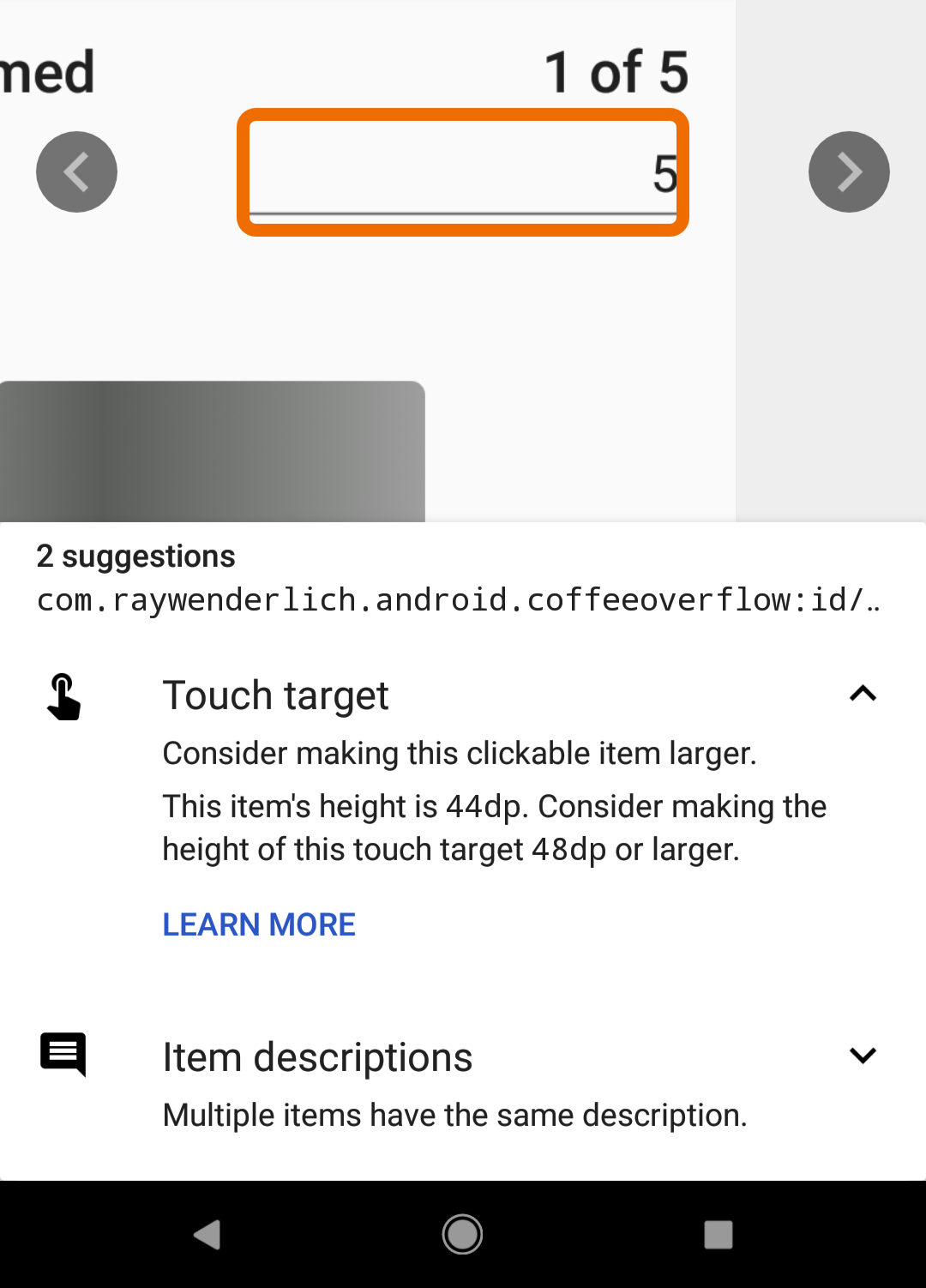
It’s recommended by Google to make any clickable items at least 48dp in size. That is because anything smaller is difficult for people with vision and motor impairments to tap accurately. In addition, you’ll help out all your users that might be in a bumpy vehicle, wearing gloves, or in bright light that makes it hard to see the screen. Everyone benefits from making this improvement.
To solve this, add the android:minHeight attribute to that EditText. Make sure the value is at least 48dp. Alternatively, you could set android:height to 48dp or higher. This example uses minHeight.
activity_main.xml
<EditText
   android:id="@+id/coffeeLimitValue"
   android:layout_width="wrap_content"
   android:layout_height="wrap_content"
   android:layout_gravity="end"
   android:layout_weight="1"
   android:hint="@string/coffee_limit_input_hint"
   android:inputType="number"
   android:minHeight="48dp"
   android:text="@string/default_coffee_limit"
   android:textAlignment="textEnd"/>
Run the Accessibility Scanner again to make sure this works. There should no longer be a warning for the height of this item.
Color contrast
There are two warnings remaining. There is still one on the EditText that says “Multiple items have the same description.” Because you put the labelFor on the label for this field, the description for the label is part of the description for the limit field. You can leave this one be.
The other is on the text in the toolbar. The message says “Consider increasing this item’s text foreground to background contrast ratio.” Having low vision, color blindness, or a dimmed screen can make it difficult to read text with a low color contrast.
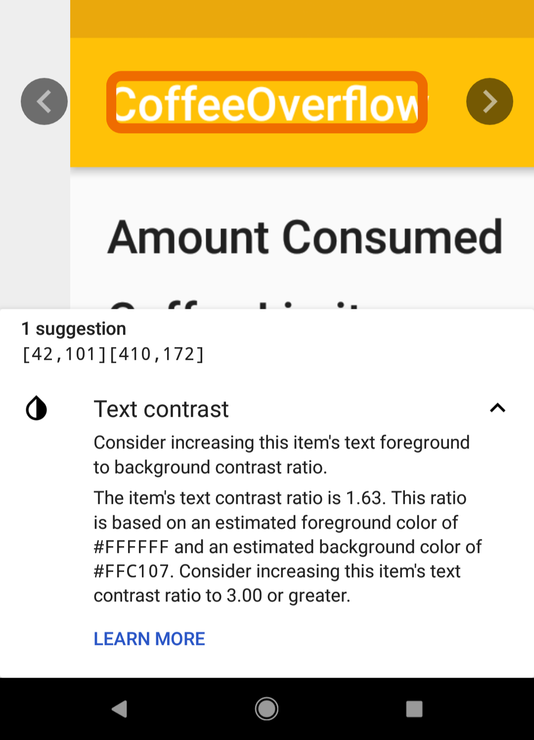
The recommended contrast ratio for text this size is at least 3.0 to 1.
Depending on where this is in your app, there are multiple possible actions you can take. You can change the font color. You can also change the background color. These are usually done in the layout xml file, activity_main.xml in this case. Because this is in the the action bar, you are going to change it in the styles in styles.xml.
Open the file and observe the parent style. The app is currently using a parent dark action bar theme, Theme.AppCompat.Light.DarkActionBar. The action bar is yellow, a light color, so this should be a light theme. Replace the parent style with Theme.AppCompat.Light.
styles.xml
<style name="AppTheme" parent="Theme.AppCompat.Light">
  <item name="colorPrimary">@color/colorPrimary</item>
  <item name="colorPrimaryDark">@color/colorPrimaryDark</item>
  <item name="colorAccent">@color/colorAccent</item>
</style>
This will change the text of the action bar from white to black. Run the Scanner again to see that this warning is gone.
Where to go from here
By completing this tutorial, you’ve learned many ways to make your apps more accessible. You can download the finished project here.
Now you know how to use TalkBack and the Accessibility Scanner to identify accessibility issues in your app. You also know that you can use Espresso and Lint to catch and make sure issues don’t creep in.
Through using the Accessibility Scanner and TalkBack, you identified areas of the app that could use accessibility improvements, then learned and completed the steps to fix them. You can use contentDescription, isImportantForAccessibility, focusable, accessibilityTraversalBefore, and announceForAccessibility to give the user the right information at the right time when using a screen reader.
You also know some tips for creating accessible designs. Making sure touch targets are big enough, and you have a high enough color contrast will benefit all your users.
These are some of the main things you can do to make your app accessible, but there are also many more things. Make sure to go through Google’s accessibility checklist when creating your app. You’ll find things you learned here, as well ways to get started making even more improvements.
Write your app with everyone in mind!
Here are some more resources on accessibility for you:
- Google’s overview about Android accessibility
- Google’s “Implementing Accessibility”
- ‘How to Earn an “A” for Android Accessibility’ by Nick Bonatsakis
- “Android is for Everyone” by Kelly Shuster
Please join the comments below with any questions or thoughts!