How To Make a Custom Control Tutorial: A Reusable Slider
Controls are the bread-and-butter of iOS apps. There are many provided in UIKit but this tutorial shows you how to make a custom control in Swift. By Mikael Konutgan.
Sign up/Sign in
With a free Kodeco account you can download source code, track your progress, bookmark, personalise your learner profile and more!
Create accountAlready a member of Kodeco? Sign in
Sign up/Sign in
With a free Kodeco account you can download source code, track your progress, bookmark, personalise your learner profile and more!
Create accountAlready a member of Kodeco? Sign in
Contents
How To Make a Custom Control Tutorial: A Reusable Slider
40 mins

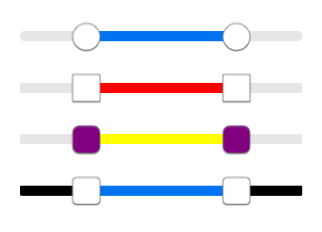
Learn how to make a custom control like a slider that has two thumbs
Update 12/8/14: Updated for Xcode 6.1.1.
Update note: This tutorial was updated for iOS 8 and Swift by Mikael Konutgan, checked against Xcode 6 beta 7. Original post by Tutorial Team member Colin Eberhardt.
User interface controls are one of the most important building blocks of any application. They serve as the graphical components that allow your users to view and interact with your application. Apple supplies a set of controls, such as UITextField
, UIButton
and UISwitch
. Armed with this toolbox of pre-existing controls, you can create a great variety of user interfaces.
However, sometimes you need to do something just a little bit different; something that the stock controls can’t handle quite the way you want.
Custom controls are nothing more than controls that you have created yourself; that is, controls that do not come with the UIKit framework. Custom controls, just like standard controls, should be generic and versatile. As a result, you’ll find there is an active and vibrant community of developers who love to share their custom control creations.
In this tutorial, you will implement your very own RangeSlider custom control. This control is like a double-ended slider, where you can pick both a minimum and maximum value. You’ll touch on such concepts as extending existing controls, designing and implementing your control’s API, and even how to share your new control with the development community.
Time to start customizing!
Getting Started
Say you’re developing an application for searching property-for-sale listings. This fictional application allows the user to filter search results so they fall within a certain price range.
You could provide an interface which presents the user with a pair of UISlider
controls, one for setting the maximum price and one for setting the minimum price. However, this interface doesn’t really help the user visualize the price range. It would be much better to present a single slider with two thumbs to indicate the high and low price range they are searching for.
You could build this range slider by subclassing UIView
and creating a bespoke view for visualizing price ranges. That would be fine for the context of your app — but it would be a struggle to port it to other apps.
It’s a much better idea to make this new component as generic as possible, so that you can reuse it in any context where it’s appropriate. This is the very essence of custom controls.
Fire up Xcode. Go to File/New/Project, select the iOS/Application/Single View Application template and click Next. On the next screen, enter CustomSliderExample as the product name, choose your desired Organization Name and Organization Identifier, then make sure that Swift is selected as the language, iPhone is selected as the Device and that Use Core Data is not selected.
Finally choose a place to save the project and click Create.
The first decision you need to make when creating a custom control is which existing class to subclass, or extend, in order to make your new control.
Your class must be a UIView
subclass in order for it be available in the application’s UI.
If you check Apple’s UIKit
reference, you’ll see that a number of the framework controls such as UILabel
and UIWebView
subclass UIView
directly. However, there are a handful, such as UIButton
and UISwitch
which subclass UIControl
, as shown in the hierarchy below:
UIControl
implements the target-action pattern, which is a mechanism for notifying subscribers of changes. UIControl
also has a few properties that relate to control state. You’ll be using the target-action pattern in this custom control, so UIControl
will serve as a great starting point.
Right-click the CustomSliderExample group in the Project Navigator and select New File…, then select the iOS/Source/Cocoa Touch Class template and click Next. Call the class RangeSlider, enter UIControl
into the Subclass of field and make sure the language is Swift. Click Next and then Create to choose the default location to store the file associated with this new class.
Although writing code is pretty awesome, you probably want to see your control rendered on the screen to measure your progress! Before you write any code for your control, you should add your control to the view controller so that you can watch the evolution of the control.
Open up ViewController.swift and replace its contents with the following:
import UIKit
class ViewController: UIViewController {
let rangeSlider = RangeSlider(frame: CGRectZero)
override func viewDidLoad() {
super.viewDidLoad()
rangeSlider.backgroundColor = UIColor.redColor()
view.addSubview(rangeSlider)
}
override func viewDidLayoutSubviews() {
let margin: CGFloat = 20.0
let width = view.bounds.width - 2.0 * margin
rangeSlider.frame = CGRect(x: margin, y: margin + topLayoutGuide.length,
width: width, height: 31.0)
}
}
The above code simply creates an instance of your all-new control in the given frame and adds it to the view. The control background color has been set to red so that it will be visible against the app’s background. If you didn’t set the control’s background to red, then the control would be clear — and you’d be wondering where your control went! :]
Build and run your app; you should see something very similar to the following:
Before you add the visual elements to your control, you’ll need a few properties to keep track of the various pieces of information that are stored in your control. This will form the start of your control’s Application Programming Interface, or API for short.
Adding Default Control Properties
Open up RangeSlider.swift and replace the code with the following:
import UIKit
class RangeSlider: UIControl {
var minimumValue = 0.0
var maximumValue = 1.0
var lowerValue = 0.2
var upperValue = 0.8
}
These four properties are all you need to describe the state of this control, providing maximum and minimum values for the range, along with the upper and lower values set by the user.
Well-designed controls should define some default property values, or else your control will look a little strange when it draws on the screen! You did that above as well.
Now it’s time to work on the interactive elements of your control; namely, the thumbs to represent the high and low values, and the track the thumbs slide on.
Images vs. CoreGraphics
There are two main ways that you can render controls on-screen:
- Images – create images that represent the various elements of your control
- CoreGraphics – render your control using a combination of layers and CoreGraphics
There are pros and cons to each technique, as outlined below:
Images — constructing your control using images is probably the simplest option in terms of authoring the control — as long as you know how to draw! :] If you want your fellow developers to be able to change the look and feel of your control, you would typically expose these images as UIImage
properties.
Using images provides the most flexibility to developers who will use your control. Developers can change every single pixel and every detail of your control’s appearance, but this requires good graphic design skills — and it’s difficult to modify the control from code.
Core Graphics — constructing your control using Core Graphics means that you have to write the rendering code yourself, which will require a bit more effort. However, this technique allows you to create a more flexible API.
Using Core Graphics, you can parameterize every feature of your control, such as colors, border thickness, and curvature — pretty much every visual element that goes into drawing your control! This approach allows developers who use your control to fully tailor it to suit their needs.
In this tutorial you’ll use the second technique — rendering the control using Core Graphics.
Open up RangeSlider.swift and add the following import to the top of the file, just below import UIKit
:
import QuartzCore
Add the following properties to RangeSlider
, just after the ones we defined above:
let trackLayer = CALayer()
let lowerThumbLayer = CALayer()
let upperThumbLayer = CALayer()
var thumbWidth: CGFloat {
return CGFloat(bounds.height)
}
These three layers — trackLayer
, lowerThumbLayer
, and upperThumbLayer
— will be used to render the various components of your slider control. thumbWidth
will be used for layout purposes.
Next up are some default graphical properties of the control itself.
Inside the RangeSlider
class, add an initializer and the following helper functions:
override init(frame: CGRect) {
super.init(frame: frame)
trackLayer.backgroundColor = UIColor.blueColor().CGColor
layer.addSublayer(trackLayer)
lowerThumbLayer.backgroundColor = UIColor.greenColor().CGColor
layer.addSublayer(lowerThumbLayer)
upperThumbLayer.backgroundColor = UIColor.greenColor().CGColor
layer.addSublayer(upperThumbLayer)
updateLayerFrames()
}
required init(coder: NSCoder) {
super.init(coder: coder)
}
func updateLayerFrames() {
trackLayer.frame = bounds.rectByInsetting(dx: 0.0, dy: bounds.height / 3)
trackLayer.setNeedsDisplay()
let lowerThumbCenter = CGFloat(positionForValue(lowerValue))
lowerThumbLayer.frame = CGRect(x: lowerThumbCenter - thumbWidth / 2.0, y: 0.0,
width: thumbWidth, height: thumbWidth)
lowerThumbLayer.setNeedsDisplay()
let upperThumbCenter = CGFloat(positionForValue(upperValue))
upperThumbLayer.frame = CGRect(x: upperThumbCenter - thumbWidth / 2.0, y: 0.0,
width: thumbWidth, height: thumbWidth)
upperThumbLayer.setNeedsDisplay()
}
func positionForValue(value: Double) -> Double {
return Double(bounds.width - thumbWidth) * (value - minimumValue) /
(maximumValue - minimumValue) + Double(thumbWidth / 2.0)
}
The initializer simply creates three layers and adds them as children of the control’s root layer, then updateLayerFrames
, well, updates the layer frames to fit! :]
Finally, positionForValue
maps a value to a location on screen using a simple ratio to scale the position between the minimum and maximum range of the control.
Next, override frame
, and implement a property observer by adding the following to RangeSlider.swift:
override var frame: CGRect {
didSet {
updateLayerFrames()
}
}
The property observer updates the layer frames when the frame changes. This is necessary when the control is initialized with a frame that is not its final frame like in ViewController.swift.
Build and run your app; your slider is starting to take shape! It should look similar to the screenshot below:
Remember, red is the background of the entire control. Blue is the “track” for the slider and green will be the two thumb points for the upper and lower values.
Your control is starting to take shape visually, but almost every control provides a way for the app user to interact with it.
For your control, the user must be able to drag each thumb to set the desired range of the control. You’ll handle those interactions, and update both the UI and the properties exposed by the control.
Adding Interactive Logic
The interaction logic needs to store which thumb is being dragged, and reflect that in the UI. The control’s layers are a great place to put this logic.
As before, create a new Cocoa Touch Class in Xcode named RangeSliderThumbLayer
which is a subclass of CALayer
.
Replace the contents of the newly added RangeSliderThumbLayer.swift with the following:
import UIKit
import QuartzCore
class RangeSliderThumbLayer: CALayer {
var highlighted = false
weak var rangeSlider: RangeSlider?
}
This simply adds two properties: one that indicates whether this thumb is highlighted, and one that is a reference back to the parent range slider. Since the RangeSlider owns the two thumb layers, the back reference is a weak variable to avoid a retain cycle.
Open RangeSlider.swift and change the type of the lowerThumbLayer
and upperThumbLayer
properties, by replacing their definitions with the following:
let lowerThumbLayer = RangeSliderThumbLayer()
let upperThumbLayer = RangeSliderThumbLayer()
Still in RangeSlider.swift, find init
and add the following lines to it:
lowerThumbLayer.rangeSlider = self
upperThumbLayer.rangeSlider = self
The above code simply sets the layer’s rangeSlider
property to populate the back reference to self
.
Build and run your project; check to see if everything still looks the same.
Now that you have the slider’s thumbs layers in place using RangeSliderThumbLayer
, you need to add the ability for the user to drag the slider thumbs around.
Adding Touch Handlers
Open RangeSlider.swift add the following property along with the others:
var previousLocation = CGPoint()
This property will be used to track the touch locations.
How are you going to track the various touch and release events of your control?
UIControl
provides several methods for tracking touches. Subclasses of UIControl
can override these methods in order to add their own interaction logic.
In your custom control, you will override three key methods of UIControl
: beginTrackingWithTouch
, continueTrackingWithTouch
and endTrackingWithTouch
.
Add the following method to RangeSlider.swift:
override func beginTrackingWithTouch(touch: UITouch, withEvent event: UIEvent) -> Bool {
previousLocation = touch.locationInView(self)
// Hit test the thumb layers
if lowerThumbLayer.frame.contains(previousLocation) {
lowerThumbLayer.highlighted = true
} else if upperThumbLayer.frame.contains(previousLocation) {
upperThumbLayer.highlighted = true
}
return lowerThumbLayer.highlighted || upperThumbLayer.highlighted
}
The method above is invoked when the user first touches the control.
First, it translates the touch event into the control’s coordinate space. Next, it checks each thumb layer to see whether the touch was within its frame. The return value for the above method informs the UIControl
superclass whether subsequent touches should be tracked.
Tracking touch events continues if either thumb is highlighted.
Now that you have the initial touch event, you’ll need to handle the events as the user moves their finger across the screen.
Add the following methods to RangeSlider.swift:
func boundValue(value: Double, toLowerValue lowerValue: Double, upperValue: Double) -> Double {
return min(max(value, lowerValue), upperValue)
}
override func continueTrackingWithTouch(touch: UITouch, withEvent event: UIEvent) -> Bool {
let location = touch.locationInView(self)
// 1. Determine by how much the user has dragged
let deltaLocation = Double(location.x - previousLocation.x)
let deltaValue = (maximumValue - minimumValue) * deltaLocation / Double(bounds.width - thumbWidth)
previousLocation = location
// 2. Update the values
if lowerThumbLayer.highlighted {
lowerValue += deltaValue
lowerValue = boundValue(lowerValue, toLowerValue: minimumValue, upperValue: upperValue)
} else if upperThumbLayer.highlighted {
upperValue += deltaValue
upperValue = boundValue(upperValue, toLowerValue: lowerValue, upperValue: maximumValue)
}
// 3. Update the UI
CATransaction.begin()
CATransaction.setDisableActions(true)
updateLayerFrames()
CATransaction.commit()
return true
}
boundValue
will clamp the passed in value so it is within the specified range. Using this helper function is a little easier to read than a nested min
/ max
call.
Here’s a breakdown of continueTrackingWithTouch
, comment by comment:
- First you calculate a delta location, which determines the number of pixels the user’s finger travelled. You then convert it into a scaled delta value based on the minimum and maximum values of the control.
- Here you adjust the upper or lower values based on where the user drags the slider to.
- This section sets the
disabledActions
flag inside aCATransaction
. This ensures that the changes to the frame for each layer are applied immediately, and not animated. Finally,updateLayerFrames
is called to move the thumbs to the correct location.
You’ve coded the dragging of the slider — but you still need to handle the end of the touch and drag events.
Add the following method to RangeSlider.swift:
override func endTrackingWithTouch(touch: UITouch, withEvent event: UIEvent) {
lowerThumbLayer.highlighted = false
upperThumbLayer.highlighted = false
}
The above code simply resets both thumbs to a non-highlighted state.
Build and run your project, and play around with your shiny new slider! You should be able to drag the green thumb points around.
You’ll notice that when the slider is tracking touches, you can drag your finger beyond the bounds of the control, then back within the control without losing your tracking action. This is an important usability feature for small screen devices with low precision pointing devices — or as they’re more commonly known, fingers! :]
Change Notifications
You now have an interactive control that the user can manipulate to set upper and lower bounds. But how do you communicate these change notifications to the calling app so that the app knows the control has new values?
There are a number of different patterns that you could implement to provide change notification: NSNotification
, Key-Value-Observing
(KVO), the delegate
pattern, the target-action
pattern and many others. There are so many choices!
What to do?
If you look at the UIKit
controls, you’ll find they don’t use NSNotification
or encourage the use of KVO, so for consistency with UIKit you can exclude those two options. The other two patterns — delegates and target-action patterns — are used extensively in UIKit.
Here’s a detailed analysis of the delegate and the target-action pattern:
Delegate pattern – With the delegate pattern you provide a protocol which contains a number of methods that are used for a range of notifications. The control has a property, usually named delegate
, which accepts any class that implements this protocol. A classic example of this is UITableView
which provides the UITableViewDelegate
protocol. Note that controls only accept a single delegate instance. A delegate method can take any number of parameters, so you can pass in as much information as you desire to such methods.
Target-action pattern – The target-action pattern is provided by the UIControl
base class. When a change in control state occurs, the target is notified of the action which is described by one of the UIControlEvents
enum values. You can provide multiple targets to control actions and while it is possible to create custom events (see UIControlEventApplicationReserved
) the number of custom events is limited to 4. Control actions do not have the ability to send any information with the event. So they cannot be used to pass extra information when the event is fired.
The key differences between the two patterns are as follows:
- Multicast — the target-action pattern multicasts its change notifications, while the delegate pattern is bound to a single delegate instance.
- Flexibility — you define the protocols yourself in the delegate pattern, meaning you can control exactly how much information you pass. Target-action provides no way to pass extra information and clients would have to look it up themselves after receiving the event.
Your range slider control doesn’t have a large number of state changes or interactions that you need to provide notifications for. The only things that really change are the upper and lower values of the control.
In this situation, the target-action pattern makes perfect sense. This is one of the reasons why you were told to subclass UIControl
right back at the start of this tutorial!
Aha! It’s making sense now! :]
The slider values are updated inside continueTrackingWithTouch:withEvent:
, so this is where you’ll need to add your notification code.
Open up RangeSlider.swift, locate continueTrackingWithTouch
, and add the following just before the “return true
” statement:
sendActionsForControlEvents(.ValueChanged)
That’s all you need to do in order to notify any subscribed targets of the changes!
Now that you have your notification handling in place, you should hook it up to your app.
Open up ViewController.swift and add the following code to the end of viewDidLoad
:
rangeSlider.addTarget(self, action: "rangeSliderValueChanged:", forControlEvents: .ValueChanged)
The above code invokes the rangeSliderValueChanged
method each time the range slider sends the UIControlEventValueChanged
action.
Now add the following method to ViewController.swift:
func rangeSliderValueChanged(rangeSlider: RangeSlider) {
println("Range slider value changed: (\(rangeSlider.lowerValue) \(rangeSlider.upperValue))")
}
This method simply logs the range slider values to the console as proof that your control is sending notifications as planned.
Build and run your app, and move the sliders back and forth. You should see the control’s values in the console, as in the screenshot below:
Range slider value changed: (0.117670682730924 0.390361445783134) Range slider value changed: (0.117670682730924 0.38835341365462) Range slider value changed: (0.117670682730924 0.382329317269078) Range slider value changed: (0.117670682730924 0.380321285140564) Range slider value changed: (0.119678714859438 0.380321285140564) Range slider value changed: (0.121686746987952 0.380321285140564)
You’re probably sick of looking at the multi-colored range slider UI by now. It looks like an angry fruit salad!
It’s time to give the control a much-needed facelift!
Modifying Your Control With Core Graphics
First, you’ll update the graphics of the “track” that the slider thumbs move along.
Add another subclass of CALayer
to the project just like before, this time calling it RangeSliderTrackLayer
.
Open up the newly added file RangeSliderTrackLayer.swift, and replace its contents with the following:
import UIKit
import QuartzCore
class RangeSliderTrackLayer: CALayer {
weak var rangeSlider: RangeSlider?
}
The code above adds a reference back to the range slider, just as you did previously for the thumb layer.
Open up RangeSlider.swift, locate the trackLayer
property and modify it to be an instance of the new layer class, as below:
let trackLayer = RangeSliderTrackLayer()
Now find init
and replace the method with the following:
init(frame: CGRect) {
super.init(frame: frame)
trackLayer.rangeSlider = self
trackLayer.contentsScale = UIScreen.mainScreen().scale
layer.addSublayer(trackLayer)
lowerThumbLayer.rangeSlider = self
lowerThumbLayer.contentsScale = UIScreen.mainScreen().scale
layer.addSublayer(lowerThumbLayer)
upperThumbLayer.rangeSlider = self
upperThumbLayer.contentsScale = UIScreen.mainScreen().scale
layer.addSublayer(upperThumbLayer)
}
The code above ensures that the new track layer has a reference to the range slider — and that the hideous background colors are no longer applied. :] Setting the contentsScale
factor to match that of the device’s screen will ensure everything is crisp on retina displays.
There’s just one more bit — remove the red background of the control.
Open up ViewController.swift, locate the following line in viewDidLoad
and remove it:
rangeSlider.backgroundColor = UIColor.redColor()
Build and run now…what do you see?
Do you see nothing? That’s good!
Good? What’s good about that? All of your hard work — gone?!?!
Don’t fret — you’ve just removed the gaudy test colors that were applied to the layers. Your controls are still there — but now you have a blank canvas to dress up your controls!
Since most developers like it when controls can be configured to emulate the look and feel of the particular app they are coding, you will add some properties to the slider to allow customization of the “look” of the control.
Open RangeSlider.swift and add the following properties just beneath the ones you added earlier:
var trackTintColor = UIColor(white: 0.9, alpha: 1.0)
var trackHighlightTintColor = UIColor(red: 0.0, green: 0.45, blue: 0.94, alpha: 1.0)
var thumbTintColor = UIColor.whiteColor()
var curvaceousness : CGFloat = 1.0
The purposes of the various color properties are fairly straightforward. And curvaceousness
? Well, that one is in there for a bit of fun — you’ll find out what it does shortly! :]
Next, open up RangeSliderTrackLayer.swift.
This layer renders the track that the two thumbs slide on. It currently inherits from CALayer
, which only renders a solid color.
In order to draw the track, you need to implement drawInContext:
and use the Core Graphics APIs to perform the rendering.
Add the following method to RangeSliderTrackLayer
:
override func drawInContext(ctx: CGContext!) {
if let slider = rangeSlider {
// Clip
let cornerRadius = bounds.height * slider.curvaceousness / 2.0
let path = UIBezierPath(roundedRect: bounds, cornerRadius: cornerRadius)
CGContextAddPath(ctx, path.CGPath)
// Fill the track
CGContextSetFillColorWithColor(ctx, slider.trackTintColor.CGColor)
CGContextAddPath(ctx, path.CGPath)
CGContextFillPath(ctx)
// Fill the highlighted range
CGContextSetFillColorWithColor(ctx, slider.trackHighlightTintColor.CGColor)
let lowerValuePosition = CGFloat(slider.positionForValue(slider.lowerValue))
let upperValuePosition = CGFloat(slider.positionForValue(slider.upperValue))
let rect = CGRect(x: lowerValuePosition, y: 0.0, width: upperValuePosition - lowerValuePosition, height: bounds.height)
CGContextFillRect(ctx, rect)
}
}
Once the track shape is clipped, the background is filled in. After that, the highlighted range is filled in.
Build and run to see your new track layer rendered in all its glory! It should look like the following:
Play around with the various values for the exposed properties to see how they affect the rendering of the control.
If you’re still wondering what curvaceousness
does, try changing that as well!
You’ll use a similar approach to draw the thumb layers.
Open up RangeSliderThumbLayer.swift and add the following method just below the property declarations:
override func drawInContext(ctx: CGContext!) {
if let slider = rangeSlider {
let thumbFrame = bounds.rectByInsetting(dx: 2.0, dy: 2.0)
let cornerRadius = thumbFrame.height * slider.curvaceousness / 2.0
let thumbPath = UIBezierPath(roundedRect: thumbFrame, cornerRadius: cornerRadius)
// Fill - with a subtle shadow
let shadowColor = UIColor.grayColor()
CGContextSetShadowWithColor(ctx, CGSize(width: 0.0, height: 1.0), 1.0, shadowColor.CGColor)
CGContextSetFillColorWithColor(ctx, slider.thumbTintColor.CGColor)
CGContextAddPath(ctx, thumbPath.CGPath)
CGContextFillPath(ctx)
// Outline
CGContextSetStrokeColorWithColor(ctx, shadowColor.CGColor)
CGContextSetLineWidth(ctx, 0.5)
CGContextAddPath(ctx, thumbPath.CGPath)
CGContextStrokePath(ctx)
if highlighted {
CGContextSetFillColorWithColor(ctx, UIColor(white: 0.0, alpha: 0.1).CGColor)
CGContextAddPath(ctx, thumbPath.CGPath)
CGContextFillPath(ctx)
}
}
}
Once a path is defined for the shape of the thumb, the shape is filled in. Notice the subtle shadow which gives the impression the thumb hovers above the track. The border is rendered next. Finally, if the thumb is highlighted — that is, if it’s being moved — a subtle grey shading is applied.
One last thing before we build and run. Change the declaration of the highlighted
property as follows:
var highlighted: Bool = false {
didSet {
setNeedsDisplay()
}
}
Here, you define a property observer so that the layer is redrawn every time the highlighted property changes. That will change the fill color slightly for when the touch event is active.
Build and run once again; it’s looking pretty sharp and should resemble the screenshot below:
You can easily see that rendering your control using Core Graphics is really worth the extra effort. Using Core Graphics results in a much more versatile control compared to one that is rendered from images alone.
Handling Changes to Control Properties
So what’s left? The control now looks pretty snazzy, the visual styling is versatile, and it supports target-action notifications.
It sounds like you’re done — or are you?
Think for a moment about what happens if one of the range slider properties is set in code after it has been rendered. For example, you might want to change the slider range to some preset value, or change the track highlight to indicate a valid range.
Currently there is nothing observing the property setters. You’ll need to add that functionality to your control. You need to implement property observers that update the control’s frame or drawing. Open up RangeSlider.swift and change the property declarations of the following properties like this:
var minimumValue: Double = 0.0 {
didSet {
updateLayerFrames()
}
}
var maximumValue: Double = 1.0 {
didSet {
updateLayerFrames()
}
}
var lowerValue: Double = 0.2 {
didSet {
updateLayerFrames()
}
}
var upperValue: Double = 0.8 {
didSet {
updateLayerFrames()
}
}
var trackTintColor: UIColor = UIColor(white: 0.9, alpha: 1.0) {
didSet {
trackLayer.setNeedsDisplay()
}
}
var trackHighlightTintColor: UIColor = UIColor(red: 0.0, green: 0.45, blue: 0.94, alpha: 1.0) {
didSet {
trackLayer.setNeedsDisplay()
}
}
var thumbTintColor: UIColor = UIColor.whiteColor() {
didSet {
lowerThumbLayer.setNeedsDisplay()
upperThumbLayer.setNeedsDisplay()
}
}
var curvaceousness: CGFloat = 1.0 {
didSet {
trackLayer.setNeedsDisplay()
lowerThumbLayer.setNeedsDisplay()
upperThumbLayer.setNeedsDisplay()
}
}
Basically, you need to call setNeedsDisplay
for the affected layers depending on which property was changed. setLayerFrames
is invoked for properties that affect the control’s layout.
Now, find updateLayerFrames
and add the following to the top of the method:
CATransaction.begin()
CATransaction.setDisableActions(true)
Add the following to the very bottom of the method:
CATransaction.commit()
This code will wrap the entire frame update into one transaction to make the re-flow rendering smooth. It also disables implicit animations on the layer, just like we did before, so the layer frames are update immediately.
Since you are now updating the frames automatically, every time the upper and lower values change, find the following code in continueTrackingWithTouch
and delete it:
// 3. Update the UI
CATransaction.begin()
CATransaction.setDisableActions(true)
updateLayerFrames()
CATransaction.commit()
That’s all you need to do in order to ensure the range slider reacts to property changes.
However, you now need a bit more code to test your new macros and make sure everything is hooked up and working as expected.
Open up ViewController.swift and add the following code to the end of viewDidLoad
:
let time = dispatch_time(DISPATCH_TIME_NOW, Int64(NSEC_PER_SEC))
dispatch_after(time, dispatch_get_main_queue()) {
self.rangeSlider.trackHighlightTintColor = UIColor.redColor()
self.rangeSlider.curvaceousness = 0.0
}
This will update some of the control’s properties after a 1 second pause. You change the track highlight color to red, and change the shape of the range slider and its thumbs.
Build and run your project. After a second, you should see the range slider change from this:
to this:
How easy was that?
The code you just added to the view controller illustrates one of the most interesting, and often overlooked, points about developing custom controls – testing. When you are developing a custom control, it’s your responsibility to exercise all of its properties and visually verify the results. A good way to approach this is to create a visual test harness with various buttons and sliders, each of which connected to a different property of the control. That way you can modify the properties of your custom control in real time — and see the results in real time.
Where To Go From Here?
Your range slider is now fully functional and ready to use within your own applications! You can download the complete project right here.
However, one of the key benefits of creating generic custom controls is that you can share them across projects — and share them with other developers.
Is your control ready for prime time?
Not just yet. Here are a few other points to consider before sharing your custom controls:
Documentation – Every developer’s favorite job! :] While you might like to think your code is beautifully crafted and self-documenting, other developers will no doubt disagree. A good practice is to provide public API documentation, at a minimum, for all publicly shared code. This means documenting all public classes and properties.
For example, your RangeSlider
needs documentation to explain what it is — a slider which is defined by four properties: minimumValue
, maximumValue
, lowerValue
, and upperValue
— and what it does — allows a user to visually define a range of numbers.
Robustness – What happens if you set the upperValue
to a value greater than the maximumValue
? Surely you would never do that yourself – that would be silly, wouldn’t it? But you can guarantee that someone eventually will! You need to ensure that the control state always remains valid — despite what some silly coder tries to do to it.
API Design – The previous point about robustness touches on a much broader topic — API design. Creating a flexible, intuitive and robust API will ensure that your control can be widely used, as well as wildly popular.
API design is a topic of great depth, and one which is out of scope for this tutorial. If you are interested, Matt Gemmell’s 25 rules of API design comes highly recommended.
There are a number of places to start sharing your controls with the world. Here are few suggestions of places to start:
- GitHub – GitHub has become one of the most popular places to share open source projects. There are already numerous custom controls for iOS on GitHub. What’s great about GitHub is that it allows people to easily access your code and potentially collaborate by forking your code for other controls, or to raise issues on your existing controls.
- CocoaPods – To allow people to easily add your control to their projects, you can share it via CocoaPods, which is a dependency manager for iOS and OSX projects.
- Cocoa Controls – This site provides a directory of both commercial and open source controls. Many of the open source controls covered by Cocoa Controls are hosted on GitHub, and it’s a great way of promoting your creation.
Hopefully you’ve had fun creating this range slider control, and perhaps you have been inspired to create a custom control of your own. If you do, please share it in the comments thread for this article — we’d love to see your creations!