How to Port Your App to the iPhone 6, iPhone 6 Plus and iOS 8: Top 10 Tips
Check out our top 10 tips about how to port your apps to iOS 8 and the new devices and screen sizes! By Jack Wu.

Update April 10, 2015: Updated for Xcode 6.3 / Swift 1.2
It’s the holiday season! Check out the geeky poem I wrote about this article to celebrate:
‘Twas the night before the Keynote, and no one could know
Whether new APIs would be part of the show.
Some wished for Siri, others Touch ID.
But when iOS 8 came, no one was ready.
Extensions, Swift, Metal and more.
And who would’ve guessed — universal storyboards.
Many cheered, but others started to think about support.
All these existing apps, so many we need to port!
No need to worry about porting, as this tutorial will show
New APIs and screen sizes to make your apps glow.
Follow these 10 tips and you’ll see.
iOS 8 is awesome! Ummmmmm, mom’s spaghetti?
Poems aside, now it’s time for the article itself – 10 handy tips about porting your apps to iOS 8 and the new devices – just in time for the holidays! :]
Getting Started
You might be thinking “I checked out my existing app on an iPhone 6 Plus and it displayed just fine”. You’re correct, your app should work just like before, but that doesn’t mean there’s no work to do!
Apple has done well with allowing existing apps to run in Scale Mode, and you’ll notice the app is simply scaled up to fit the larger screen. At first glance it seems okay, but you can see that the status bar is larger too. You’re definitely going to want your app to work in fullscreen mode; just look at the difference:

Fullscreen mode allows the app to display much more information in the same screen space. Notice that the status bar size is different as well. The text may look too small in this photo, but it looks just right on the Retina HD Screen.
Now that you’re on-board to support fullscreen mode, there’s one more question that needs to be answered: Should you drop iOS 7 support?
You’re going to have to make the final call, but here are a few points to consider:
- iOS 7 users will still have access to the current version in the App Store.
- The large screen devices (iPhone 6 and iPhone 6 Plus) only run iOS 8 or higher.
- iOS 8 adoption rate, although lower than what iOS 7 was in the same timeframe, is already over 60%.
- All the glorious new APIs. :]

Alright, now that you’ve made up your mind, here are the top 10 tips for porting your app to the iPhone 6, iPhone 6 Plus and iOS 8, grouped into three sections.
Note: If you do choose to target iOS 7 for your update, you can still take advantage of the new APIs. Check out Supporting Multiple iOS Versions and Devices for tips on how to support multiple iOS versions and devices in the same app.
Note: If you do choose to target iOS 7 for your update, you can still take advantage of the new APIs. Check out Supporting Multiple iOS Versions and Devices for tips on how to support multiple iOS versions and devices in the same app.
Section 1 – Supporting the New Screen Sizes
Tip 1: Adopting Adaptive Layout and the Universal Storyboard
If your app uses storyboards and auto-layout, good for you; porting will be a breeze. If not, right now is the best time to start doing so. Size classes require auto-layout, and with Universal Storyboards, Apple has made it pretty clear that storyboards will be a centerpiece for iOS apps in the future.
Furthermore, the latest SDK WatchKit won’t even work without one.
The good news is that if you haven’t adopted them yet, raywenderlich.com has some great tutorials on storyboards and auto layout. A couple of my favorites:
- Storyboards Tutorial in Swift Part 1
- Storyboards Tutorial in Swift Part 2
- Beginning Auto Layout Tutorial in Swift Part 1
- Beginning Auto Layout Tutorial in Swift Part 2
To take the first step towards implementing adaptive layout, you first want to turn your existing storyboard into an universal storyboard — a storyboard that can handle your interface for any screen size.
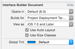
It only takes one click to do so! Open up your storyboard and go to the info panel (command + alt + 1) and check the box for Use Size Classes:
You’ll notice that your views all turn into squares. Don’t get too excited though, as that doesn’t mean your app now supports the Blackberry Passport. It’s just an arbitrary size that now works for any size screen.
Your constraints should all be kept the same as before, and nothing has really changed (yet!). You can confirm this by using the new Preview mode in the Assistant Editor:

What you can do now is set up your constraints independently for different size classes. Check out our Beginning Adaptive Layout for an in-depth tutorial on adaptive layout, size classes and universal storyboards.
Note: If your app is universal, chances are you have separate storyboards for your iPhone and iPad interfaces. You have two options here:
- Continue to use separate storyboards. Turn only your iPhone storyboards, or all your storyboards, into universal ones and still use them separately for the iPhone and iPad.
- Go all out and replace them with a single universal storyboard! This allows you to only maintain a single storyboard going forward. However, this approach likely requires quite a bit of work. Currently, there are no refactoring tools in Xcode to help you with this so you’re on your own with the conversion.