Implicit Animations in Flutter: Getting Started
Learn how to make smooth-flowing and beautiful apps by adding implicit animations to your Flutter project’s buttons, containers and screen transitions. By Yogesh Choudhary.
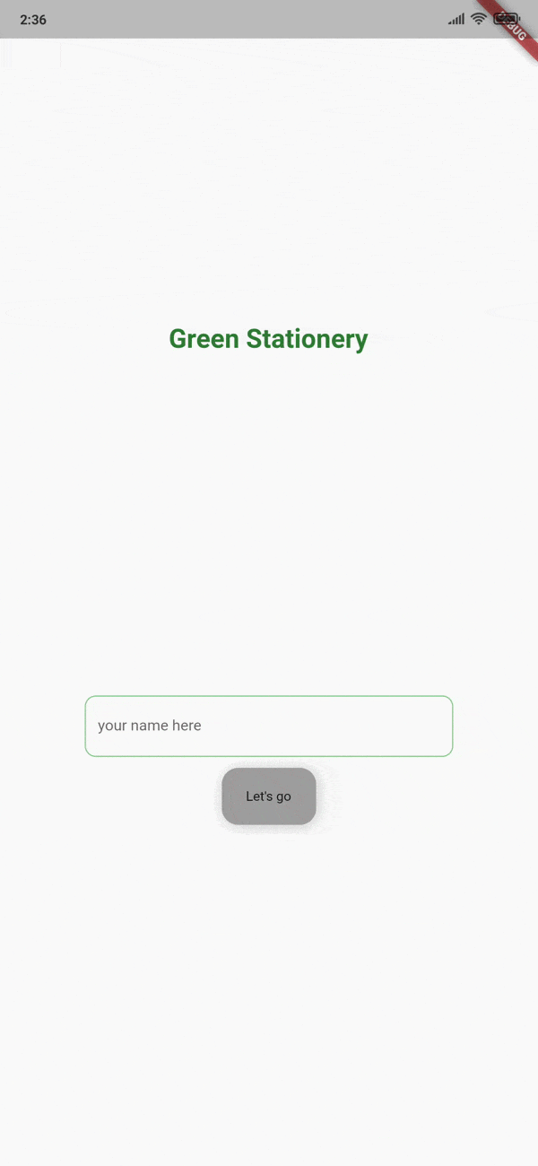
Animating Buttons
AnimatedContainer is an animated version of Container. It's a powerful animation widget that allows animations on most properties of Container. You'll use this widget to change the color of the Let's go button on the initial screen from grey to green in an animated way, instead of having the same color all the time.
Open greetings_screen.dart in the screens folder. Scroll down until you find _userNameInput. Inside that method, you'll see the onChanged callback of TextFieldForm with a // TODO comment. Directly below that comment, add the following code:
if (v.length > 2) {
  setState(() {
    _color = Colors.green;
  });
} else {
  setState(() {
    _color = Colors.grey;
  });
}
The text field calls the onChanged callback whenever the user changes the text in the field. In this case, the _color field will set to green if there's more than two characters in the textfield. If there's less than or equal to two characters it'll be set to grey. You're using setState to tell the Flutter framework that it should rebuild the user interface.
While still in greetings_screen.dart, replace _getButton with the following code:
Widget _getButton() {
  // 1
  return AnimatedContainer(
    margin: const EdgeInsets.only(top: 10.0),
    // 2
    duration: const Duration(milliseconds: 900),
    padding: const EdgeInsets.all(16.0),
    decoration: BoxDecoration(
      // 3
      color: _color,
      borderRadius: const BorderRadius.all(
        Radius.circular(15.0),
      ),
      boxShadow: [
        BoxShadow(
            color: Colors.black.withOpacity(0.2),
            offset: const Offset(1.1, 1.1),
            blurRadius: 10.0),
      ],
    ),
    child: InkWell(
      onTap: () {
        if (name.length > 2) {
          if (!_currentFocus.hasPrimaryFocus) {
            _currentFocus.unfocus();
          }
          setState(() {
            // TODO
            _showNameLabel = true;
          });
        }
      },
      child: const Padding(
        padding: EdgeInsets.symmetric(horizontal: 6.0, vertical: 3.0),
        child: Text('Let\'s go'),
      ),
    ),
  );
}
Here is the explanation for the numbered comments:
-
AnimatedContaineris the name of the animated version ofContainer. - The
durationparameter is a required parameter for any animation widget. It takes aDurationobject, which tells the animation widget how long the animation should take to complete. - You're assigning
_colorto thecolorparameter. A change in this variable triggers the animation. The animated widget then animates the color for the given duration.
Finally, change the initial color of the button to gray. Update the _color declaration at the top of GreeetingsScreenState to the following:
Color _color = Colors.grey;
Hot reload the app to see the difference:

Since you're using the AnimatedContainer class, any property changes on the AnimatedContainer will automatically animate without you having to specify any messy animation code. Pretty nifty, huh?
Making a Responsive TextField
Making a responsive button is good, but the user interface could be better. It's time to make the text field more responsive so that whenever the user selects it to type something, its width increases to the maximum.
To achieve this, you'll use AnimatedSize. This animation widget changes its size over a given duration of time whenever its child widget changes its size. All you need to do to use this widget is provide it a duration and a child.
To prepare for that change, first replace this line:
class GreetingsScreenState extends State<GreetingsScreen> {
with the following:
class GreetingsScreenState extends State<GreetingsScreen>
    with TickerProviderStateMixin {
You'll use TickerProviderStateMixin to provide a Ticker to your animation.
Add the following property to GreetingsScreenState:
bool _textFieldSelected = false;
Now, you're ready to add the animation. You're going to wrap the text field with AnimatedSize. To do that, replace _userNameInput with the following code:
Widget _userNameInput() {
  return AnimatedSize(
    // 1
    duration: const Duration(milliseconds: 500),
    // 2
    vsync: this,
    child: Container(
      width: _textFieldSelected ? double.infinity : 3 * _screenWidth / 4,
      padding: const EdgeInsets.symmetric(horizontal: 16.0),
      child: TextFieldForm(
        onTap: () {
          setState(() {
            // 3
            _textFieldSelected = true;
          });
        },
        onChanged: (v) {
          name = v;
          if (v.length > 2) {
            setState(() {
              _color = Colors.green;
            });
          } else {
            setState(() {
              _color = Colors.grey;
            });
          }
        },
      ),
    ),
  );
}
Here's an explanation of the code:
-
durationsets the time the animation takes to move to full width and back again. -
vsyncis aTickerProviderthat will provide theTickerto your animation widget. These objects are responsible for listening to the screen refresh rate of your smartphone and providing a refresh rate for the animations. Since you addedTickerProviderStateMixinto this class,thishandles it. - When
_textFieldSelectedchanges, the animation starts.
For the last piece of the puzzle, you'll use a gesture detector to detect when you click outside the text field.
Go to build in GreetingsScreenState and locate the onTap parameter of GestureDetector. Add the following lines to the top of the onTap callback:
setState(() {
  _textFieldSelected = false;
});
Tapping anywhere outside the text field will let the animator know it needs to return to its original state.
Build and run again:
This time, everything works as expected. Nice! :]
Using the Cross-fade Effect Between Widgets
The next animation widget you'll work with is AnimationCrossFade. This widget is a simple and fast way to get a cross-fade effect between widgets. Using it with widgets of the same size is straightforward but, if you have different widget sizes, you might need a custom layoutBuilder to avoid sudden jumps in animation.
You'll use AnimationCrossFade to fade in the greetings box and fade out the text field. Add the following to GreetingsScreenState:
bool _showWelcomeMessage = false;

Widget _getAnimatedCrossFade() {
  return AnimatedCrossFade(
    //1
    firstChild: _userInputField(),
    secondChild: _welcomeMessage(),
    //2
    crossFadeState: _showWelcomeMessage
        ? CrossFadeState.showSecond
        : CrossFadeState.showFirst,
    //3
    duration: const Duration(milliseconds: 900),
  );
}
Here's what you just did:
- The parameters
firstChildandsecondChildtake the widgets you want to animate between. -
crossFadeStatetakes the child that will be visible after the animation has completed. When_showWelcomeMessageistrue, it'll show the_welcomeMessagewidget. Otherwise,_userInputFieldwould be visible after the end of the animation. - You define how long the animation will take.
Now, you need to make a couple of adjustments. Go to _getButton and find the // TODO comment. Replace _showNameLabel = true; with the following line:
_showWelcomeMessage = true;
Next, go to build, find the line !_showNameLabel ? _userInputField() : _welcomeMessage(), and replace it with the following:
_getAnimatedCrossFade(),
Now instead of abruptly switching between showing the name input field or the welcome message, you'll do a nice controlled cross fade from one to the other.
That's it. Save the file and re-run your app. You'll be able to see the cross-fade effect:
